The network for creativity
Join 1.25M professional creatives like you
Connect with clients, get discovered, and run your business 100% commission-free
Creatives on Contra have earned over $150M and we are just getting started
Back to feedPost
Taste Test

Two ways to introduce the same tea brand.
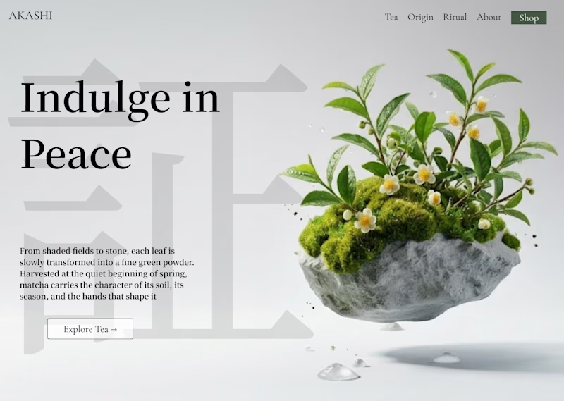
A — Crafted
A minimal editorial direction built around botanical art, typography, and a sculptural tea landscape.
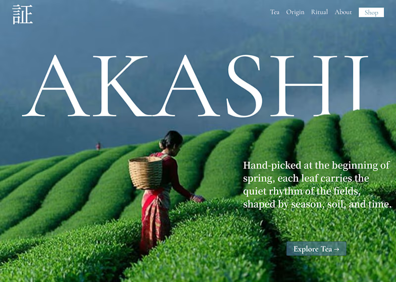
B — Immersive
A full-bleed tea plantation, natural atmosphere, and quieter typography that lets the photograph lead.
Same brand. Same story.
Two completely different first impressions.
Which one would you choose?
👇🏻 A or B?

3 votes
Ends in 10h

Dependence on audience on website, first one can be more relatable to user then 2nd


Iike crafted . It feels innovative and unique!
The network for creativity
Join 1.25M professional creatives like you
Connect with clients, get discovered, and run your business 100% commission-free
Creatives on Contra have earned over $150M and we are just getting started

Challenges
View all


Related posts


New Case 🙈
This time it’s BUDOVA — a next-gen real estate platform we designed from the product UX to the full brand identity and visual system.
Would love to hear what the Contra community thinks — what stands out to you most in this direction: Product Demo or Product Overview?

16 voted
41%
23 voted
59%
39 votes
Closed

PRO Design 😍

A brilliant SaaS tool needs a landing page that instantly builds trust and drives action.
I recently put together this visual upgrade for OpenTag to explore how tightening the layout could elevate their first impression.
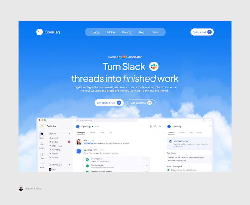
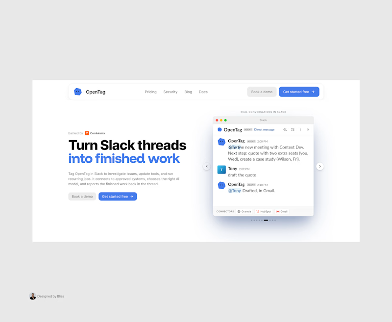
Option A (The Original): Strong product copy, but the split layout and floating elements create competing focal points that divide the user's attention.
Option B (The Redesign): Centered messaging, a much clearer visual hierarchy, and a dynamic, breathable layout. The goal was to remove distractions and let the product interface take center stage.
Which direction do you think communicates the value better and creates a stronger first impression?
Let me know your pick!
8 voted
100%
0 voted
0%
8 votes
Closed

Great work, Emmanuel!


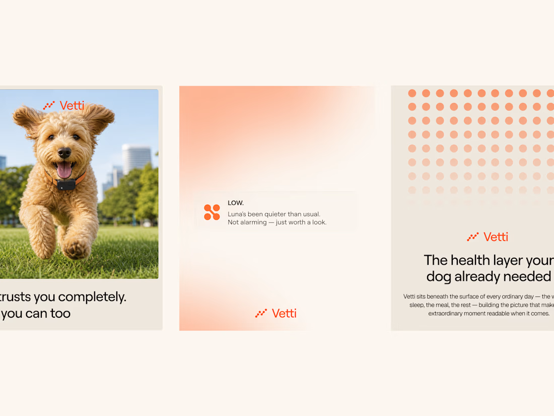
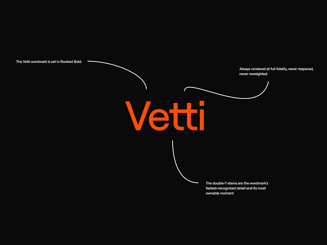
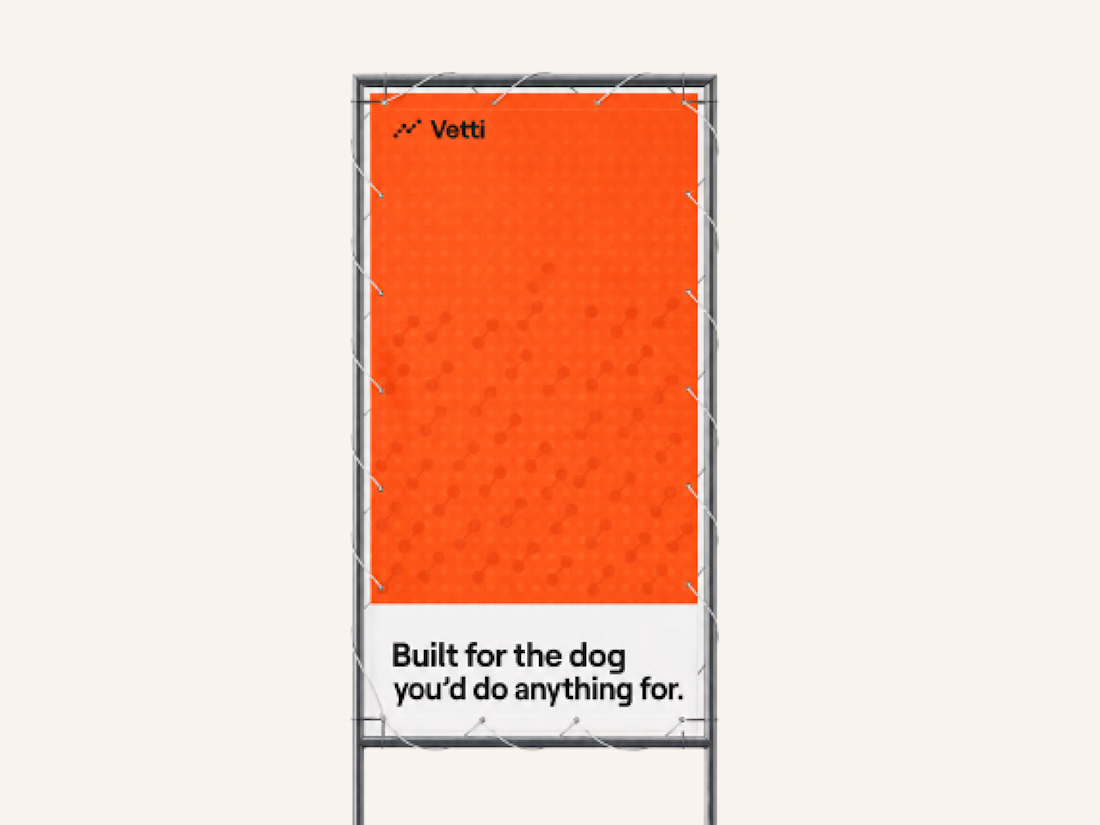
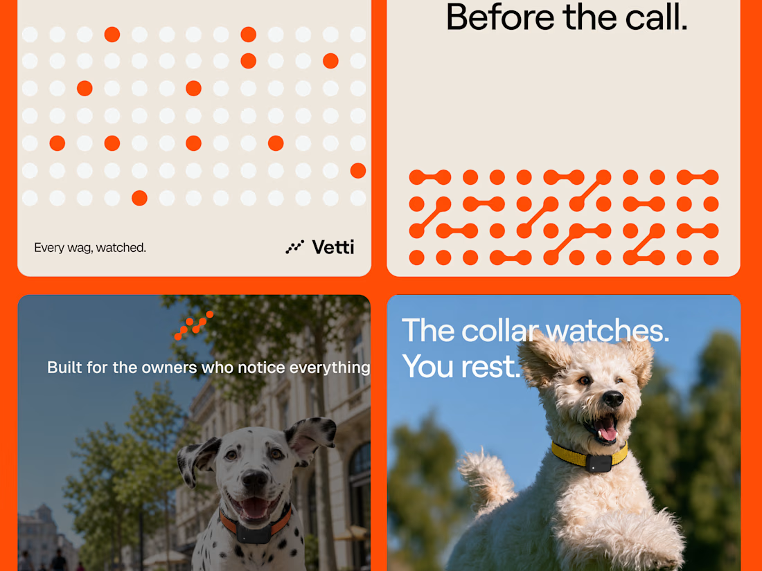
A fuller look at the brand identity work we for Vetti, a dog health monitoring brand.
The connected dots carry through the whole identity. They form the mark, expand into patterns and give the campaign a recognisable language of its own. Sometimes they fill the layout.
Paired with warm orange and cream the system has room for both the technology and the dogs it’s there for.

Looks very nice welldone