The network for creativity
Join 1.25M professional creatives like you
Connect with clients, get discovered, and run your business 100% commission-free
Creatives on Contra have earned over $150M and we are just getting started
Back to feedPost
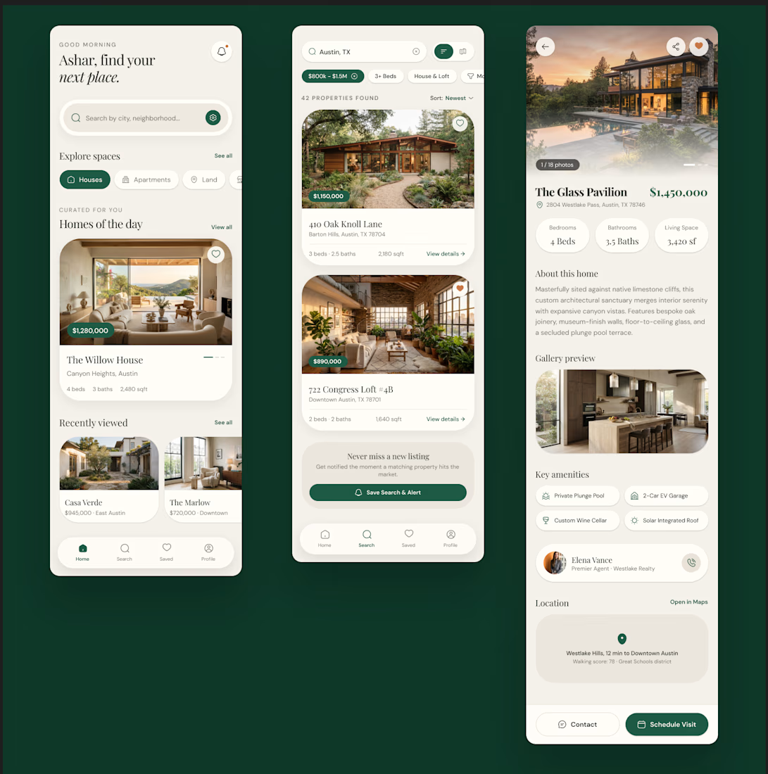
Luxury Real Estate Mobile App UI/UX Design
🏡 Aurelia is a premium real estate mobile app designed to make property discovery faster, simpler, and more engaging.
The concept focuses on a refined property-search experience with curated listings, smart filters, detailed property information, saved homes, and a seamless journey from discovering a property to scheduling a visit.
✨ Key Features
Property discovery & search
Smart filters
Curated property recommendations
Property listing cards
Detailed property pages
Price & property specifications
Image gallery
Amenities overview
Agent contact section
Location information
Save & favorite properties
Schedule visit CTA
Clean mobile-first UX
Tools: Figma • UI/UX Design • Mobile App Design • Product Design



Property search is a good place to focus on clarity: filters need to narrow the choice without hiding the listings. How did you decide which filters to surface first in Aurelia?

@Mykola Malyhin Thanks, Mykola!
I started with the filters that have the biggest impact on the initial decision location, price, property type, and bedrooms. I kept those visible upfront and pushed more detailed options into secondary filters, so the search stays focused without overwhelming the listings.
Core filters upfront keeps the search focused.

Saved homes to scheduling a visit is where these apps usually lose people. Curious whether a saved property carries its price and agent state into the booking step.
@Mark Barliet Great point, Mark! Yes, the idea is to carry the property context into the scheduling flow, including the price and assigned agent details. This keeps the transition from a saved home to booking a visit seamless and avoids making users re-check or re-enter information.

The Clean UI. Looks like proffessional.
@Zara Designs Thank You!
The network for creativity
Join 1.25M professional creatives like you
Connect with clients, get discovered, and run your business 100% commission-free
Creatives on Contra have earned over $150M and we are just getting started
Challenges
View all


Related posts


Engaging website for a New York–based architecture and construction studio, balancing bold typography, immersive imagery and a minimal editorial layout.


A look at the identity we designed for Vetti, a dog health monitoring brand.
There’s a lot of data behind a product like this but the person using it just wants to know their dog is okay.
That’s the balance in the design with a connected dot system that feels precise and warm colors and photography that keep it close to what people care about.
Also, an excellent excuse to spend far too long choosing dog photos.


Starting the week with 3 client calls in a row.
2 active Framer + brand projects
1 new product design lead
Later this week I’m catching up with a former client who went from Seed to enterprise in 3 years. Could turn into my biggest project so far ✌️

Going from Seed to enterprise in 3 years is a serious journey. What interests me is how much changes operationally as a business scales. More customers, more data, more moving parts, and suddenly visibility becomes just as important as growth itself. Excited to see what comes from that conversation! 🔥


