The network for creativity
Join 1.25M professional creatives like you
Connect with clients, get discovered, and run your business 100% commission-free
Creatives on Contra have earned over $150M and we are just getting started
Back to feedPost

A burst of color. A splash of flavor. A whole new identity.
The new packaging for Mirinda brings every flavor to life with bold visuals and playful energy exactly what the drink stands for. From the vibrant palettes to the juicy illustrations, this rebrand feels fresh, fun, and impossible to ignore.
What do you think about this new look? 👀
#Mirinda #PackagingDesign #Rebranding #DesignInspiration #CreativeDirection #BrandIdentity #MotionDesign #VisualDesign


The network for creativity
Join 1.25M professional creatives like you
Connect with clients, get discovered, and run your business 100% commission-free
Creatives on Contra have earned over $150M and we are just getting started
Related posts

A little more about the inspiration behind Tindara.
I wanted the identity to have a connection to Tindari, Sicily. The Madonna di Tindari statue was the starting point for the symbol, while Sicilian decorative patterns inspired the graphics around it.
For the colors, I chose mustard yellow, deep green, and burgundy, balanced with cream. I wanted to bring some of that warmth and richness into the packaging, while keeping the different elements comfortable together.
For me, these references are what give the project its character and sense of place.



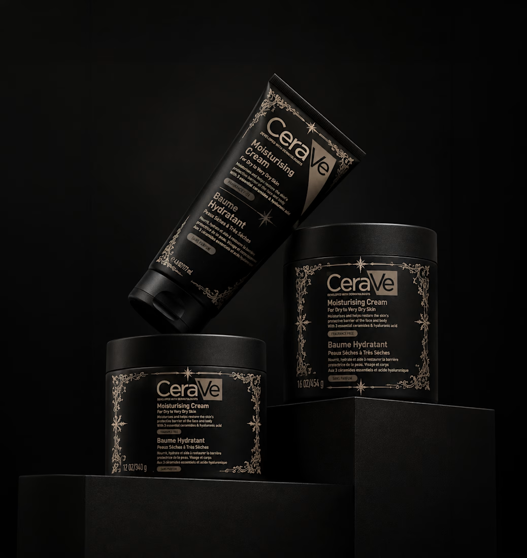
Having fun testing how brands I use could look like with a goth redesign for Halloween using Adobe Firefly.
Requested by @Aly W



Ooh another spooky take on a classic. Love it Anita!!

IPO Gateway landing page web design 3D animation website

