The network for creativity
Join 1.25M professional creatives like you
Connect with clients, get discovered, and run your business 100% commission-free
Creatives on Contra have earned over $150M and we are just getting started
Back to feedPost
Quiet: A login that doesn't push
A concept exploring how a single screen — the login — can quietly communicate a product's values before the user has clicked anything.
Most login screens are built around efficiency: email, password, button, social-login shortcuts, marketing nudges. The default is transactional and slightly cold. But the login is also the first screen a returning user sees — the first moment of the relationship every day. That's a design opportunity most products waste.
Quiet is the opposite: a login built around intentional first impressions.
A serif welcome line — "Welcome back. Take your time." Soft form fields that feel like depressions in the surface, not boxes stuck on top. A subtle warm halo appears when a field is focused — the interaction itself feels like attention being paid. A primary button without urgency or exclamation marks. Reset-password copy that treats forgetting as something that happens, not a failure: "That's okay — it happens." A "New here?" link that simply says Begin. No social-login clutter. No marketing nudges. Restraint as the design statement.
Designed in a deep midnight palette with a single warm gold accent, serif welcome typography, and a quiet ambient background that connects visually to my other work.
A single-screen concept study exploring how much character and intention can live in a screen most products treat as utility.
Concept project · UI + interaction design · 2026
The network for creativity
Join 1.25M professional creatives like you
Connect with clients, get discovered, and run your business 100% commission-free
Creatives on Contra have earned over $150M and we are just getting started
Related posts
Awesome! Did you do this in Blender? Curious because the render looks so finished!
The most ignored screen in any app is the loading screen.
So when this dating-safety app needed one, we didn't reach for a spinner.
The app flags red flags in your chats. Built in Rive: vector-crisp, ~85KB, native 60fps.
First in a series on the Rive work we've shipped lately.
Check it out
Nice, I too trying to get my hands on rive. Find it bit difficult to understand for now. 😅
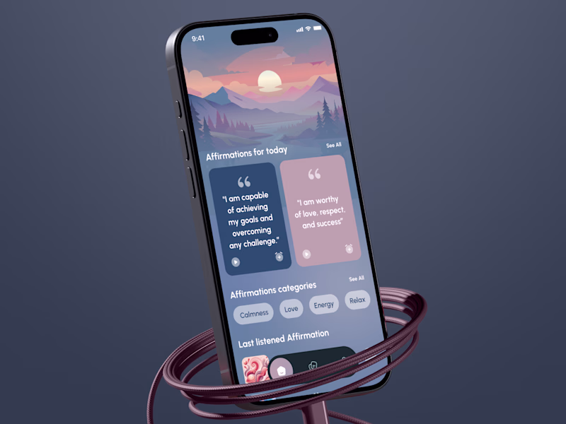
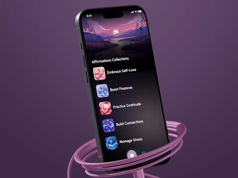
WELLNESS APP DESIGN IS NOT ONLY ABOUT LOOKING CALM 🌿
It’s about creating a feeling users want to return to every day.
For this Daily Affirmation Mobile App, we explored two visual directions for the same product experience.
The client first moved forward with one concept. Later, we created a second direction as an additional paid exploration.
But once both were side by side, the real question became:
WHICH ONE IS STRONGER FOR DAILY RETURN? 👀
Affirmation apps often fail when the experience starts feeling repetitive, or emotionally flat.
Projected impact:
+43% potential daily retention
+27% user engagement
stronger emotional connection
WHICH ONE WOULD MAKE YOU OPEN THE APP DAILY?
🟢 Book a Mobile App Strategy Session
https://calendly.com/asol_design/book-diagnostic-call-linkedin-clone
35 voted
60%
23 voted
40%
58 votes
Closed
Mountain sunset, because it's actually looks calm :)
Challenges
View allTrending
Claude
Claude has entered the design space. How are you using Claude Design?
Contra University
Learn from expert creatives how to earn more using next-gen AI tools.
MagicPath
The canvas is infinite, and exploration is becoming the workflow. How are you using MagicPath?
creativeaiflow
Creative AI workflows are evolving. What tools do you use, and what are their strengths and weaknesses?
freelancerlife
Freelancer life is wins, pivots, and everything in between. What’s yours right now?
