The network for creativity
Join 1.25M professional creatives like you
Connect with clients, get discovered, and run your business 100% commission-free
Creatives on Contra have earned over $150M and we are just getting started
Back to feedPost




Perfect
Thanks!

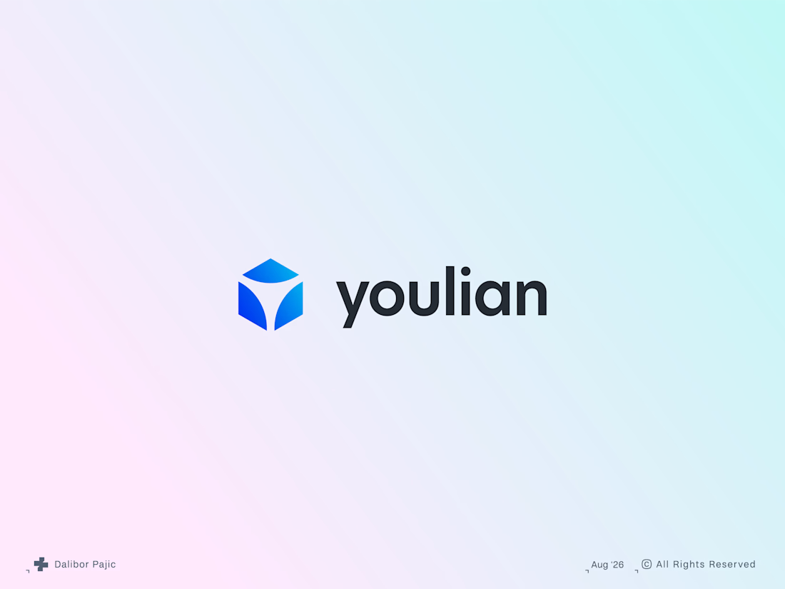
Nice work here, I see how you used negative space in the symbol to create a Y shape to associate with the name .
Great eye, and thank you! That was exactly the intention.

Cool work
Thanks!


This is incredibly inspiring. 🚀
Thank you so much!

what's the idea behind the youlian icon?
Thanks for the question. It's a digital infrastructure company, so the idea of connection is built into the mark itself through the negative space within the cubic, modular structure, which reflects the form of the company's product. The monogram “Y” is also subtly implied...

Amazing work
Much appreciated!

So creative 👏
Big thanks!
The network for creativity
Join 1.25M professional creatives like you
Connect with clients, get discovered, and run your business 100% commission-free
Creatives on Contra have earned over $150M and we are just getting started
Trending

Claude
Claude has entered the design space. How are you using it?

Contra University
Learn from expert creatives how to earn more using next-gen AI tools.
Brand Design
The best brand designers are on Contra. Scroll to see what's trending in brand design. What are you building?
creativeaiflow
Creative AI workflows are evolving. What tools do you use, and what are their strengths and weaknesses?
freelancerlife
Freelancer life is wins, pivots, and everything in between. What’s yours right now?





Related posts


Awesome


dope

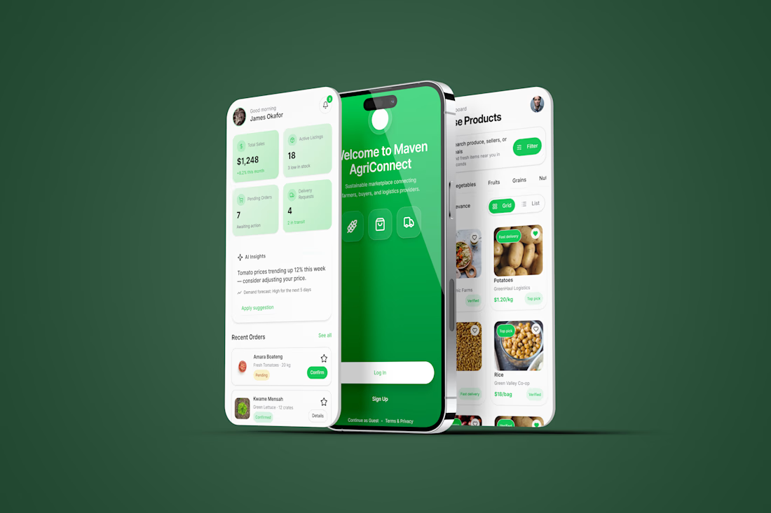
Excited to share my submission for the #FlowstepChallenge!
I designed Maven AgriConnect, a mobile marketplace that connects farmers, buyers, and logistics providers in one seamless experience. Starting with Flowstep AI, I refined the concept in Figma to create a role-based product focused on usability, trust, and efficient agricultural commerce.
Tools: Flowstep AI • Figma
@flowstep_ai
#UIDesign #Figma #ProductDesign #Marketplace #MobileApp