The network for creativity
Join 1.25M professional creatives like you
Connect with clients, get discovered, and run your business 100% commission-free
Creatives on Contra have earned over $150M and we are just getting started
Back to feedPost

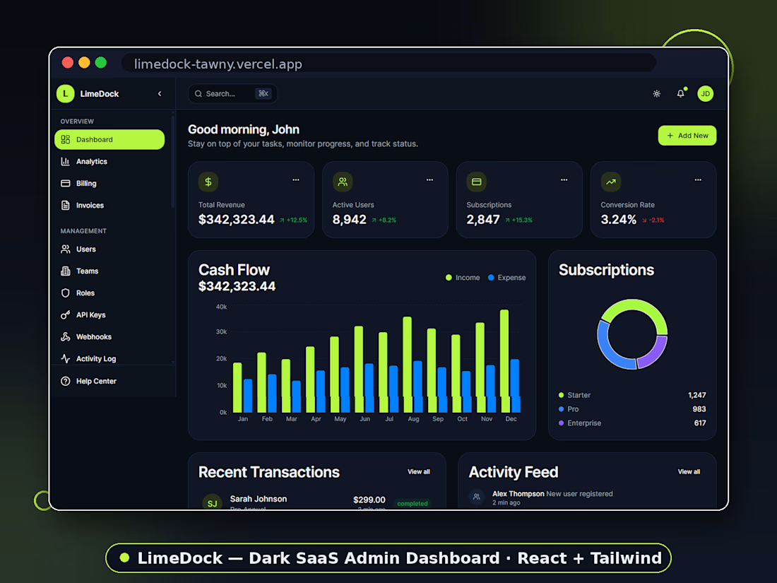
LimeDock is a complete dark-mode admin dashboard for SaaS products — designed, built, and launched as my own commercial product. It found buyers fast: sales and downloads on TemplateMonster within its first weeks of launch.
It covers what a real SaaS actually needs to run, not just a pretty overview page:
Dashboard — revenue, active users, subscriptions, cash flow, recent transactions, live activity feed
Analytics — traffic overview, conversion funnel, top countries, user growth
Billing & Finance — MRR/ARR tracking, revenue growth, invoices with payment status, subscription plan management
Management — users, teams, roles, API keys, webhooks, activity log
The design challenge I cared most about: making a true dark UI stay readable with dense data. That meant strict contrast discipline, elevation through subtle borders instead of heavy shadows, and one lime accent used sparingly so status colors (paid, pending, overdue, failed) always read instantly. Underneath is a component system — cards, charts, tables, status badges — consistent across every page, so buyers can extend the template without breaking the design.
I handled the entire product end to end: concept, UX, UI design, front-end development, and launch.
Built with React and Tailwind CSS. Fully responsive.
🔗 Live demo: https://limedock-tawny.vercel.app
🛒 Available on TemplateMonster


The network for creativity
Join 1.25M professional creatives like you
Connect with clients, get discovered, and run your business 100% commission-free
Creatives on Contra have earned over $150M and we are just getting started





Related posts

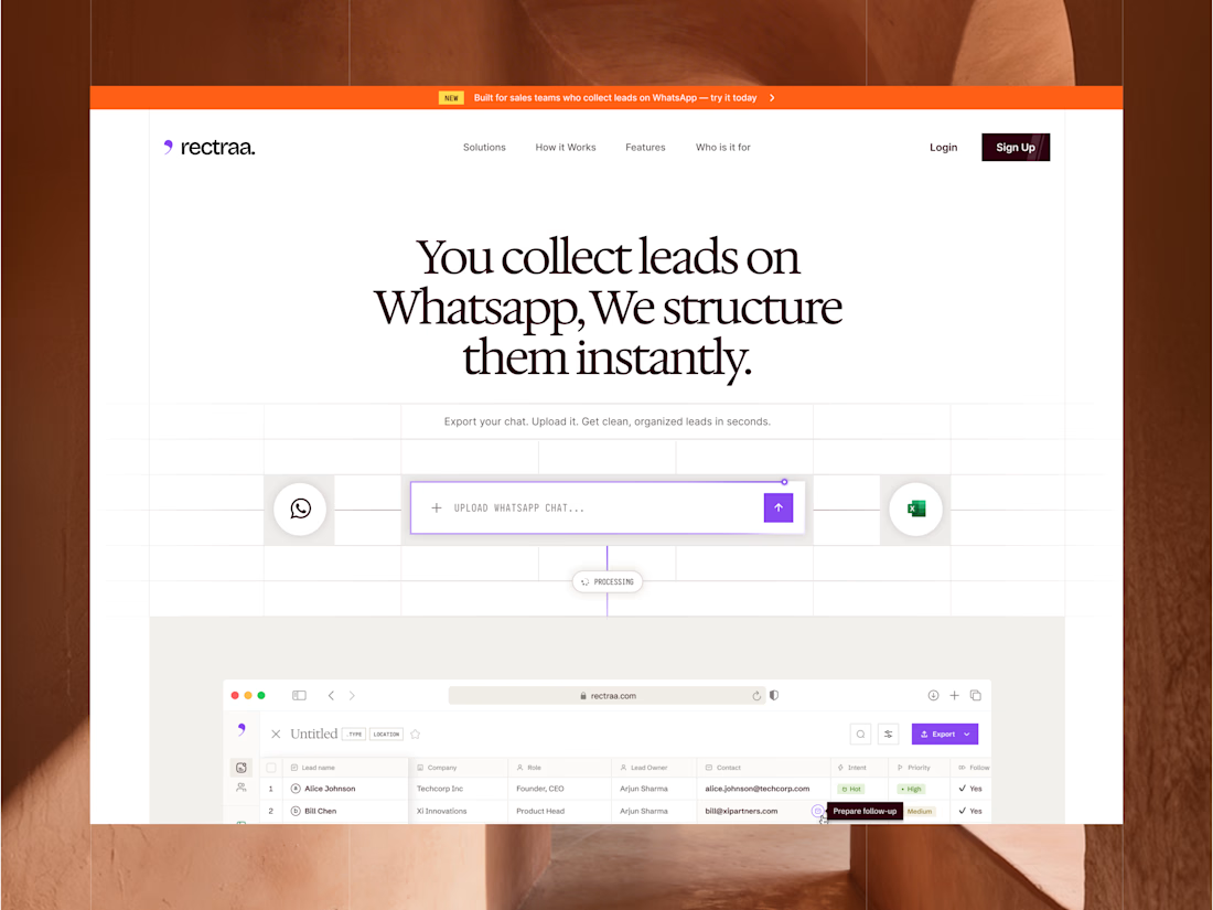
Rectraa helps sales teams extract, classify and organize leads collected through WhatsApp. I designed and developed its marketing website to explain the product clearly, demonstrate its workflow and encourage visitors to try it.
Project information:
Role: Website Designer & Framer Developer
Scope: Website strategy, UI design, responsive design and development
Tools: Figma and Framer
Deliverable: Responsive SaaS marketing website


High end design


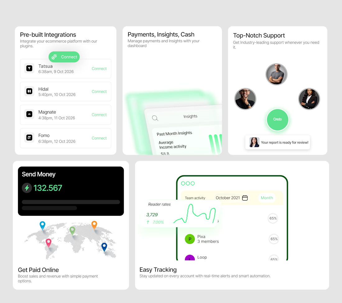
A bento system designed to make a SaaS product feel tangible.
I wanted each card to do more than display a feature — it needed to show the experience.
So I designed a collection of interactive-looking product cards around:
→ Integrations
→ Payments & insights
→ Customer support
→ Global payments
→ Real-time tracking
The visual direction combines minimal layouts, soft green accents, dashboard UI, subtle gradients and strong typography to create a modern fintech/SaaS feel.
The goal was simple:
Make the product feel useful before the user even clicks anything.
I'm currently open to UI/UX, Product Design and freelance opportunities.
If you're building a SaaS, fintech, Web3 or Web2 product and need a designer who can turn ideas into polished interfaces, let's work.
Available for new projects →
#UIDesign #ProductDesign #SaaS #Fintech #UXDesign #Figma #WebDesign #FreelanceDesigner

Love the vibe of this!