The network for creativity
Join 1.25M professional creatives like you
Connect with clients, get discovered, and run your business 100% commission-free
Creatives on Contra have earned over $150M and we are just getting started
Back to feedPost

HR Analytics Dashboard | Power BI
Project Overview
I built an interactive HR Analytics Dashboard in Power BI to transform employee data into meaningful workforce insights and support HR-focused decision-making.
The project covered the complete dashboard development process — from understanding and preparing the dataset to creating KPIs, developing interactive visuals, designing a custom wireframe, and building the final dashboard.
Rather than directly copying the layout from the learning tutorial I followed, I first created my own wireframe and used it as the blueprint for the final dashboard.
Tools & Skills Used
Tools:
Power BI | Power Query | DAX | Excel/CSV
Skills:
Data Cleaning | Data Transformation | Data Analysis | Data Visualization | KPI Development | Dashboard Design | DAX Measures | Data Storytelling | Business Intelligence
What I Built
The dashboard provides an overview of employee demographics, workforce composition, employee attrition, salary levels, job roles, experience, and job satisfaction.
Key KPIs include:
Total Employees
Active Employees
Attrition Count
Attrition Rate
Average Age
Average Experience
The dashboard also analyzes:
Attrition by Department
Attrition by Gender
Attrition by Age Group
Attrition by Salary Slab
Attrition by Years of Experience
Job Role and Job Satisfaction
Employee distribution across departments
The final dashboard contains 1.42K employees, 1.19K active employees, 231 attritions, and a 16.3% attrition rate based on the cleaned dataset used for the project.
Data Preparation & Power Query
One of the first things I learned from this project was that importing a dataset into Power BI does not mean the data is automatically ready for analysis.
I used Power Query to inspect and prepare the dataset before building the dashboard.
I checked the data for empty values and removed unnecessary rows. I also used Group By and Count Rows on Employee ID to investigate whether employee records appeared more than once.
This was particularly useful because I initially did not understand why the tutorial was grouping Employee IDs.
I learned that grouping an ID and counting rows can be used as a duplicate-checking technique. Filtering the count so that it does not equal 1 helps identify IDs that appear more than once and therefore require further investigation.
This helped me understand the difference between simply following a Power Query step and understanding why that step is being performed.
DAX & KPI Development
I created measures to calculate the key HR metrics used throughout the dashboard.
One of the concepts that stood out to me was Active Employees.
The dataset contains an Attrition field indicating whether an employee left the organization.
Therefore:
Attrition = Yes → employee has left
Attrition = No → employee is considered active
To calculate Active Employees, I used the employee count together with an Attrition = No filter.
This helped me understand how a column that does not directly contain the metric I need can still be used to create a meaningful KPI.
I also worked with measures for Attrition Count, Attrition Rate, Average Age, and Average Experience.
Dashboard Design
Before developing the visuals, I created a custom wireframe in my preferred design tool.
I wanted the final dashboard to have its own visual identity rather than replicate the layout of the tutorial.
I chose a purple, white, and ash/gray color palette and structured the dashboard around six KPI cards followed by analytical sections for departments, attrition, salary, age, experience, and job satisfaction.
The wireframe helped me plan the visual hierarchy, spacing, and placement of each component before recreating the design in Power BI.
This was an important part of the project because it reinforced the value of planning the user experience before building the actual dashboard.
Challenges & What I Learned
One of the biggest learning moments was understanding Attrition and how it can be used to derive other HR metrics.
Initially, I questioned why the Employee Count needed to be filtered using the Attrition column when creating the Active Employee KPI.
Understanding that Attrition = No represents employees who have not left the organization made the calculation much clearer.
I also learned more about Power BI's sorting behavior.
For example, the salary slab visual was sorted by Attrition Count in descending order, rather than by the salary categories themselves. This meant the salary slab with the highest attrition appeared first.
Understanding this helped me realize that sorting is not simply a formatting decision — it can change what information a chart emphasizes.
Another important lesson was understanding the difference between data cleaning and data validation. Finding duplicate or empty records does not automatically mean they should be deleted. The analyst needs to understand why the records exist and whether removing them is appropriate.
Outcome
This project strengthened my practical skills in:
Power BI | Power Query | DAX | Data Cleaning | Data Analysis | Data Visualization | Dashboard Design | Business Intelligence
More importantly, it helped me move beyond simply building charts and start thinking about the reason behind each transformation, calculation, and visualization.
The project reinforced my approach of:
Understand → Clean → Validate → Analyze → Visualize → Communicate
I’m continuing to build projects that demonstrate not only my technical skills, but also my ability to turn raw data into clear and useful business insights.
Learning Credit
This project was inspired by a Power BI HR Analytics tutorial that I followed as a hands-on learning exercise, while designing my own wireframe and dashboard layout.


The network for creativity
Join 1.25M professional creatives like you
Connect with clients, get discovered, and run your business 100% commission-free
Creatives on Contra have earned over $150M and we are just getting started
Trending
retrofuturism
Share your favorite designs from the past exploring the distant future. Or your own take on the aesthetic 🚀
halftone
Dots. Texture. Grain. Let's see your designs using the halftone technique.

Midjourney
Creatives are showing off what they're making with Midjourney.
colorgrade
Video editors sound off: How do you enhance the mood of your video in color grading?
Related posts

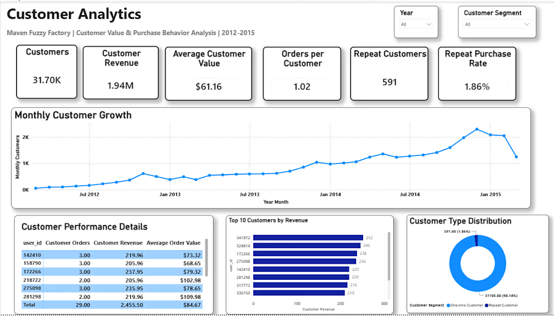
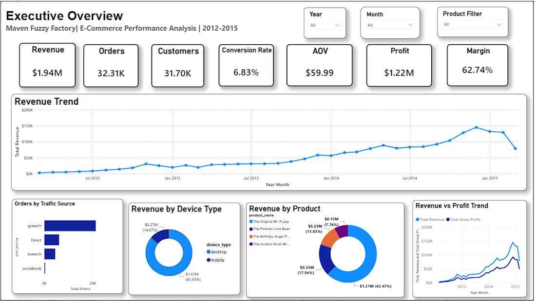
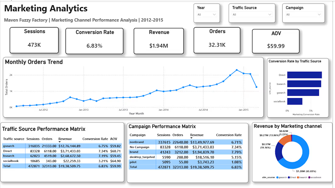
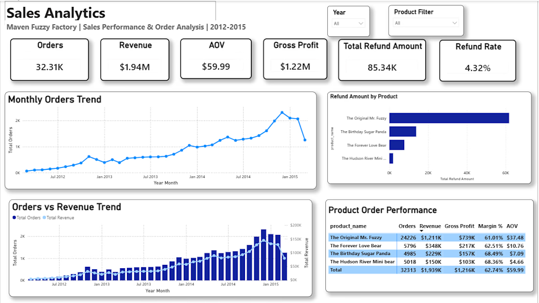
Built an end-to-end e-commerce BI solution using SQL and Power BI. Cleaned and modeled website session, pageview, order and refund data, developed business KPIs and interactive dashboards to analyze sales, customer behavior, conversion, and marketing performance.


great work💯

📊 From Raw PDF Data to Actionable Business Insights
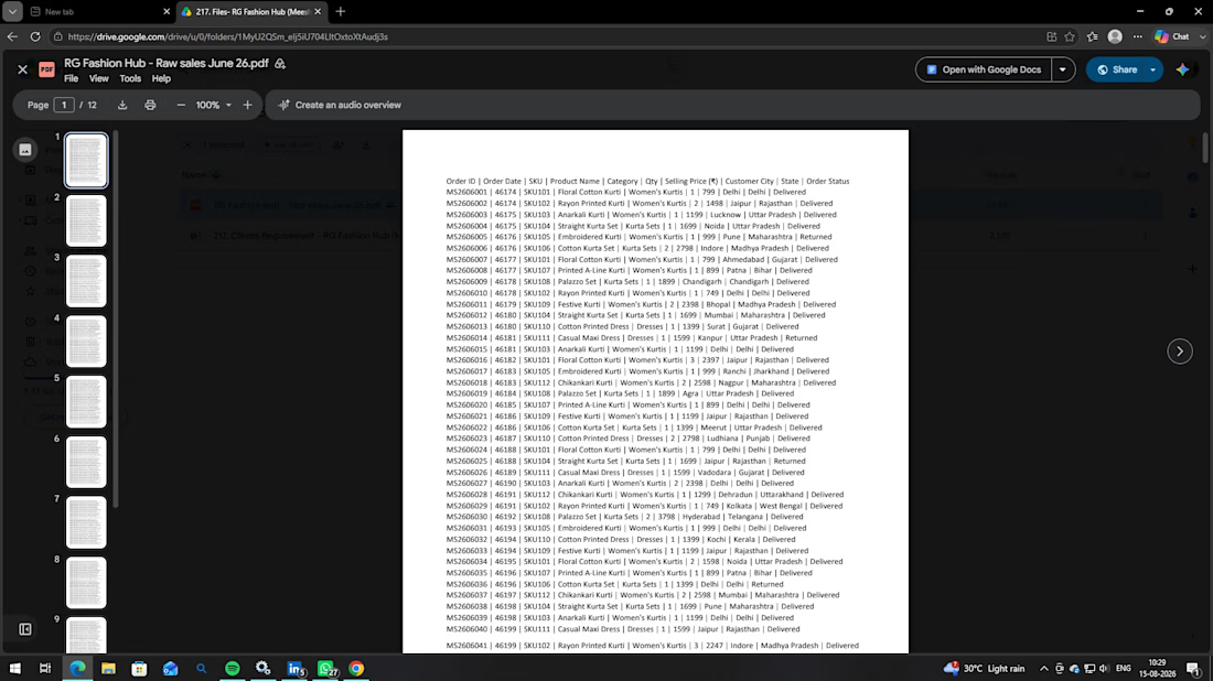
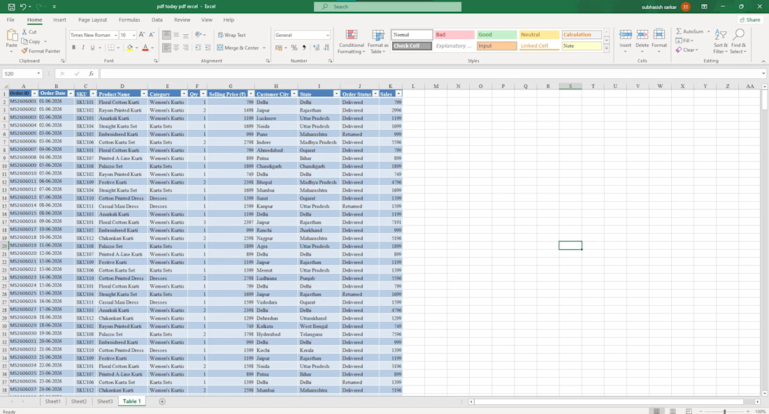
Recently, I worked on a practical data analysis task where I transformed raw sales data from a PDF into a structured Excel dataset and turned it into meaningful business insights.
🔹 What I worked on:
• Converted raw PDF sales data into Excel
• Cleaned and structured the dataset
• Created an Excel Table for organized data management
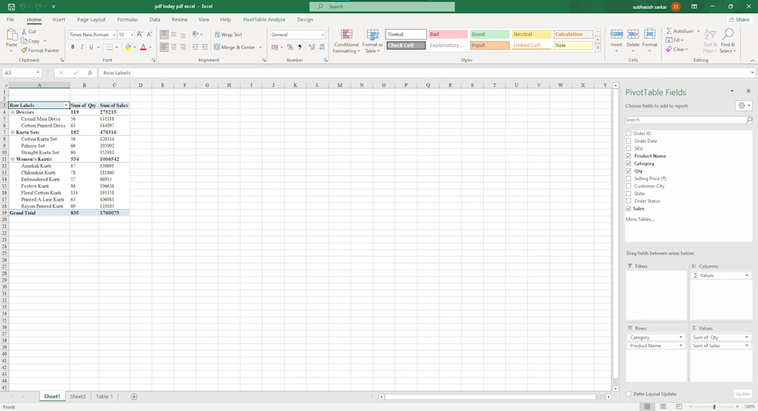
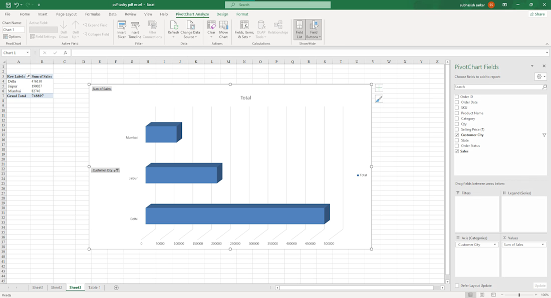
• Used Pivot Tables to summarize sales and quantity
• Analyzed product/category-wise performance
• Created Pivot Charts to visualize sales across different customer cities
• Converted raw numbers into easy-to-understand insights
📈 This exercise helped me strengthen my understanding of Excel, Data Cleaning, Pivot Tables, Data Analysis, and Data Visualization.
The key takeaway for me was simple:
Raw data is just information — structured data and visualization turn it into insights that can support better business decisions.
I’m continuing to build my skills in Excel & Data Analytics through hands-on projects and real-world datasets.
#Excel #DataAnalytics #DataAnalysis #MicrosoftExcel #PivotTable #DataVisualization #BusinessAnalytics #DataCleaning #LearningByDoing #Analytics

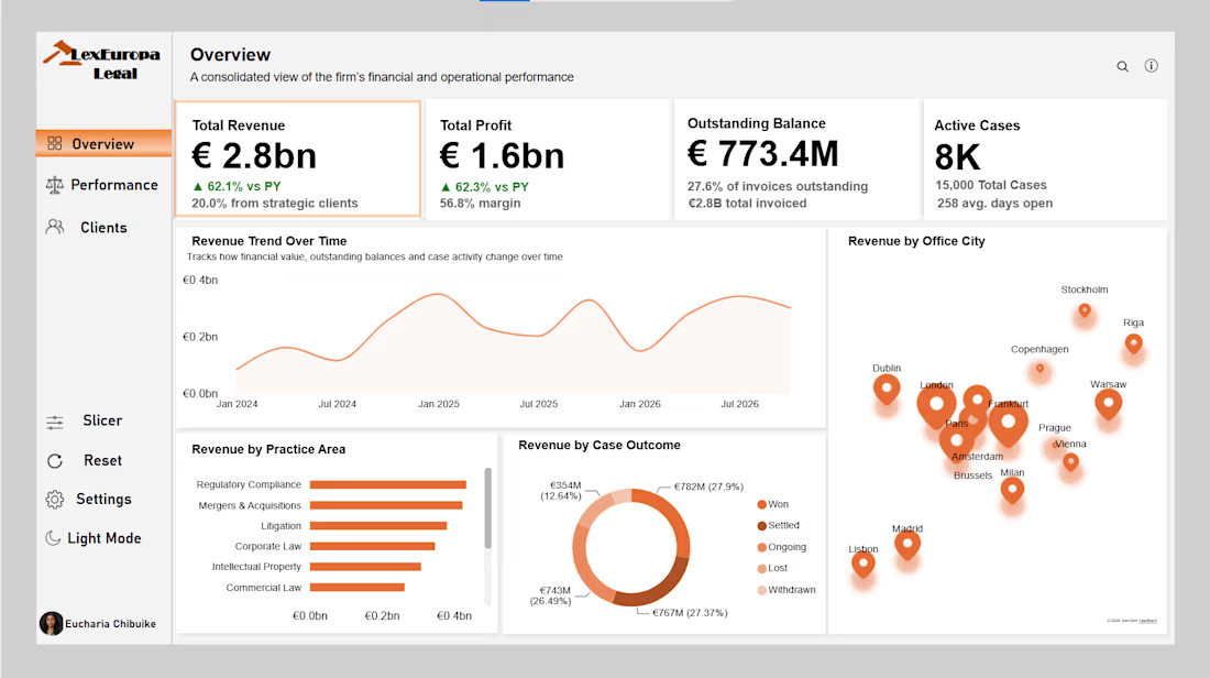
A law firm's numbers looked healthy at 56.8% profit margin, until I dug into who was actually doing the work. Partners were carrying nearly 3x the workload of Associates, not because they worked harder, but because of how cases were assigned. I also found €773M sitting uncollected and seven of the firm's ten highest-revenue clients flying under the radar because they weren't flagged as strategic. Built in Power BI across 15,000 cases, 200 lawyers, and 800 clients.
Link