The network for creativity
Join 1.25M professional creatives like you
Connect with clients, get discovered, and run your business 100% commission-free
Creatives on Contra have earned over $150M and we are just getting started
Back to feedPost

Can you still have engaging interactions & animations when trying to maintain minimalism?
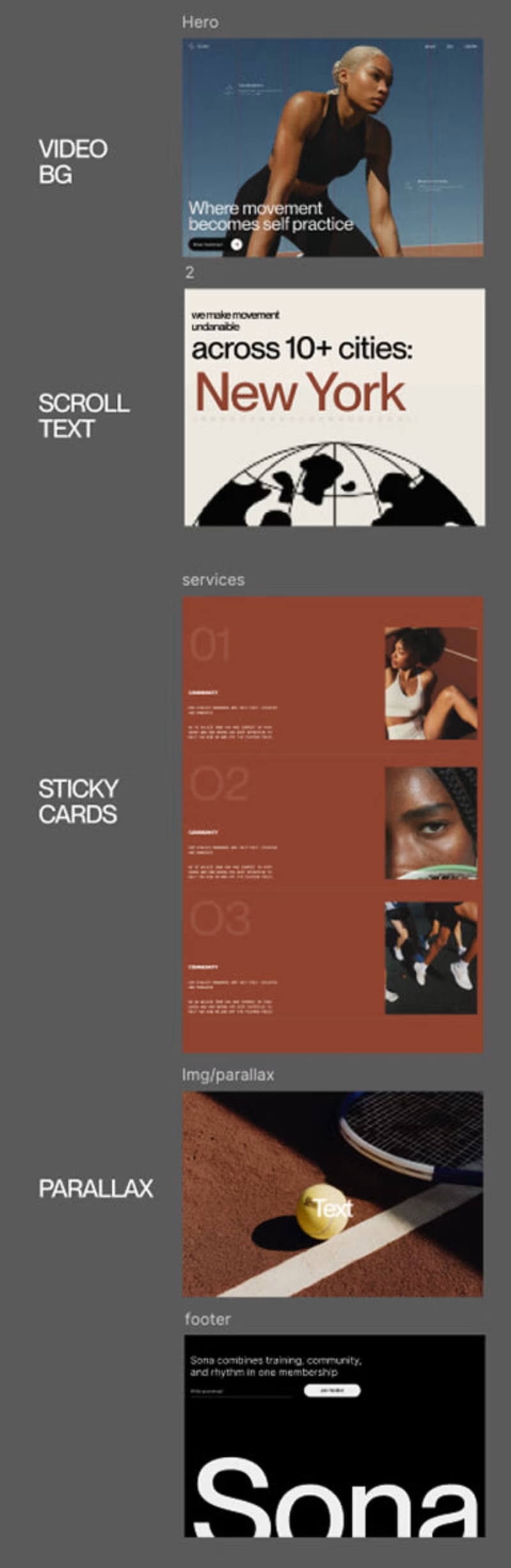
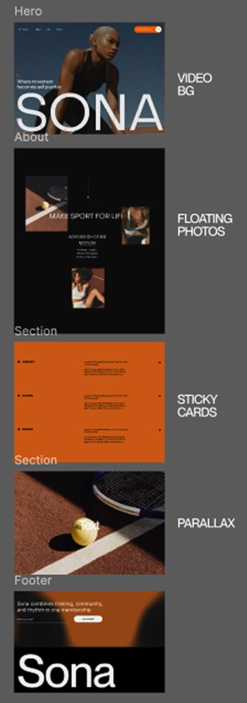
When I built my portfolio (alexek.com), I had one rule: If an interaction doesn't reduce cognitive load, it doesn't belong on the page.
The challenge? Maintaining a "clean" aesthetic while using animations to guide the user. I wanted the site to feel alive, but never loud.
Here is how I approached "Invisible Design" on Squarespace:
→ Value-Driven Stickiness: I only use sticky elements when they provide immediate utility. If it’s not helping the user take the next step, it’s just taking up real estate.
→ The "Orientation" Animation: My navigation isn't just a list of links. I used subtle animations to detail exactly where you are on the page. It removes the "guesswork" and keeps the user grounded.
→ Device-Specific Intent: Desktop and Mobile shouldn't be identical—they should be equivalent. I rebuilt the navigation for mobile to maintain that same intentional flow without the clutter of a standard "hamburger" mess.
What intentional interactions & animations do you like to include in your designs?


The network for creativity
Join 1.25M professional creatives like you
Connect with clients, get discovered, and run your business 100% commission-free
Creatives on Contra have earned over $150M and we are just getting started
Related posts

My website needed a redesign so today I completely overalled it.
As I was working on it I realized that your website can really affect the view you have on your work.
When I was using the old one I didn't fee as confident sending it to potential leads or studios in my area. The new one feel more like a representation of myself and my skills.
Let me know what you think I'm curious to know your thoughts.
2 voted
15%
11 voted
85%
13 votes
Closed

Well done Alexis


Love the immersive version for something related to movement I think the orange makes it feel more dynamic and energetic!

Here’s my submission😍
I created an interactive hero section for a skincare brand called “Baresol.” The background visually represents the texture, thickness, and colour of different skincare products, dynamically adapting to each one.
The hero section is powered by a fully interactive WebGL shader. As you move your mouse, the surface responds in real time—distorting into smooth 3D waves and swirls that mimic the natural flow and feel of skincare creams.
To enhance interactivity, I’ve added a controller in the bottom-left corner that lets users adjust:
Texture thickness Color saturation Flow intensity
There’s also a “Discover Our Products” call-to-action that smoothly navigates users to the product section.
Check it out here: 👉 https://omma.build/p/new-chat-5l2zw0


The WebGL shader reacting to mouse movement is so satisfying — love how the texture controls let you feel the product


Trending


Notion
Notion isn’t just where you work, it’s starting to work for you. What agents are you building?
portfolioreview
The best portfolios tell a story, not just show a grid. Share yours for feedback.
brandguidelines
Brand guidelines are becoming living systems, not static documents. What are you building for your clients?
aivideo
AI video tools are moving at warp speed. Which ones are you experimenting with?
freelancerlife
Freelancer life is wins, pivots, and everything in between. What’s yours right now?