The network for creativity
Join 1.25M professional creatives like you
Connect with clients, get discovered, and run your business 100% commission-free
Creatives on Contra have earned over $150M and we are just getting started
Back to feedPost
Turin's biggest run club has no website to book and see events
So what do you build when 150+ people show up every Thursday and the whole thing runs on Instagram stories and WhatsApp threads?
For the @Lovable challenge, I built Endorphin's site and their booking system
I started with their reality.
I went through everything they publish. No website. Stories, a Linktree, two WhatsApp groups. 150+ people at the season opener, around 11K followers, nights with Nike and adidas. "Can I come?" arrives as a DM, and every answer is typed by hand.
Strategy before screens.
Endorphin isn't a logistics problem. The product is connection, and the run is the excuse. So Thursday stays booking-free: "I'm coming", one tap, a signal and not a reservation. Real booking exists only where spots are real: the drops. Brands get their own door. The crew gets one room instead of an inbox. The real power is behind "add every thursday to you calendar" button.
Every state designed in Figma before I touch Lovable.
Calendar, carousel, full, waitlist, booked, past. The molecule. The formula. One visual language: black, volt yellow, mono labels.
Lovable gets a spec, not a wish.
One prompt at a time, with the Figma design system: sizes, colors, timings, easing. I check the result against my board before I send the next one.
Details that make it feel like the club.
Endorphin is a molecule, so the homepage have one. Every dot is a moment from a Thursday. A "Your move" card asks three taps before any form, so you see people like you before you see a pass. Then you slide to claim it.
First time?
Live website and book page:
https://endorphin-spark-flow.lovable.app
Find the black flag.

Full walkthrough ( sorry for the length, too much to say : )

Incredible work Sergey!! The experience looks soo smooth and exciting from start to finish.
thanks so much, really appreciate you liked it!

thanks so much

I couldn't catch if the run club hired you or if this is your initiative, but if they didn't I hope you pitch this to them. No way they pass, it's absolutely gorgeous and the save your spot experience you created is seamless. Great job! 👏
thanks so much really appreciated

Booking-free sign-ups for a run club is a smart product call. The molecule homepage fits the community idea well.
Thanks so much

Treating the site like a community hang instead of a rigid ticket counter makes so much sense. The interactive molecule map and the quick slide to join flow look incredible.
Thanks so much really appreciate your kind words

Thanks so much, really appreciate your support!
have to pitched this, but I wanted to make it perfect before launch

Congratulations, Sergey! I just watched the livestream where they announced you as the winner. You executed the project brilliantly, a well-deserved win! :)

Congratulations @Sergey Bertagnini on winning the Contra Challenge, I appreciate your hard works!
The network for creativity
Join 1.25M professional creatives like you
Connect with clients, get discovered, and run your business 100% commission-free
Creatives on Contra have earned over $150M and we are just getting started











Related posts


📢 Quick Update on Free Credits & Challenge Guidelines!
Hi creators!
We have already processed the first batch of credit top-ups! For those who haven't received yours yet, our approval and top-up team was off over the weekend. As the new business week starts, your 8,000 credits will be processed and rolling out shortly!
In the meantime, feel free to start brainstorming and planning your video ideas! We can’t wait to see what you create.
⚠️ Important Reminder: Please make sure to carefully review the submission requirements on this page before posting! Don't forget to:
Post on IG, X, TikTok, or LinkedIn with #CapCutWorld #CapCutWorldLA and tag @capcutapp (on IG) or @CapCut (on TikTok/X/YT).
Submit your final 15–60s video, CapCut project link, prompt/workflow breakdown, and social post link on Contra to qualify for the $10K prize pool!
Happy creating! 🎬


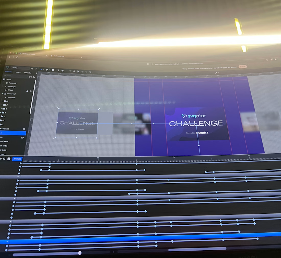
WIP, not showing the animation yet, just how it’s built. Clean keyframes, no shortcuts... Final piece drops soon.


I've been working on Cervia, a @Framer website for a single product.
A good single-product site combines the landing page and the store in one page, so the call to action is the purchase itself. Visitors learn what the product is, see why it’s better, and add it to the cart without leaving the page.
The challenge is making one page do both jobs. It has to look like a landing page, with room to explain the product and show it well, and still work like a store product page, with the price, colors and Add to cart always close at hand.
Every extra step between arriving and paying loses some buyers, so I kept the steps to a minimum.


This is so well put Heron! 🔥 Single-product site logic is spot on - landing + store in one page removes friction, CTA is purchase itself. No wandering around. Visitors learn what it is, why it's better, add to cart without scrolling through 5 pages - that's conversion gold!...