The network for creativity
Join 1.25M professional creatives like you
Connect with clients, get discovered, and run your business 100% commission-free
Creatives on Contra have earned over $150M and we are just getting started
Back to feedPost

Shopify Thumbnail Design for Tech Channel 😊 Hows this?


The network for creativity
Join 1.25M professional creatives like you
Connect with clients, get discovered, and run your business 100% commission-free
Creatives on Contra have earned over $150M and we are just getting started






Related posts

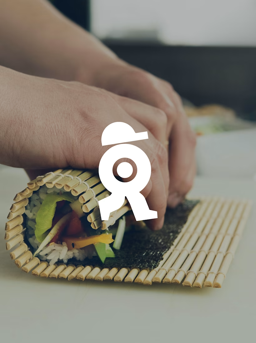
A sushi roll with a life of its own.
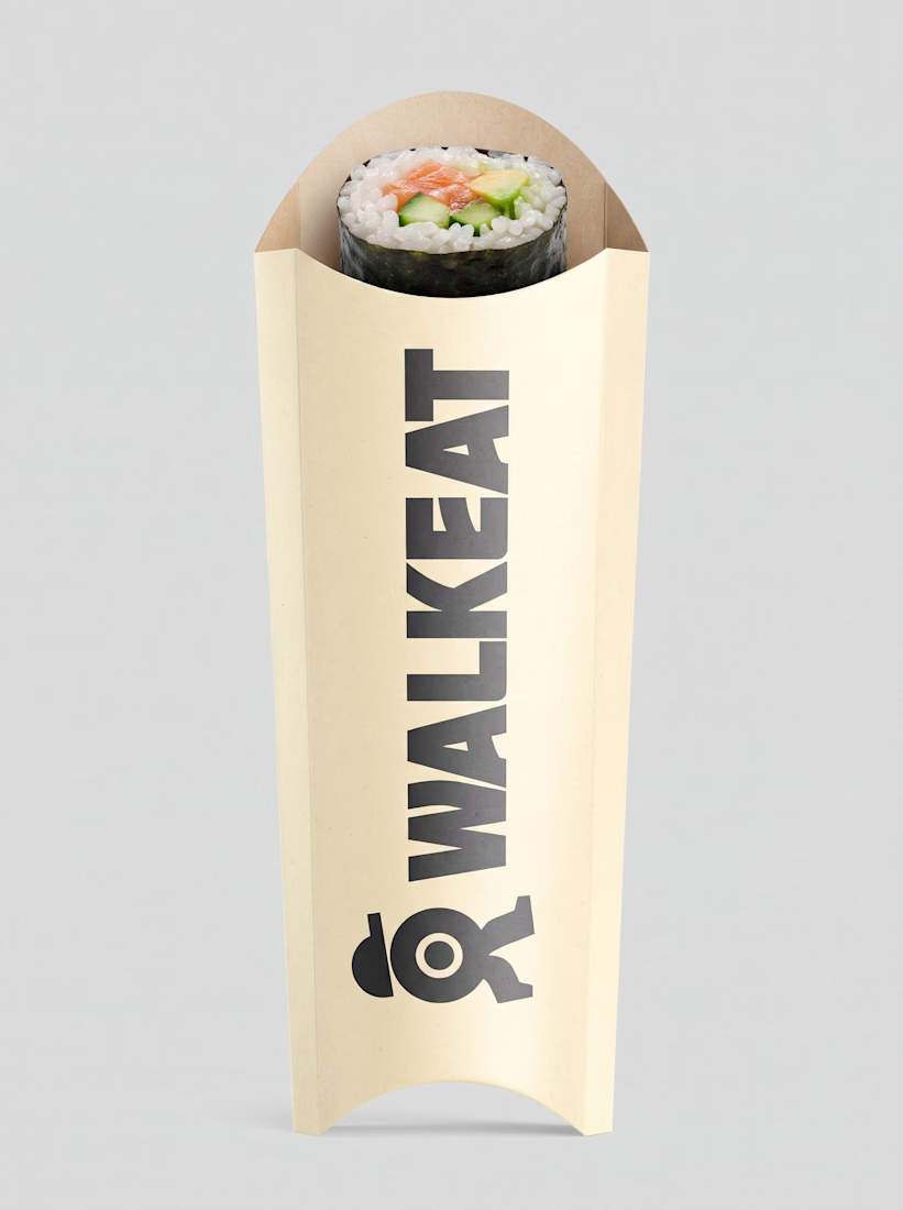
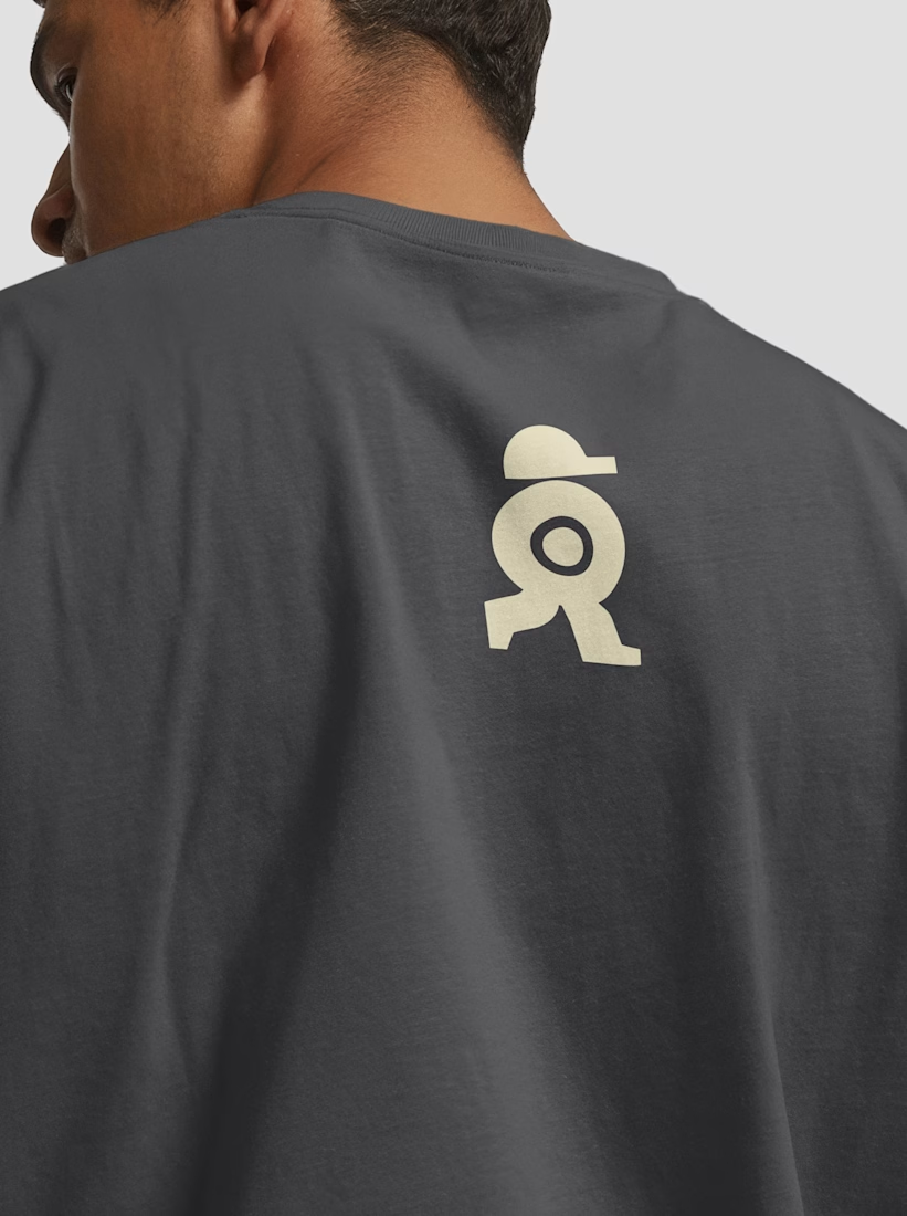
The WALKEAT identity transforms the shape of a sushi roll into a walking character. Its circular center references the cross-section of the roll, while the cap and legs bring movement and personality to the figure.
The custom-designed wordmark reinforces this concept through subtle modifications to the W, A, and E, creating a visual connection between typography and symbol.
A simple, playful and contemporary identity that communicates the product without relying on literal Japanese imagery or an overly cartoonish character.



Great work!!

Dashboard design for AllWays Holiday.
Clarity is what makes a good dashboard.
Every section, metric and action should help users understand what's happening and what needs their attention.
Designed to make managing travel operations easier.

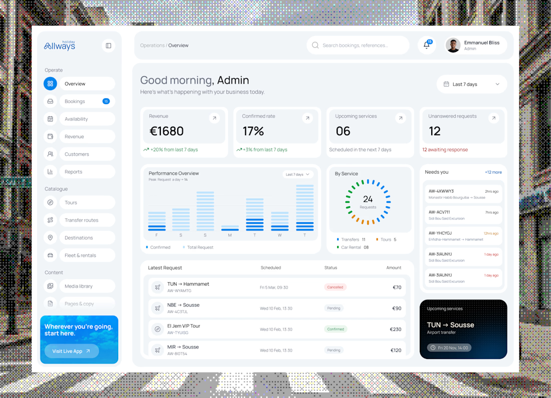

"What needs their attention" is the part most dashboards miss. Clean KPI cards up top, then the list below makes it easy to act. Did you consider pulling urgent bookings or issues into their own highlighted block, so ops teams see problems before they scroll?


Very juicy. Didn't you feel like having some berries while working?