The network for creativity
Join 1.25M professional creatives like you
Connect with clients, get discovered, and run your business 100% commission-free
Creatives on Contra have earned over $150M and we are just getting started
Back to feedPost
A menu is the most-read page of any café. Most brands still treat it like an afterthought. ☕✨
I designed the full Specialty Menu for CHOCOCHAI, a 14-page journey through the world's most iconic drinks. Here's how I approached it.
The brief: CHOCOCHAI brings Tokyo's matcha, the subcontinent's chai, Spanish lattes, and Taiwanese bubble tea under one roof. The menu had to feel just as global, and just as premium, from the first page.
1️⃣ Start with the cover, not the categories
Deep charcoal, warm brewed coffee, a minimal gold emblem. Before a guest reads a single price, they already sense: this is a serious café.
2️⃣ Open with the brand's story first
Page one isn't a menu item. It's a welcome: who CHOCOCHAI is, what "globally inspired, locally brewed" means, plus a table of contents that sets the tone for the journey ahead.
3️⃣ Build one disciplined system, then repeat it
Full-bleed photo on the left, clean typeset list on the right, a subtle botanical border framing every spread. Fourteen categories, one visual language, so a long menu still feels effortless to navigate.
4️⃣ Let photography do the selling
Pour-over coffee mid-pour, matcha with delicate latte art, boba glasses on rustic wood. Every image is chosen to make guests crave the item before they even see the number beside it.
5️⃣ Choose typography like a boutique magazine
An elegant serif for headers, a refined sans-serif for lists. It's the difference between "menu" and "experience."
6️⃣ End the way you began
The back cover echoes the front, a soft watermark emblem, contact details, quiet confidence. First impression and last impression, matched.
💡 The takeaway: A menu this considered doesn't just list what's for sale, it tells guests the brand is worth the price on the page.
Building a café, restaurant, or hospitality brand that deserves this level of design?
📩 Let's talk. Message me here or find me on Contra.
What's the best restaurant menu you've ever held? Tell me below 👇
#MenuDesign #BrandDesign #GraphicDesign #CafeBranding #HospitalityDesign #PrintDesign #FreelanceDesigner
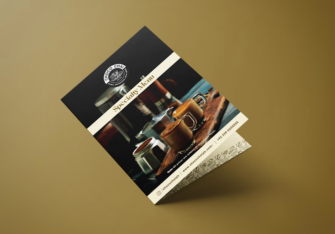
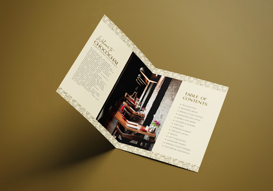
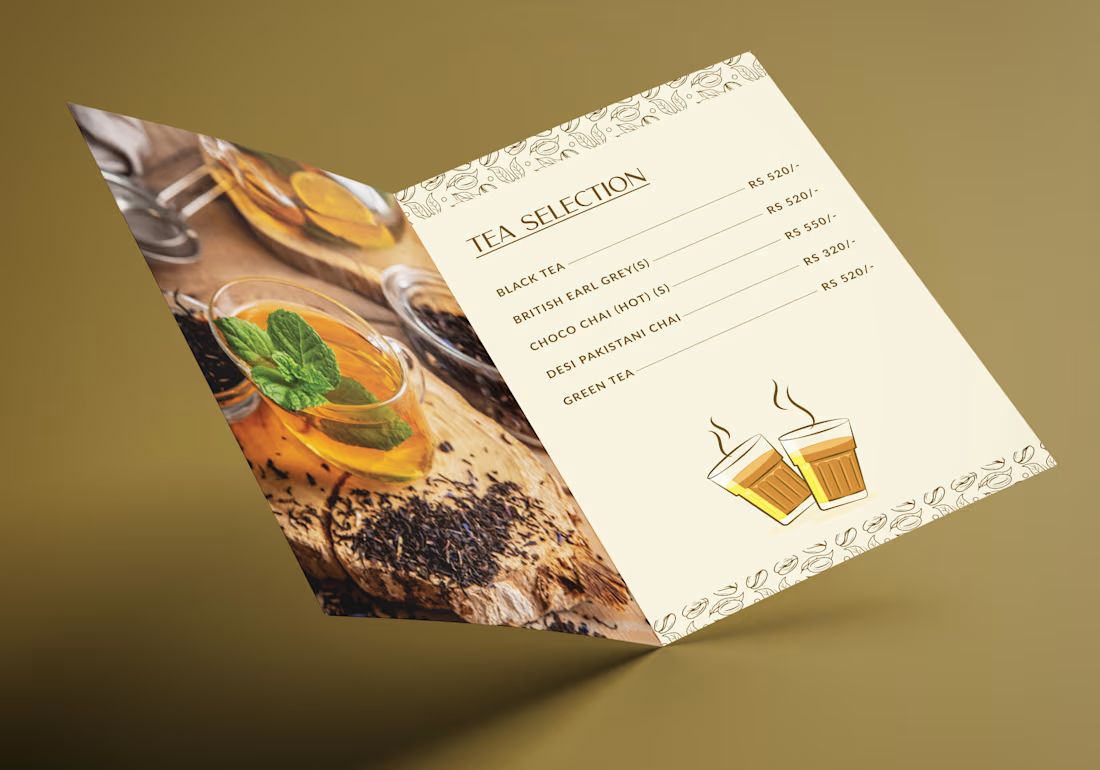
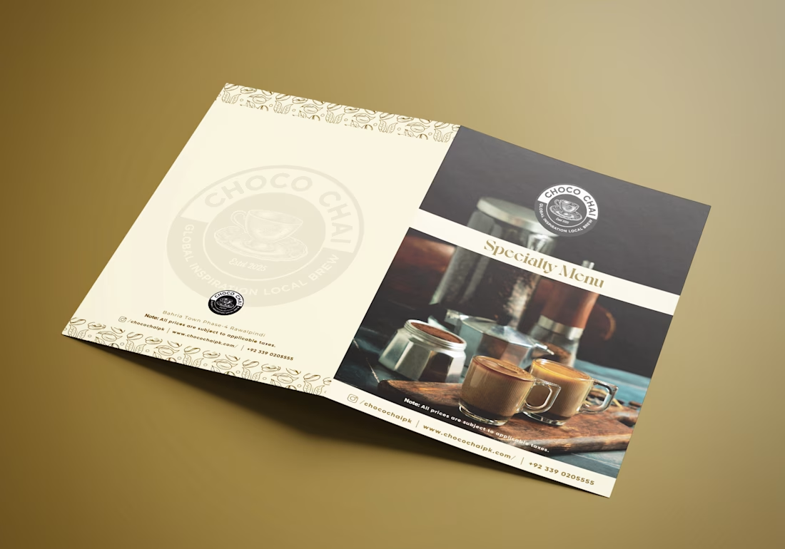

Point 4 has a side effect worth naming: shooting every item at that quality lifts the perceived price of the whole page, which is great until there's one cheap anchor drink you actually need to move volume on. Did the entry-level items stay in the same photographic treatment, or did you let them sit as text?

𝐓𝐡𝐚𝐭’𝐬 𝐚 𝐟𝐚𝐢𝐫 𝐩𝐨𝐢𝐧𝐭! 𝐈 𝐚𝐜𝐭𝐮𝐚𝐥𝐥𝐲 𝐮𝐩𝐝𝐚𝐭𝐞𝐝 𝐭𝐡𝐞 𝐞𝐧𝐭𝐫𝐲-𝐥𝐞𝐯𝐞𝐥 𝐢𝐭𝐞𝐦𝐬 𝐢𝐧 𝐭𝐡𝐞 𝐟𝐢𝐧𝐚𝐥 𝐟𝐢𝐥𝐞, 𝐛𝐮𝐭 𝐈 𝐟𝐨𝐫𝐠𝐨𝐭 𝐭𝐨 𝐮𝐩𝐝𝐚𝐭𝐞 𝐭𝐡𝐞𝐦 𝐢𝐧 𝐭𝐡𝐞𝐬𝐞 𝐦𝐨𝐜𝐤𝐮𝐩𝐬.. That was my oversight when preparing the presentation. Thanks for catching it!
The network for creativity
Join 1.25M professional creatives like you
Connect with clients, get discovered, and run your business 100% commission-free
Creatives on Contra have earned over $150M and we are just getting started




Related posts

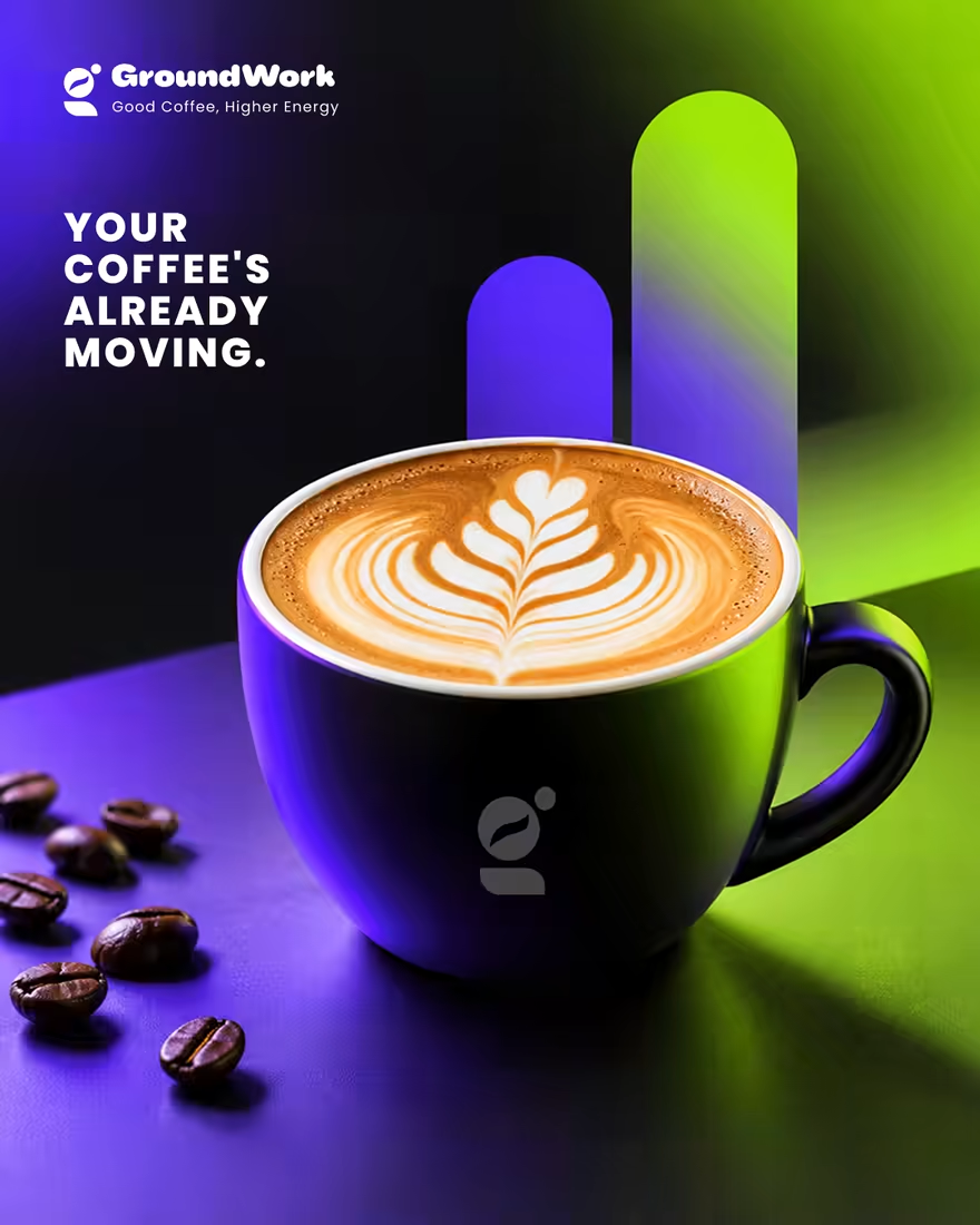
☕ GroundWork — Good Coffee, Higher Energy.
🎨 Brand Identity · 📱 UI/UX · 📦 Packaging
A modern coffee brand built around energy, creativity, and momentum. ⚡
💡 The Idea
I wanted to create a coffee brand that feels as energetic as the first cup of the day.
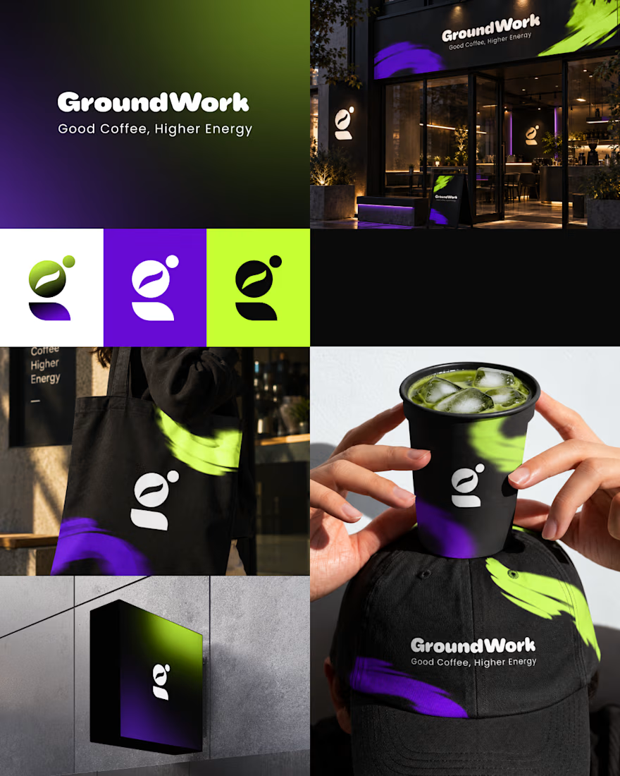
🎨 Visual Direction
🖤 Charcoal — premium foundation
💜 Electric Violet — creativity
💚 Neon Lime — energy & freshness
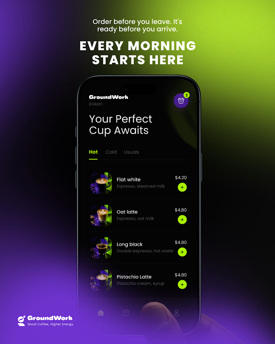
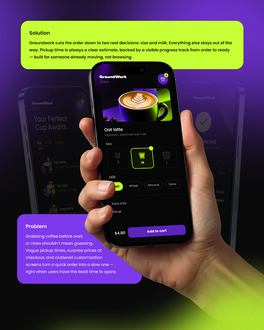
📱 Digital Experience
A clean mobile ordering experience designed to make getting coffee simple, fast, and engaging.
☕ Brand Experience
I extended the identity across cups, caps, totes, packaging, and storefronts — creating one consistent visual system.
✨ The Result
A bold coffee identity that connects digital + physical experiences under one idea:
Good Coffee, Higher Energy. ⚡
What’s your first impression of GroundWork? 👀☕



I personally don't like the colors intensity or shade

Do you prefer the main logo or the mark? Choose your pick.
The full project is coming soon, or check it out here on Instagram if you don't wanna wait.
11 voted
69%
5 voted
31%
16 votes
Closed
The mark, but for a reason that has nothing to do with which one looks better here: this brand lives on a pizza box, a napkin and a sticker on a takeaway bag, mostly around 20mm and often one ink on brown board. The full logo introduces the place once; the mark is what someone...

A modern educational presentation about coffee, combining clear information, visual storytelling, and a clean, engaging slide layout.