The network for creativity
Join 1.25M professional creatives like you
Connect with clients, get discovered, and run your business 100% commission-free
Creatives on Contra have earned over $150M and we are just getting started
Back to feedPost


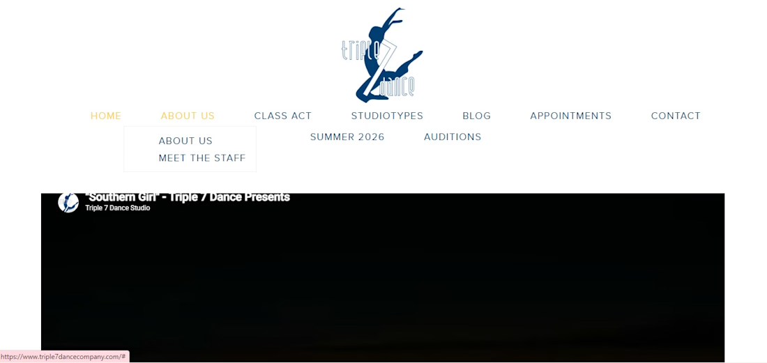
Sometimes you stumble across a brand online and just have to give them a visual upgrade. I recently came across the website for Triple 7 Dance Company (triple7dancecompany.com). While they clearly have incredible talent and energy, their current site felt a bit too plain and static for a dynamic performance studio.
I decided to jump into Figma and give it a complete UI/UX overhaul.
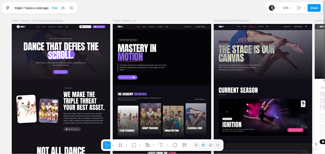
For the redesign, I completely shifted the art direction. I went with a premium, dark-themed brutalist aesthetic to capture the raw, explosive energy of dance.
The upgrades include:
Deep Dark Mode: A rich #070707 background to make the vibrant imagery pop.
High-Impact Typography: Massive, bold uppercase headers paired with clean, readable paragraph text to command attention.
Modern Structure: Moving away from standard layouts to a high-contrast, immersive visual hierarchy.
The Catch:
Right now, only the UI/UX is built. It’s strictly a visual concept in Figma—I haven't mapped out the pure HTML/CSS or wired up the buttery-smooth GSAP and ScrollTrigger animations that would really bring this dark-themed concept to life.
Before I dedicate the time to writing the code, I wanted to get some eyes on it.
What do you think of the before and after? Should I pitch this redesign to the company? Let me know in the comments! 👇

The network for creativity
Join 1.25M professional creatives like you
Connect with clients, get discovered, and run your business 100% commission-free
Creatives on Contra have earned over $150M and we are just getting started
Trending
retrofuturism
Share your favorite designs from the past exploring the distant future. Or your own take on the aesthetic 🚀
halftone
Dots. Texture. Grain. Let's see your designs using the halftone technique.

Midjourney
Creatives are showing off what they're making with Midjourney.
colorgrade
Video editors sound off: How do you enhance the mood of your video in color grading?
Related posts

Kogy — AI Companion Toy / UI/UX Design
Designed the landing page for Kogy — a plush, keychain-sized AI companion that learns, plays, and keeps you company throughout the day.
The tricky part with products like this: lean too techy and you lose the cuteness, lean too cute and it stops feeling like a real smart device. So instead of the usual soft-pastel illustration route, I let real hero-scale photography of the plush character carry the whole page — its actual texture, its little smile, its scale as a keychain — wrapped in bold, high-contrast orange and oversized type.
A small character-selector strip (Lumi, Mochi, Poppy) hints at collectibility, and a live scrolling stat ticker at the bottom (questions answered, active companions) keeps it grounded as a real AI device, not just a toy.
Genuinely one of the more fun briefs I've worked on.


The live stat ticker (questions answered, active companions) is what sells the AI-device framing here, not the photography — a plush toy with a counter reads as a running system, not a static product shot.


We rebuilt (RED)’s outdated WordPress site in Framer—in just one month.
The result: a faster, more flexible website their creative team can update without relying on developers.
Check out the full case study to see how it came together ↓


the red type pops. how long did this take?

Bem came in with logo marks and colors, and we're looking for an identity to call home. After doing some research and inspiration exercises, we came up with this concept, which I absolutely love.
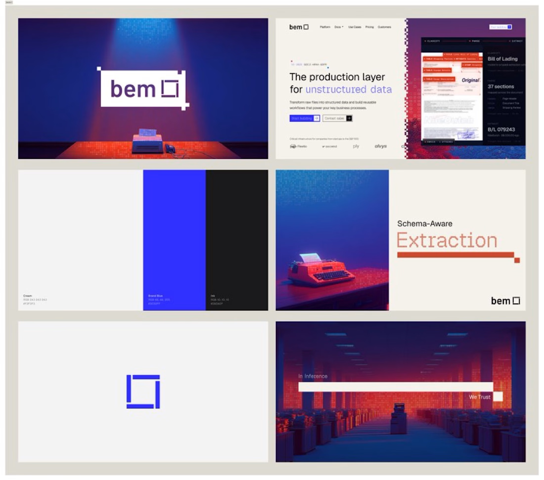

That recurring blue square feels like it could carry the whole brand on its own eventually. Did bem come in already sold on going this abstract, or did you have to build the case for it internally?


