The network for creativity
Join 1.25M professional creatives like you
Connect with clients, get discovered, and run your business 100% commission-free
Creatives on Contra have earned over $150M and we are just getting started
Back to feedPost

Bem came in with logo marks and colors, and we're looking for an identity to call home. After doing some research and inspiration exercises, we came up with this concept, which I absolutely love.

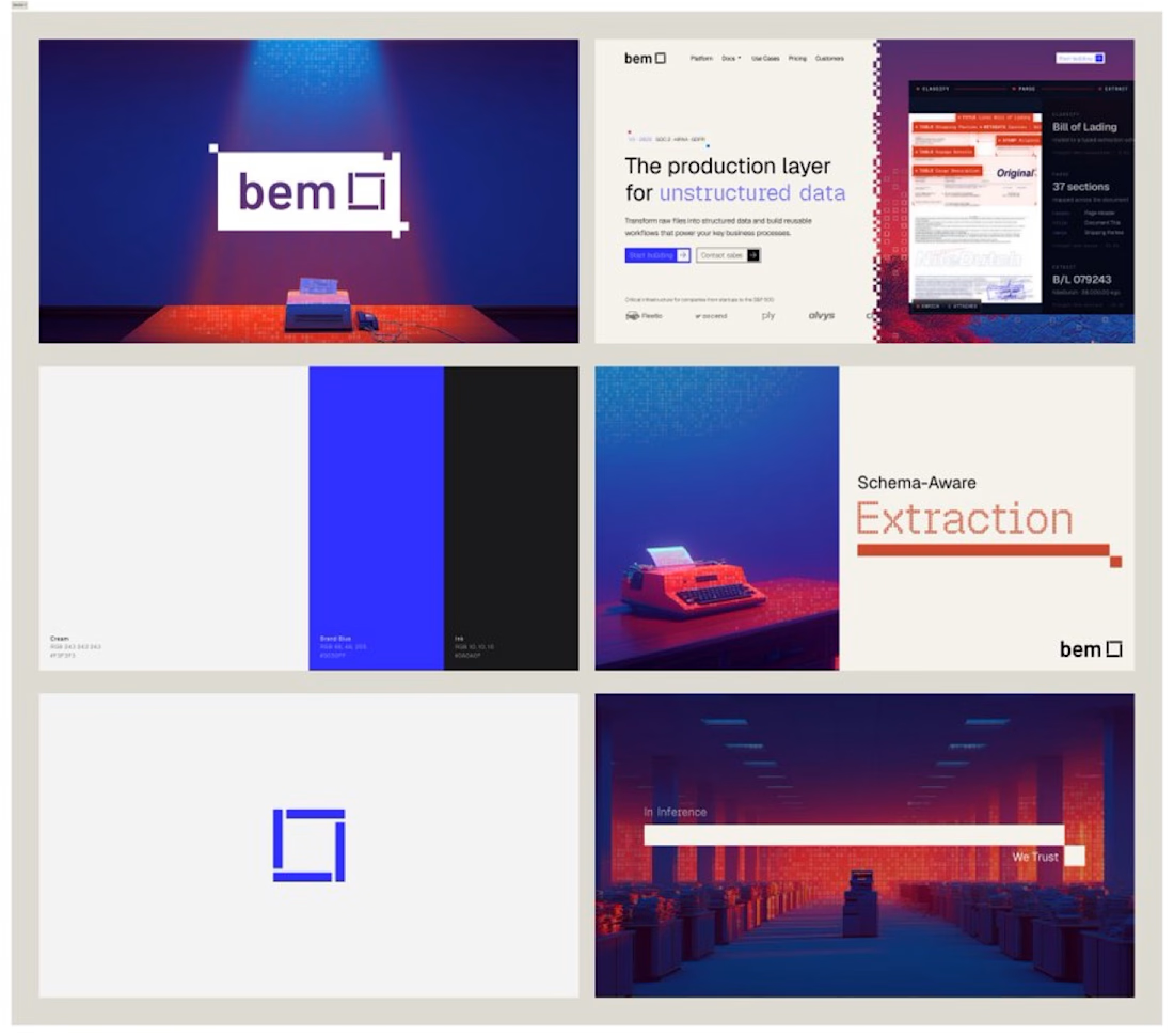

The navy and cobalt combo with that dot-matrix texture gives Bem a distinct technical feel without falling into the usual "AI startup blue" trap. Was there another direction in the exploration phase that almost won out instead?


It was much more iconography-based and pattern-based instead of pixels.

Hmmm, I am always dumbfounded when I get here, you are the best.
Thank you so much. I really, really appreciate it.
You are welcome

That recurring blue square feels like it could carry the whole brand on its own eventually. Did bem come in already sold on going this abstract, or did you have to build the case for it internally?
No, they came in with nothing really, just a logo that was already marked and then in color.


So cool

The design looks awesome. Great project!
Thanks, dude.

The contrast between that deep blue and the vibrant red is striking. It perfectly captures that highly technical, structured data feel without looking like a traditional corporate SaaS tool. Beautiful identity work.

This is amazing


the square mark next to the wordmark does a lot here.. it reads as a container, which fits "a layer for unstructured data" better than any icon would
the orange room renders are the best part, i would let one of them sit behind the hero type on the site

perfect

What a creative choice. 👍
How long did it take?

The blue square as a recurring mark works well against that warm red and cream palette. It gives bem a consistent anchor across pretty different layouts.
The network for creativity
Join 1.25M professional creatives like you
Connect with clients, get discovered, and run your business 100% commission-free
Creatives on Contra have earned over $150M and we are just getting started

Challenges
View all


Related posts


Web Design for Contra Labs — an extension of the Brand Identity we created.
Translating the visual language, principles, and character of the identity into a cohesive digital experience.


My Top Featured Projects on @Contra Labs 🔥
⚡| NEXVOLU
⚡| HYDRUM VEIL
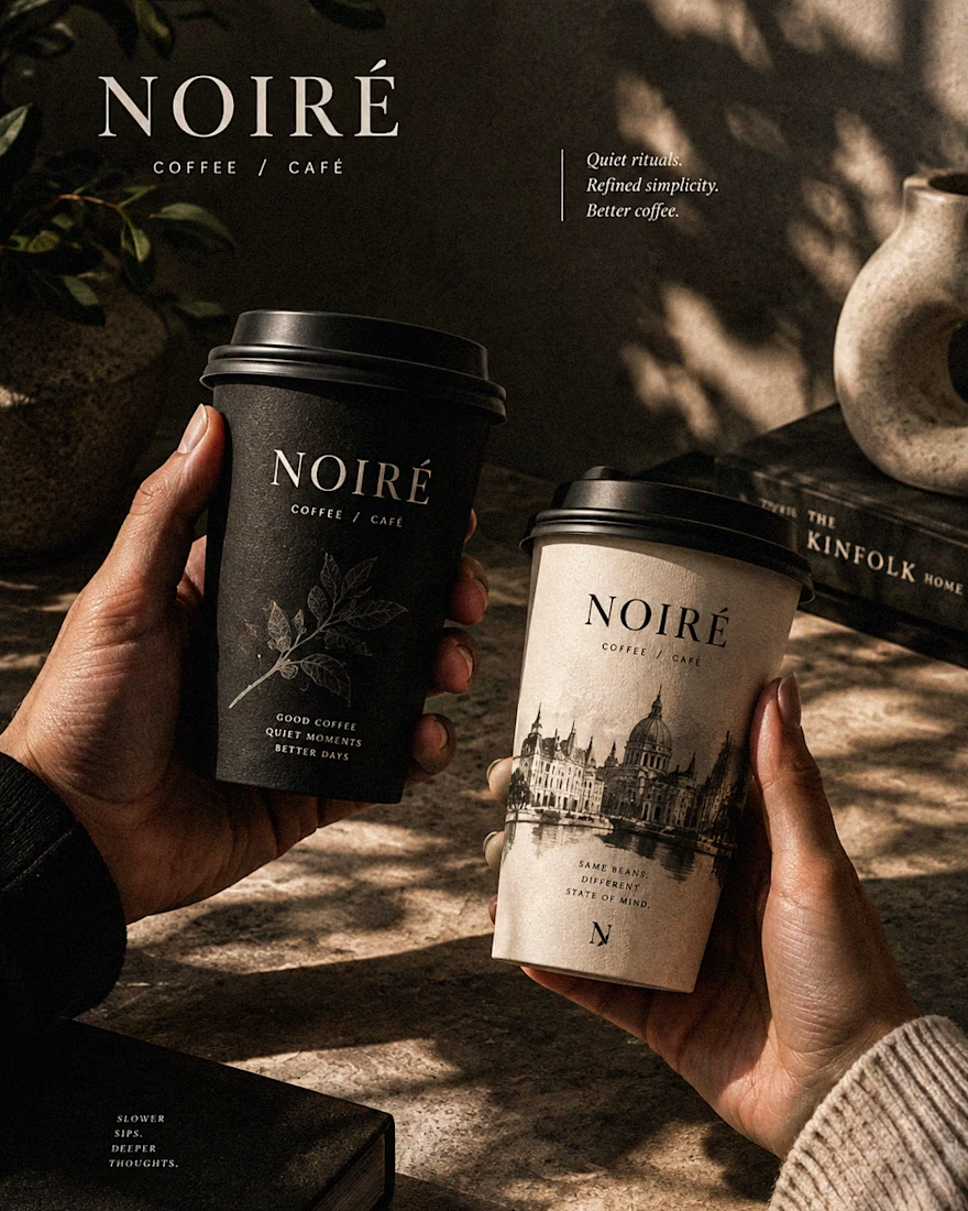
⚡| NOIRÉ
Each project explores a different direction, but the goal stays the same: build brands that stand out.
Which project is your favorite?
Drop the name below 👇


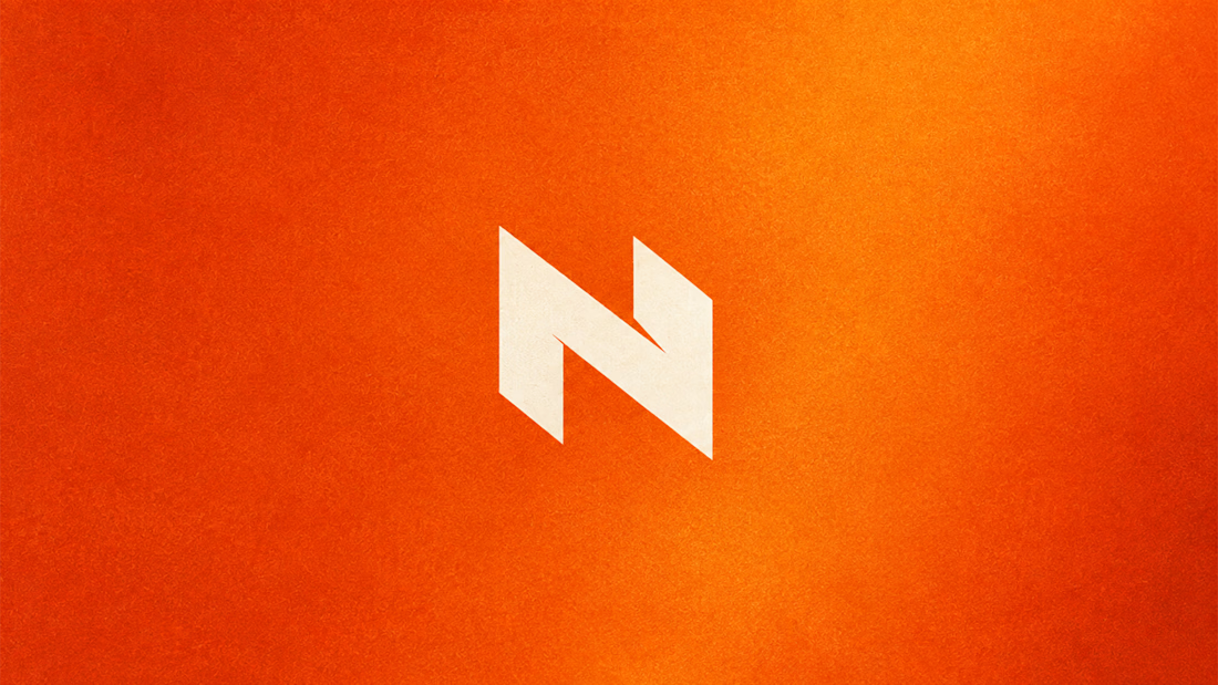
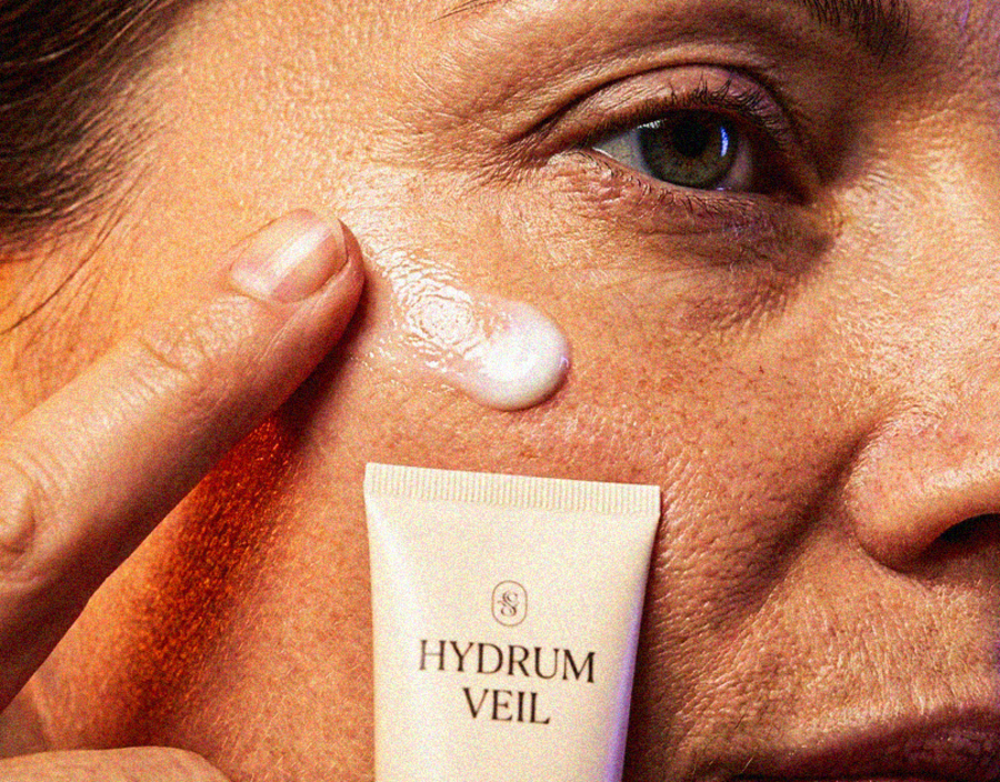
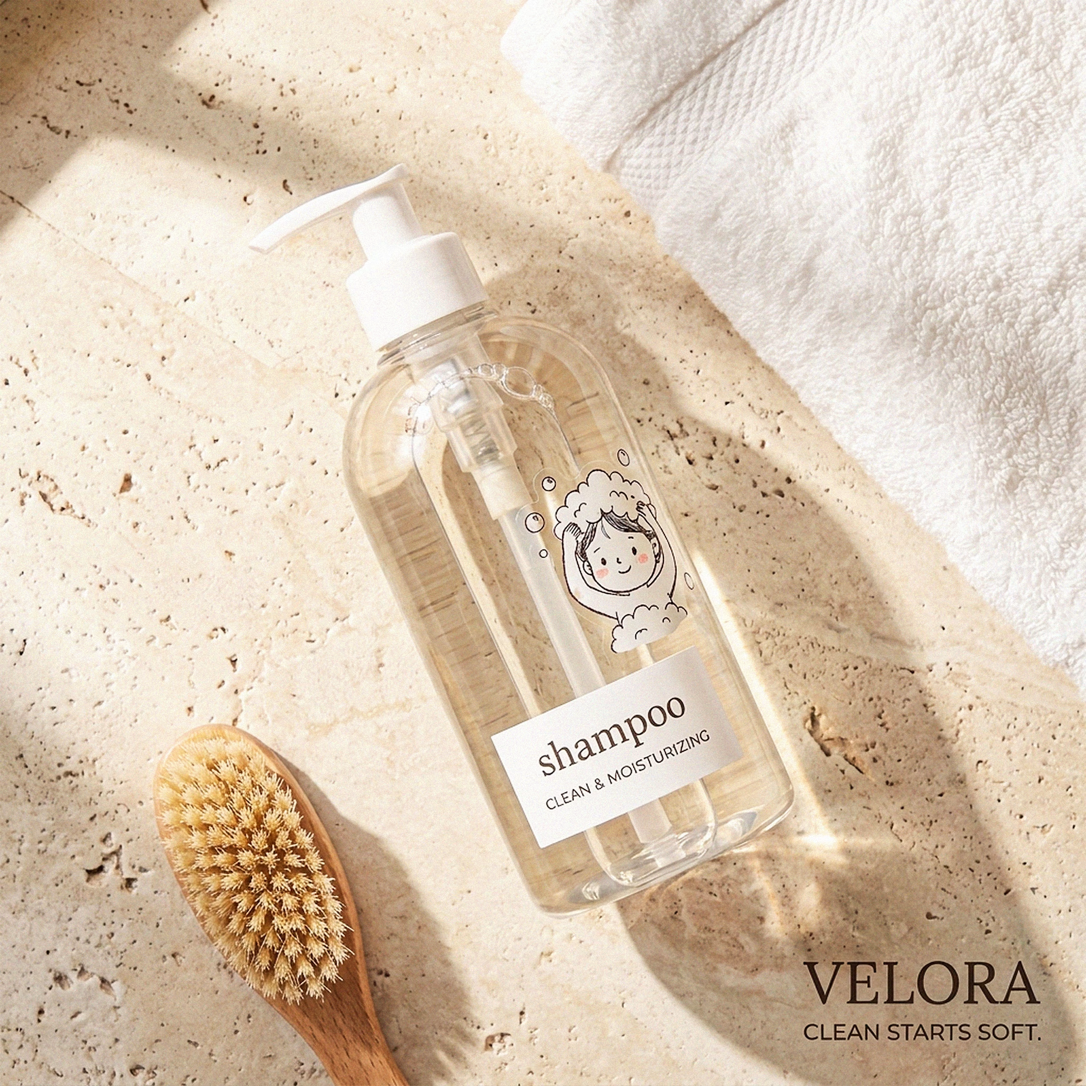

These are 🔥 Mine are all fav 🙌
Congo for Featured on @Contra HQ & @Contra Labs ... 😍

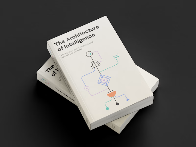
Which book cover design theme speaks the clearest?
6 voted
38%

10 voted
62%
16 votes
Closed


