The network for creativity
Join 1.25M professional creatives like you
Connect with clients, get discovered, and run your business 100% commission-free
Creatives on Contra have earned over $150M and we are just getting started
Back to feedPost

Over 60% of web traffic comes from mobile devices, yet responsive design is still treated as an afterthought on so many client builds.
When translating complex desktop layouts into Elementor Pro, my goal isn't just scaling elements down—it's restructuring the entire user experience for touch navigation:
Mobile-First Breakpoint Styling: Re-ordering flexbox containers so key call-to-actions (CTAs) land above the fold.
Touch-Friendly Hit Targets: Expanding button padding and tap targets to eliminate accidental clicks.
Adaptive Image Assets: Serving smaller, pre-cropped WebP variants for mobile screens to save bandwidth and boost performance.
Currently fine-tuning custom breakpoint settings for a client’s portfolio site to make sure it looks just as sharp on an iPhone as it does on a 27-inch monitor.
How much time do you typically spend on mobile responsiveness versus desktop design? Let’s talk workflow! 👇
Responsive DesignWordPress DevelopmentFigmaPixelmator ProWordPressbugfixwordpresswebsitedesignwordpressdeveloper


The network for creativity
Join 1.25M professional creatives like you
Connect with clients, get discovered, and run your business 100% commission-free
Creatives on Contra have earned over $150M and we are just getting started








Related posts


How fast can a template get without changing a single pixel?
⠀
We just optimized 11 of our templates in Framer, Astro and Next.js. The rule was simple: nothing visible changes, only how things load.
⠀
What we changed: CSS inside the page, fonts from our own domain instead of Google Fonts, WebP images with phone-sized copies, videos that load when you scroll near them, heavy videos re-encoded without visible loss (one template went from about 20 MB of video to 2.4 MB), WebGL that starts near the screen, and analytics after the page. Every page was checked pixel by pixel at three widths before and after.
⠀
Mobile PageSpeed now, Astro / Next.js:
Sunbeam 100 / 100
Auria 100 / 96
Lapse 97 / 98, up from 64 / 66
Parley 97 / 94
Nova Quinn 93 / 92 ⠀
On desktop, Mote scores 98 in Framer and 100 in Astro and Next.js.
More posts on the individual fixes coming.


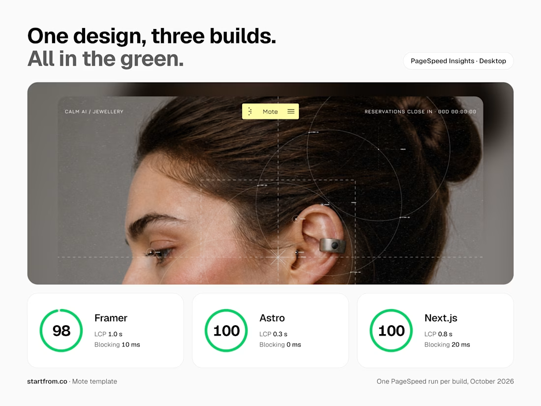

Nothing visible changes, only how things load is such a good rule. Speed work like this is underrated, buyers feel it even if they can't see it.


Hourfield is a 16-second 16:9 launch film for products that organise people's time: calendars, schedulers, booking and reservation apps, planners. Retype a few short lines, drop in your logo and rename the calendar's days and tiles (meetings, table bookings, classes, shifts): the week re-plans itself on screen and the film lands on your logo lockup. Our second version, Maréva, a fictional table-booking app, turns the working week into an evening of reservations on the same animation and timing.
Built end-to-end through the SVGator MCP server. The calendar that re-plans its own week, the orbit that swirls into a single dot and the lines centred by their real letter shapes (fonts measured, not eyeballed) were computed in Python and written straight into a live SVGator project as 780 editable keyframes; I directed every note and finished it in the canvas. Maréva was made the same way, on the same timeline. Everything stays a real layer: 50 live text layers, named elements (headline, logo, product-name, tagline) and one logo image animated in two moments.
Yes, there is a lot to edit: every line of the story, a whole week of calendar tiles, a palette in nine roles. A full rebrand takes longer than five minutes, and that is the honest trade: it shows how much a single SVGator file can carry, and how MCP makes a detailed, story-driven film practical to re-make, not just to watch.
Links:
▶ Template (SVGator)
▶ Demo video, A → B


Love the smooth flow and the text animation! Good luck!

Traditional corporate training often feels disconnected from everyday work. Skillio helps bridge that gap with personalized five-minute sessions, job-specific AI simulations, and instant feedback.
The mobile experience supports role-based learning across professions, with interactive chat and voice exercises that recreate realistic workplace situations. A lime-green, lavender, and deep-green palette, bold typography, and a flower-shaped performance chart make progress easy to understand and engaging to explore.
Explore the project on Dribbble:
https://dribbble.com/shots/27808131-Mobile-App-Powered-Employee-Training

Sweeet