The network for creativity
Join 1.25M professional creatives like you
Connect with clients, get discovered, and run your business 100% commission-free
Creatives on Contra have earned over $150M and we are just getting started
Back to feedPost



The network for creativity
Join 1.25M professional creatives like you
Connect with clients, get discovered, and run your business 100% commission-free
Creatives on Contra have earned over $150M and we are just getting started



Related posts

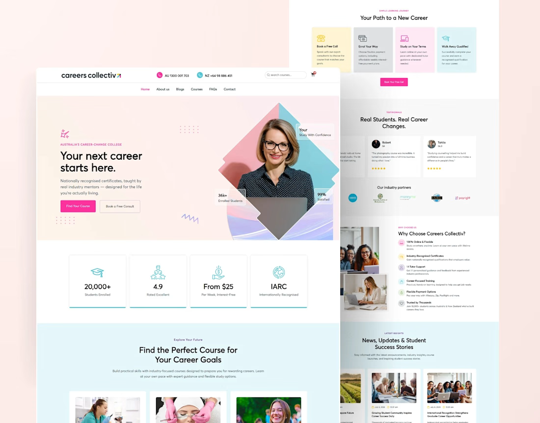
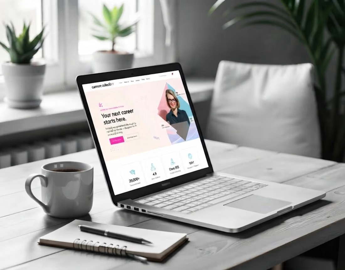
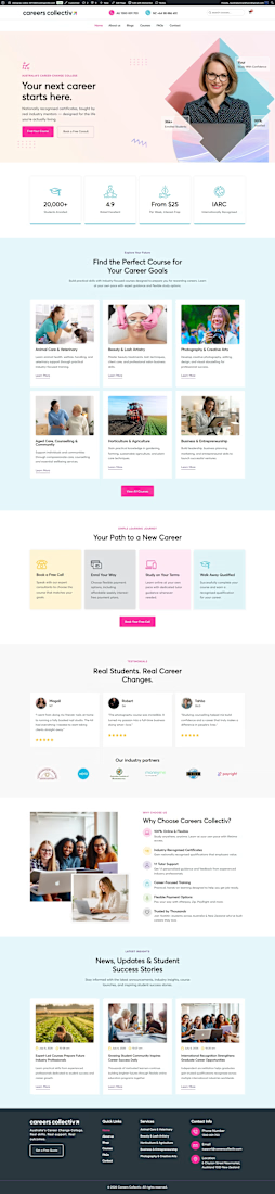
Educational College Website | Modern Kajabi Web Design
This project was about turning a college's online presence from a digital brochure into something that actually enrolls students. They needed a website that loaded fast, guided visitors naturally, and made the leap from "I'm interested" to "I'm applying" feel obvious.
Built on Kajabi, so the whole thing runs in one system: no clunky add-ons, no plugins fighting each other, no inflated maintenance.
What went into it:
Modern, mobile-first design that reflects identity
Clear program and course pages that answer questions before they're asked
A streamlined admissions funnel from first visit to application
pages, all built to convert, not just to look pretty
The part I care about most: it performs. Every section exists to move a prospective student one step closer to saying yes.
If your school, academy, or education brand is living on a dated site, that's my lane. Let's build yours.




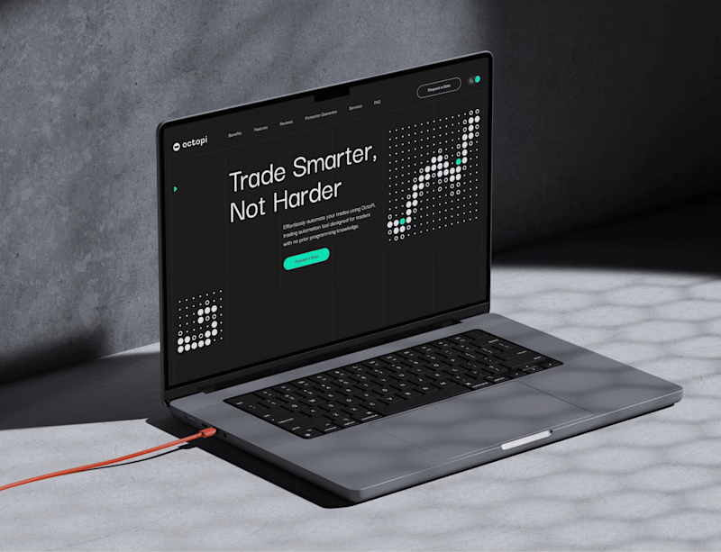
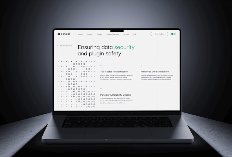
Dark mode is the default for trading tools. But is it the right choice for a website? 🤔
For Octopi, a no-code trading automation plugin for, we explored both directions:
🅰️ Dark: focused, pro-level, feels at home next to trading charts
🅱️ Light: clean, open, feels approachable for traders who don’t code
Which one would make you click “Get started”? 👇
1 voted
33%
2 voted
67%
3 votes
Closed



The chocolate drip header and the two cones make you want ice cream right away. The yellow address text on the purple is a bit thin, a darker outline would help it read on a phone.