The network for creativity
Join 1.25M professional creatives like you
Connect with clients, get discovered, and run your business 100% commission-free
Creatives on Contra have earned over $150M and we are just getting started
Back to feedPost

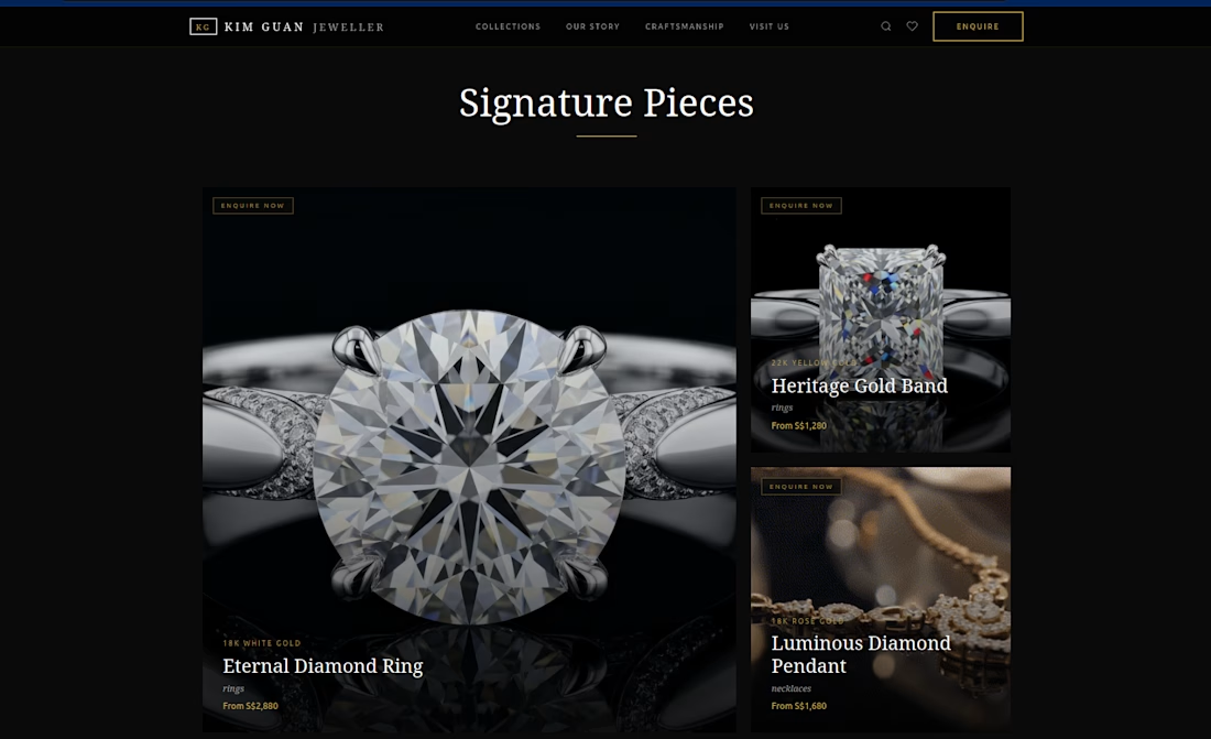
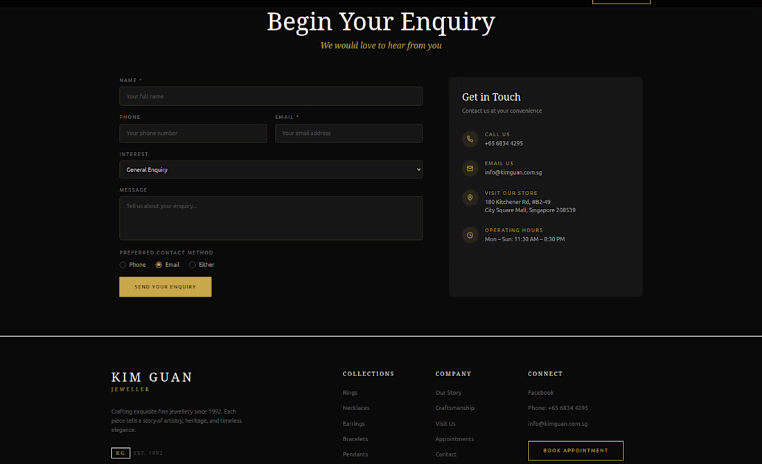
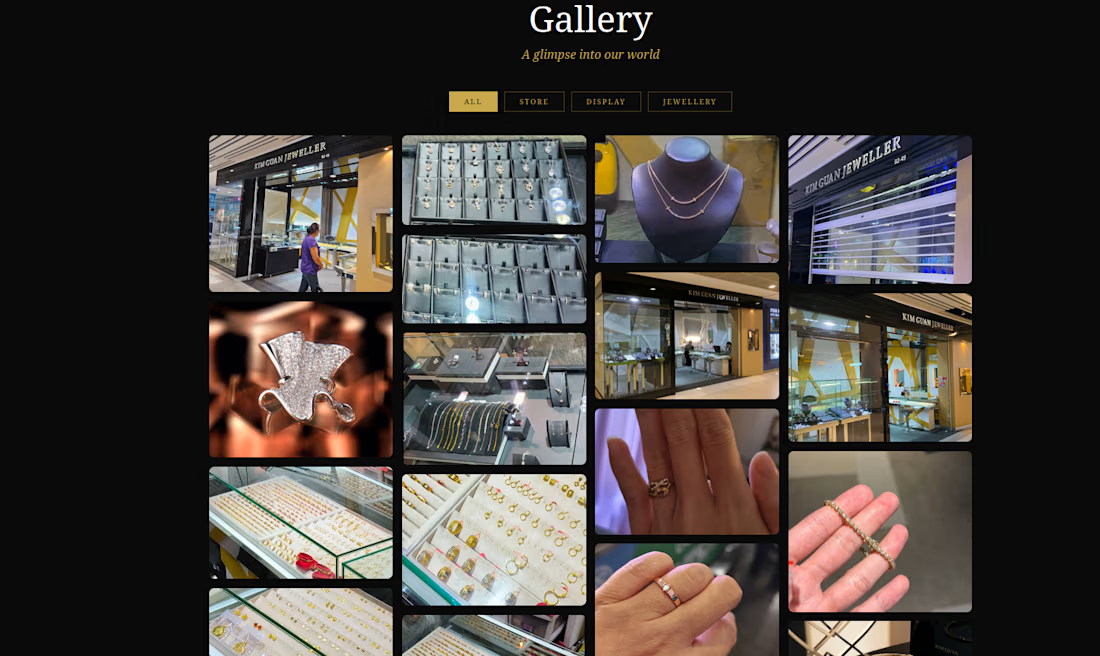
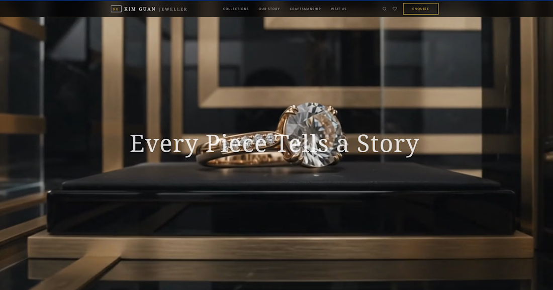
Jeweller Project collection...


The network for creativity
Join 1.25M professional creatives like you
Connect with clients, get discovered, and run your business 100% commission-free
Creatives on Contra have earned over $150M and we are just getting started




Related posts

What should a creative agency website actually feel like?
For Orvika, we didn't want another agency site built around the same safe layouts and predictable sections.
We pushed the visual direction further with oversized typography, editorial layouts, bold imagery, and stronger contrast, while keeping the experience structured enough to communicate the agency's work and capabilities clearly.
The goal wasn't just to make it look different.
It was to make the agency feel different.
Designed in Figma and built in Framer.
We're sharing more of the websites and digital experiences we've been working on here over the next few weeks.




Very neat man

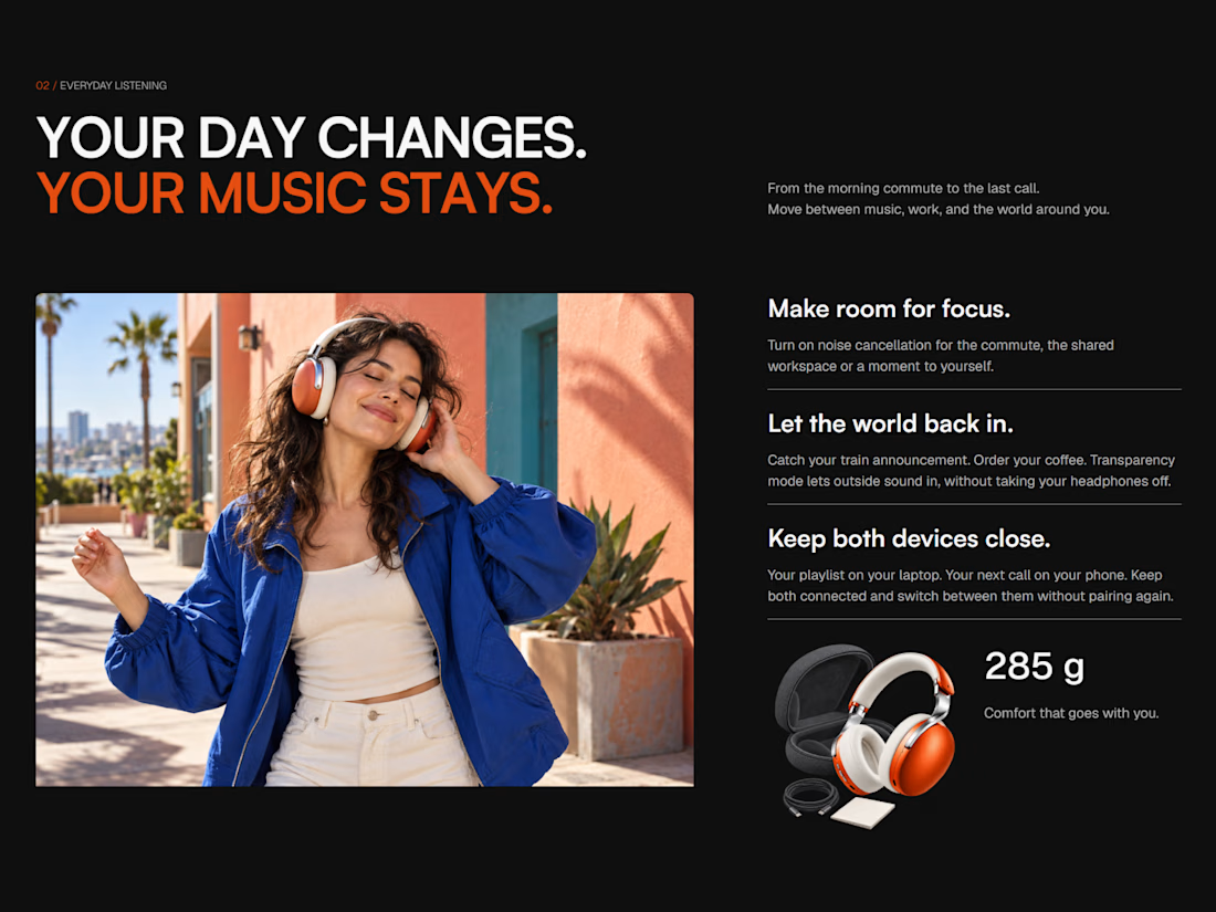
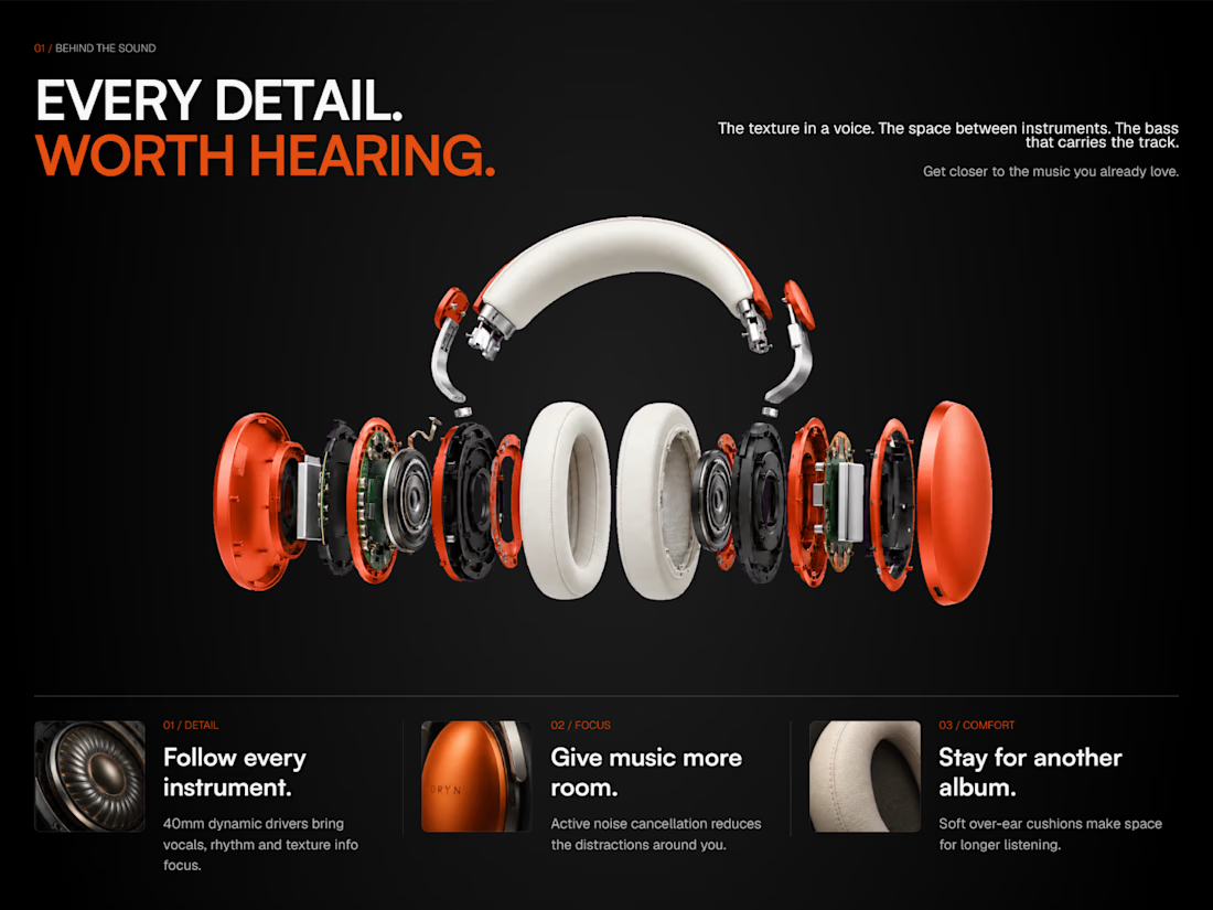
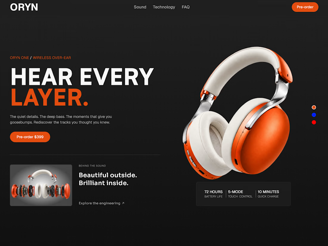
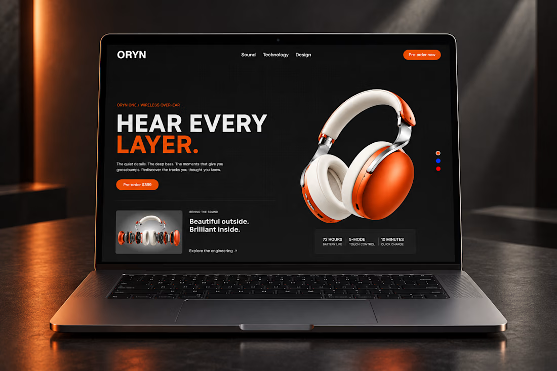
Just finished designing and building my newest Framer template, ORYN Audio 🎧
A bold product landing page with detailed product visuals, interactive color selection, and smooth scroll animations. Built to look sharp on every screen and be easy to make your own.
It’ll be available for free. Take a look and let me know what you think 👇


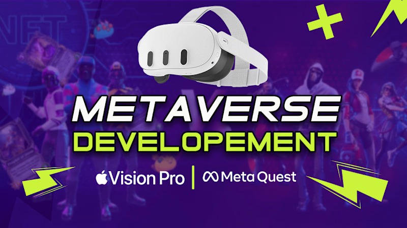
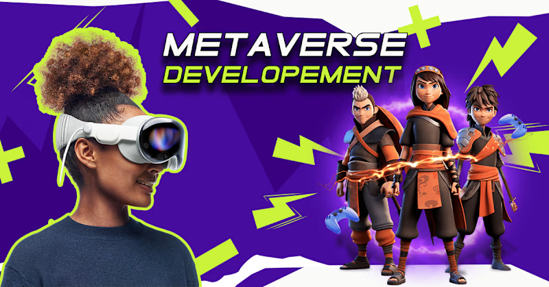
Fiverr Thumbnail Design — Visual Direction Exploration
Overview
Designed two visual directions for a Fiverr thumbnail, exploring different approaches to composition, typography, imagery, and visual hierarchy.
Direction 01: Centered Impact: A bold, center-focused layout that places the main message at the visual focal point for immediate readability and impact.
Direction 02: Dynamic Balance: A more dynamic composition using side-positioned typography with supporting imagery to create visual movement and stronger balance.
Both variations were created from the same core concept to explore how different layouts can influence attention, readability, and overall engagement.


3 voted
75%
1 voted
25%
4 votes
Closed

centered for me