The network for creativity
Join 1.25M professional creatives like you
Connect with clients, get discovered, and run your business 100% commission-free
Creatives on Contra have earned over $150M and we are just getting started
Back to feedPost

An aesthetics-training Kajabi build is not just a website. The marketing pages, training content, offers, funnel, and follow-up all need to feel like one system.
For this project I organized the responsive experience around three jobs: explain the training offer, guide the right next action, and keep the student journey clear across devices.
The practical takeaway: map the prospect path and the learner path before styling the pages. It prevents a polished site from becoming a confusing platform.
#Kajabi #CourseCreator #MarketingAutomation

The network for creativity
Join 1.25M professional creatives like you
Connect with clients, get discovered, and run your business 100% commission-free
Creatives on Contra have earned over $150M and we are just getting started

Challenges
View all


Related posts

Designed for people who want the journey to feel as good as the destination.
Created a premium travel website concept for Wanderly, combining cinematic imagery with an editorial-style digital experience.
The goal was to make the website feel less like a typical travel booking platform and more like a luxury travel magazine you can interact with.
What I focused on:
• Premium travel brand direction
• Cinematic hero experience
• Editorial typography
• Destination and experience cards
• Strong visual storytelling
• Clear booking-focused CTA
• Social proof and traveler ratings
• Responsive web layout
• Luxury hospitality-inspired UI
The design uses warm neutrals, deep shadows, soft typography, and immersive imagery to create a sense of escape before the user even starts planning the trip.
Designed with a strong Figma + Framer-style approach, focusing on visual hierarchy, interaction, and conversion.
#WebDesign #TravelDesign #Figma #Framer #UIUX #LandingPage #LuxuryTravel #BrandDesign #WebDesignInspiration #Contra


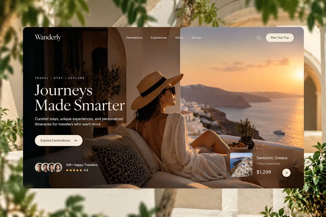

Elegance hero

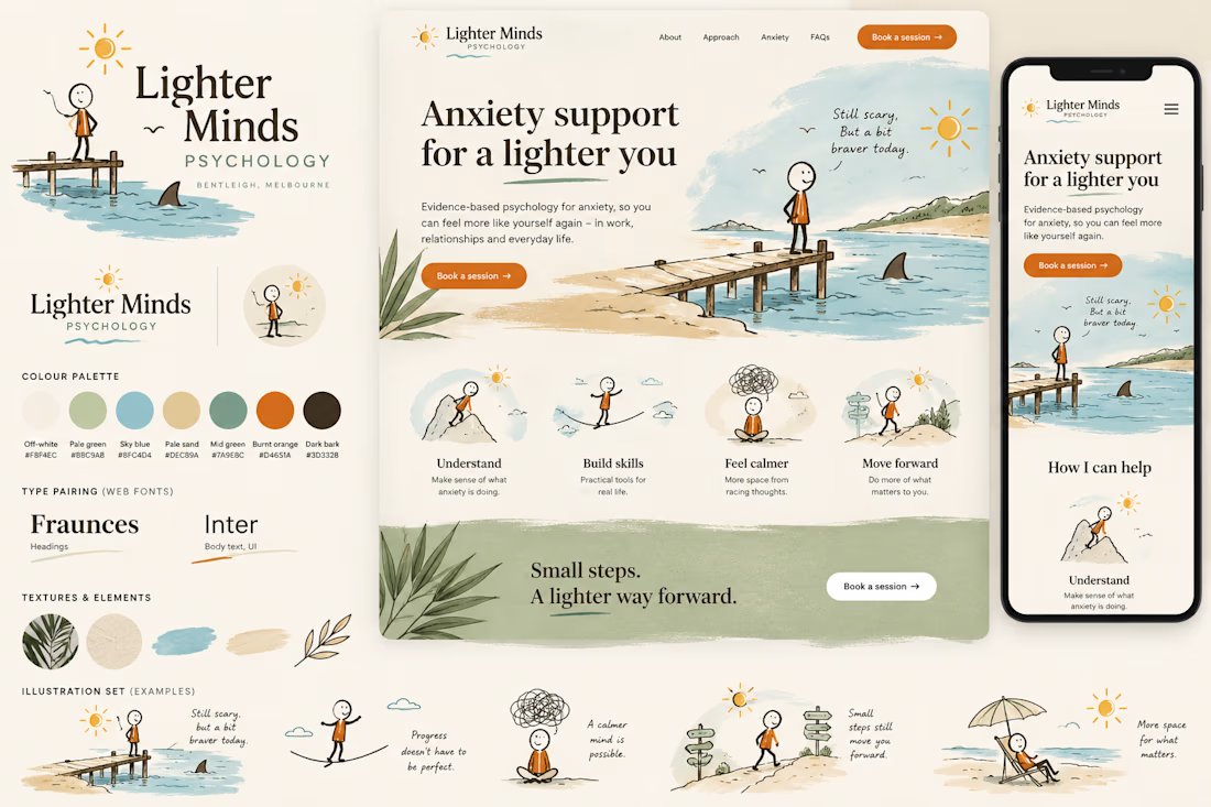
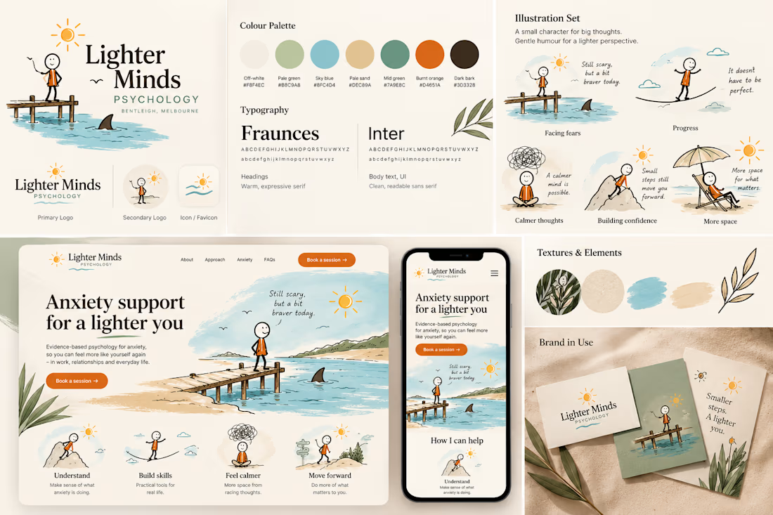
Coastal Calm — Anxiety & Wellness Brand Concept
A self-initiated visual identity and landing-page concept exploring how an anxiety-treatment brand could feel calm, distinctly Australian and gently humorous without relying on clinical wellness clichés.
The Concept: This speculative brand study explores a warmer visual language for anxiety and mental-health services, balancing clinical trust with personality and gentle humour.
Creative Direction: The identity draws from Australian coastal environments through sun-bleached neutrals, paperbark greens, water blues, sand tones and tactile illustrated textures.
A recurring hand-drawn character navigates small moments of uncertainty, from standing near a suspicious shark fin to balancing across a tightrope. The intention is not to make anxiety itself humorous, but to bring lightness to the sometimes disproportionate situations our minds create around it.
Visual System: The concept combines editorial typography, loose line illustration, natural textures and generous whitespace. Burnt orange provides moments of energy against the otherwise quiet coastal palette.
The landing-page exploration demonstrates how the system could extend from brand identity into a responsive digital experience.
Scope explored: Brand direction · Logo system · Colour palette · Typography · Character illustration · Landing-page UI · Mobile responsive direction
Self-initiated speculative concept created for portfolio demonstration. Not commissioned by or affiliated with the businesses depicted.

This is nice 👌

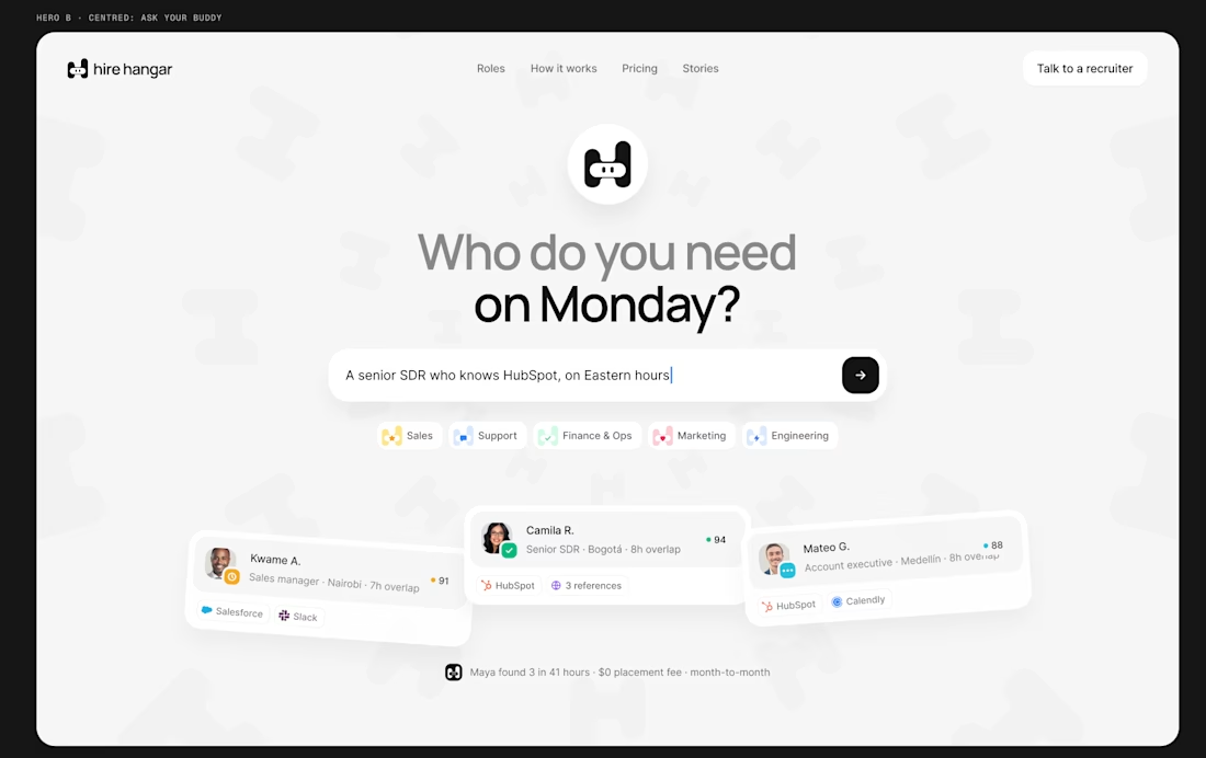
A good landing page shouldn’t make you work to understand it.
Been working on a new project where the goal was simple:
Make a complex product feel simple, clear, and easy to explore.
Less explaining. Less clutter. More visual hierarchy. A clearer path to the next step.
Still working through the details, but this one is coming together nicely.
Full case study soon.
This pairs well with the Hire Hangar screenshot because the design itself demonstrates the point—you don't need to reveal the whole project yet.


This is nice 👌