The network for creativity
Join 1.25M professional creatives like you
Connect with clients, get discovered, and run your business 100% commission-free
Creatives on Contra have earned over $150M and we are just getting started
Back to feedPost


SŌMA HOUSE is an 18 room boutique wellness hotel in Tulum, Mexico.
Most wellness bookings start with a simple guest message: “Can I book a massage tomorrow?”
But behind that request, the concierge has to understand what the guest needs, recommend the right treatment, check practitioner and space availability, coordinate timing, confirm the booking, send reminders, handle rescheduling, and fill cancellations.
I rebuilt that entire moment in Lovable.
Guests can now share how they want to feel, receive a personalized ritual recommendation, choose their preferred setting, see only valid availability, and confirm their session without messaging the concierge.
After booking, they can manage changes independently, while cancelled openings can automatically be offered to eligible guests.
On the owner side, the Concierge view brings together confirmed bookings, scheduling, automation activity, waitlist handling, and the amount of manual coordination saved.
The result: a more personal guest experience with significantly less routine admin for the hotel team.
Business: SŌMA HOUSE
Location: Tulum, Mexico
Business type: 18 room boutique wellness hotel
Key operational challenge: a small concierge team coordinating practitioners, treatment spaces, guest preferences, reminders, rescheduling, and cancellations.
Built in Lovable for #lovablechallenge
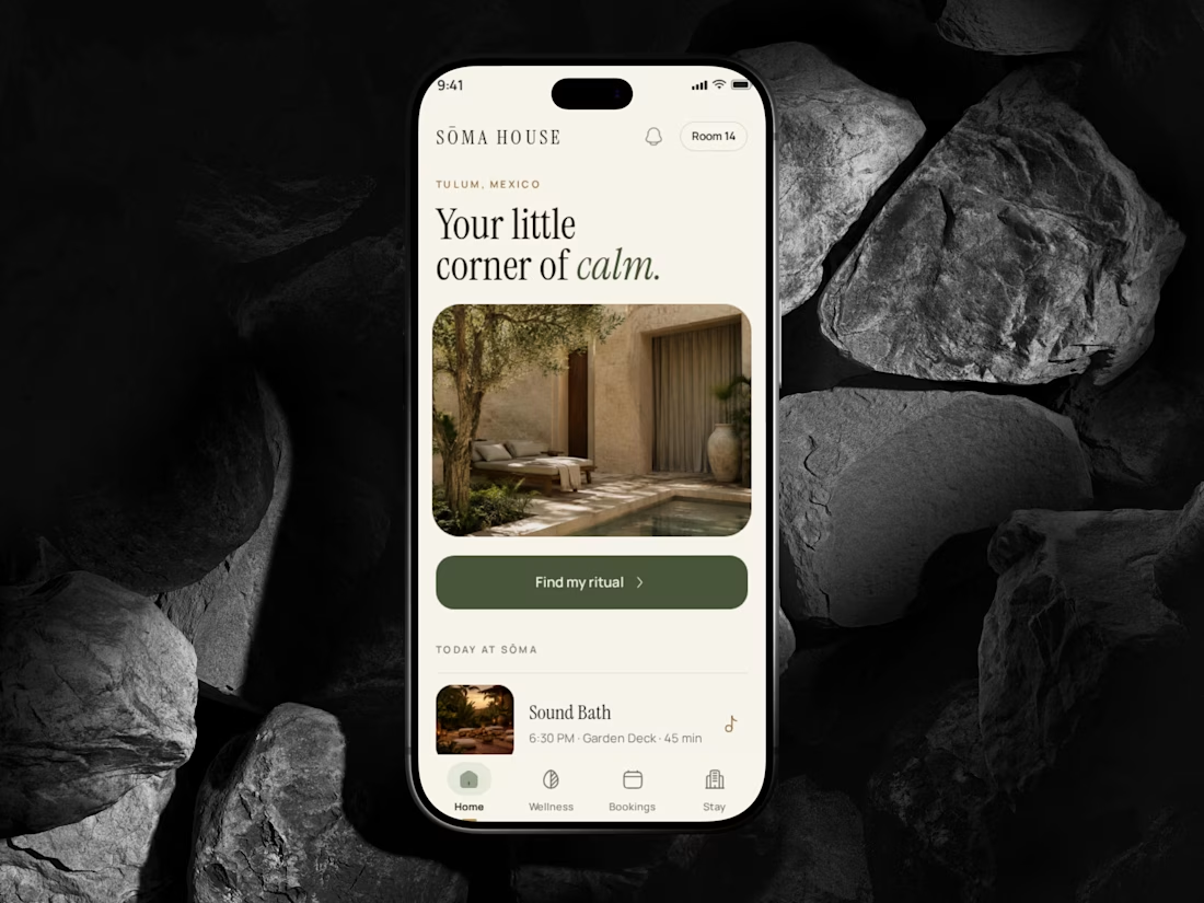


Really smart use of automation to make the guest experience more personalized while taking routine work off the concierge team. Love this approach!

SŌMA HOUSE sounds like a dream brief — boutique wellness in Tulum needs that calm, tactile visual language.
The network for creativity
Join 1.25M professional creatives like you
Connect with clients, get discovered, and run your business 100% commission-free
Creatives on Contra have earned over $150M and we are just getting started
Related posts

Zenith — Wellness Landing Page
Websites for wellness studios often make the mistake of overloading the user with class grids, schedules, and pop-ups right at the start. For Zenith, my goal was the exact opposite: I wanted the user interface to feel as quiet and restorative as stepping into a physical studio.
Instead of boxing content into rigid rows, the desktop layout relies on expansive whitespace to create a sense of scale. The large serif headline commands attention on the left, but it is given massive breathing room, counterbalanced by a soft-focused, ambient hero image. This intentional asymmetry draws the eye down the page naturally, rather than forcing it through dense blocks of information.
Most booking platforms overwhelm users with choices. To prevent choice fatigue, the primary call-to-action ("Book Your Session") is isolated as a single clear destination. It uses a rich, grounded forest green that stands out cleanly against the warm cream canvas, providing a clear visual anchor without screaming for attention.
When scaled down to mobile screens, the layout drops the secondary elements entirely, keeping the focus locked onto the core value proposition and a seamless path to scheduling.

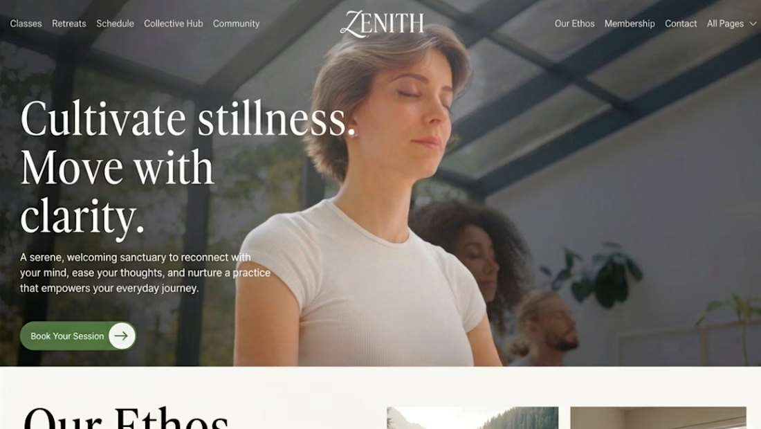

The forest green button on warm cream is the one thing the eye lands on, and it still feels calm. Does the three line headline stay stacked on mobile or shrink?

Based in Montenegro. Shooting across the Balkans.
I’ve been living in Budva since 2022, and I’m available for on-site shoots in Montenegro, Serbia and nearby.
20+ years behind the camera and in the edit: fashion, editorial, brand films, hospitality. Past work for Vogue, Esquire, Port Magazine, The Rake and SHOWstudio.
If you’re planning a campaign, a hotel or villa film, or a fashion story on the Adriatic coast, I can handle it end to end: shoot, edit and colour.
Message me with your dates and idea.
filminghospitalityVideo EditingVideographyVideo Post-ProductionAdobe Premiere ProDaVinci ResolveFinal Cut Promontenegro


VanreHealth is a concept website for a mental health clinic, built around a 2-minute stress check that guides visitors from “I’m not sure I need help” to booking a free intro call with a therapist.
The goal was to make therapy feel approachable instead of clinical: calm sage tones, soft natural photography, and warm, human copy throughout.
I handled the full process, from UI/UX design in Figma to development with Astro, deployed on Vercel.
Live site: vanrehealth.vercel.app


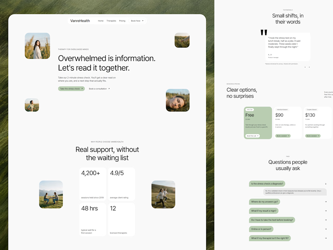

The sage palette feels calming.