The network for creativity
Join 1.25M professional creatives like you
Connect with clients, get discovered, and run your business 100% commission-free
Creatives on Contra have earned over $150M and we are just getting started
Back to feedPost
Taste Test

I’m exploring two visual directions for the ZetoMart grocery app. Both are designed with a clean, modern mobile-first experience, but with different color systems.
A or B — which design would you choose?
I’d really appreciate your feedback. Which one feels more polished, user-friendly, and suitable for a modern grocery app?

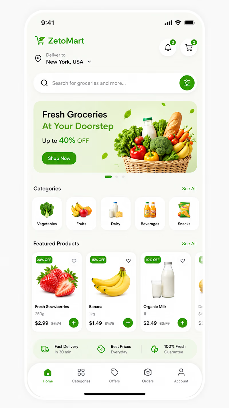
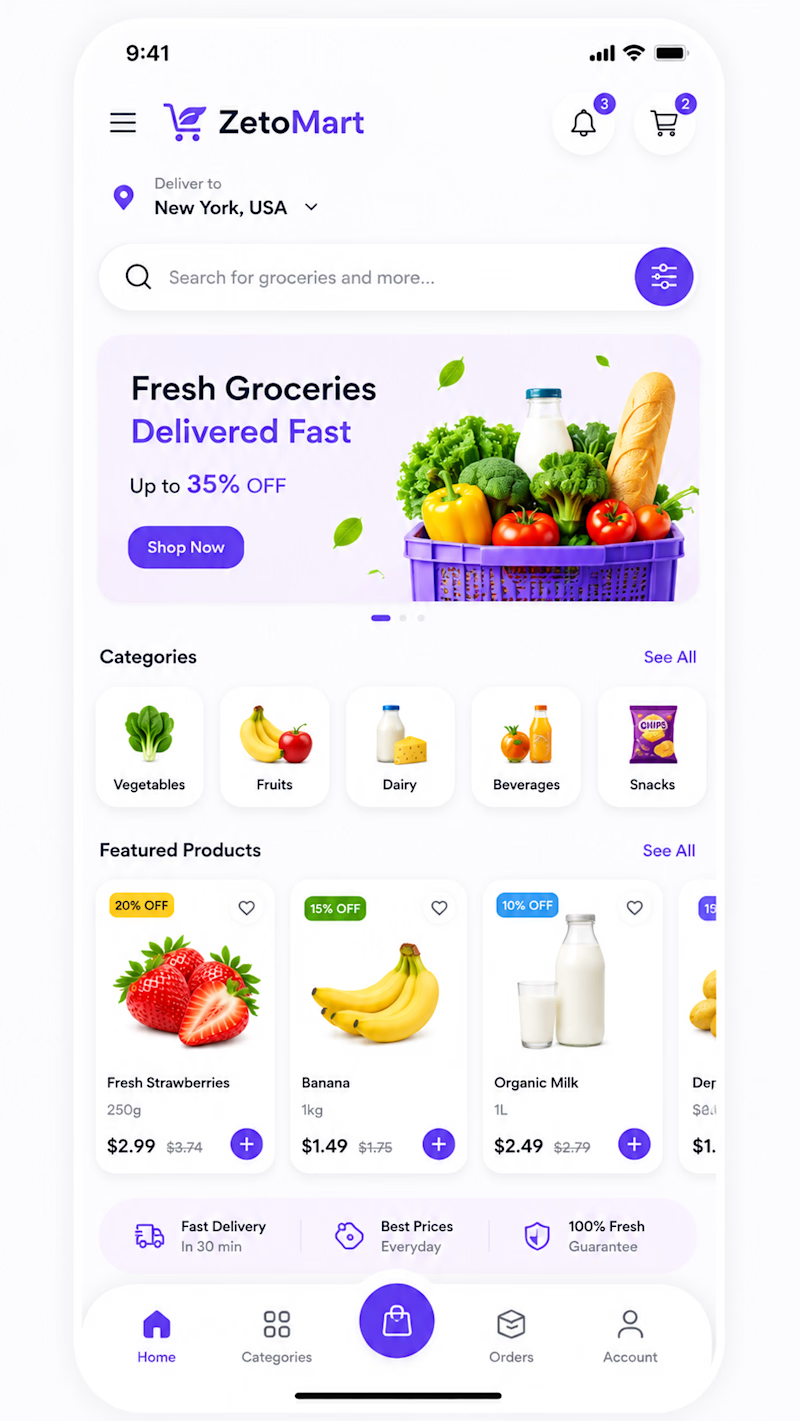
1 vote
Ends in 1d

The network for creativity
Join 1.25M professional creatives like you
Connect with clients, get discovered, and run your business 100% commission-free
Creatives on Contra have earned over $150M and we are just getting started
Trending
retrofuturism
Share your favorite designs from the past exploring the distant future. Or your own take on the aesthetic 🚀
halftone
Dots. Texture. Grain. Let's see your designs using the halftone technique.

Midjourney
Creatives are showing off what they're making with Midjourney.
colorgrade
Video editors sound off: How do you enhance the mood of your video in color grading?





Related posts

Which color scheme would you choose – white or color?
16 voted
62%
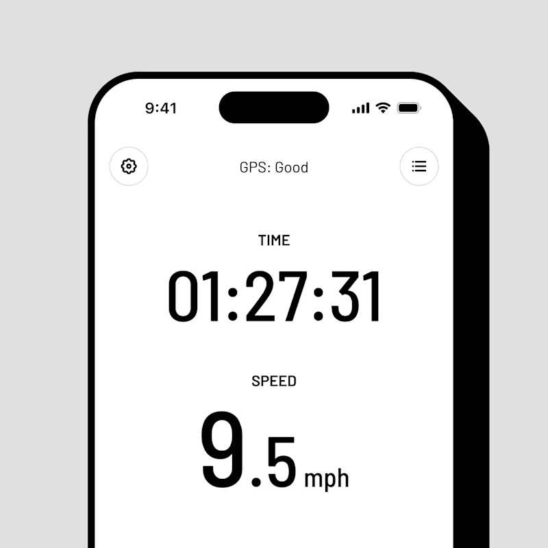
10 voted
38%
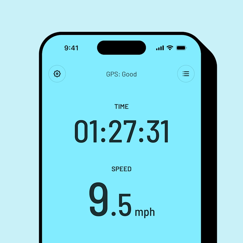
26 votes
Closed


I’d go with Color. It gives the app more personality and makes the UI feel more memorable, while still keeping it clean.


I’ve been staring at these two for too long, so I’ll let you decide.
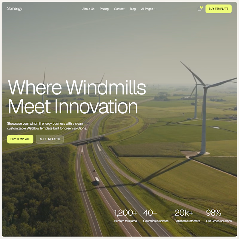
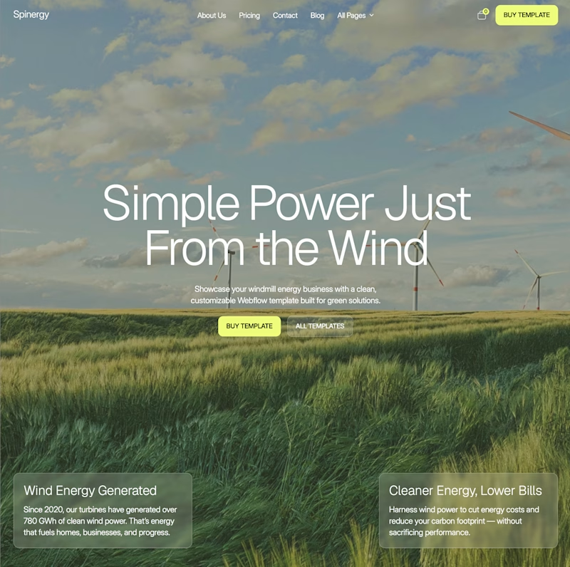
Both are homepage directions for Spinergy, a Webflow template for wind energy companies.
Which one would you choose?

50 voted
68%
24 voted
32%
74 votes
Closed


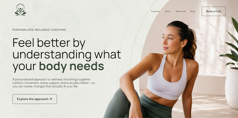
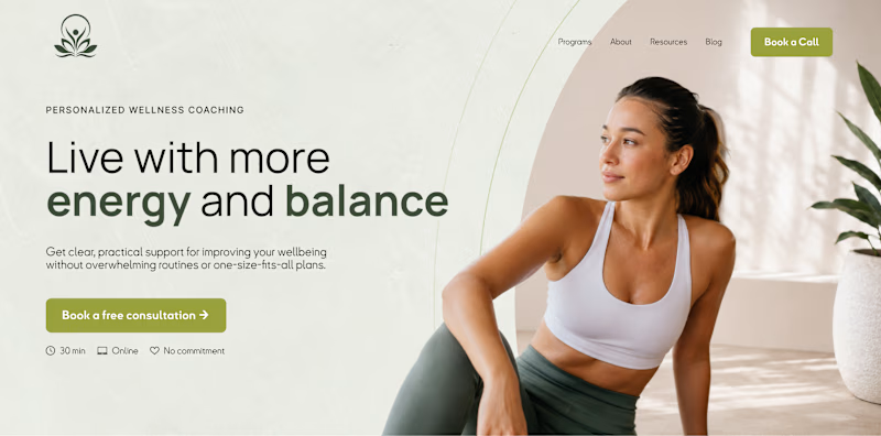
What should a homepage prioritize first: understanding or action?
A hero section can look almost identical visually and still be built around a completely different goal.
Version A focuses on clarity. Version B focuses on conversion.
One helps users understand before they decide. The other makes the next step immediately obvious. Neither approach is automatically better. The right one depends on what visitors need most at that stage of the journey.
Which would you prioritize on a homepage: clarity first or action first?
14 voted
27%
38 voted
73%
52 votes
Closed

I love the filled button more than the outline however I recommend to use one filled button and the other should be secondary otherwise users will be confused “where should I click”