The network for creativity
Join 1.25M professional creatives like you
Connect with clients, get discovered, and run your business 100% commission-free
Creatives on Contra have earned over $150M and we are just getting started
Back to feedPost
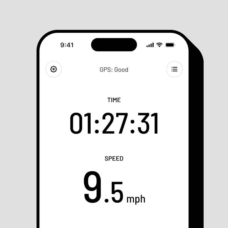
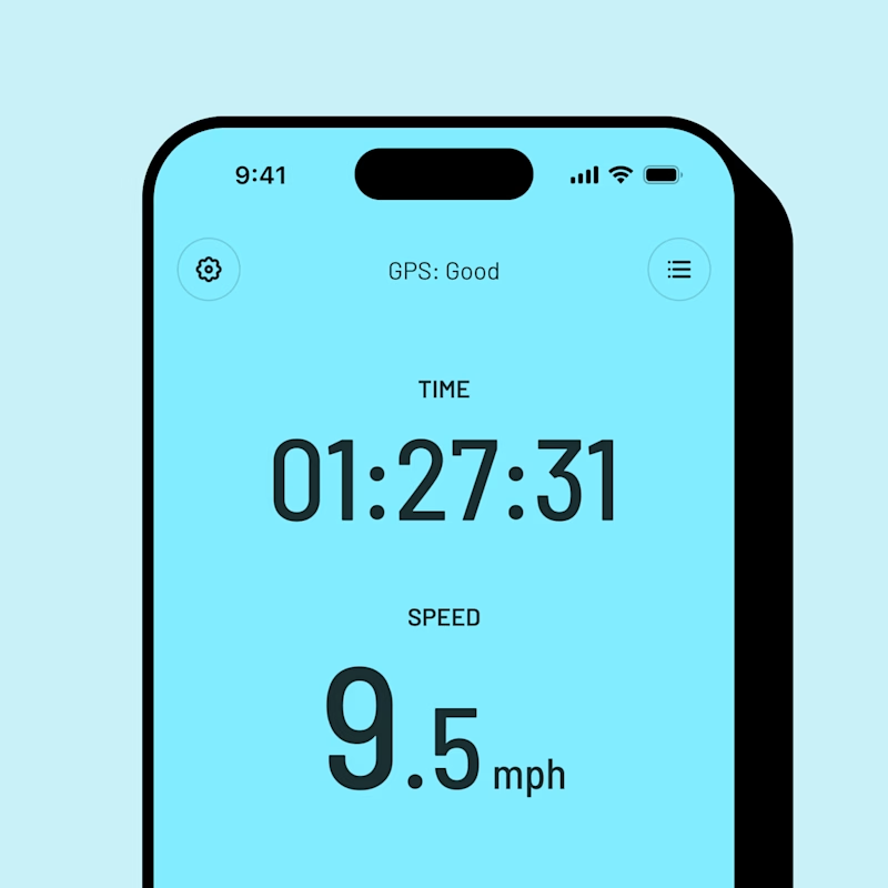
Taste Test

Which color scheme would you choose – white or color?
25 votes
Ends in 2h


I’d go with Color. It gives the app more personality and makes the UI feel more memorable, while still keeping it clean.

White is better due to readability and clarity.


color one, the white feels flat

The colored version reads faster at a glance, which matters more for something you're checking mid workout. Was legibility while moving something you actually tested, or is this poll more about which one just looks better sitting still?

Color one 🔥

the colored version really gives the design live

Going with the white! The minimalist approach always wins for me when it comes to readability. The color version is fun, but the white is just so clean.

Love the style 😍
The network for creativity
Join 1.25M professional creatives like you
Connect with clients, get discovered, and run your business 100% commission-free
Creatives on Contra have earned over $150M and we are just getting started
Trending
retrofuturism
Share your favorite designs from the past exploring the distant future. Or your own take on the aesthetic 🚀
halftone
Dots. Texture. Grain. Let's see your designs using the halftone technique.

Midjourney
Creatives are showing off what they're making with Midjourney.
colorgrade
Video editors sound off: How do you enhance the mood of your video in color grading?


Related posts

Which background makes the APEX logo look more luxurious and premium?
White or Black? Drop your choice + reason below 👇
2.


10 voted
22%
36 voted
78%

46 votes
Closed


Same animation, two formats.
Sometimes the idea works just as well in vertical as it does in horizontal. The challenge is making it feel right in both.
Which one do you prefer? 💭
19 voted
21%
73 voted
79%
92 votes
Closed

Which one wins for you, honestly? I lean horizontal for how the transitions breathe, but the vertical cut feels tighter for a scroll-stopping ad. Nice work either way.

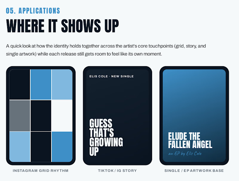
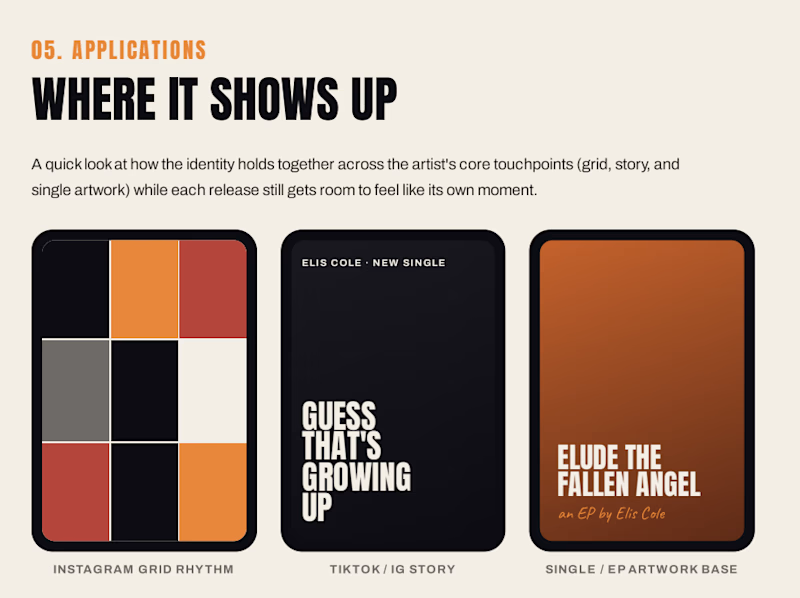
As a UI/UX designer, I didn't want to limit my design skills to just web and app design. So I tried something new, a music brand identity project for @Elis Cole .
I picked an independent artist, listened to their music, studied their style, and created two brand identity directions from scratch, inspired by their sound and mood.
It was a fun challenge to translate music into visuals.
Would love to hear which direction you'd pick for a pop + danceable artist, 1. cool and moody (Cool theme)
2. warm and energetic (Warm theme)
?
1 voted
13%
7 voted
87%
8 votes
Closed

