The network for creativity
Join 1.25M professional creatives like you
Connect with clients, get discovered, and run your business 100% commission-free
Creatives on Contra have earned over $150M and we are just getting started
Back to feedPost

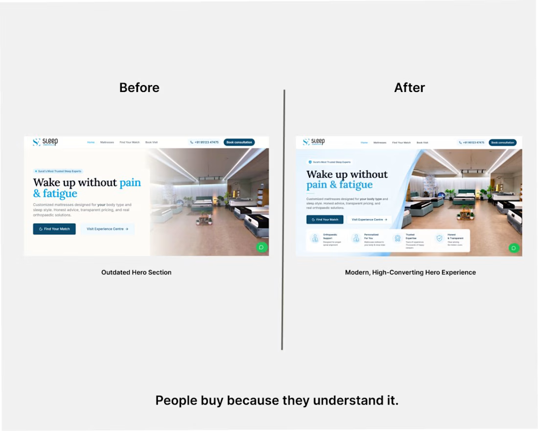
How a few UX changes can make a stronger first impression.
I recently spent around 20 minutes redesigning the hero section of a business website as a personal UX exercise.
My goal wasn't to make it look "prettier."
It was to make it:
Clearer for first-time visitors.
Easier to understand the value proposition.
More focused on the primary call-to-action.
More trustworthy through better visual hierarchy.
Small design decisions can have a big impact on how users perceive a business in the first few seconds.
I'd love to hear your feedback.
What would you improve further?
#UIUX #WebDesign #LandingPage #Figma #UserExperience #SaaS #UIDesign #WebDesigner
The network for creativity
Join 1.25M professional creatives like you
Connect with clients, get discovered, and run your business 100% commission-free
Creatives on Contra have earned over $150M and we are just getting started
Related posts

Landing page design for Lumo — banking for freelance life
Banks sell control — dashboards, charts, a card floating at fifteen degrees. Freelancers don't want control over their money. They want to stop thinking about it in the gap between sending an invoice and the money landing.
That gap is what the page is built on. The product sits in a meadow instead of on a dark grid, because the promise isn't "manage your finances better" — it's "we handle the part that keeps you up." And the strongest line on the page isn't a feature: no waiting for Monday. Freelancers don't lose weekends to fees. They lose them to timing.
The proof follows the same rule. One freelancer, one number — 4% lost on every international payment. A percentage someone can check against their own account beats any adjective.


great visuals 🙌

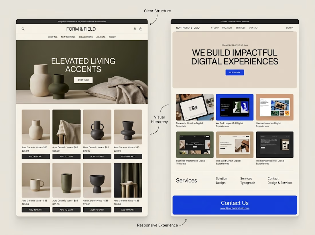
A website can look beautiful and still be difficult to use.
That's something I keep in mind when exploring both Shopify store design and Framer website design.
Although the platforms serve different purposes, some design principles apply to both:
→ Clear navigation helps visitors find their way.
→ Strong visual hierarchy makes important information stand out.
→ Thoughtful page structure creates a natural flow.
→ Responsive layouts help the experience work across screen sizes.
→ Clear calls to action help visitors understand what to do next.
The goal isn't simply to make a website look impressive.
It's to make the experience clear, useful, and easy to navigate.
I'm continuing to explore how these principles can be applied across different types of websites and projects.
What matters most to you when visiting a website, its visual design, its usability, or a combination of both?



Well said. Usability first, then visuals. Clear navigation wins me every time. 🙌

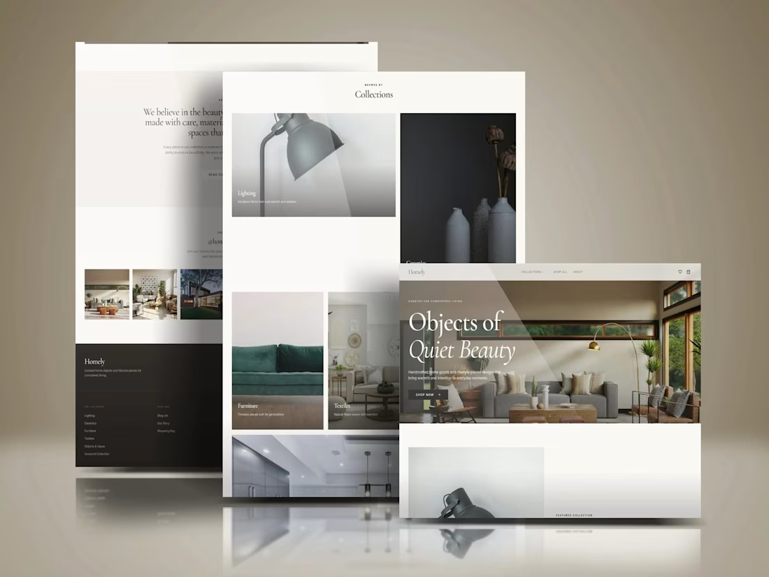
Kajabi Home Décor & Home Goods Store Website Design
Designed a Kajabi website concept for a home décor and home goods brand, with a focus on presenting products through a clean, visually cohesive layout.
The design emphasizes product imagery, curated home collections, clear navigation, and organized content to help visitors explore items and discover pieces that complement their living spaces. The overall approach combines a refined visual style with a responsive layout to create a welcoming, professional brand experience across desktop and mobile.
The goal was to give the brand a polished online presence that reflects its style and makes browsing feel simple and engaging.
#Kajabi #KajabiWebsiteDesign #WebsiteDesign #WebDesign #HomeDecor #HomeGoods #InteriorDesign #HomeDecorStore #EcommerceWebsite #ProductWebsite #ResponsiveWebDesign #UIUXDesign #WebDevelopment #OnlineStoreDesign #BrandWebsite


Impressive Work