The network for creativity
Join 1.25M professional creatives like you
Connect with clients, get discovered, and run your business 100% commission-free
Creatives on Contra have earned over $150M and we are just getting started
Back to feedPost

Evolved from initials to identity.
Silverline Creation started with a sentiment-led mark, we rebuilt it into a structure-led system. Using real construction cues like plans, forms, and spatial geometry, we shaped an identity that feels industry-true and built to be remembered.
When branding shifts from personal to purposeful — it shows.
If your brand has outgrown its old skin, maybe it’s time to rebuild.
Let’s build it right.
Checkout https://www.eviationmarketing.com/


The network for creativity
Join 1.25M professional creatives like you
Connect with clients, get discovered, and run your business 100% commission-free
Creatives on Contra have earned over $150M and we are just getting started







Related posts


Tash rendered in a custom holographic alphabet, built from patterned letterforms in Figma.

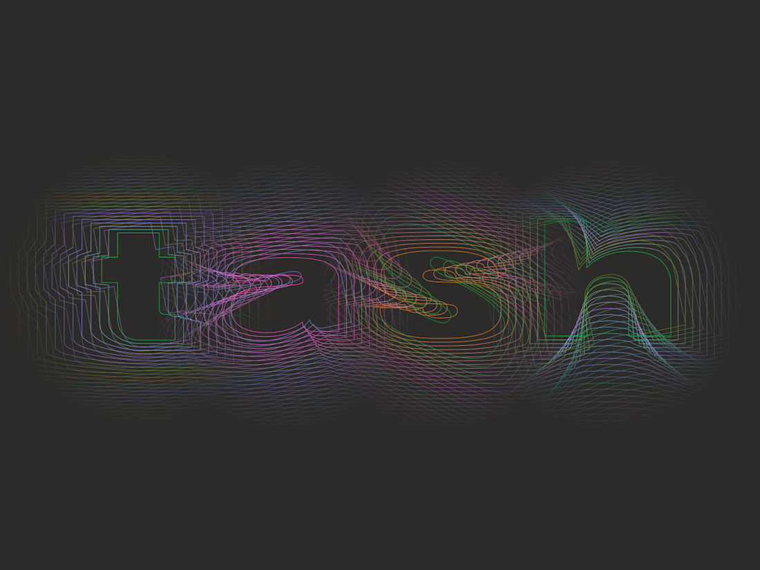

The holographic effect makes it really stand out.

Sipzy – Fresh Fruit Juice Can Design


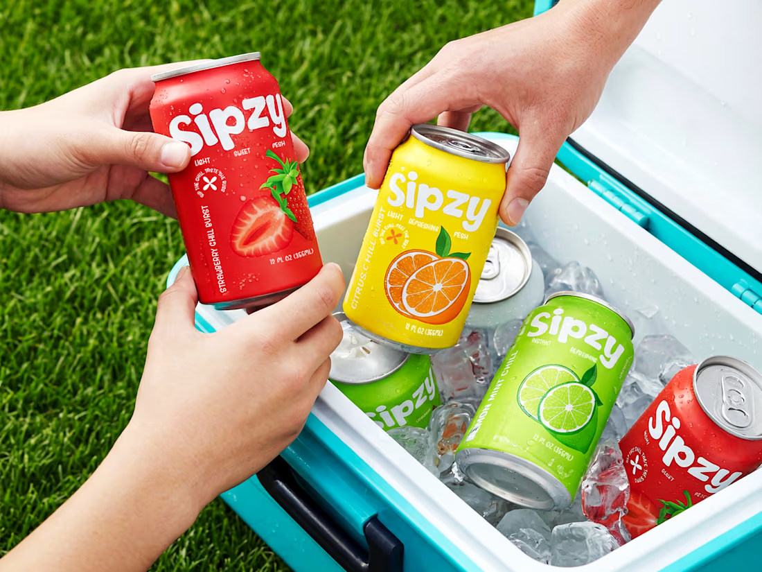
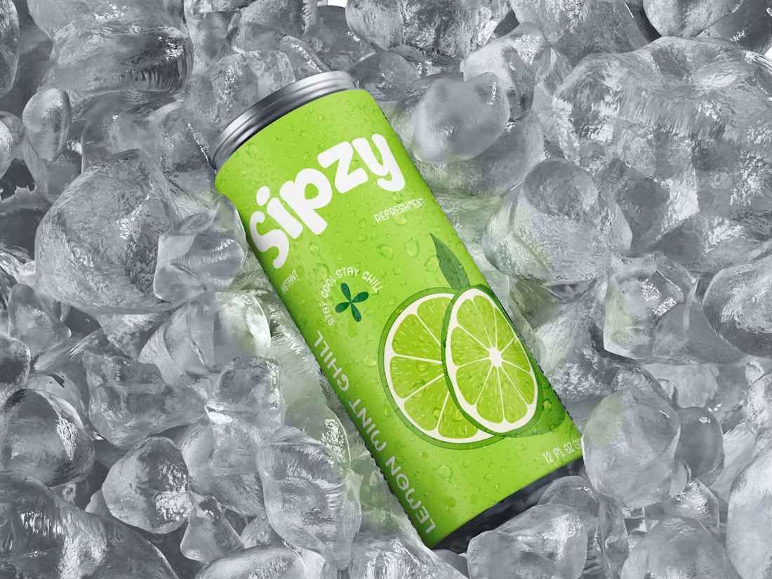
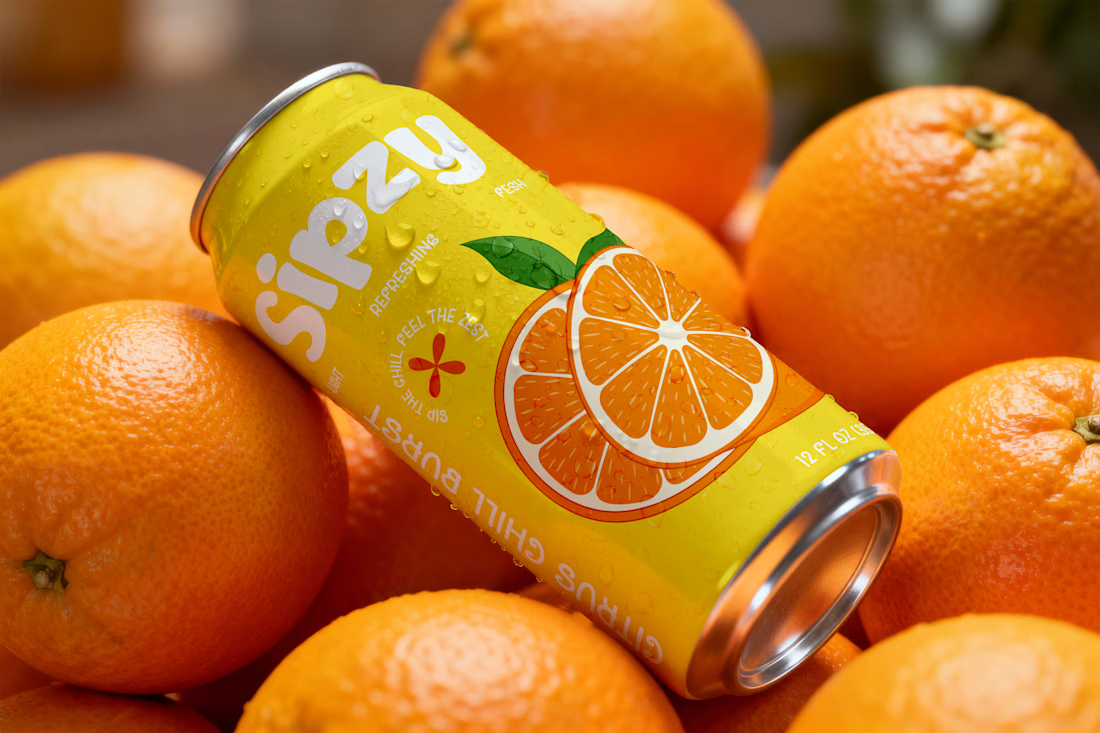
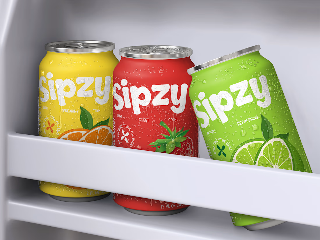

Love the visuals!

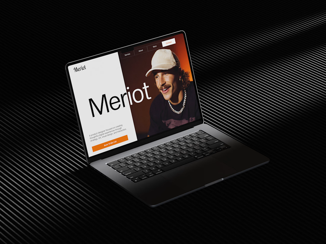
Meriot Netherlands-based product designer portfolio
I explored a portfolio website for Meriot, a product designer based in the Netherlands who wanted a digital presence that felt more personal, editorial, and design-focused.
The challenge was to avoid the typical portfolio formula and create something that communicates personality within the first few seconds.
The direction
→ Bold editorial typography
→ Strong personal photography
→ Minimal black-and-white foundation
→ Warm orange accent for CTAs
→ Simple, structured navigation
→ Clear positioning as a product designer
→ A portfolio experience that feels like a personal brand
The idea was to make the website feel confident without being complicated.
Rather than leading with a long introduction, the hero immediately communicates who Meriot is, what he does, and where the visitor should go next.


Nice design broooo