The network for creativity
Join 1.25M professional creatives like you
Connect with clients, get discovered, and run your business 100% commission-free
Creatives on Contra have earned over $150M and we are just getting started
Back to feedPost


The network for creativity
Join 1.25M professional creatives like you
Connect with clients, get discovered, and run your business 100% commission-free
Creatives on Contra have earned over $150M and we are just getting started



Related posts

What should a beekeeping website explain before asking someone to choose a hive?
For Bee Girl, I designed and built a complete Shopify website around a clear journey: meet the colony, understand what’s inside a nucleus hive, compare the options, and connect with the beekeeper.
Honey yellow, hive black, warm cream, and bold typography bring the same visual language across desktop and mobile layouts.
One design decision that ties it together: the page explains the colony and its five frames before introducing the hive-quantity choices. Education gives the product selection context.
I handled the complete website project for the client through Fiverr, using Shopify. This video walks through the homepage.
Which would you explore first—the hive options, field classes, or the beekeeper’s story?
Explore the full Bee Girl case study: https://contra.com/p/WqNFR67b-bee-girl-shopify-website-design-for-beekeeping
If you’re building a Shopify website for a specialist business, I’m available for website design and development projects.


I'd open the hive options first, but only because the colony section already told me what I'm buying. Explaining the five frames before the quantity choice is a smart order. Teaching before asking someone to choose is so underrated in Shopify stores.

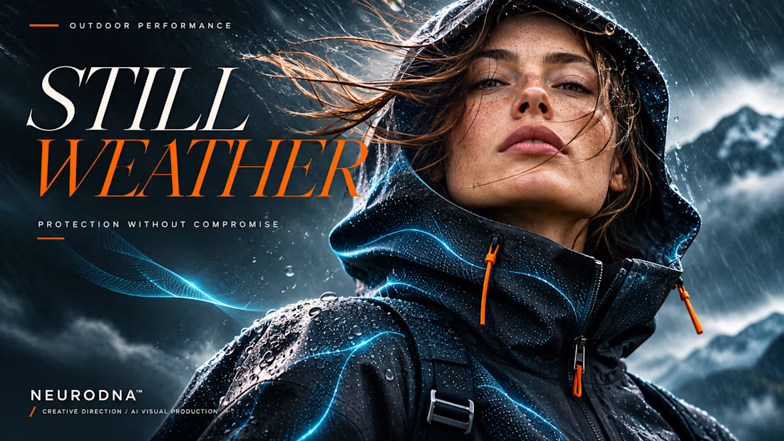
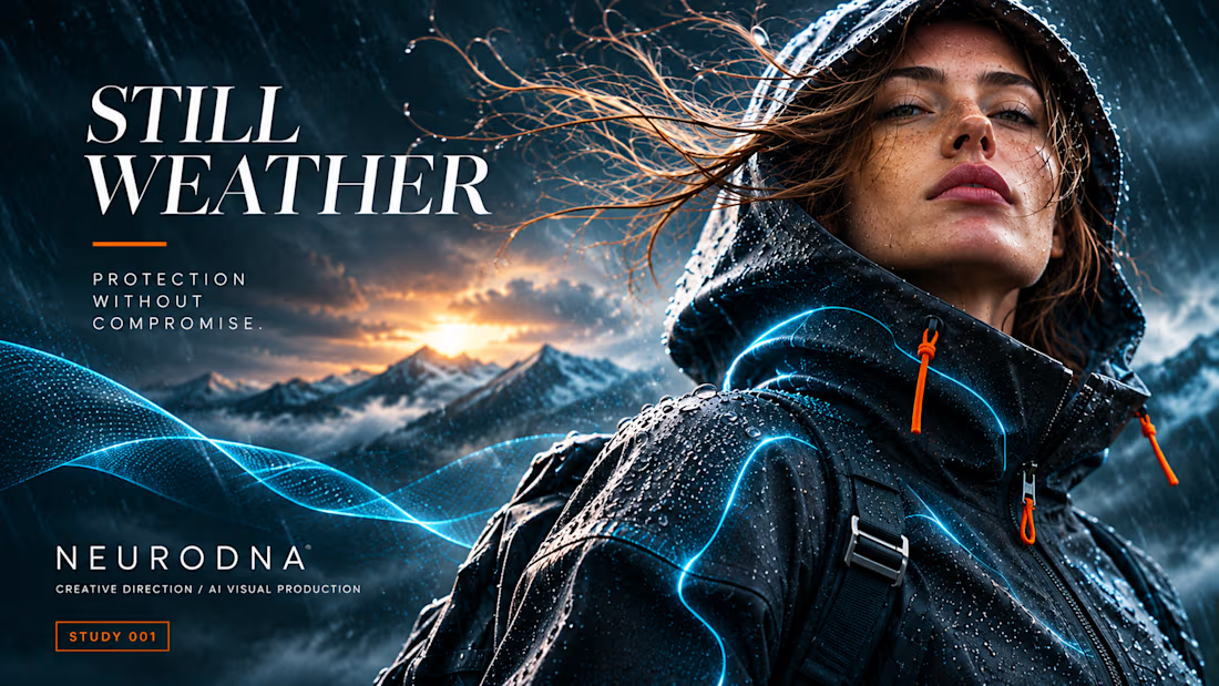
THE STORM MOVES. SHE DOESN'T.
STILL WEATHER × NEURODNA
A self-initiated AI-assisted fashion-tech campaign concept exploring the contrast between human composure and the raw force of a storm.
Four visual moments. One creative direction.
01 — Quiet Confidence
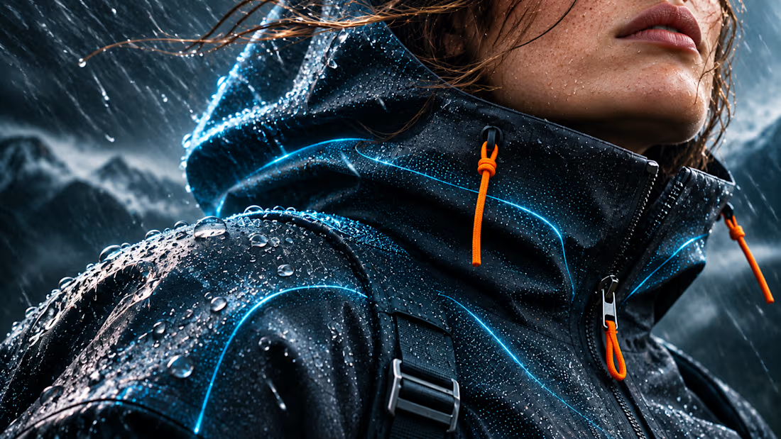
02 — Material Intelligence
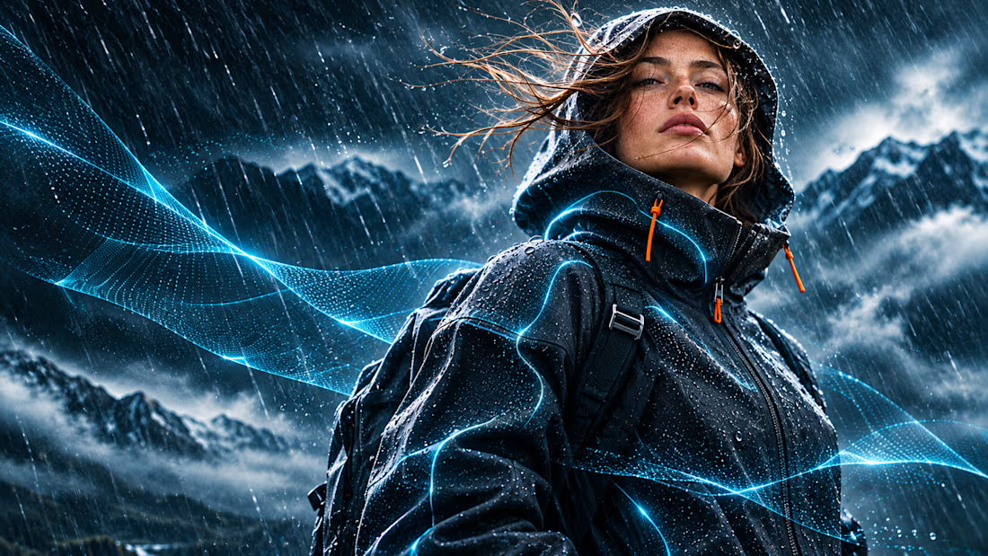
03 — Controlled Chaos
04 — The Signature
Built around technical outerwear, cinematic lighting, material detail and a consistent visual identity.
Creative Direction · AI Visual Production · Key Visual Design
An independent visual concept, not a commissioned campaign or completed film.
Creating distinctive campaign visuals for fashion, lifestyle and technology brands.
Looking for a stronger visual identity for your product? Let's connect.
#NeuroDNA #CreativeDirection #AIVisuals #FashionTech #KeyVisual



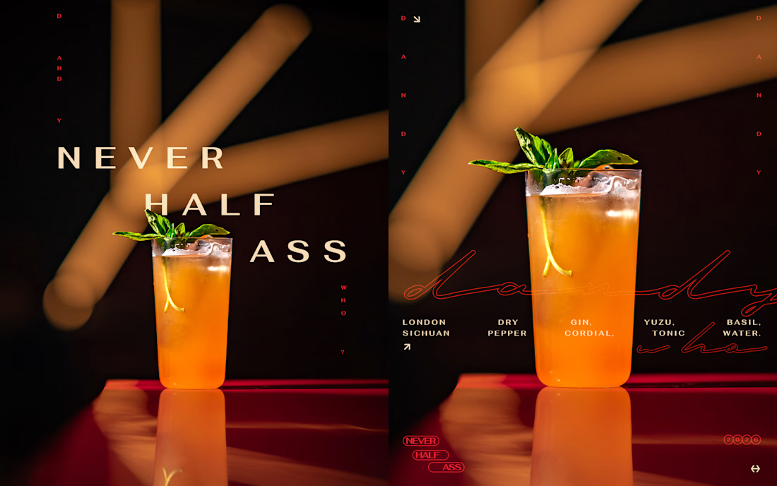
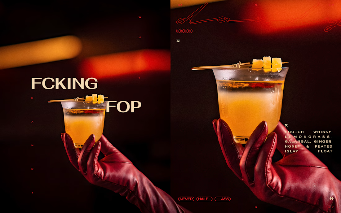
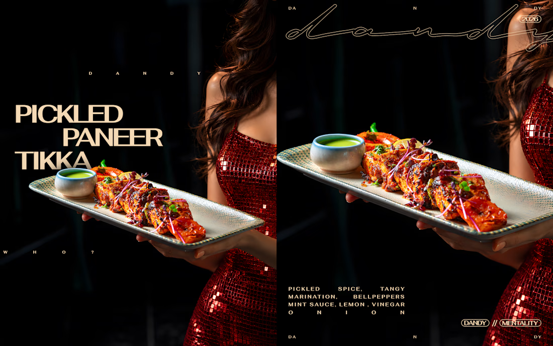
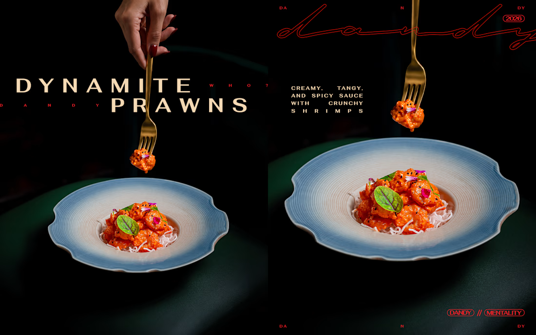
A little attitude, a little chaos, and a whole lot of DANDY.
Created this editorial carousel series for DANDY, blending bold, unconventional typography with cinematic food and cocktail photography. The idea was to make every frame feel like a statement rather than just another menu showcase.
Played around with oversized type, experimental layouts, dramatic lighting, playful copy, and striking compositions, giving each dish and drink its own personality while keeping the entire series visually connected.
Less like a regular food campaign. More like DANDY being DANDY.