The network for creativity
Join 1.25M professional creatives like you
Connect with clients, get discovered, and run your business 100% commission-free
Creatives on Contra have earned over $150M and we are just getting started
Back to feedPost
Taste Test
Which logo design works best for Practice Source?
I’m refining the brand identity and UI/UX for Practice Source, and I’m torn between two logo concepts.
As a full-stack software engineer and web developer building digital platforms, creating a clean, professional, and trustworthy brand identity is essential for user engagement.
Which one catches your eye, and why? Drop your thoughts in the comments below! 👇
Tags: #Branding #LogoDesign #UIUX #WebDesign #BrandIdentity #ProductDesign #PracticeSource


0 voted
0%

3 voted
100%
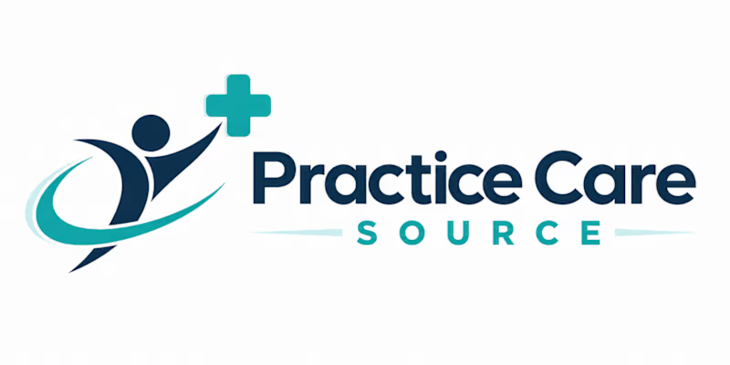
3 votes
Closed

Good idea to test both.

Thanks, Vansita! It really helps to see how different people perceive the initial directions. Which style do you think would resonate best in the medical tech space?

That makes total sense! Since it's for medical billing services, building trust, clarity, and a sense of security is definitely the main priority. Knowing that, which of the two color palettes or concepts do you think aligns better with a professional healthcare website vibe?
The network for creativity
Join 1.25M professional creatives like you
Connect with clients, get discovered, and run your business 100% commission-free
Creatives on Contra have earned over $150M and we are just getting started



Related posts


Video-led hero for me. The big script Presence over the field sells a feeling in one glance, which is what wellness needs. The expanding gallery would work well as the second section.

Photographer Portfolio Website
"Capturing light, emotion, and the moments you never want to forget." That line set the tone, and the layout follows it.
The hero is one motion-blurred portrait washed in red. The photographer's name runs across the bottom in a condensed white face, so large the screen cuts it off. The photo keeps its soft focus, and the name still reads first.
Thin grid lines split the page into narrow columns, and the small copy sits justified inside them. The loose photo gets a strict structure to lean on.
A single round red button with an arrow sits right on the letters and marks where to go next.
Designed by the Hue & Machine team.
#WebDesign #Photography #PortfolioWebsite #EditorialDesign #Typography #UIDesign #ProductDesign #CreativeDirection #ResponsiveDesign #FigmaDesign

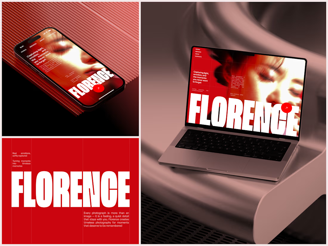
The heavy condensed white FLORENCE over the red portrait is bold, and keeping the same red across phone, laptop and type tile makes the case study read as one system. Did the red come from the photographer's own work, or was it your call?

This summer I worked an interactive, animated webpage to showcase all the local producers who supply Auberge de crussol, unique French restaurant, in Saint-Péray, France.
The page was built entirely in @Rive, using the supplied vector illustrations to produce a series of animations and interactive moments that are triggered by the user's touch or cursor states.
Bespoke sound design was woven throughout the experience, with sound and movement tightly synchronised to add depth to the animation.
Credits:
Creative Director: @Bernard Magri
Rive Development, Animation, Sound Design: @Ashley Best
Additional Animation: @Gabriele Montinaro
Original Illustration: Le point D
View the experience: Auberge de crussol


Beautiful work in Rive. Was the click and drag navigation an intentional choice over regular scrolling?