The network for creativity
Join 1.25M professional creatives like you
Connect with clients, get discovered, and run your business 100% commission-free
Creatives on Contra have earned over $150M and we are just getting started
Back to feedPost

A lot of my design work exists in the digital realm, so it really is a treat to get to hold something tangible every now & then!
I designed this energy drink label as a one-off promotional item for a room-drop gift at a trade show in Miami. The colors are getting me excited for summer 🤩
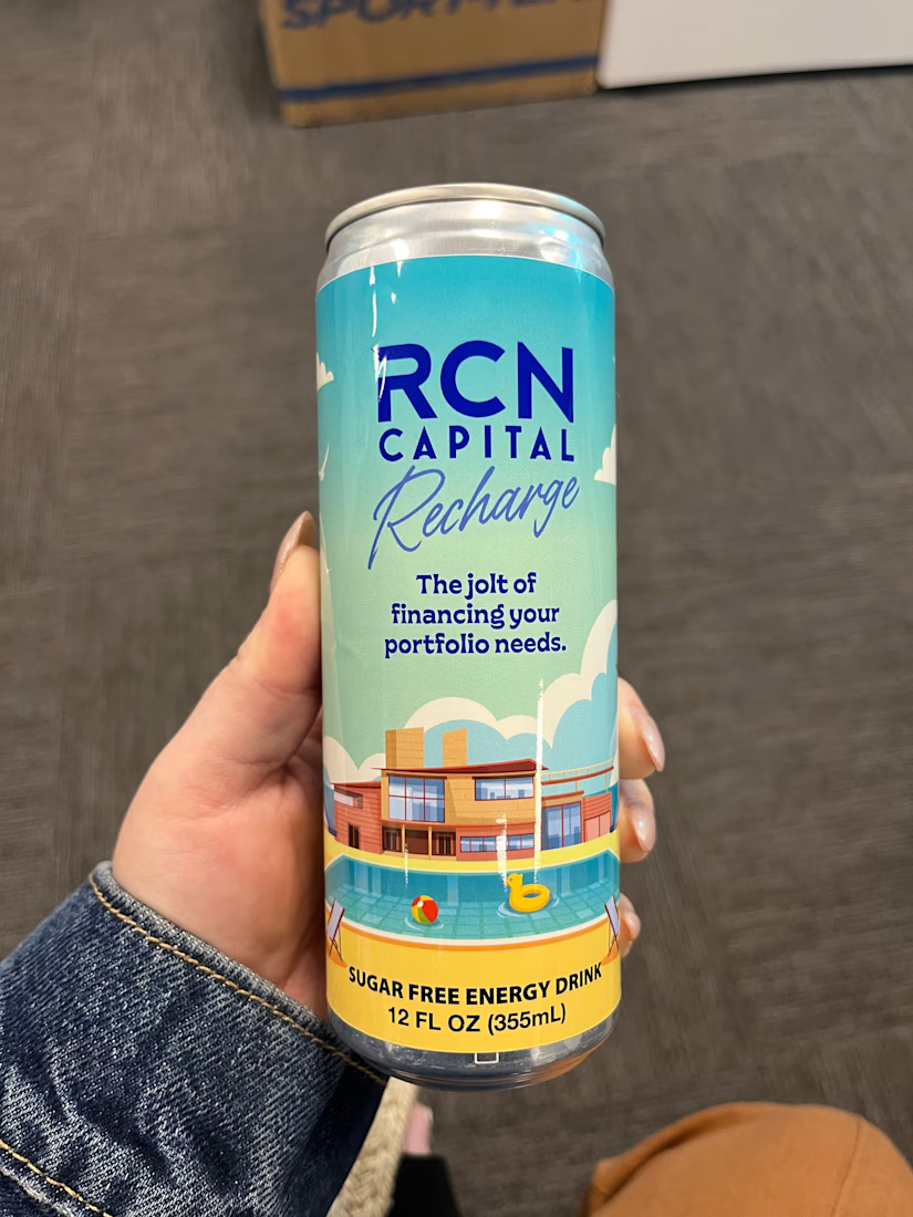

Label design is delightful, especially that feeling after finally seeing your work in your hands! It really is such a summery design. Excellent job, Taylor! ☀️
Thanks so much, Jaclyn! It's always another level of satisfaction being able to actually hold a tangible final product!
The network for creativity
Join 1.25M professional creatives like you
Connect with clients, get discovered, and run your business 100% commission-free
Creatives on Contra have earned over $150M and we are just getting started





Related posts

I'm currently working on my graphic design portfolio, creating clean and professional social media ads, Canva designs, and promotional graphics for businesses. I'm focused on improving my skills and building designs that help brands attract customers.🔥

🎨 I Turn Ideas Into Powerful Visual Identities!
Hello everyone! 👋
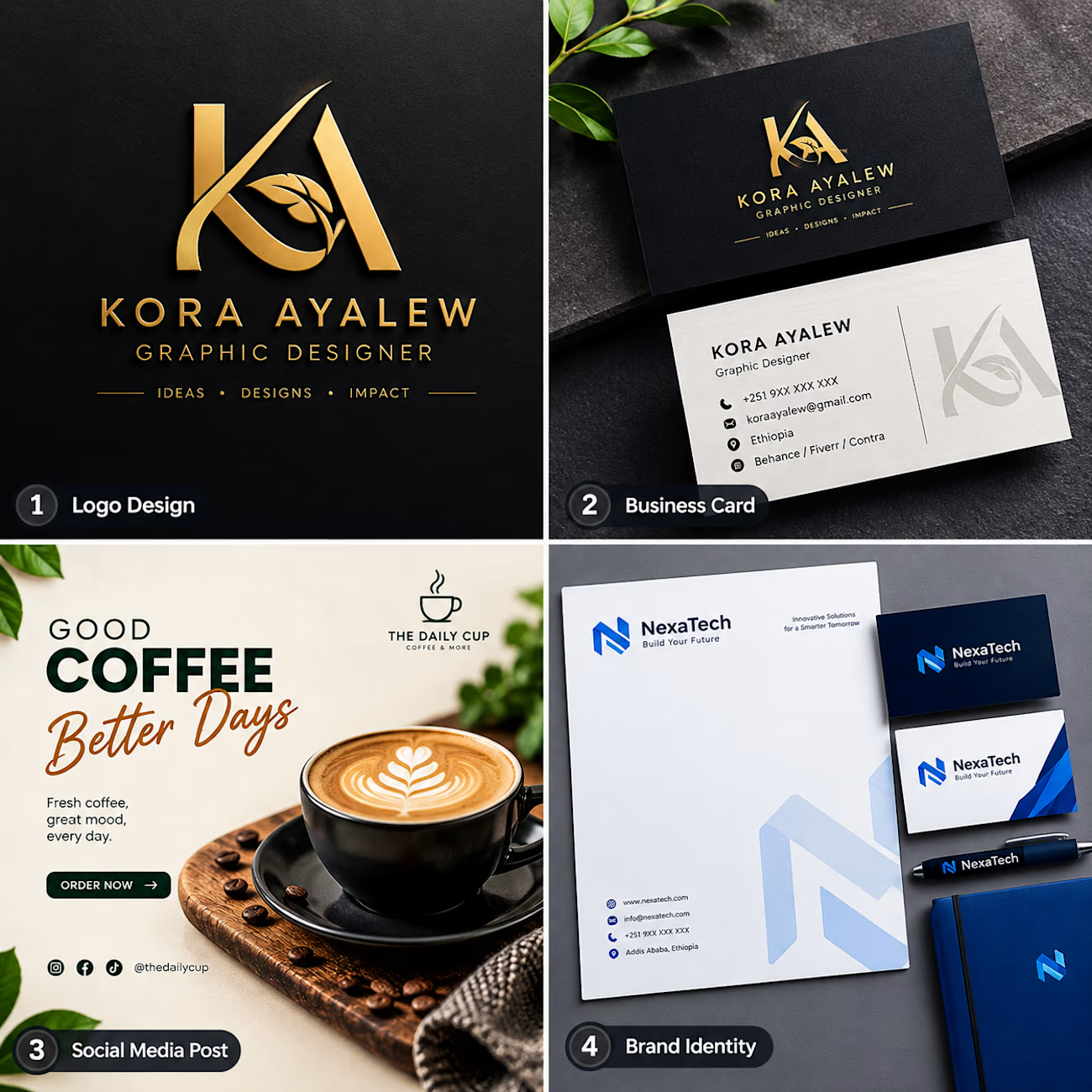
I'm excited to showcase some of my graphic design work, including:
✨ Logo Design
💼 Business Card Design
📱 Social Media Design
🚀 Brand Identity Design
I help businesses and individuals bring their ideas to life through creative, modern, and professional designs that make brands stand out.
💡 Need a unique identity for your business? Let's bring your vision to life!
📩 Feel free to connect with me for your next design project.
Let's create something amazing together! 🚀
#GraphicDesigner #LogoDesign #BrandIdentity #BusinessCardDesign #SocialMediaDesign #FreelanceDesigner #CreativeDesign

The Daily Cup – Coffee Social Media Post
A creative coffee advertisement design for The Daily Cup. This design combines warm colors, beautiful coffee photography, and clear typography to create an attractive promotional post for social media.
Focus: Social Media Design, Advertising, Graphic Design.
This is a practice portfolio concept created to demonstrate my graphic design skills.