The network for creativity
Join 1.25M professional creatives like you
Connect with clients, get discovered, and run your business 100% commission-free
Creatives on Contra have earned over $150M and we are just getting started
Back to feedPost

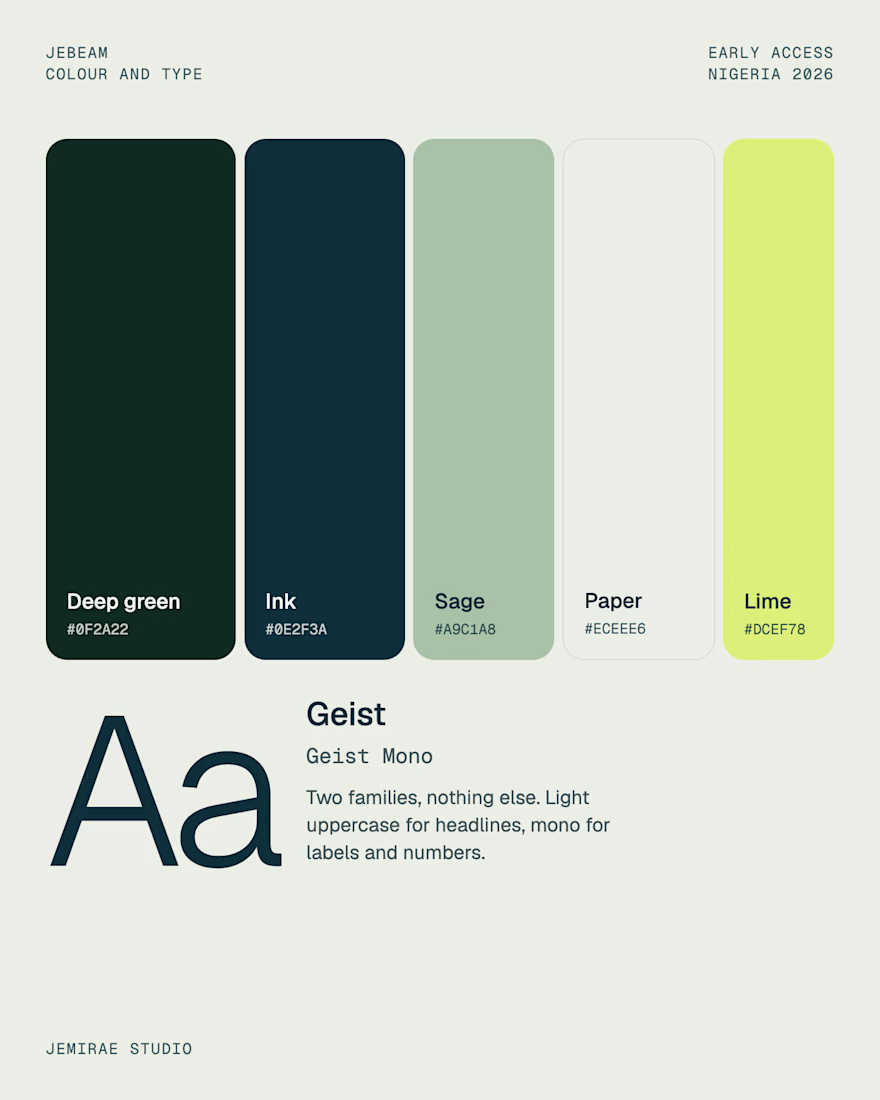
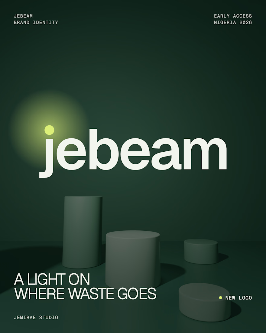
Jebeam is a product we are building in house at Jemirae to follow bottles, cans and sachets from the bin to the recycler. I designed the brand identity: a wordmark where the dot of the j is the light, a deep green, ink, sage, paper and lime palette, and a Geist and Geist Mono type system.
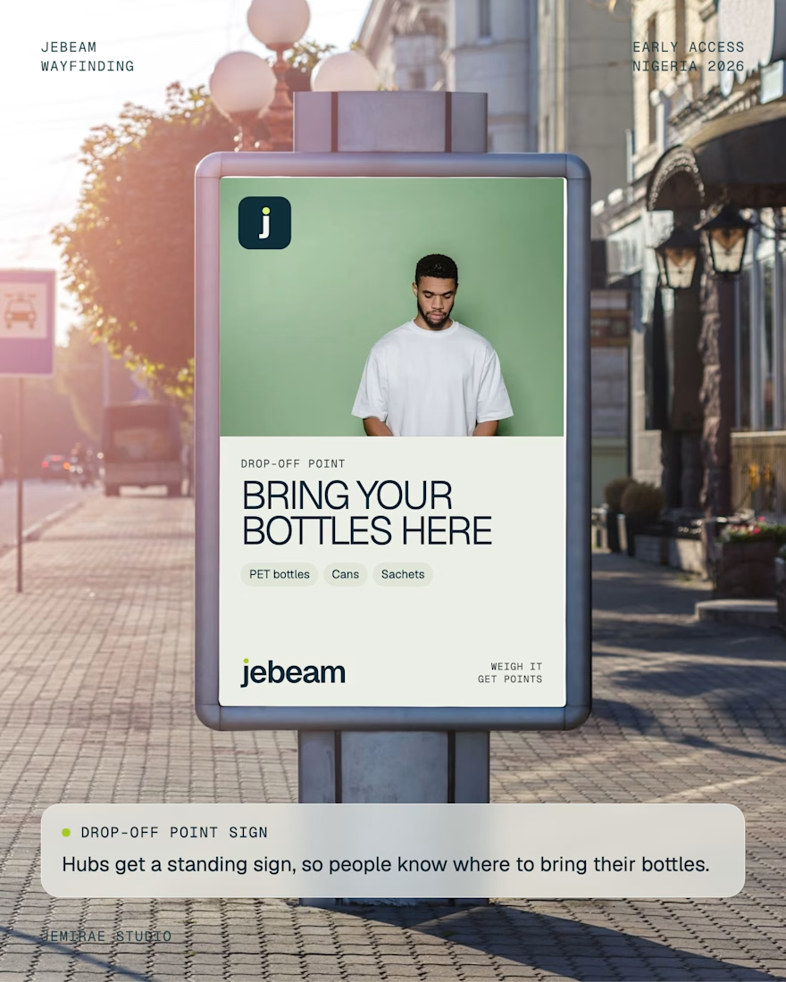
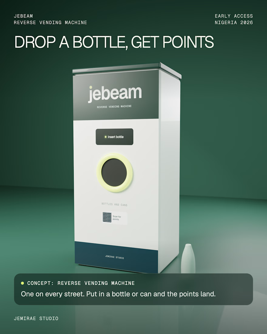
The identity includes construction guidelines for the dot and concept applications across a reverse vending machine, billboard, bridge banner, drop-off sign, smartwatch and social feed. The product is in development, so the applications are concepts and not live deployments.
If you are launching a product and need an identity that works from a logo to a billboard, send me a message.

The dot becoming the light is clever.
The network for creativity
Join 1.25M professional creatives like you
Connect with clients, get discovered, and run your business 100% commission-free
Creatives on Contra have earned over $150M and we are just getting started


Related posts



A fresh identity for Flankman, a US-based industrial intelligence company.
The idea was to bring together two different worlds: the credibility of traditional finance and the character of contemporary editorial design.
Really enjoyed exploring this one and giving a traditionally corporate industry a more distinctive visual personality.
Brand identity by Katlan.co ©

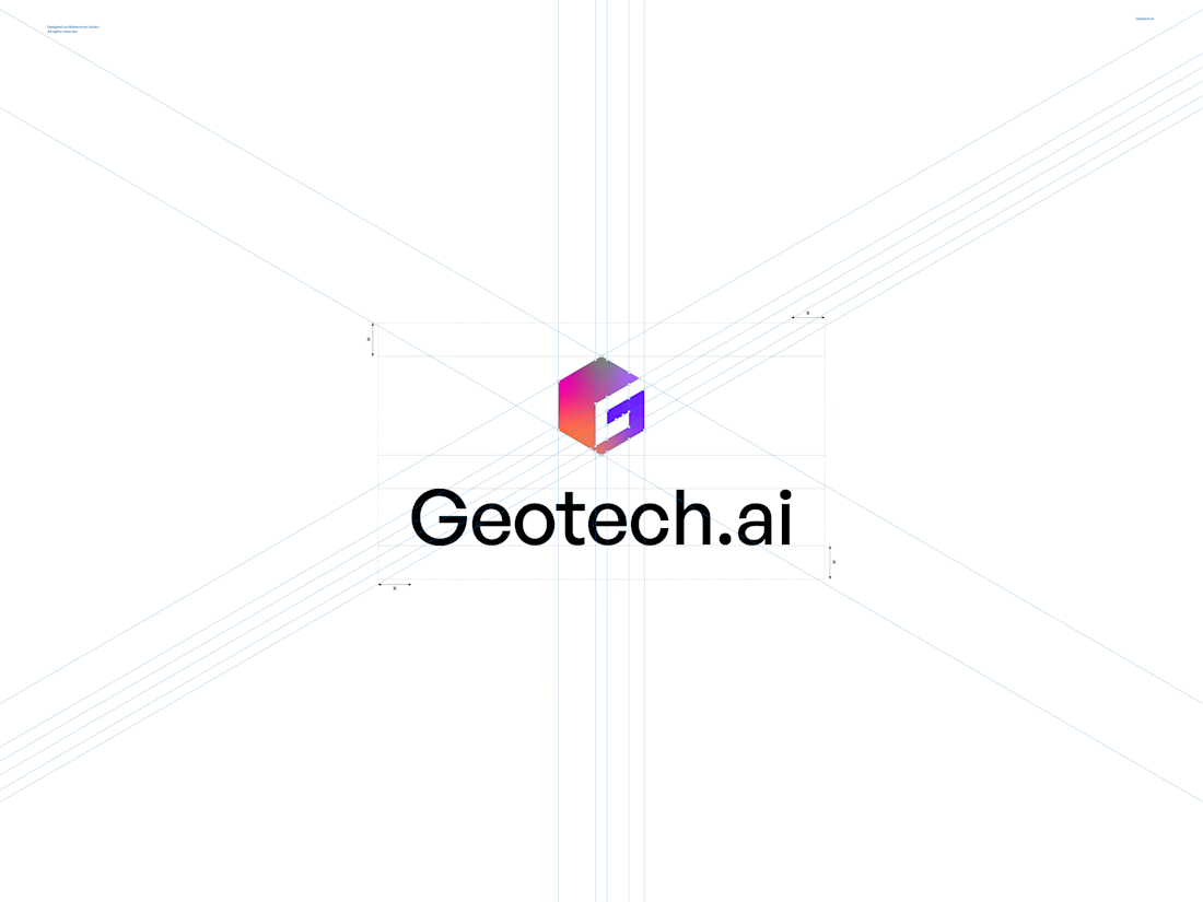
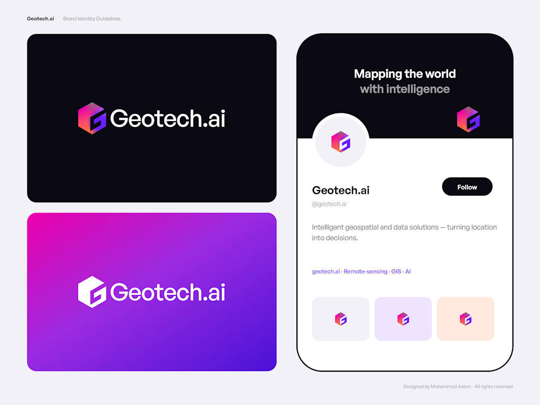
Complete brand identity design for Geotech.ai, an AI-driven geospatial and data technology brand. I created a hexagon-based “G” monogram logo, a gradient colour system, typography, app icons, social presence, stationery and website mockups, all delivered as a 15-page brand guideline with editable vector files.
What clients get from me: a scalable logo, a consistent visual system, and files ready for web, apps, social and print.