The network for creativity
Join 1.25M professional creatives like you
Connect with clients, get discovered, and run your business 100% commission-free
Creatives on Contra have earned over $150M and we are just getting started
Back to feedPost

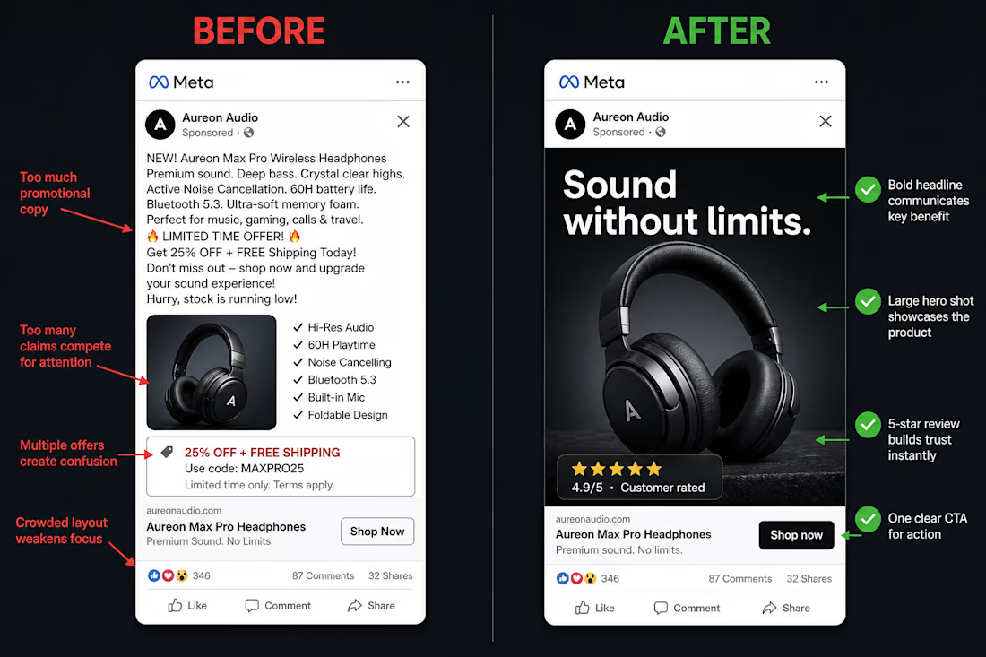
I rebuilt a struggling DTC static ad after watching cold-traffic CPA spike 40% in two weeks.
When a scroller can't identify what you sell and why it beats the alternative in 1.5 seconds, media buying tweaks won't save the campaign.
Here is the 3-part Visual Hierarchy Fix I applied:
Replaced the brand-first headline with a direct pain-point hook at 120pt font.
Added an "Us vs. Them" visual split so the mechanism is obvious without reading body copy.
Anchored a verified 5-star customer quote directly next to the product hero shot.
The result: higher thumbstop rate and cleaner cold-traffic efficiency without touching the targeting.
When you audit a losing static ad, do you test a new visual format first or rewrite the opening hook?
DM me on LinkedIn if you want me to send you "creative testing ideas" to help improve your sales conversions
(Disclaimer: This is an AI image for illustration purposes and not the actual client)
The network for creativity
Join 1.25M professional creatives like you
Connect with clients, get discovered, and run your business 100% commission-free
Creatives on Contra have earned over $150M and we are just getting started


Related posts

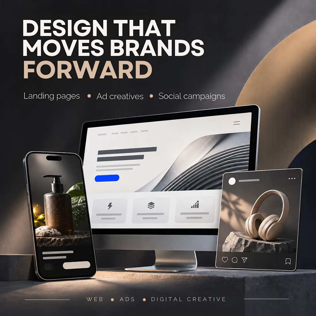
Good design should do more than look good. It should move a business forward.
I work across web design and digital creative, helping brands turn their ideas into experiences and campaigns that get noticed.
Here's what I can help you create:
→ High-converting landing pages
→ Website design and redesigns
→ Social media creatives
→ Paid advertising designs
→ E-commerce product campaigns
I'm particularly interested in working with SaaS companies, e-commerce brands, startups and growing businesses.
Have a product to launch, a website to improve, or a campaign coming up?
Let's make something that works.

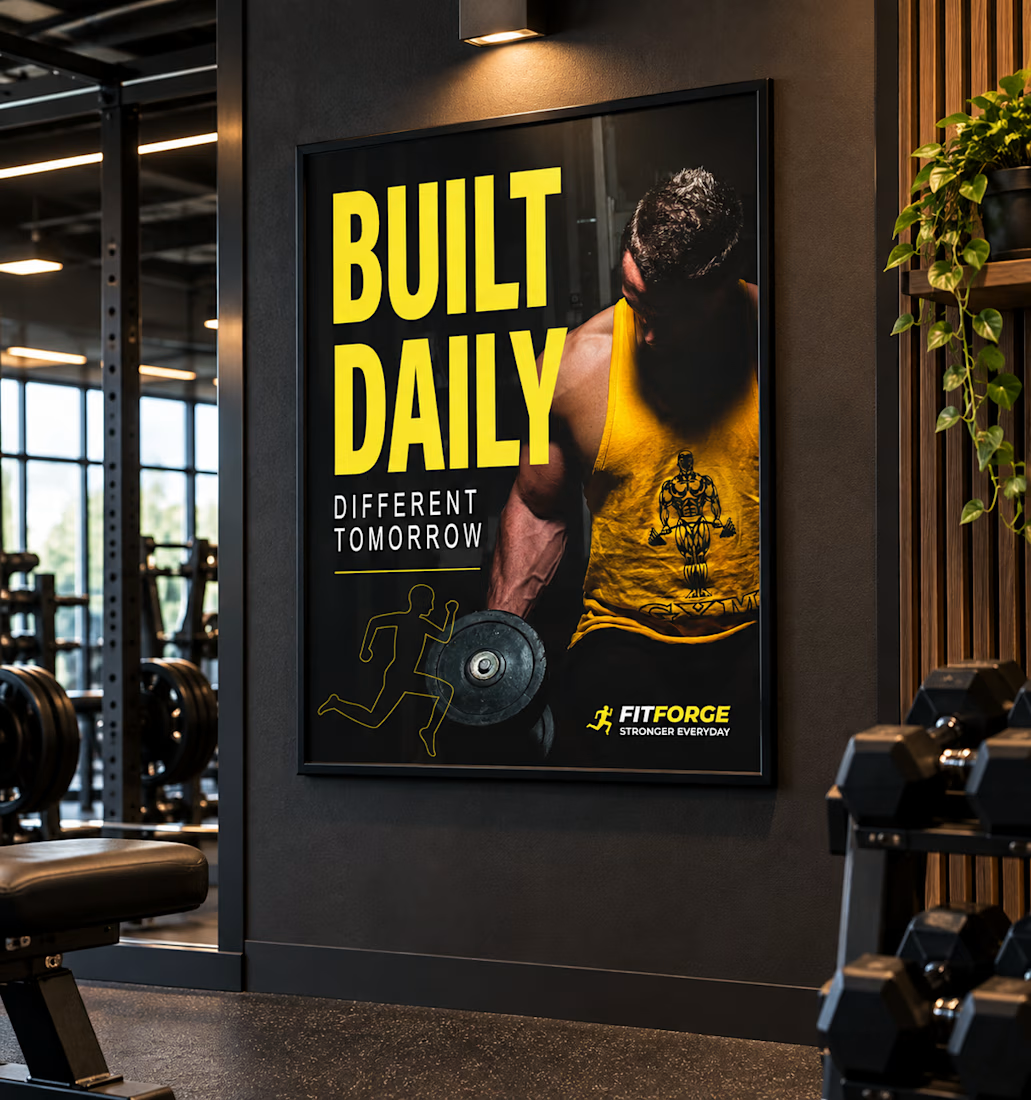
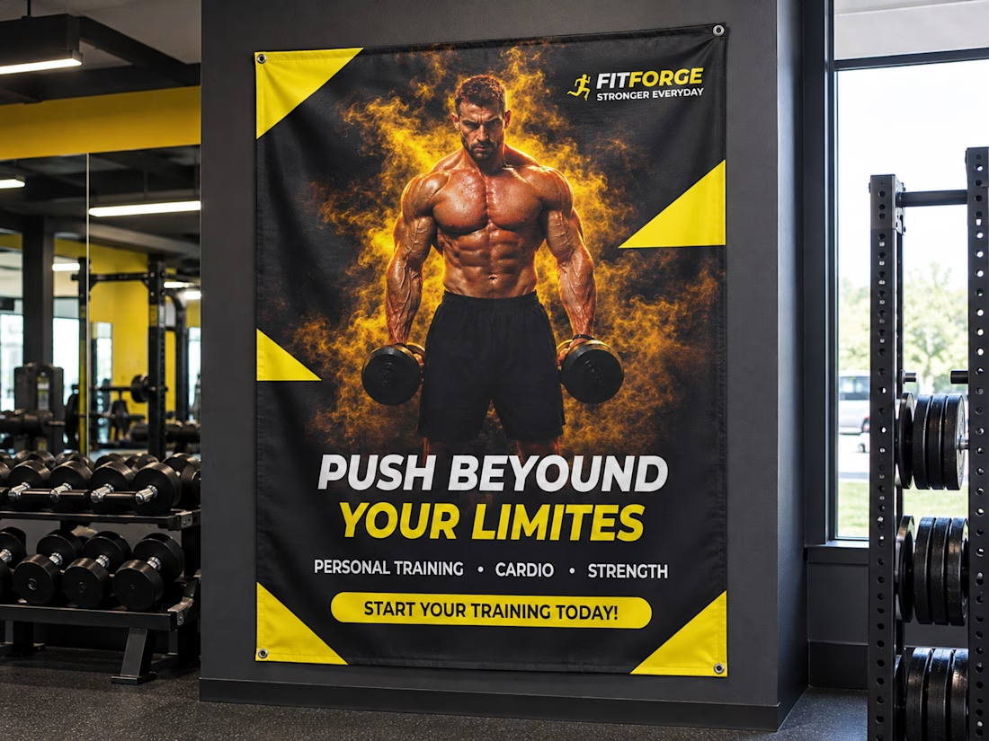
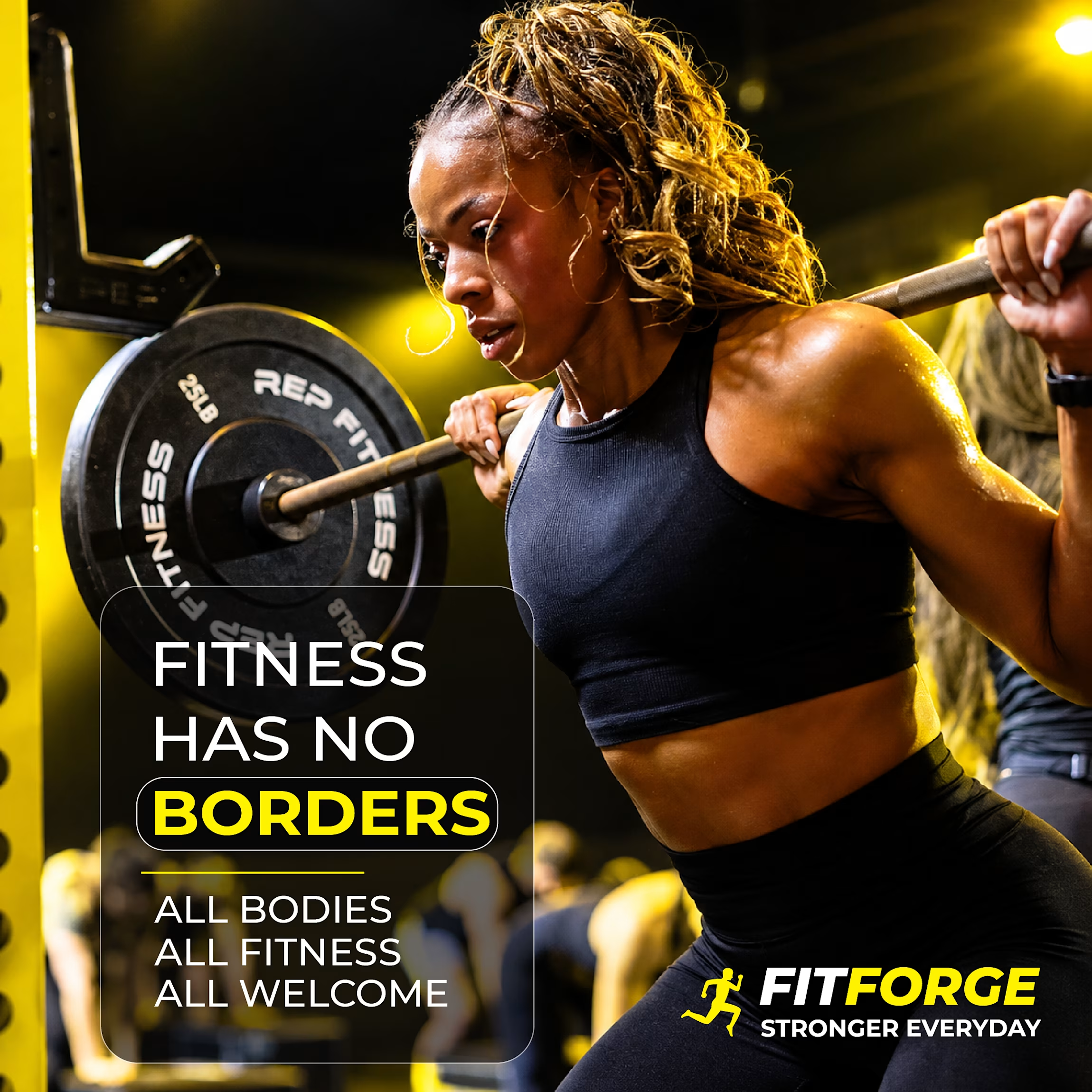
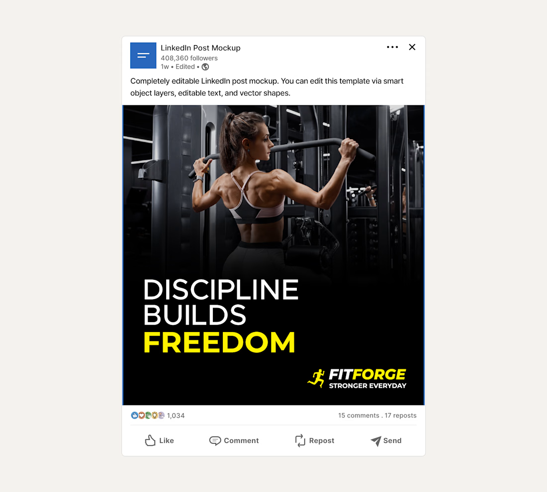
Brief: FitForge gym wanted posters and social media posts to promote their fitness services and create a bold, energetic look.
I designed two posters, three social media posts, and one postcard for FitForge, using strong typography, clear visual hierarchy, and a consistent black-and-white plus brand color palette.
Process: Started with logo direction, then carried the same look into the posters to keep the brand consistent. Used typography to create clear hierarchy so the main message reads first, with details following naturally.
Deliverables: Two posters, Three social media posts, One postcard, plus mockups showing how the design would look in a real gym space.
Outcome: a bold, clean, and cohesive set of materials that reflect the gym's energetic feel

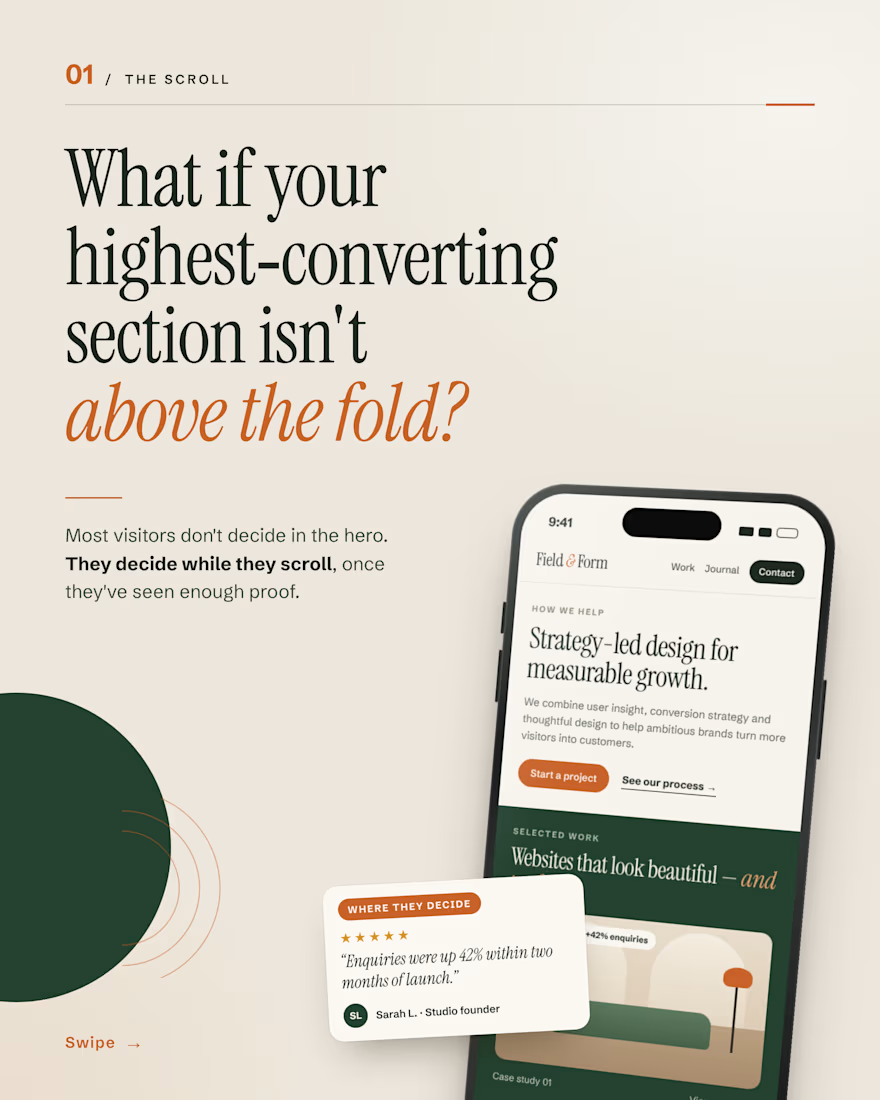
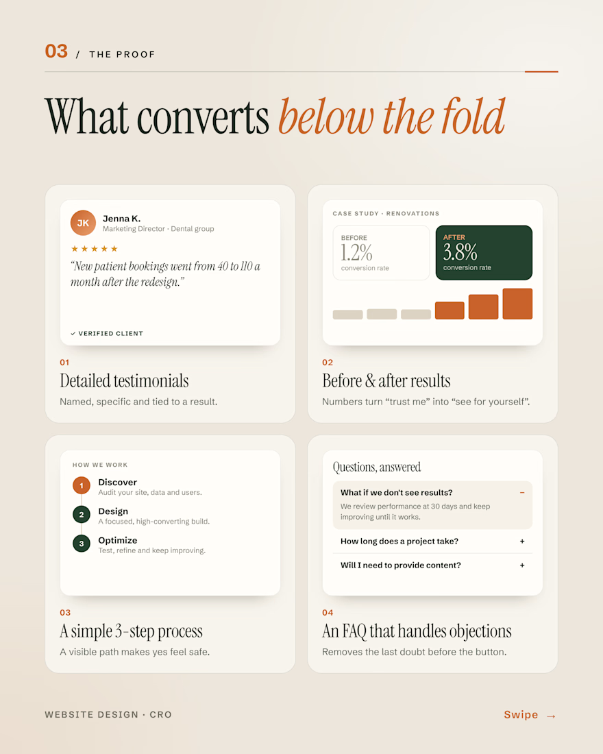
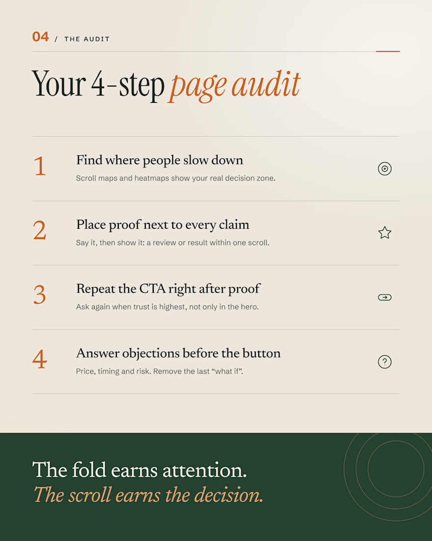
Your hero gets the first look. But most visitors don’t decide there.
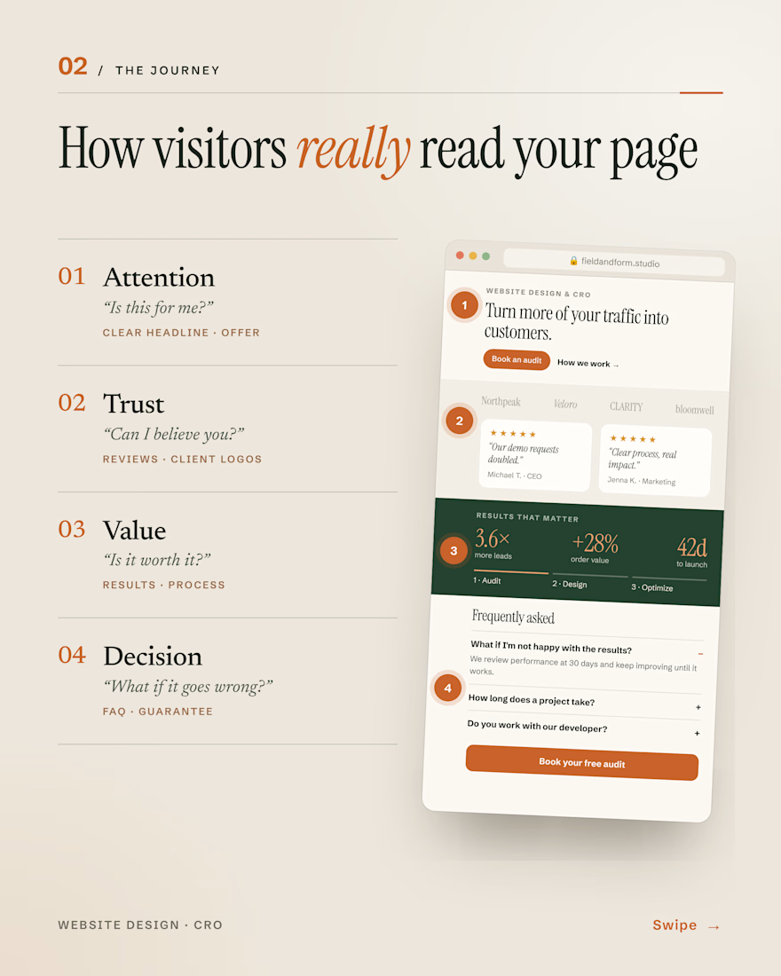
They scroll and question you: Is this for me? Can I trust you? Is it worth it? What if it goes wrong?
The sections that answer those (reviews, real results, a clear process, an honest FAQ) are often the ones doing the selling.
The fold earns attention. The scroll earns the decision.
#WebDesign #CRO #ConversionRateOptimization #LandingPages #UXDesign

Agree that the FAQ is where a lot of doubt gets settled. When you build these sections, do you put reviews before the process or after it?