The network for creativity
Join 1.25M professional creatives like you
Connect with clients, get discovered, and run your business 100% commission-free
Creatives on Contra have earned over $150M and we are just getting started
Back to feedPost

For this motion graphics project, I created a short educational explainer that visually breaks down the difference between logo design, branding, and brand identity in a simple and engaging way.
The goal was to transform a design concept that can feel complicated into an easy-to-understand visual story using motion graphics, typography, transitions, visual hierarchy, sound design, and video editing.
The result is a clean, modern explainer designed to educate, communicate, and keep viewers engaged.


The network for creativity
Join 1.25M professional creatives like you
Connect with clients, get discovered, and run your business 100% commission-free
Creatives on Contra have earned over $150M and we are just getting started




Related posts


Motion Graphics for a new product launch.

the freeze protection card is a nice touch. is this for a real app or a concept?

Animated Event Video Poster | Tag der Clubkultur
Dynamic motion design and video poster created for the "COREspecs" event as part of Berlin's official Tag der Clubkultur festival series.
The visual concept merges an authentic underground Berlin aesthetic—featuring iconic transit motifs, gritty textures, and acid neon accents—with clean, structured typographic hierarchy and a fully synchronized lineup reveal.
Software & Tools: Adobe After Effects (motion design, compositing, visual effects, and expression-driven audio reactivity), Suno AI (custom industrial/EBM sound design and score).
Deliverable: Vertical looping video teaser optimized for social media promotion and digital event boards.
#

the yellow train going across the top is my favourite bit. is that real footage or did you animate it?

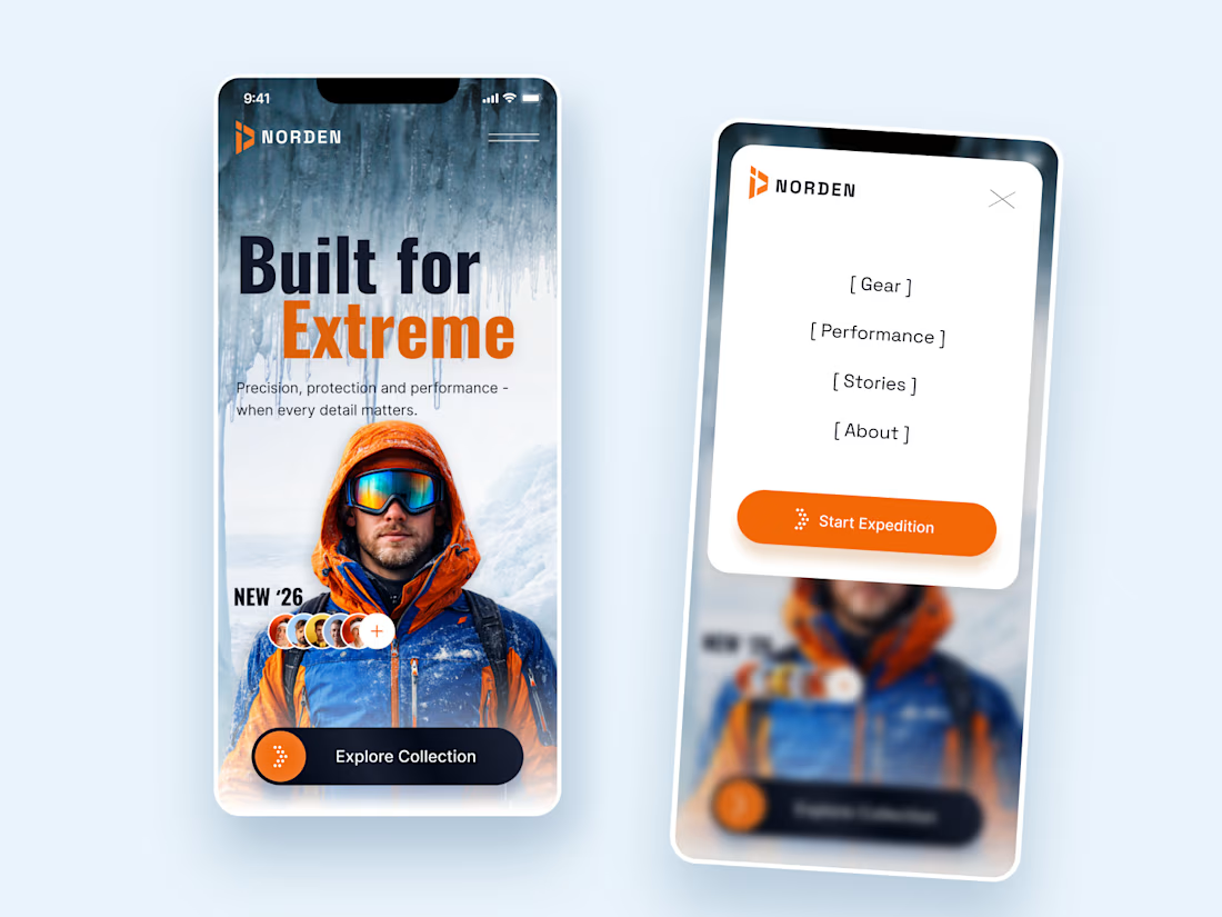
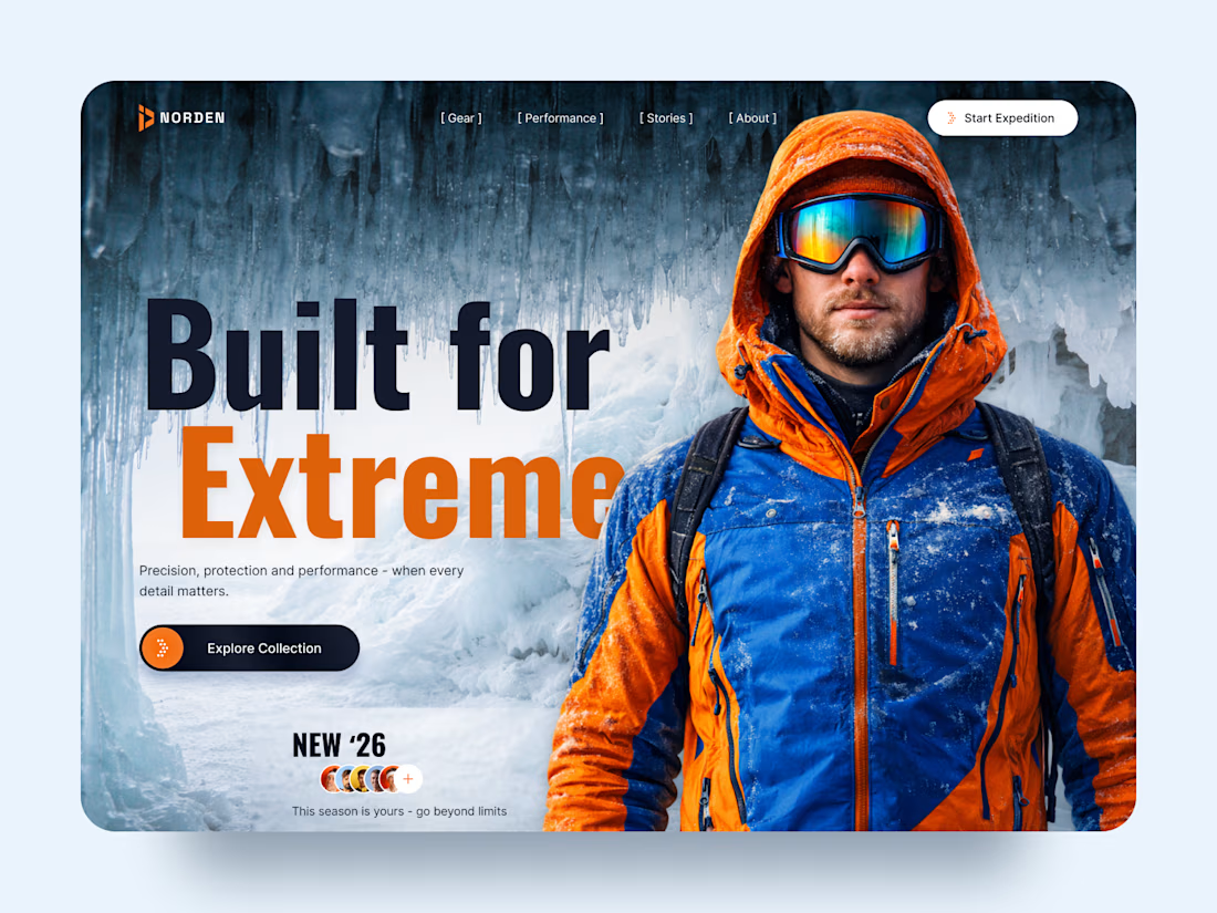
NORDEN — Outdoor Gear Landing Page 🏔️
NORDEN is a premium outdoor gear landing page concept inspired by extreme environments, exploration, and high-performance equipment.
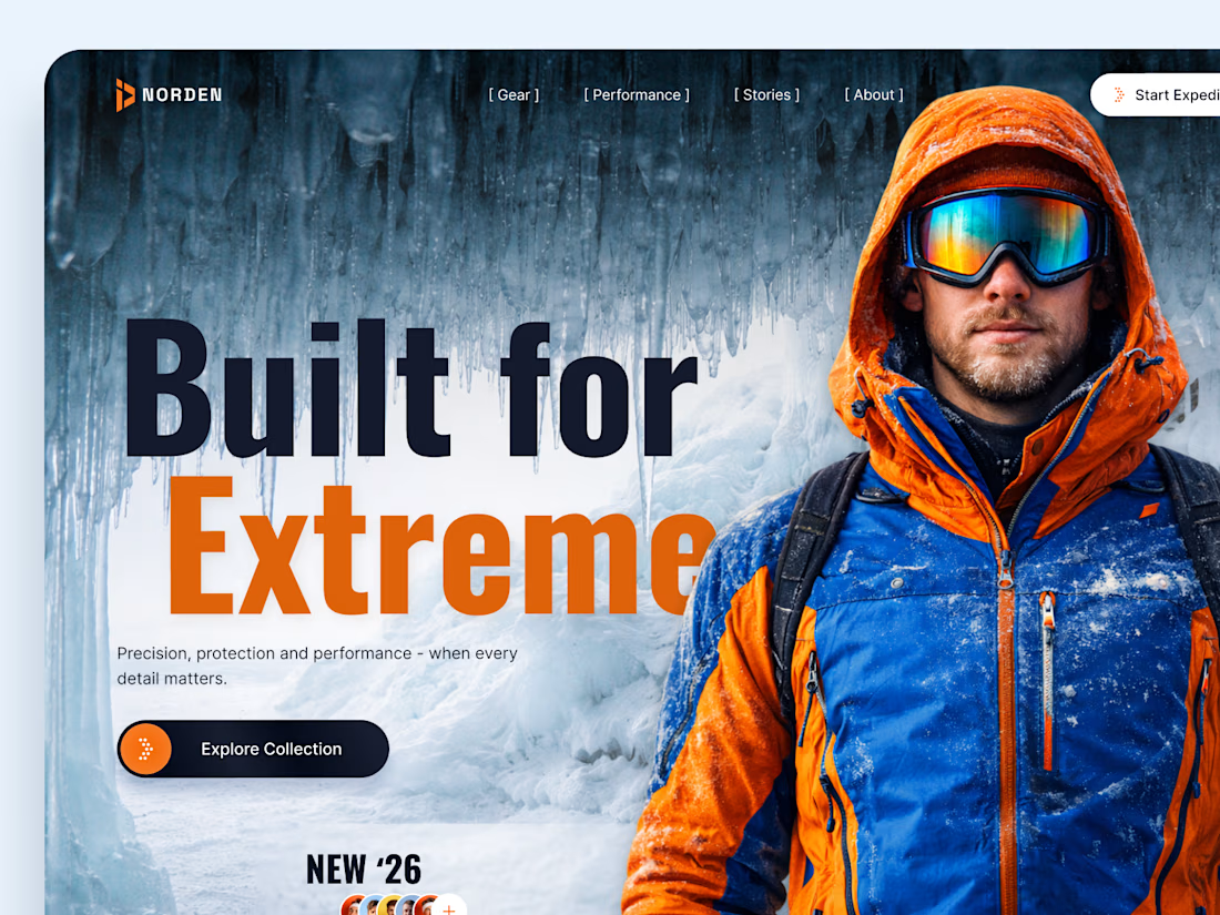
The design combines dramatic icy landscapes, bold typography, and vibrant orange accents to create an immersive experience that captures the spirit of adventure.
Special attention was given to:
A cinematic hero composition featuring an explorer in extreme conditions.
Oversized typography that communicates strength and confidence.
A cold blue-and-orange color palette inspired by alpine environments.
Clear CTAs that guide visitors toward the collection and expedition.
Responsive mobile layouts that preserve the visual impact.
Minimal navigation that keeps the focus on the experience.
The result is a visually striking digital concept that connects outdoor performance with premium product storytelling.
Looking to create a distinctive website for your outdoor, sports, or lifestyle brand? Let's bring your vision to life. ⚡



How did you choose the hero image?