The network for creativity
Join 1.25M professional creatives like you
Connect with clients, get discovered, and run your business 100% commission-free
Creatives on Contra have earned over $150M and we are just getting started
Back to feedPost


The network for creativity
Join 1.25M professional creatives like you
Connect with clients, get discovered, and run your business 100% commission-free
Creatives on Contra have earned over $150M and we are just getting started



Related posts


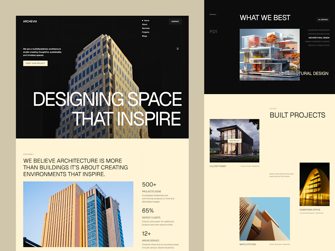
Archevia, Architecture & Design Website Template.
An editorial-style template built for architecture studios.
It features a CMS-powered project portfolio, service pages, testimonials, a contact form, and a blog.
Archevia is a device-friendly template with gallery-first layouts.
This is perfect for visual storytelling for design-led studios.
Check the comment.


nice work

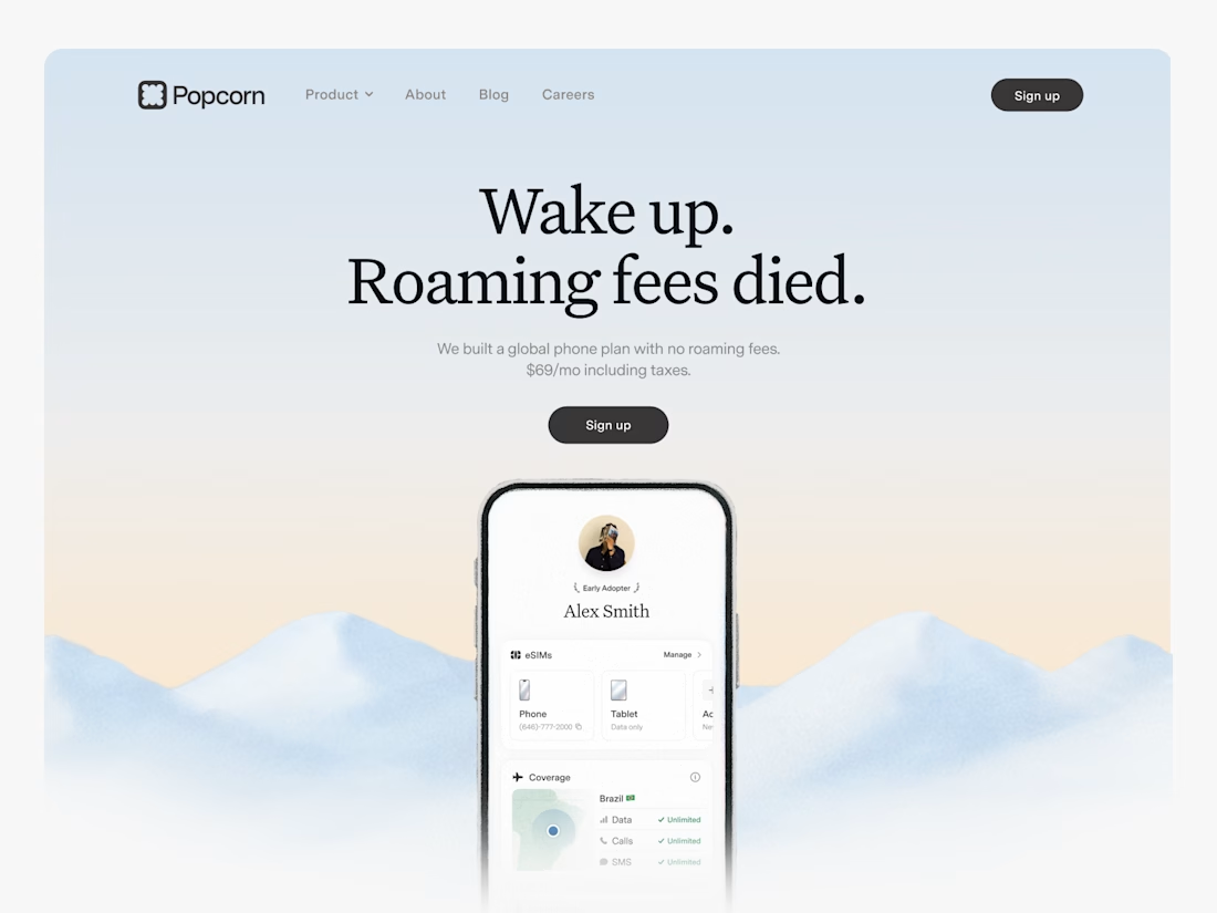

Looks great! What about readability though?
Text seems low contrast to me. Although I have a poor vision and most things seem too small and low contrast to me.


Some concept work from the agency. Planning to share more of what we create, from clean interfaces to the little motion details that bring them to life.
Check out the website: https://urest.agency/
