The network for creativity
Join 1.25M professional creatives like you
Connect with clients, get discovered, and run your business 100% commission-free
Creatives on Contra have earned over $150M and we are just getting started
Back to feedPost

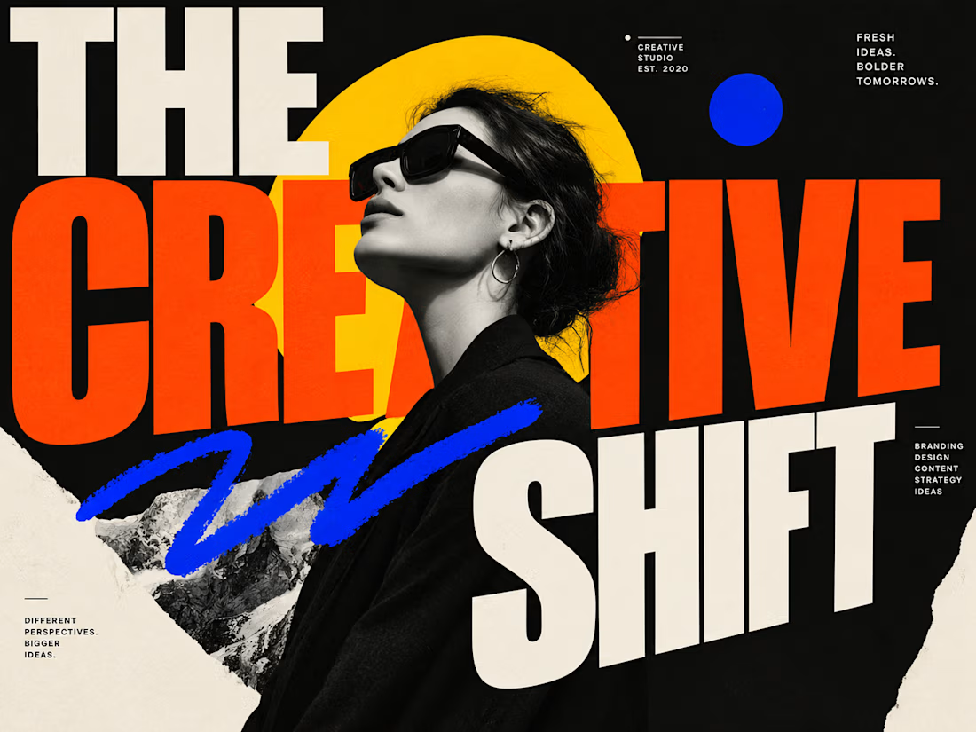
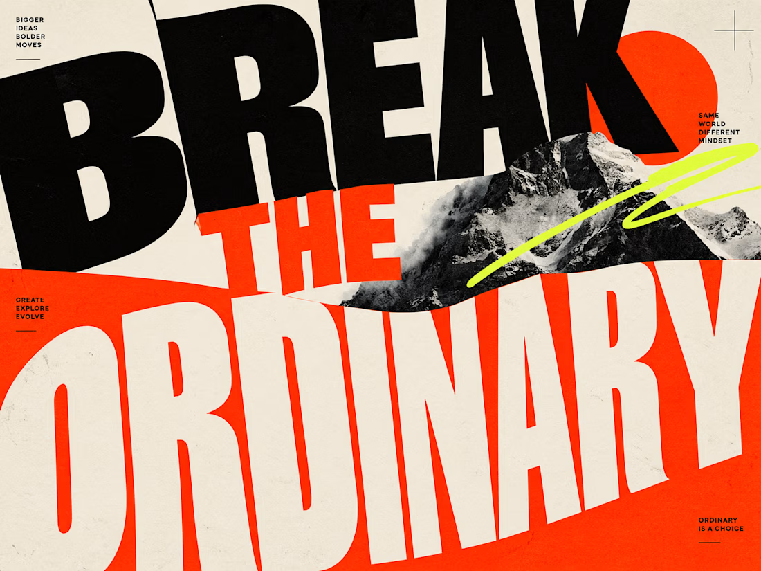
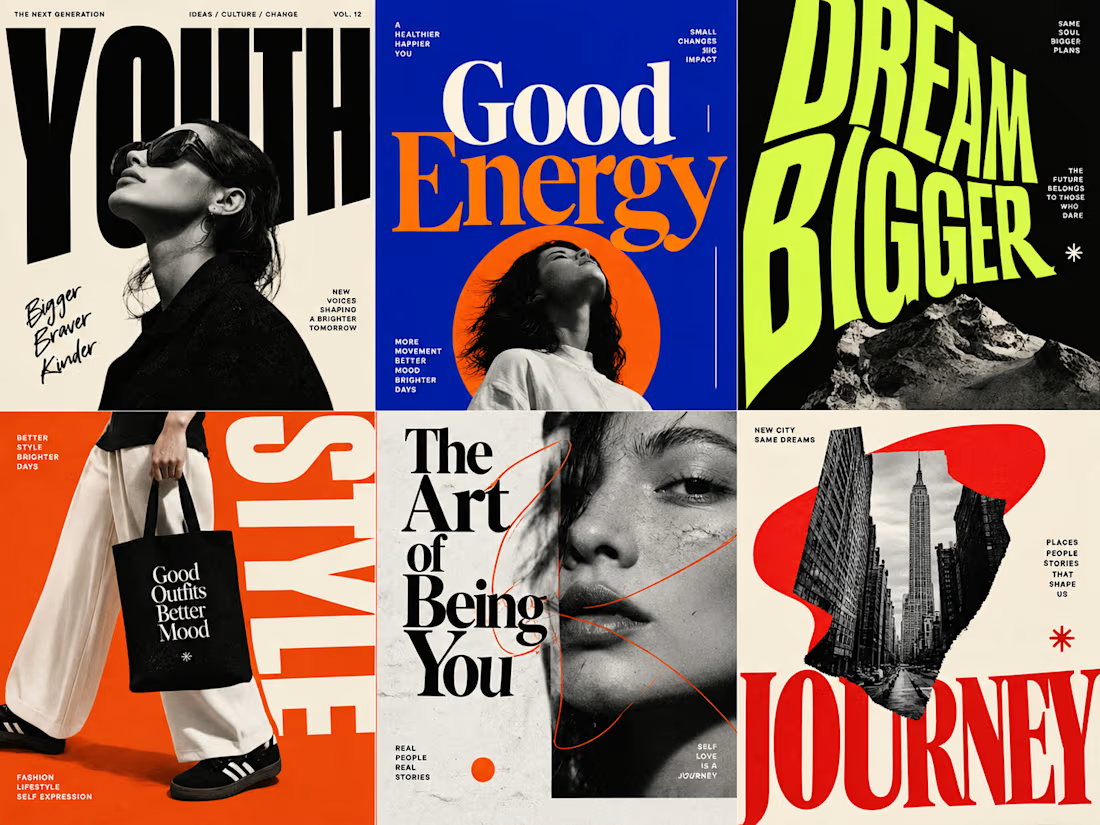
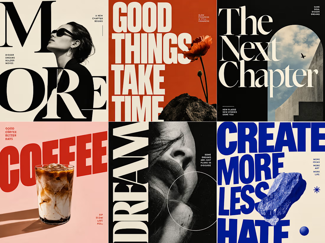
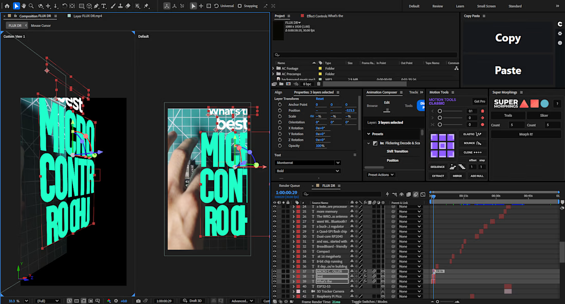
Hear me out! Whenever I use these type of Typography on my client projects, the retention it bring is crazy!
It's just so much fun to implement and to look as well. Have you tried it?
The network for creativity
Join 1.25M professional creatives like you
Connect with clients, get discovered, and run your business 100% commission-free
Creatives on Contra have earned over $150M and we are just getting started







Related posts

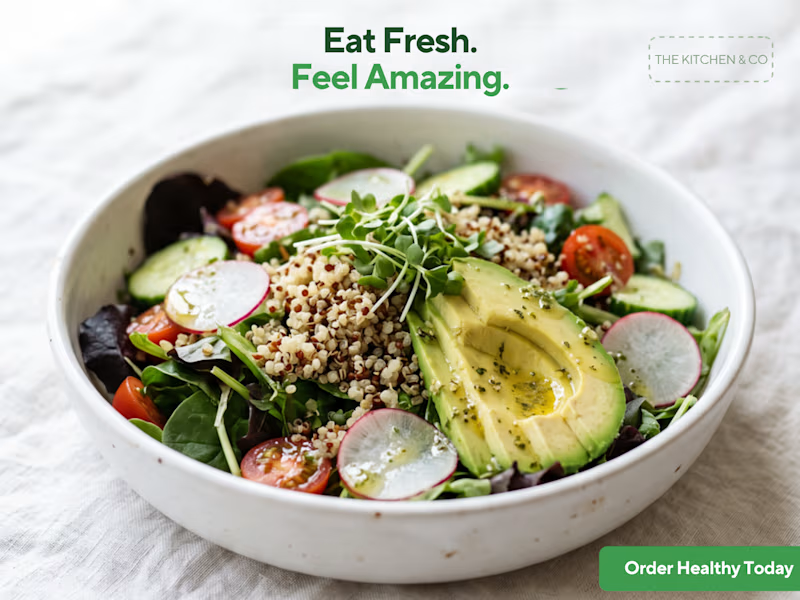
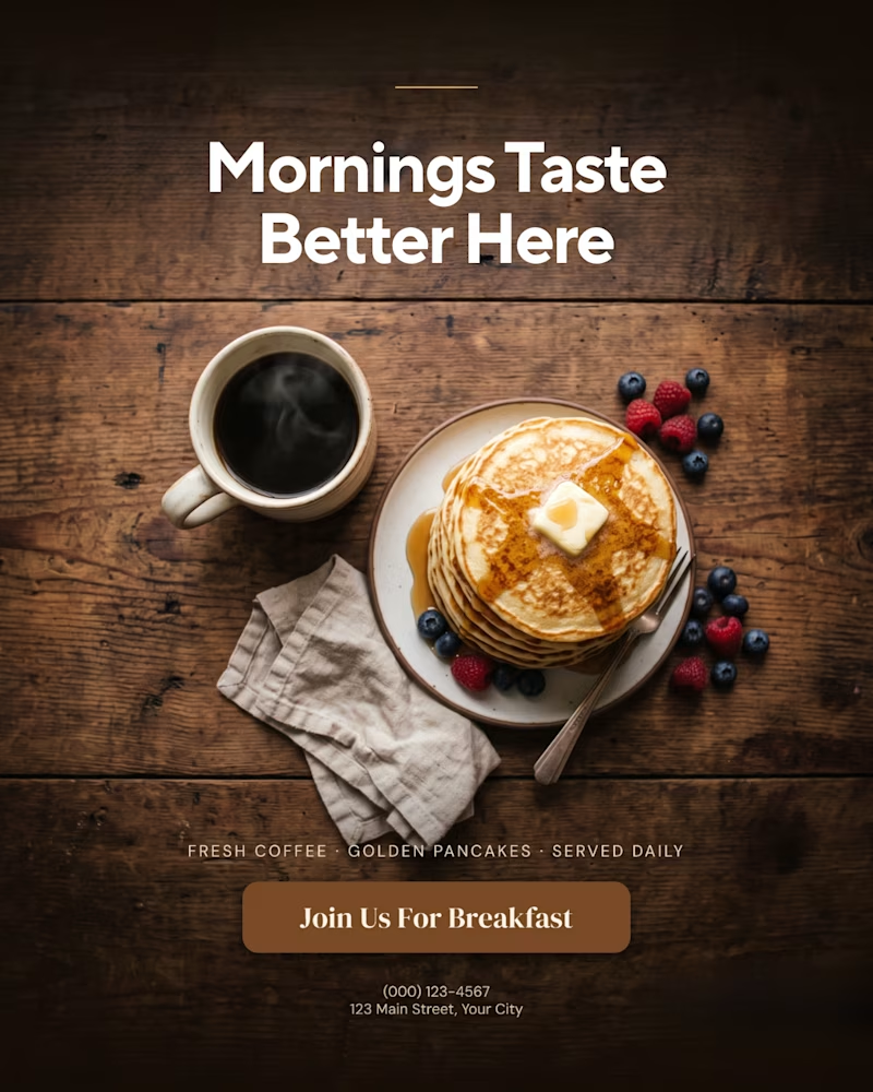
A creative food advertising design series focused on bold typography, visual hierarchy, and appetizing food photography.
The first design uses warm, rustic tones and expressive typography to create a cozy breakfast feel, while the second combines fresh green typography with a clean, modern layout for a healthy food concept.
Both designs explore how typography, color, and composition can communicate different food brand identities.
Which design do you prefer, the warm breakfast aesthetic or the fresh, minimal look?

1 voted
11%
8 voted
89%
9 votes
Closed

That is more attractive to me great job Malaika🎉🎉🎉

Ask a coding agent to "make the UI look premium", and you get whatever it felt like building that day.
I give mine constraints instead.
I keep a list of sites that generate design markdown files for AI builds. Typography, colours, spacing, radius, shadows, components, states, responsive behaviour. A full design system in a single file.
The workflow, before any screen gets built:
Pick a visual direction. Generate the .md against what the product actually does and the outcome it needs to hit. Drop it into Claude Code or Codex or Kimi or Cursor. Use /design to fix what stays consistent across every screen.
Now the agent follows a spec, not a mood.
That file, plus a folder of five or six visual references, is the first thing I prepare before a client build.
The sites:
https://www.typeui.sh/
https://design-md.hyperbrowser.ai/
https://neuform.ai/
https://www.aura.build/
https://www.designmd.supply/
https://open-design.ai/
https://designmd.me/
Enjoy. Build. Ship.
Cheers.

This is so true! 🔥 "Make it premium" is the most subjective prompt ever - every agent has its own version of premium haha! Giving constraints like typography, colors, spacing, radius, shadows, components, states is the real pro move. That's how you get consistent design...

I experimented with oversized typography across editorial layouts, posters, and social media covers. What do you think about the typography, layout, and color combinations? Which design catches your eye the most? I’d love to hear your thoughts! ✨