The network for creativity
Join 1.25M professional creatives like you
Connect with clients, get discovered, and run your business 100% commission-free
Creatives on Contra have earned over $150M and we are just getting started
Back to feedPost


The network for creativity
Join 1.25M professional creatives like you
Connect with clients, get discovered, and run your business 100% commission-free
Creatives on Contra have earned over $150M and we are just getting started




Related posts


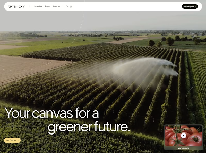
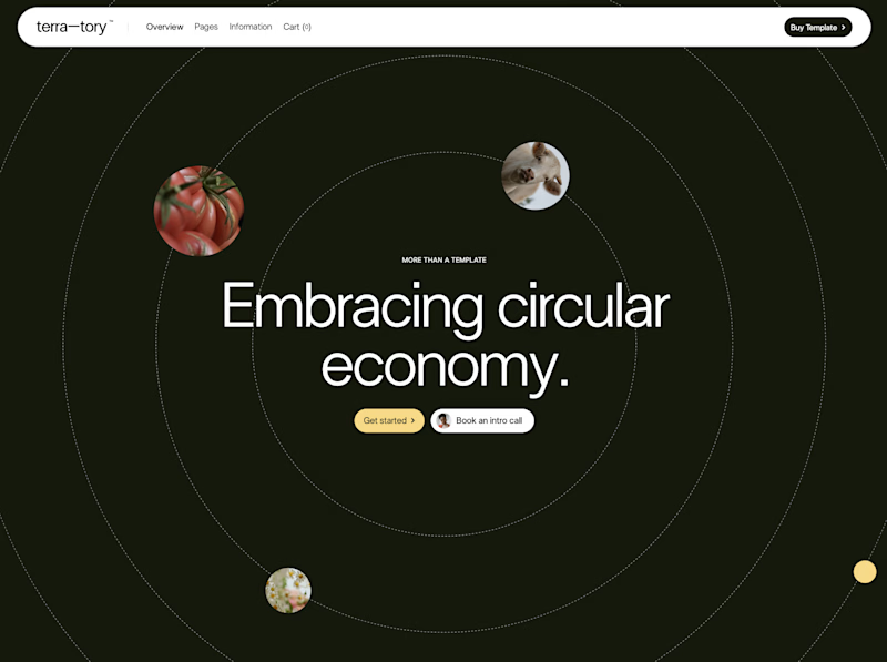
You only get to keep one. Which stays?
The circular layout has a bit of playfulness to it. The landscape gives you a much bigger sense of place.
I can see a case for both. Curious where you land.

93 voted
78%
27 voted
22%
120 votes
Closed

I'd keep the landscape one honestly, that sense of scale feels right for anything talking about sustainability at an industry level. Did the client push back on the crop at all, or were they on board with circular from the start?

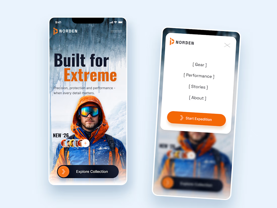
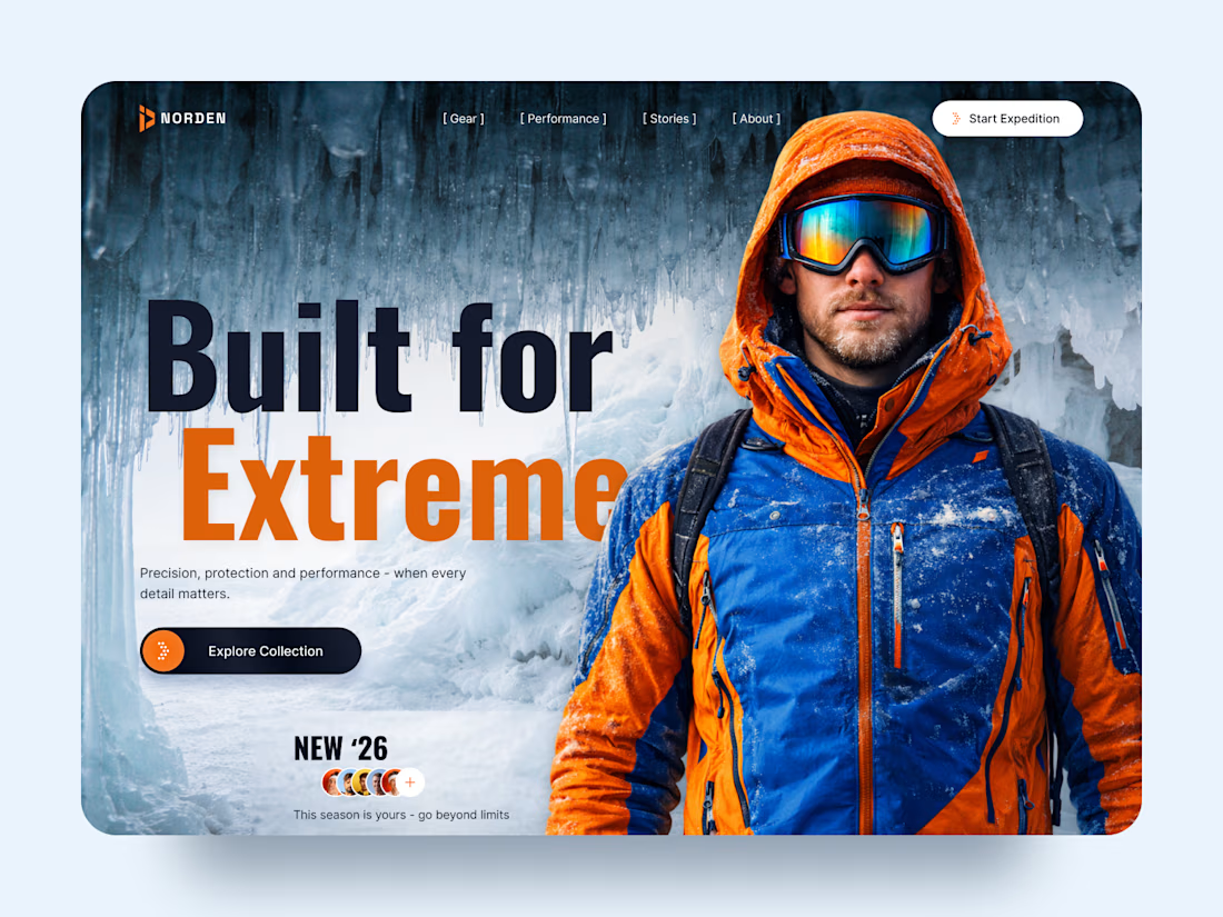
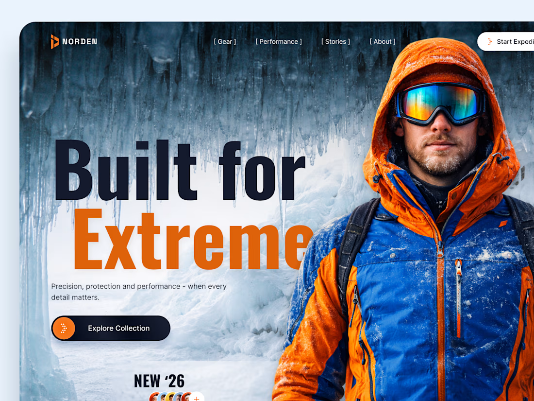
NORDEN — Outdoor Gear Landing Page 🏔️
NORDEN is a premium outdoor gear landing page concept inspired by extreme environments, exploration, and high-performance equipment.
The design combines dramatic icy landscapes, bold typography, and vibrant orange accents to create an immersive experience that captures the spirit of adventure.
Special attention was given to:
A cinematic hero composition featuring an explorer in extreme conditions.
Oversized typography that communicates strength and confidence.
A cold blue-and-orange color palette inspired by alpine environments.
Clear CTAs that guide visitors toward the collection and expedition.
Responsive mobile layouts that preserve the visual impact.
Minimal navigation that keeps the focus on the experience.
The result is a visually striking digital concept that connects outdoor performance with premium product storytelling.
Looking to create a distinctive website for your outdoor, sports, or lifestyle brand? Let's bring your vision to life. ⚡



How did you choose the hero image?

Designed and built this for Haunted Boulder City, a ghost and UFO tour just outside Vegas.
Had a lot of fun playing with the night photography, fog, and scroll effects on this one. Pretty happy with how it all came together.
Check it out: https://www.hauntedbouldercity.com/ 👻 👽 🛸

Really nailed the atmosphere here. The night photography, fog, and scroll effects make the site feel like part of the tour experience rather than just a booking page. 👻 Which effect took the most experimenting to get right?