The network for creativity
Join 1.25M professional creatives like you
Connect with clients, get discovered, and run your business 100% commission-free
Creatives on Contra have earned over $150M and we are just getting started
Back to feedPost
Designing OVA: Translating Sound into Motion
Designing the visual identity and web experience for OVA was all about taking something completely invisible: sound, AI, and futuristic energy, to give it a bold, tangible visual form.
The Idea & Inspiration
It all started with one simple question: What does sound look like when it moves? I wanted to capture that magic spot where human emotion meets generative AI. Drawing inspiration from real-time audio visualizers and fluid dynamics, every gradient, wave, and curve in this system was built to mimic audio ripples moving through space.
The Challenges and solutions:
Making Static Graphics Feel Alive: Audio is pure motion, but static screens can easily feel flat. The trick was creating visual rhythm through fluid shapes and high-contrast gradients so the identity felt energetic without needing heavy video files that bog down site performance.
Futuristic, But Still User-Friendly: AI branding can quickly slide into generic sci-fi tropes. To keep it grounded, I paired an electric blue and neon purple palette with clean, spacious UI, readable typography, and straightforward navigation.
Putting the Tech Together: Embedding custom 1440px canvas layouts, interactive Spline 3D scenes, and responsive Framer builds into a seamless portfolio view took a lot of trial, error, and breakpoint tweaking but getting that full-width desktop feel was totally worth it.
At its core, OVA is a minimal, modern showcase of what happens when design, music, and artificial intelligence hit the exact same frequency.


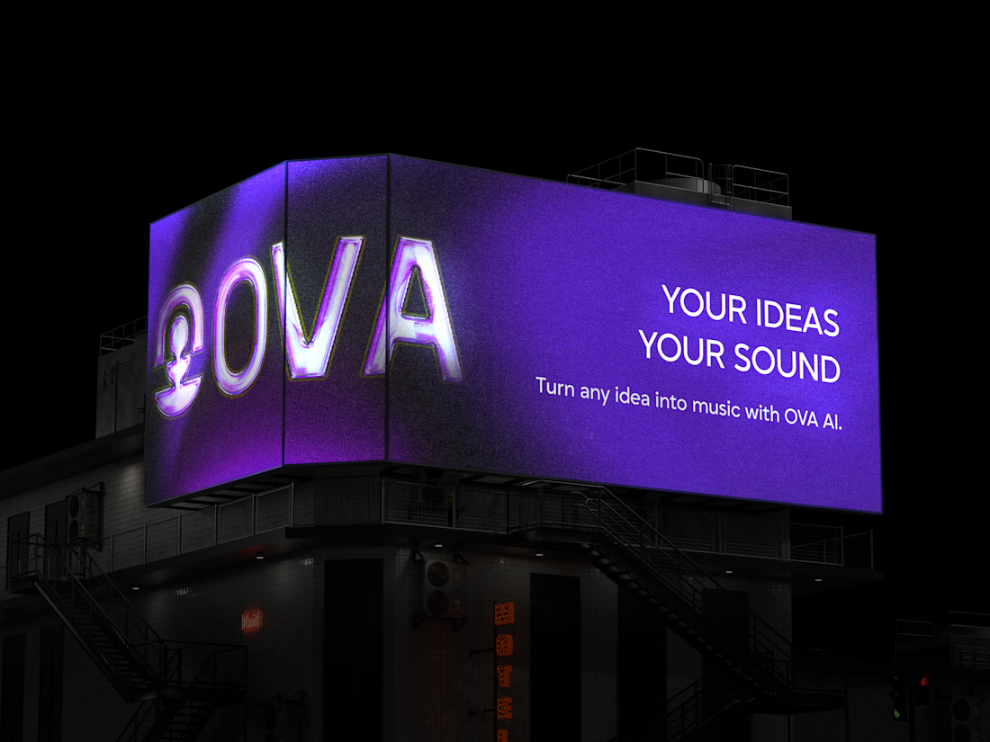
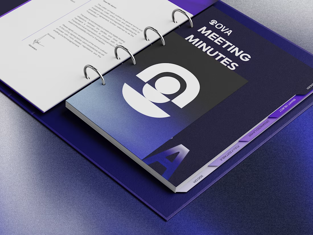

Love how you translated something as intangible as sound into the whole visual language. The gradients and fluid forms really make it feel like it’s moving even when it’s static. Really loved how this turned out!

thanks Kumari!😊

Wow! Love theseeee
The network for creativity
Join 1.25M professional creatives like you
Connect with clients, get discovered, and run your business 100% commission-free
Creatives on Contra have earned over $150M and we are just getting started











Related posts

FOCUS — Creative Portfolio & Digital Art Website 🌸✨
A visually expressive website concept for a creative portfolio, built around digital art, bold imagery, and visual storytelling
The design combines vibrant pink tones, soft gradients, experimental typography, and immersive photography to create a distinctive editorial experience
Special attention was given to:
• Bold editorial hero composition
• Vibrant pink and dark color palette
• Experimental typography and visual details
• Immersive photography and digital artwork
• Creative project gallery and navigation
• Responsive mobile experience
• Clean layouts with a strong visual identity
The result is an expressive digital experience that puts creativity, emotion, and visual storytelling at the center of every screen 💗
Looking to create a standout portfolio or website for a creative brand? Let’s connect 🚀






Figma Football
An unofficial football concept inspired by Figma and its visual language.
The ball was created using a custom 3D generator I built in ChatGPT, with animated interface icons and graphics developed with Claude.
Part design experiment, part exploration of how custom AI-powered tools can become part of the creative process.


The interface icons translate surprisingly well into a football identity.

The presentation on top. The process below. ⚡
A behind-the-scenes look at my Tesla Cybertruck presentation, with the finished animation playing alongside a sped-up view of how I built it in PowerPoint.
From arranging each slide to fine-tuning the Morph transitions, here’s the work behind the final result.

