The network for creativity
Join 1.25M professional creatives like you
Connect with clients, get discovered, and run your business 100% commission-free
Creatives on Contra have earned over $150M and we are just getting started
Back to feedPost

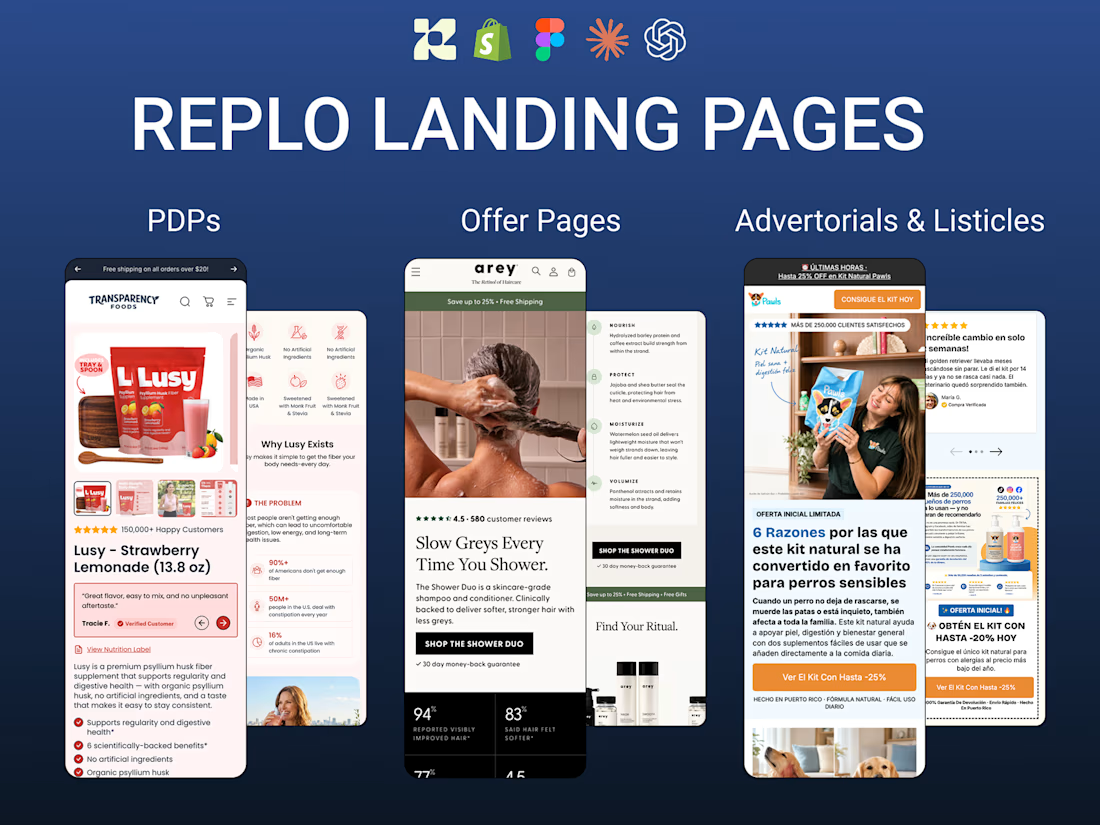
A selection of Replo projects I've developed for Shopify and DTC brands, covering PDPs, landing pages, offer pages, and educational listicles.
I've worked across multiple client workspaces, turning Figma designs, existing pages, and campaign briefs into responsive, launch-ready Shopify experiences.
Some examples include:
1. Transparency Foods — Supplement PDP
A product page combining ingredient education, bundles, subscriptions, UGC, social proof, and comparison sections.
2. Premium Accessories Brand — PDP
A premium product experience featuring product storytelling, compatibility information, bundle selection, and responsive Shopify implementation.
3. Arey — Hair Care Offer Page
A paid-traffic page combining product education, clinical proof, before-and-after imagery, testimonials, and conversion-focused sections.
4. Collagen Supplement Brand — Educational Listicle
An editorial-style pre-sale page explaining product benefits, ingredients, and mechanisms before introducing the offer.
Across these projects, my work covered Replo development, reusable sections, Shopify integration, responsive implementation, mobile optimization, and launch-ready QA.
My focus is on building pages that not only match the creative direction but also support the customer journey from ad click to purchase.


The network for creativity
Join 1.25M professional creatives like you
Connect with clients, get discovered, and run your business 100% commission-free
Creatives on Contra have earned over $150M and we are just getting started
Related posts

A website can look beautiful and still be difficult to use.
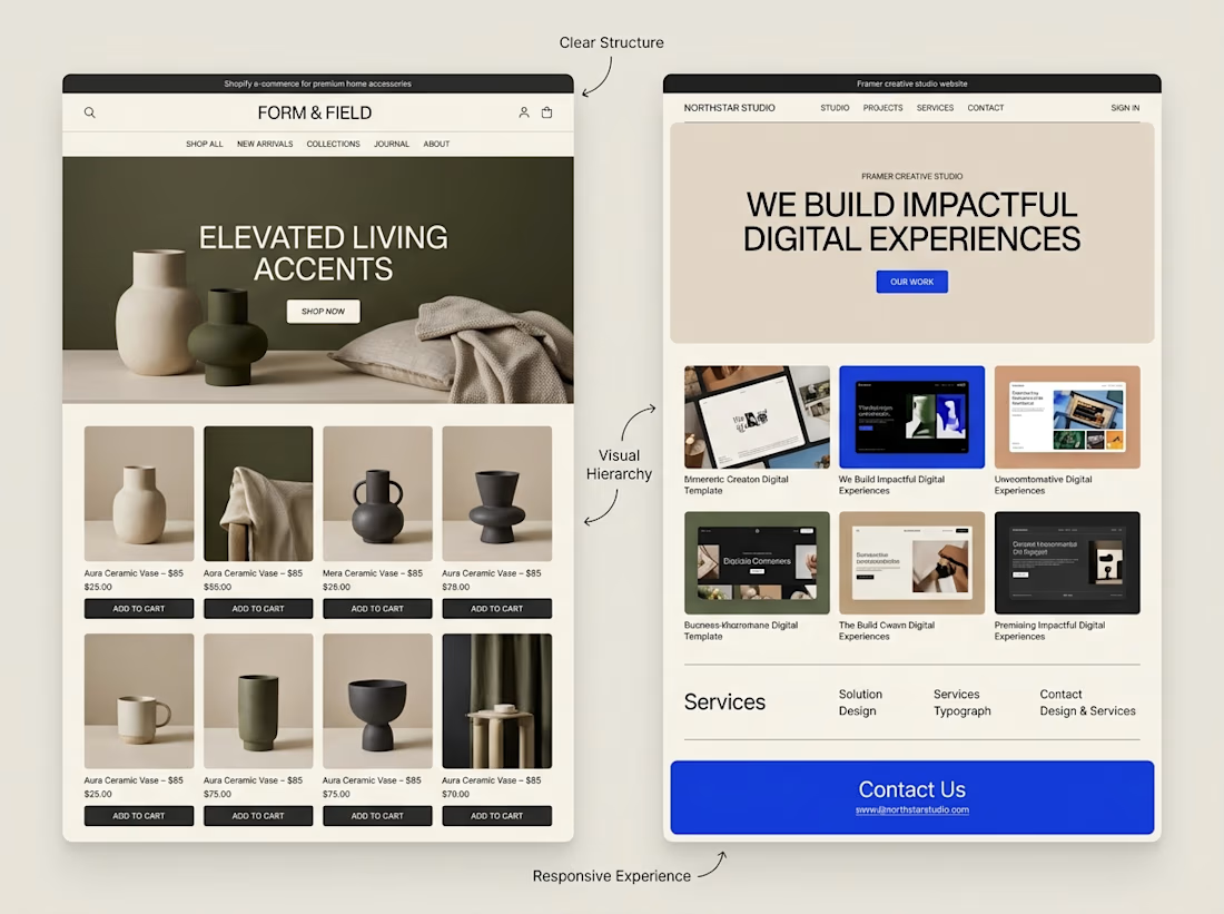
That's something I keep in mind when exploring both Shopify store design and Framer website design.
Although the platforms serve different purposes, some design principles apply to both:
→ Clear navigation helps visitors find their way.
→ Strong visual hierarchy makes important information stand out.
→ Thoughtful page structure creates a natural flow.
→ Responsive layouts help the experience work across screen sizes.
→ Clear calls to action help visitors understand what to do next.
The goal isn't simply to make a website look impressive.
It's to make the experience clear, useful, and easy to navigate.
I'm continuing to explore how these principles can be applied across different types of websites and projects.
What matters most to you when visiting a website, its visual design, its usability, or a combination of both?


Well said. Usability first, then visuals. Clear navigation wins me every time. 🙌

IPO Gateway landing page web design 3D animation website


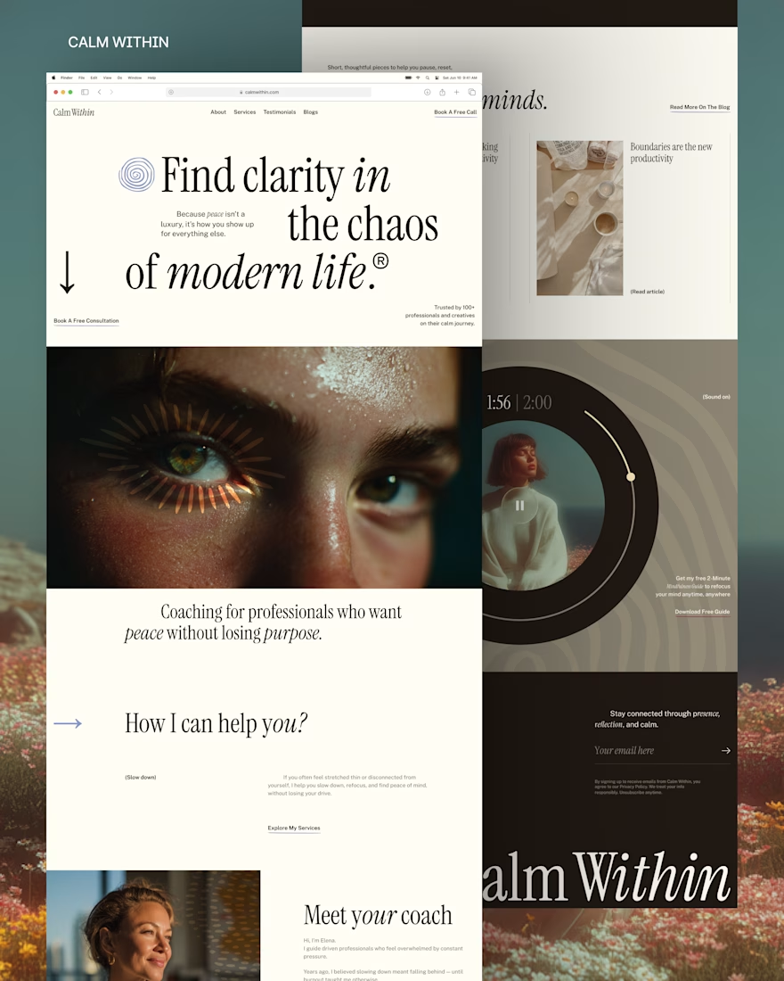
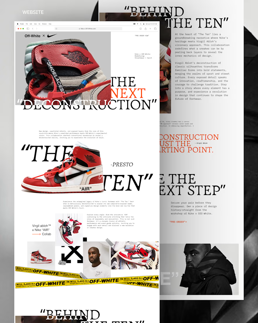
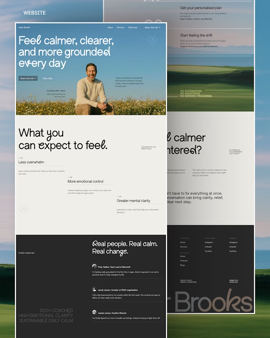
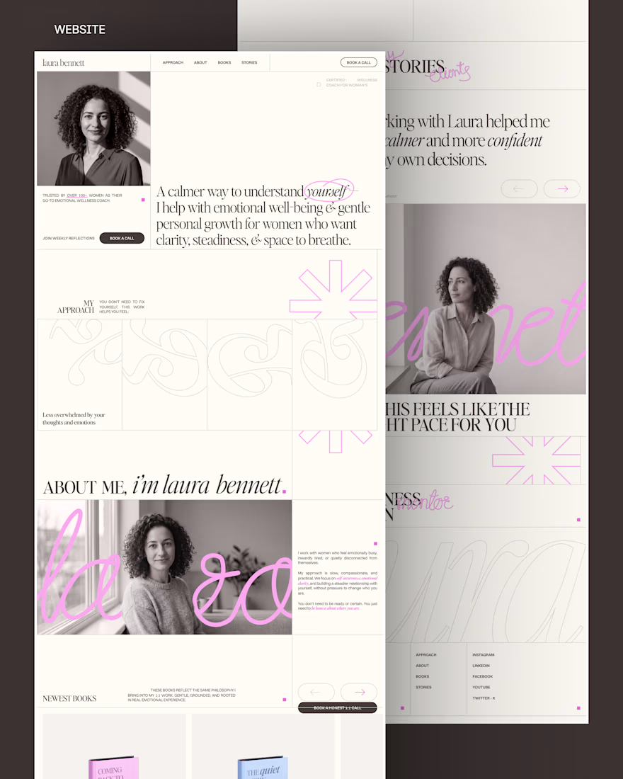
I design websites, build them in Framer, and also do branding
Here’s some of my recent work
See more at dhirajingle.com
DM me or book a call 🤝