The network for creativity
Join 1.25M professional creatives like you
Connect with clients, get discovered, and run your business 100% commission-free
Creatives on Contra have earned over $150M and we are just getting started
Back to feedPost

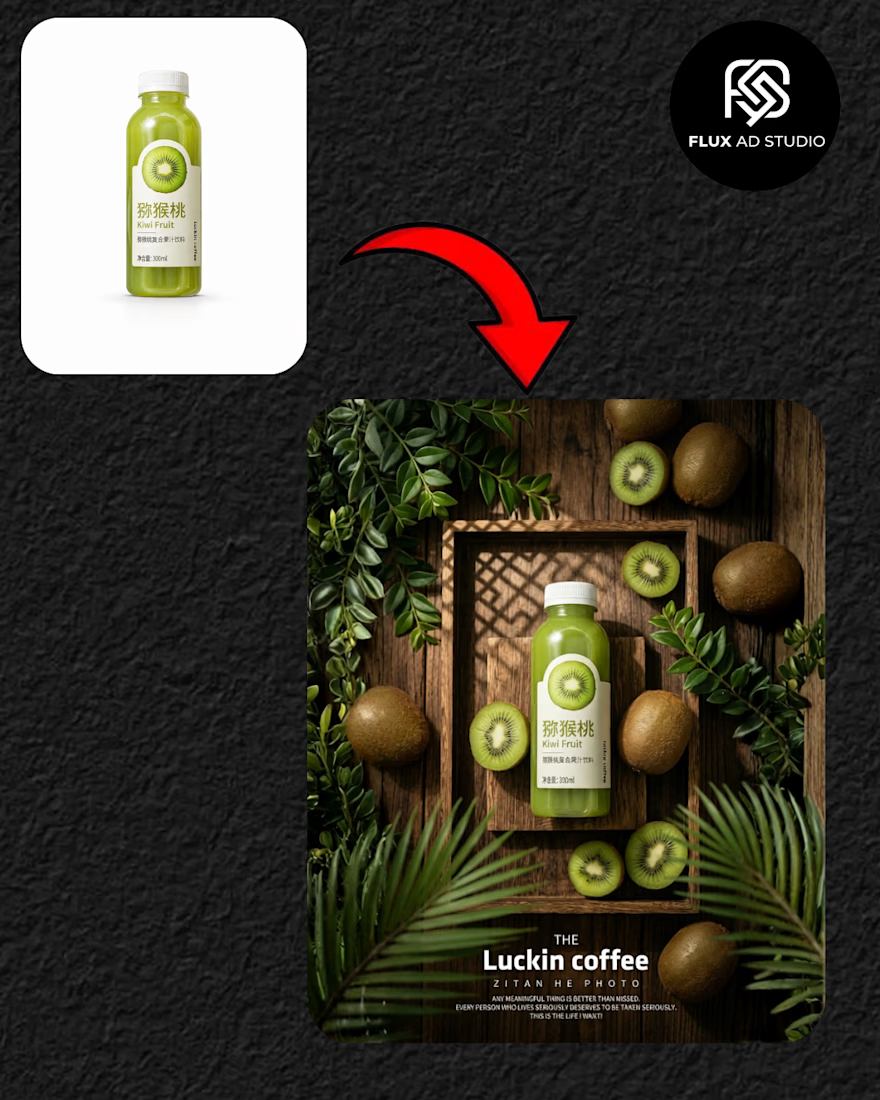
Improve Your Product Visual Branding 🚀✨
What it is:
I create high-quality product mockups and visual designs that showcase your product in a clean, premium style. 📦✨
Why it works:
These visuals grab attention and help build a strong, professional brand image, increasing trust and engagement. 📈🔥
Work with me:
Ready to upgrade your product visuals? DM me to get started. 💼🤝
#ProductDesign #VisualBranding #FreelanceDesigner #ProductAds #FluxAdStudio


The network for creativity
Join 1.25M professional creatives like you
Connect with clients, get discovered, and run your business 100% commission-free
Creatives on Contra have earned over $150M and we are just getting started





Related posts

Ceya Logo & Visual Identity, 2025.
Two offset circles, one idea: a partner that’s always alongside you. 🟢🔵
Full case study in my portfolio.
Got a project ? Let's talk about it.

Great visual identity it was so attractive and unique 🎉🎉🔥🔥

AI Video Generation - Futuristic Smartphone Ad | Vision Gen 2.0
Created a 30-second cinematic product ad for a futuristic AI smartphone concept. This video showcases "VISION GEN 2.0" - an AI model that generates video from text prompts.
Tools Used: AI Video Generation, Midjourney / Runway, After Effects, CapCut
Concept: Floating smartphone with holographic UI, neon blue tech environment, 4K cinematic lighting.
Features Highlighted: Prompt-to-Video, 120ms Latency, 70B Parameters, 4K Quality
Designed for tech startups, AI product launches, and futuristic mobile ads. Fully loopable, 4:3 aspect ratio optimized for Contra portfolio and social media ads.


Great


Turning complex AI workflows into a calm, monochrome experience, brought to life with motion. We'd love to hear your thoughts!


