The network for creativity
Join 1.25M professional creatives like you
Connect with clients, get discovered, and run your business 100% commission-free
Creatives on Contra have earned over $150M and we are just getting started
Back to feedPost

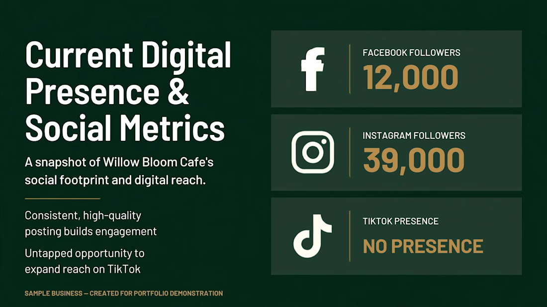
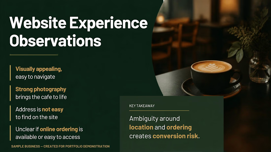
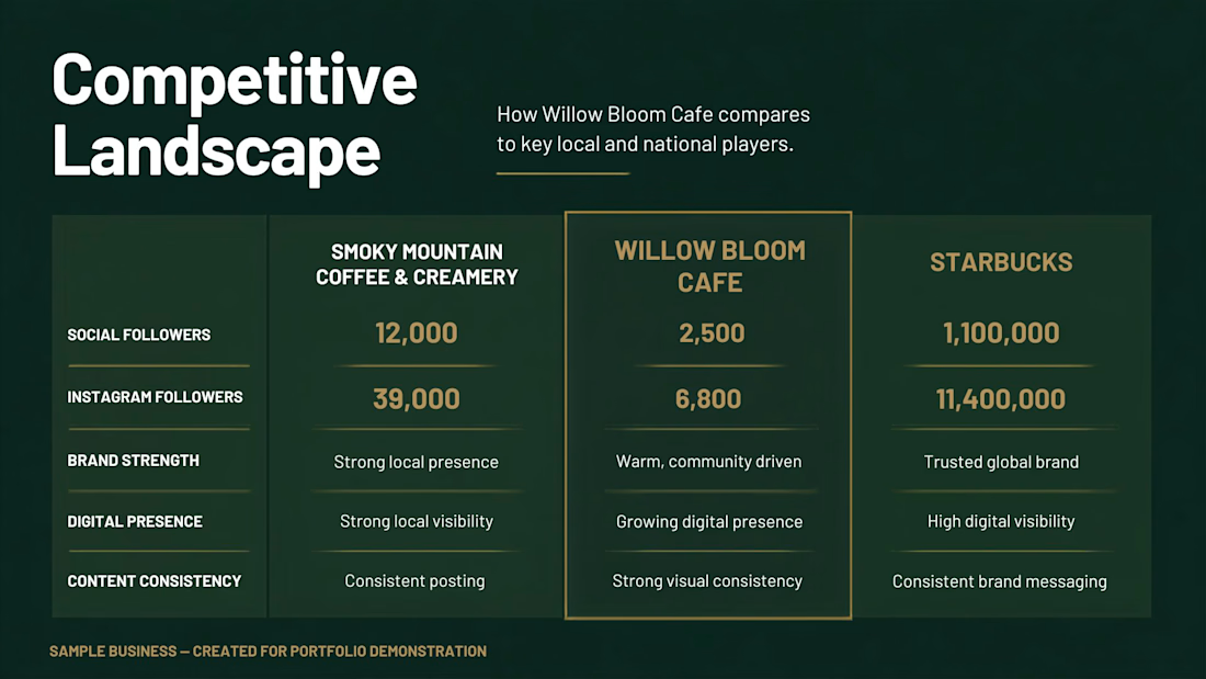
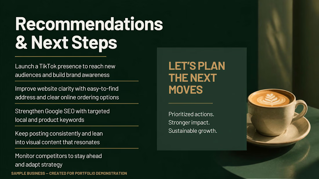
Small Business Marketing Audit for Willow Bloom Cafe, evaluating digital presence, social media performance, competitive positioning, and opportunities for growth. The audit provides practical findings and actionable recommendations to strengthen visibility, customer reach, and overall marketing strategy.

The network for creativity
Join 1.25M professional creatives like you
Connect with clients, get discovered, and run your business 100% commission-free
Creatives on Contra have earned over $150M and we are just getting started

Challenges
View all


Related posts

Aisha's Hair - Price List Flyer
I created a minimal and luxury price list flyer for a hair stylist brand.
Goal: Show prices clearly and make the brand look premium.
What I did:
Used elegant black and gold colors for luxury feel
Simple layout: Braids N15k, Wig Install N8k
Added Home Service Available for more bookings
Clean call to action: DM to book + WhatsApp
Tools: Canva
Result: A classy, easy-to-read price list that helps the client get bookings on Instagram and WhatsApp.
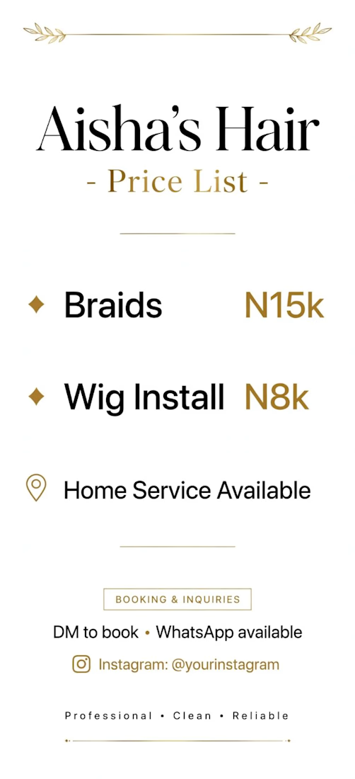

Putting the prices in gold rather than the service names is the choice doing the real work — the number becomes the accent instead of the thing you soften, which is the reverse of how most rate cards handle it. Hard numbers do date a flyer fast though; did she get an editable file so she can reprice without coming back to you?


What does “simple skincare” look like as a brand?
For Clairfair, I explored a soft, youthful visual identity built around a simple idea: care should feel gentle, approachable, and personal.
I developed the direction across the logo, typography, color palette, messaging, and facial-cream packaging keeping the system clean and minimal while adding subtle playful details through the soft pink palette, hearts, and expressive typography.
The goal wasn't to make skincare feel clinical or overly luxurious. It was to create something that feels friendly, confident, gentle, and easy to connect with.
I also explored how the identity could translate into a broader brand system rather than stopping at the logo.
Does this feel more like a skincare brand for teens, young adults, or both?

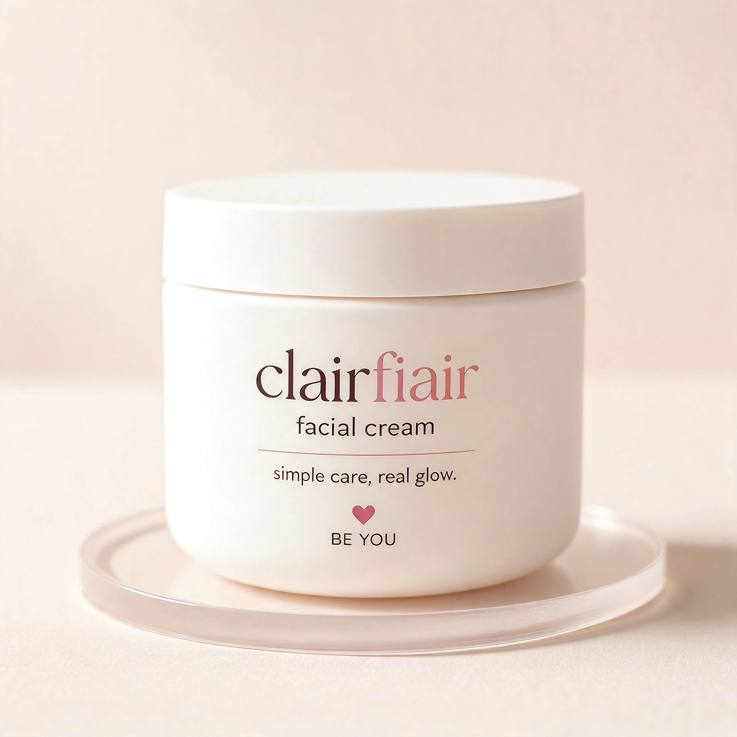
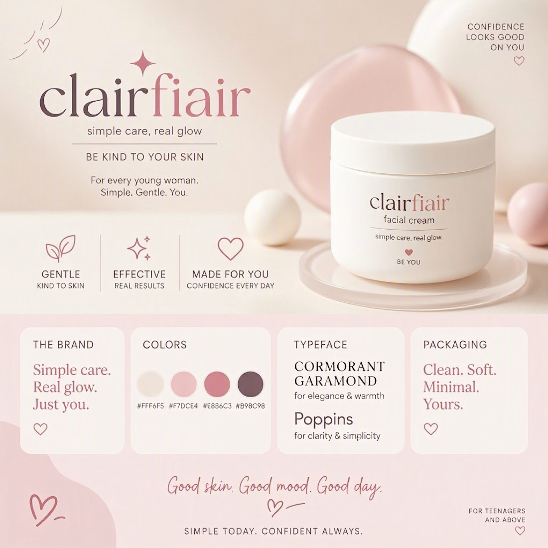
Teen-leaning to me, and the hearts are what tip it — they're the one element an older buyer would read as aimed at someone younger. The script wordmark and that muted rose palette on their own would sit fine in early-twenties territory. If you want it to stretch to both, the...

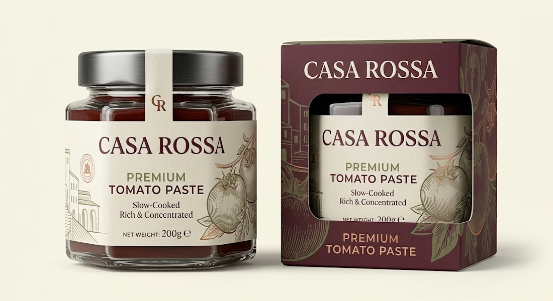
Premium Tomato Paste Packaging | Gourmet Food Label Design
Premium tomato paste packaging and food label design featuring a glass jar, custom carton, refined typography and a gourmet Mediterranean brand identity.
CASA ROSSA is a premium tomato paste packaging design created to give an everyday pantry product a more refined, gourmet presence. The concept was developed for a Mediterranean-inspired food brand that needed packaging capable of communicating quality, authenticity and craftsmanship while still feeling contemporary and commercially realistic.
The packaging system combines a heavy glass jar with a premium folding carton featuring a custom die-cut window. This allows the product and branded jar label to remain visible while giving the overall presentation a stronger retail presence. A paper tamper seal extending across the metal lid adds another layer of detail and helps create a complete, professionally considered food packaging design.
The visual identity uses warm cream, deep burgundy, muted olive and subtle copper accents to establish a sophisticated Mediterranean character. Elegant serif typography gives CASA ROSSA a distinctive premium personality, while clean supporting typography keeps important product information such as Premium Tomato Paste, Slow-Cooked, Rich & Concentrated and net weight easy to read.
Custom engraved-style tomato illustrations and subtle architectural linework were incorporated into the food label design and outer carton. Rather than relying on food photography or excessive decorative elements, the packaging uses controlled illustration, typography and negative space to create shelf appeal.
Special attention was given to how the jar label and secondary carton work together as one cohesive product packaging system. The burgundy carton provides strong shelf recognition, while its die-cut window reveals the cream jar label and creates visual contrast. This makes the design suitable for gourmet supermarkets, specialty food stores, premium pantry brands and direct-to-consumer food products.
This project demonstrates my approach to food packaging, tomato paste packaging, jar label design, food label design, folding carton packaging and retail packaging design. The goal is not simply to make packaging attractive, but to build a clear visual hierarchy that communicates the product category, positioning and value within seconds.
The CASA ROSSA concept also demonstrates how premium materials and print finishes can elevate food branding. Textured uncoated paper, subtle foil detailing, embossed branding and a matte carton finish were considered to reinforce the artisanal positioning without making the package feel overly traditional.
For food and beverage brands, I can develop complete packaging systems covering product label design, jar packaging, food box design, carton packaging, print-ready packaging artwork, dielines, brand identity and realistic 3D packaging mockups.
The final result is a sophisticated, shelf-ready tomato paste identity designed to feel authentic, premium and commercially credible.