The network for creativity
Join 1.25M professional creatives like you
Connect with clients, get discovered, and run your business 100% commission-free
Creatives on Contra have earned over $150M and we are just getting started
Back to feedPost

Premium Tomato Paste Packaging | Gourmet Food Label Design
Premium tomato paste packaging and food label design featuring a glass jar, custom carton, refined typography and a gourmet Mediterranean brand identity.
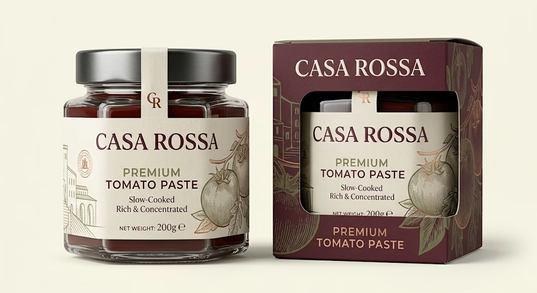
CASA ROSSA is a premium tomato paste packaging design created to give an everyday pantry product a more refined, gourmet presence. The concept was developed for a Mediterranean-inspired food brand that needed packaging capable of communicating quality, authenticity and craftsmanship while still feeling contemporary and commercially realistic.
The packaging system combines a heavy glass jar with a premium folding carton featuring a custom die-cut window. This allows the product and branded jar label to remain visible while giving the overall presentation a stronger retail presence. A paper tamper seal extending across the metal lid adds another layer of detail and helps create a complete, professionally considered food packaging design.
The visual identity uses warm cream, deep burgundy, muted olive and subtle copper accents to establish a sophisticated Mediterranean character. Elegant serif typography gives CASA ROSSA a distinctive premium personality, while clean supporting typography keeps important product information such as Premium Tomato Paste, Slow-Cooked, Rich & Concentrated and net weight easy to read.
Custom engraved-style tomato illustrations and subtle architectural linework were incorporated into the food label design and outer carton. Rather than relying on food photography or excessive decorative elements, the packaging uses controlled illustration, typography and negative space to create shelf appeal.
Special attention was given to how the jar label and secondary carton work together as one cohesive product packaging system. The burgundy carton provides strong shelf recognition, while its die-cut window reveals the cream jar label and creates visual contrast. This makes the design suitable for gourmet supermarkets, specialty food stores, premium pantry brands and direct-to-consumer food products.
This project demonstrates my approach to food packaging, tomato paste packaging, jar label design, food label design, folding carton packaging and retail packaging design. The goal is not simply to make packaging attractive, but to build a clear visual hierarchy that communicates the product category, positioning and value within seconds.
The CASA ROSSA concept also demonstrates how premium materials and print finishes can elevate food branding. Textured uncoated paper, subtle foil detailing, embossed branding and a matte carton finish were considered to reinforce the artisanal positioning without making the package feel overly traditional.
For food and beverage brands, I can develop complete packaging systems covering product label design, jar packaging, food box design, carton packaging, print-ready packaging artwork, dielines, brand identity and realistic 3D packaging mockups.
The final result is a sophisticated, shelf-ready tomato paste identity designed to feel authentic, premium and commercially credible.



This is really awesome
The network for creativity
Join 1.25M professional creatives like you
Connect with clients, get discovered, and run your business 100% commission-free
Creatives on Contra have earned over $150M and we are just getting started





Related posts

Real Estate Website
The villa stands in front of the name, on purpose.
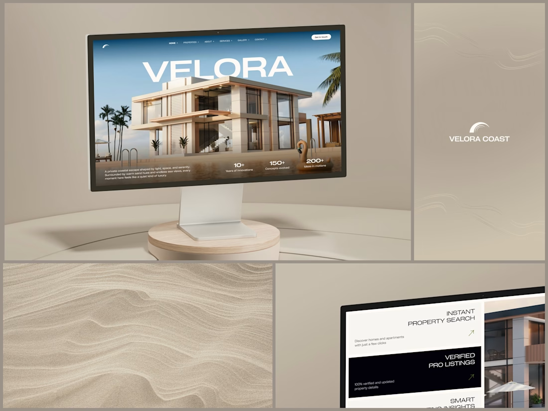
The hero is one wide image of a modern villa under a blue sky, with palms at the sides and a pool in front. The name runs across the sky in wide white capitals, and the roof covers the bottom of the middle letters. It still reads at a glance, and the house keeps the foreground.
Lower on the page, the feature cards alternate cream and black, so it is clear where one card ends and the next begins. Each heading repeats the wide capitals of the name, aligned right, with a short line of copy and a small green arrow.
Designed by the Hue & Machine team.
#RealEstate #Architecture #RealEstateWebsite #WebDesign #LandingPage #HeroSection #Typography #UIDesign #DesktopDesign #FigmaDesign


This looks so premium! Love the concept of the villa standing in front of the name on purpose, it makes the hero feel so bold and confident. The wide image, the blue sky, palms and pool, everything feels luxurious but still clean. And the way VELORA runs across the sky in big...


This looks amazing


Has AI taken my job yet? 👀
As a designer, I feel like I constantly need to keep up with new tools and products, if only to keep my "has a computer replaced me already?" anxiety under control
At first, we expected AI to do everything with one click
Then we moved on to writing ridiculously long and detailed prompts
And now I feel like we're finally getting to a healthier place with our expectations: build a good system → get good results
I went to play with Recraft's new Logo Maker to see if AI can actually make decent logos now
Weeeeell, you can see the result for yourself! 🤩
Sure, it's not a magic button that reads your mind and does everything for you. But if you have a clear sense of your brand's style and personality, the results can be surprisingly good
Left - my usual aesthetic. Right - Recraft's take on me
So, what do you think of my one-click logo?
Does it feel like me? 🪩✨



“Build a good system, get good results” is exactly where I’ve landed too. The tool only goes as far as your sense of what you’re after. How many tries did it take to get there?