The network for creativity
Join 1.25M professional creatives like you
Connect with clients, get discovered, and run your business 100% commission-free
Creatives on Contra have earned over $150M and we are just getting started
Back to feedPost
How I Built a Fintech-Style Checkout Page With Only HTML & CSS
Negative margins, pseudo-elements and keyframe animations, with zero JavaScript.
INTRO:
A good checkout UI builds trust before a user types a single digit. Here is how I built a polished payment form UI using nothing but HTML and CSS, and the small details that make it feel professional. (It is a UI demo: it does not process payments.)
OUTLINE:
The layout: header, amount card, options, card form
The floating card with a negative margin
Decorative circles with ::before and ::after
The focus pulse animation with @keyframes
Hover lift effects
Making it responsive under 480px
What a real checkout needs: validation and a payment provider
KEY SNIPPET (for Hashnode):
.middle-box {
margin: -35px 30px 25px;
position: relative;
z-index: 2;
}
TAGS: CSS, Web Development, Frontend, HTML, UI Design


zero javascript for the keyframe stuff is kind of a flex

Haha thanks Benjamin! 🙌 Keyframes can do way more than people expect, no JS needed. What’s the coolest thing you’ve seen built with pure CSS?
The network for creativity
Join 1.25M professional creatives like you
Connect with clients, get discovered, and run your business 100% commission-free
Creatives on Contra have earned over $150M and we are just getting started



Related posts

Photographer Portfolio Website
"Capturing light, emotion, and the moments you never want to forget." That line set the tone, and the layout follows it.
The hero is one motion-blurred portrait washed in red. The photographer's name runs across the bottom in a condensed white face, so large the screen cuts it off. The photo keeps its soft focus, and the name still reads first.
Thin grid lines split the page into narrow columns, and the small copy sits justified inside them. The loose photo gets a strict structure to lean on.
A single round red button with an arrow sits right on the letters and marks where to go next.
Designed by the Hue & Machine team.
#WebDesign #Photography #PortfolioWebsite #EditorialDesign #Typography #UIDesign #ProductDesign #CreativeDirection #ResponsiveDesign #FigmaDesign


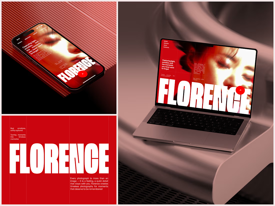

The heavy condensed white FLORENCE over the red portrait is bold, and keeping the same red across phone, laptop and type tile makes the case study read as one system. Did the red come from the photographer's own work, or was it your call?

Kajabi Life Coach Website Design & Development
The client needed a professional website that would communicate their life coaching services more effectively, build trust with potential clients, and make it easier for visitors to understand their coaching approach and take the next step.
I helped bring this vision to life by designing and developing a Kajabi website with a welcoming visual direction, clear content structure, and intuitive navigation. The focus was on presenting the coaching services in a more engaging way, creating a smoother visitor experience, and making it easier for prospective clients to connect with the coach and explore available opportunities for personal growth.
#Kajabi #KajabiWebsiteDesign #KajabiExpert #LifeCoach #LifeCoaching #LifeCoachWebsite #CoachingWebsite #PersonalDevelopment #PersonalGrowth #CoachingBusiness #WebsiteDesign #WebsiteDevelopment #WebDesign #ResponsiveWebDesign #OnlineCoaching #BusinessWebsite #UXDesign #UIUXDesign

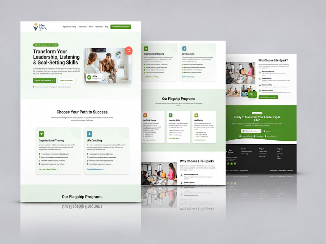

Love how clean and intentional everything feels.

AI Health & Wellness Companion App
Vita is a concept mobile app that makes personal health feel calm, clear, and human. Instead of overwhelming users with charts and numbers, it uses a soft, glass morphic interface and gentle motion to turn daily health data into simple, actionable guidance.
AI VIsual DesignerMobile DesignUI DesignAdobe After EffectsClaudeFigmamobileappdesignhealthappmobileapp

