The network for creativity
Join 1.25M professional creatives like you
Connect with clients, get discovered, and run your business 100% commission-free
Creatives on Contra have earned over $150M and we are just getting started
Back to feedPost
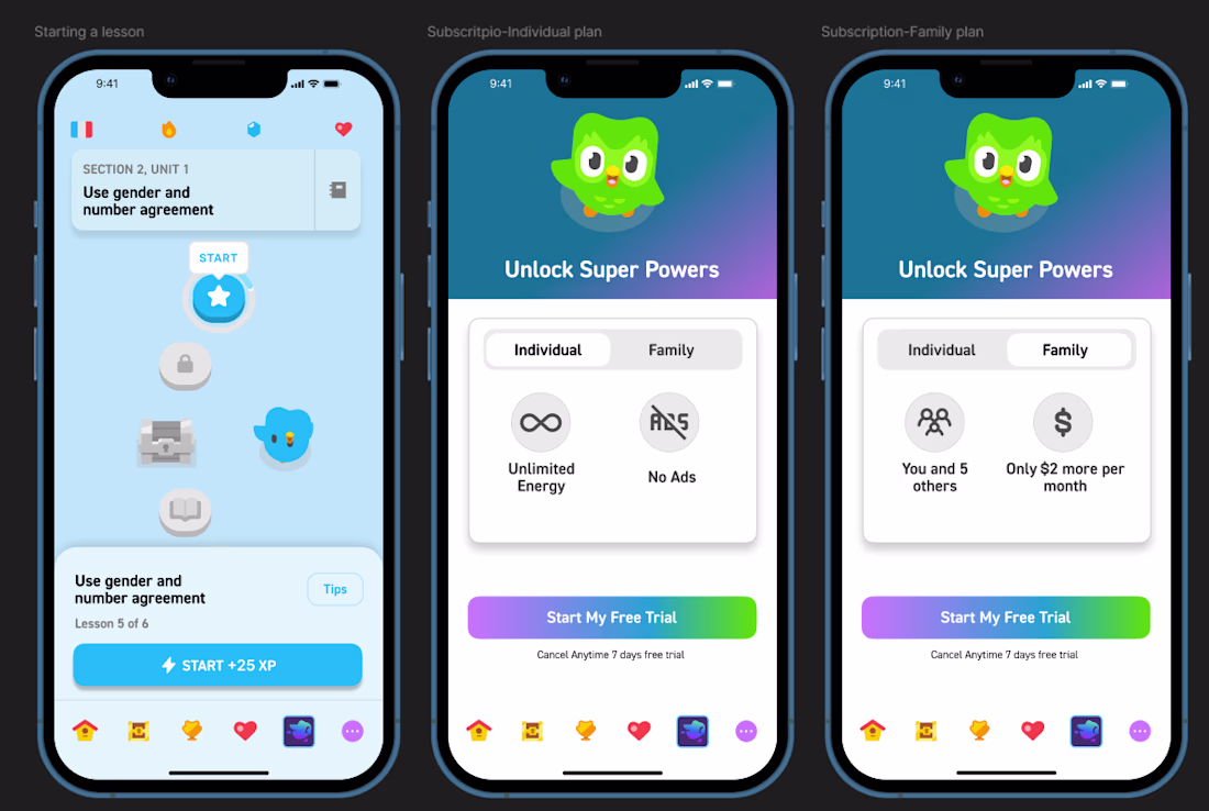
Unsolicited Redesign: What if Duolingo felt more... magic? ✨
I’ve been experimenting with Glassmorphism and modern UI trends, and I wanted to see how they would apply to a mass-market app like Duolingo.
The current app is iconic, but I felt the "Super" experience could feel more premium.
Design Decisions:
1. Immersive Map: I removed the opaque overlays to keep the learning path visible and engaging.
2. Simplified Decision Making: On the subscription screen, I grouped plans into a toggle to reduce cognitive load.
No client brief, just me having fun in Figma. 🎨
Thoughts on this direction?
#UIUX #VisualDesign #AppDesign #Concept #Figma
The network for creativity
Join 1.25M professional creatives like you
Connect with clients, get discovered, and run your business 100% commission-free
Creatives on Contra have earned over $150M and we are just getting started
Related posts
Packing the next case study - which opener actually makes you stop? 👇
#mobiledesign #fintech #figma #uxui
79 voted
88%
11 voted
12%
90 votes
Closed
Obviously the mobile preview
I wanted the coming soon page to show the idea without overexplaining it
So instead of writing a giant product manifesto (yet),
I added a small playground
You can move the sliders and see how the visual keeps shifting
Same base 🤝 different settings
Scale, density, or contrast can change the whole direction
That's my favorite - how many versions can come from even one small effect
Come play with it 🙌
aftrglo.app
Really like the idea of turning the “coming soon” page into an interactive playground instead of a static teaser.
The “same base, different settings” concept feels much more engaging than over explaining the product upfront.
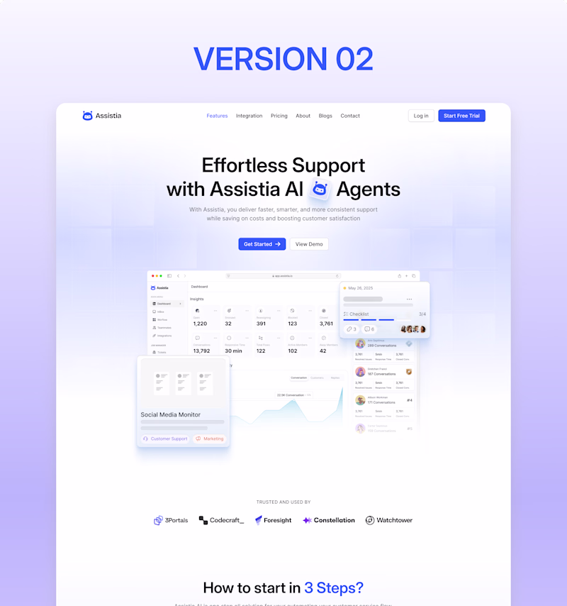
I'm going with version 2
Trending
Claude
Claude has entered the design space. How are you using Claude Design?
Contra University
Learn from expert creatives how to earn more using next-gen AI tools.
creativeaiflow
Creative AI workflows are evolving. What tools do you use, and what are their strengths and weaknesses?
portfolioreview
The best portfolios tell a story, not just show a grid. Share yours for feedback.
freelancerlife
Freelancer life is wins, pivots, and everything in between. What’s yours right now?