The network for creativity
Join 1.25M professional creatives like you
Connect with clients, get discovered, and run your business 100% commission-free
Creatives on Contra have earned over $150M and we are just getting started
Back to feedPost
Most coffee brands compete on intensity. Bold colors, aggressive typography, slogans built around hustle and momentum. Even premium specialty brands tend to lean on origin stories, roasting data, and café culture aesthetics.
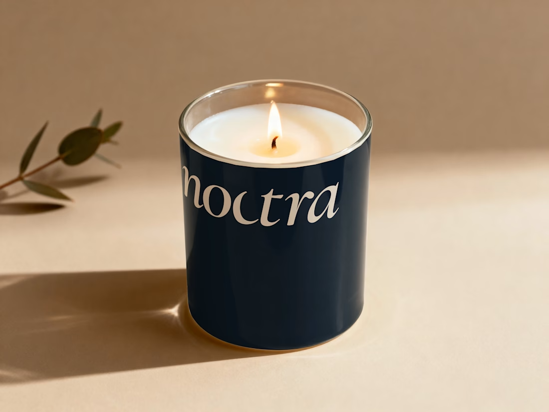
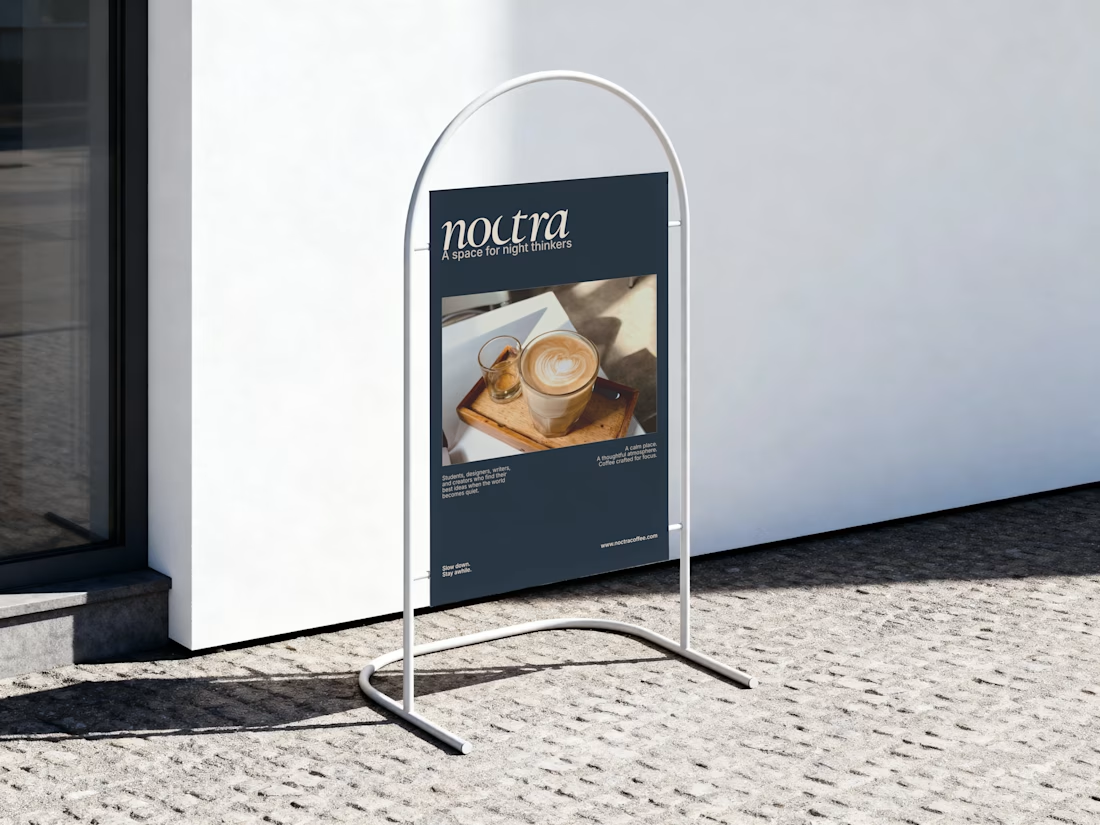
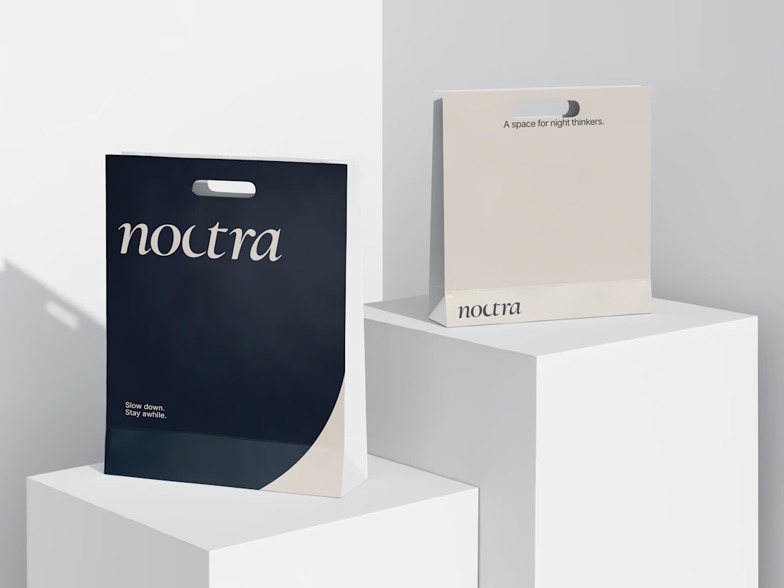
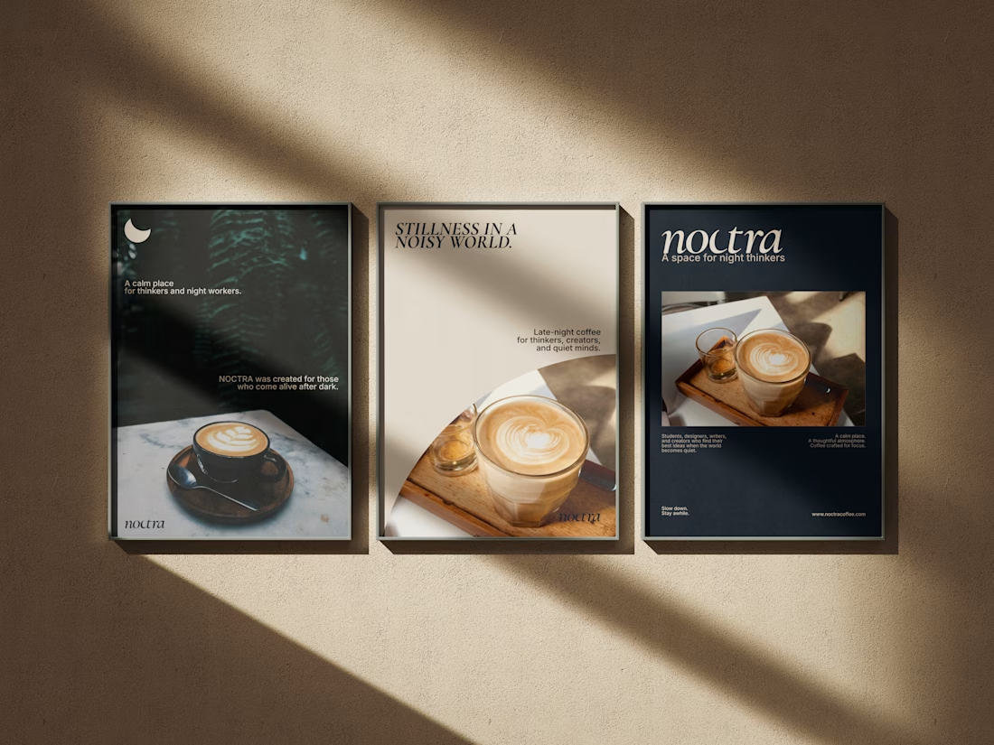
Noctra is a specialty coffee brand built for the quiet hours — the moments between dusk and dawn when the world slows down and you finally have time to just exist. In a market that shouts energy, speed, and productivity, Noctra whispers something different: stillness is not emptiness. Darkness is not absence. And a good cup of coffee deserves more than a rushed morning.
The goal was to build a brand that feels like the last hour before sleep or the first hour before the world wakes — warm, intentional, and deeply present.



That's amazing 🤩

Thank you so much.

This brand stands out and had amazing design
Thank you
The network for creativity
Join 1.25M professional creatives like you
Connect with clients, get discovered, and run your business 100% commission-free
Creatives on Contra have earned over $150M and we are just getting started



Related posts

Rebuilt my portfolio with AI and added new case studies.
Brand, web, and product UI. All custom coded, all in one page.

One page with brand, web and product UI together is a strong move. Clients see the range without clicking around. Rebuilding mine with AI coding tools taught me the same thing: the speed lets you spend the saved time on the case study writing, which is what actually wins work.


Branding & Visual Identity for AirCon West based in London.
Designers! Present your work with motion! It breathes life into your work and conveys your ideas in a dynamic way.
Use free online motion tools to do it.
My favorites:
https://animos.app/
https://arqe.ai/
https://orelin.app/editor
https://openvid.dev/en
(Or animate it yourself, like I did here using EffectCraft!)


Nice work!!

A website hero and motion identity concept for Cycle.
The experience takes the viewer through seven historical eras in one continuous forward journey, while the logo, camera path and core composition remain consistent.
The concept explores how a static identity can become a living digital experience through motion, environment and interaction.
Workflow included Spline, Claude via MCP, Midjourney and SeaDance.
Available for brand identity, motion and digital design projects.


I fall in love, It is like Encarta, but 1000% better