The network for creativity
Join 1.25M professional creatives like you
Connect with clients, get discovered, and run your business 100% commission-free
Creatives on Contra have earned over $150M and we are just getting started
Back to feedPost
Sometimes, companies face challenges that make them believe it's impossible to implement in reality. However, with inner faith, nothing is impossible in this life, provided there's faith in science and planning. This has been proven in practice. Let's see what has been achieved.
✨ Client's Field of Work and Practical Explanation
** UI/UX (User Interface and User Experience) Design
** Simplified Explanation:**
UI (User Interface): This refers to the "appearance and aesthetics," such as choosing wall colors, chair styles, and lighting in a physical store.
UX (User Experience): This refers to the "convenience and ease of use," such as arranging supermarket shelves so that sugar is placed next to tea for quick and easy access.
In the Digital World: This field transforms complex and boring websites into attractive and user-friendly pages, so that visitors click the "Buy" button happily and without frustration.
2. What Does the Client Want in Detail?
A) Problems and Reasons:
The client runs a rapidly growing startup called Zorven, which specializes in designing e-commerce storefronts, automation systems, and control panels. The company faces three main challenges:
Lack of Skilled Talent: Startups need numerous designs quickly, but budgets don't allow for hiring highly paid experts.
Time Pressure and Rapid Growth: A large number of clients and a heavy workload necessitate the development of a "business plan" from designers trained in the Zorven methodology.
Implementation Gap: Some designers are content with sketching on paper, while the client needs practical, implementable designs ready to become real websites.
B) Client Objectives:
Talent Business Plan: Train designers for three months in Zorven methodologies, then select the best and hire them permanently.
Landing Pages and Control Panels: Transform complex programming ideas into simple, user-friendly control panels and storefronts.
Interactive Forms via Framer: Design animated forms that interact with users, not just static images.
--
3. Practical Real-Life Benefits
For Everyday Users: A poorly designed food delivery app frustrates users. A smart app with a user interface/user experience that displays best-selling meals and a large green "Order Now" button leads to instant purchases.
For Business Owners: A clothing store that receives 1,000 visitors daily but has low sales can increase conversions from 5% to 50% by improving the checkout page design.
For Professionals: A hospital dashboard designed with clear colors (red for critical cases, green for stable cases) saves lives by preventing misinterpretation of patient data.
4. How to Achieve Customer Goals
User Research: Understanding Zorven's customers, their preferences, and their problems.
Structural Design: Black and white designs to test user journeys.
UI Design: Applying Figma's colors, fonts, and visual identity.
Prototypes and Frameworks: Design interactive and realistic prototypes.
Design System: Document all buttons, colors, and components for easy reuse by developers.
5. Free Tools and Resources
Figma: The primary tool for collaborative design of pages, icons, and dashboards.
Feature: Instant collaboration and professional UI/UX design.
Cost: Free for individuals and small projects.
6. Robust Integration (Fast Logic)
The description is written in a closed loop that connects the client's problems to Figma's technical capabilities:
Identity and Output: The sidebar includes storefronts, automation systems, and dashboards—all aligned with the Zorven brand identity.
User Path: The user path from the homepage to the dashboard ensures a high conversion rate.
Technical Integration: The atomic design system, boundary radius, and twelve-column grid ensure a seamless export from Figma to Framer.
Color Psychology: Dark backgrounds with neon pink/blue accents reflect speed, AI, and automation.
Main Title:
"The Future of E-commerce Is Here: Build Your Perfect Online Store in Minutes" - Aligns with Zorven's vision and identity.
Solves customer problems (time, complexity).
Serves as a powerful marketing tool to increase conversions.
Facilitates a smooth transition to Framer prototypes.
Project Challenges:
Data Sync and Transfer to Framer (Framer Sync): The biggest challenge is transferring the complex, data-heavy dashboards and tables from Figma to Framer. Sometimes dimensions become distorted or subtle micro-interactions are lost during transfer, requiring extremely precise software naming of layers and organization of the auto-layout. Balancing the Onboarding Funnel Experience: The challenge: Since we eliminated traditional sign-up buttons and relied on an instant setup wizard, the challenge was to make the store-building process short and engaging. If the user felt the questions were too numerous and tedious, they would abandon the site before even reaching the email entry step. Data Hierarchy in Complex Dashboards: The challenge: The client company is building automation and store systems, which contain massive amounts of numbers, charts, and data records. The challenge here is to visually structure this data in a dark theme that is easy on the eyes and highlights the most important information (such as bugs in red, sales in green) without creating visual clutter. Time and Scalability: The challenge: Building a complete "Atomic Design System" containing hundreds of elements and buttons in various states (Hover, Active, Disabled) for both mobile and desktop versions is a significant time challenge that requires strict time management to create it professionally and without a single pixel error within a few days.
Solutions (detailed explanations of solutions): Advanced Structure for Exporting to Framer: Solution: To avoid any dimensional distortion during transfer,The advanced Auto-layout and Absolute Positioning features of Figma were fully utilized. All layers were named using standard CSS code, ensuring a seamless and 100% error-free transition to the Framer platform. Gamification: To address user boredom, the setup wizard was broken down into three small, engaging visual steps. These steps utilize a "gradual disclosure" approach with subtle interactive animations, fostering a sense of accomplishment and speed, and encouraging enthusiastic participation. Simplifying complex dashboard data: A robust information chunking system and a standardized font size were implemented to organize data tables and analytics. By limiting the use of high-contrast neon colors to interactive buttons and critical alerts only, the background remains eye-friendly and free of visual noise. Developing rapidly scalable component libraries: Solution: To overcome time constraints, we utilized Figma's Local Variables and Component Variants features with predefined responsive constraints. This allows for simultaneous generation of desktop and mobile interfaces, saving approximately half the development time.
The network for creativity
Join 1.25M professional creatives like you
Connect with clients, get discovered, and run your business 100% commission-free
Creatives on Contra have earned over $150M and we are just getting started
Related posts
Good Job
Had a fun weekend building Merisole ☀️
Designed with Google Stitch.
I'm a senior product designer working on e-commerce sites every day, so my real question going into this challenge was practical: how easily does Stitch slot into my actual workflow? Could I use it to spin up a polished, client-ready option in a single sitting or even take it all the way to a shippable site?
To test that, I asked AI to create a fictional footwear brand, Merisole, and treated it like a real client project from brief to launch.
How Stitch fit into the workflow
Before generating anything, I wrote a custom design.md. Type scale, color tokens, spacing rhythm, the editorial tone I wanted Merisole to carry and uploaded it into Stitch as a design system. That single step is what made the rest of the build feel coherent.
Every screen Stitch streamed onto the canvas already spoke the brand's language, so I wasn't fighting drift between sections. This is exactly the part of my normal e-com workflow that usually eats hours! Getting AI tools to respect a brand spec was something that Stitch handled cleanly.
By the way, the stream on canvas feature was one of the coolest interactions I've seen so far! It was like having a designer design on your screen remotely through AnyDesk!
From there I worked mostly through in-place AI edits: clicking a section, telling Stitch "to add it to another variation," or "add a hover animation on the cards," and getting changes in seconds. The streaming generations meant I was reacting to a real interface taking shape instead of waiting for a static result.
The motion work is where Stitch surprised me most. Native hover states, shader backgrounds, and scroll-linked animation. All authored inside the tool, no handoff to a separate motion app, no code wrestling. Then I exported the build out to Netlify in one step.
New features I leaned on
Custom design.md - design system applied across the whole project (kept every screen on-brand from the first generation)
Streaming generations to canvas (the whole first pass)
In-place AI edits via prompts + point-and-click (most of the polish phase)
Native motion, hover states, and shaders on HTML canvas
Netlify export (final deploy)
Feedback on the platform
Coming at this from a daily e-com design seat: Stitch genuinely shortens the distance between brief and client-ready.
The design.md - design system flow is the underrated hero, uploading a brand spec once and having Stitch honor it across every streamed generation is the closest I've felt to "AI that respects a brand."
The streaming canvas is amazing to say the least!
It collapses the "describe - wait - judge - re-prompt" loop into something closer to direct manipulation. In-place edits felt the most like real design work. I stopped writing long prompts and just pointed at things. Two things I'd love next: An option to tweak elements without having to prompt it. And a way to save in-place edit "recipes" so I can reapply a vibe across sections without re-describing it.
Stitch didn't feel like an AI tool I was wrangling. It felt like a canvas that happened to understand what I meant. Merisole came together in a single sitting because of that, and I'm walking away convinced Stitch has a real place in how I'll pitch and build e-commerce work going forward.
Check it out:
Live site (really fun to click around): https://merisole.netlify.app
Stitch project: https://stitch.withgoogle.com/projects/834230787052196219
Amazing!
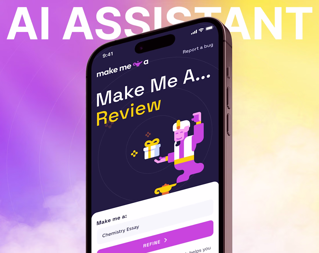
Designed the UI/UX for an AI assistant web app where the challenge wasn't the AI - it was taming 15+ customization settings without overwhelming users. Used progressive disclosure: new users see 3 settings by default, power users can expand the full suite without the interface ever feeling different.
The result is a product that scales with the user's comfort level instead of front-loading complexity.
The progressive disclosure approach for the AI settings is brilliant UX design! Starting with 3 settings and expanding for power users is exactly the right approach.
Challenges
View allTrending
Claude
Claude has entered the design space. How are you using Claude Design?
Contra University
Learn from expert creatives how to earn more using next-gen AI tools.
creativeaiflow
Creative AI workflows are evolving. What tools do you use, and what are their strengths and weaknesses?
portfolioreview
The best portfolios tell a story, not just show a grid. Share yours for feedback.
freelancerlife
Freelancer life is wins, pivots, and everything in between. What’s yours right now?