The network for creativity
Join 1.25M professional creatives like you
Connect with clients, get discovered, and run your business 100% commission-free
Creatives on Contra have earned over $150M and we are just getting started
Back to feedPost
Read fully🚨
Over the past few days, I’ve been building Partly - a browser-based virtual beach party where people can join instantly, create an avatar, explore a tropical island, chat in real time, dance to music, and hang out together.
The goal was simple: make online socializing feel more like being somewhere, rather than just sending messages.
🔗 Try Partly: https://partly.figma.site/
No downloads. No VR. Just join, meet people, and enjoy the party. 🌊
✨ Features:
• Real-time multiplayer world
• Live chat with other players
• Interactive beach environment
• Party stage with music
• Campfire hangout spots
• No downloads required
🚨 Best experienced on desktop for the full beach party experience.
Everything runs directly in the browser, making it easy for friends, communities, and creators to connect and share experiences together.
𝗛𝗲𝗿𝗲’𝘀 𝗠𝘆 𝗪𝗼𝗿𝗸𝗳𝗹𝗼𝘄
1️⃣ 𝗦𝘁𝗮𝗿𝘁𝗲𝗱 𝗶𝗻 𝗙𝗶𝗴𝗺𝗮 𝗠𝗮𝗸𝗲
I designed and built the entire Partly experience directly in Figma Make, focusing on creating a fun, social, and accessible virtual world that anyone could join instantly from a browser.
2️⃣ 𝗖𝗿𝗲𝗮𝘁𝗲𝗱 𝗮 𝗩𝗶𝗿𝘁𝘂𝗮𝗹 𝗕𝗲𝗮𝗰𝗵 𝗪𝗼𝗿𝗹𝗱
I designed a tropical island environment featuring beaches, a party stage, campfire areas, social spaces, interactive furniture, exploration zones, and landmarks to make the world feel alive.
3️⃣ 𝗕𝘂𝗶𝗹𝘁 𝗥𝗲𝗮𝗹-𝗧𝗶𝗺𝗲 𝗠𝘂𝗹𝘁𝗶𝗽𝗹𝗮𝘆𝗲𝗿 𝗜𝗻𝘁𝗲𝗿𝗮𝗰𝘁𝗶𝗼𝗻𝘀
Players can:
• Create an avatar
• Explore the island
• Chat in real time
• Dance and socialize
• Sit on furniture
• Meet other players instantly
• Experience a shared virtual world together
4️⃣ 𝗜𝗻𝘁𝗲𝗴𝗿𝗮𝘁𝗲𝗱 𝗦𝘂𝗽𝗮𝗯𝗮𝘀𝗲
Supabase powers:
• User data
• Chat systems
• Player information
• Backend services
• Real-time data synchronization
5️⃣ 𝗜𝗻𝘁𝗲𝗴𝗿𝗮𝘁𝗲𝗱 𝗬𝗼𝘂𝗧𝘂𝗯𝗲 𝗔𝗣𝗜
I built a virtual concert experience with:
• Embedded YouTube playback
• Shared music experiences
• Continuous playlists
• Party-stage entertainment
6️⃣ 𝗗𝗲𝘀𝗶𝗴𝗻𝗲𝗱 𝘁𝗵𝗲 𝗣𝗮𝗿𝘁𝘆 𝗘𝘅𝗽𝗲𝗿𝗶𝗲𝗻𝗰𝗲
I created a virtual concert area with:
• Giant music stage
• Interactive dance floors
• Dynamic lighting
• Social gathering spaces
• Beach party atmosphere
7️⃣ 𝗖𝗿𝗲𝗮𝘁𝗲𝗱 𝗮 𝗟𝗶𝘃𝗶𝗻𝗴 𝗪𝗼𝗿𝗹𝗱
To make the island feel active and realistic, I added:
• NPC characters
• Social behaviors
• Campfire gatherings
• Beach activities
• Interactive seating
• Environmental landmarks
8️⃣ 𝗖𝗼𝗻𝘁𝗶𝗻𝘂𝗼𝘂𝘀 𝗜𝘁𝗲𝗿𝗮𝘁𝗶𝗼𝗻
I continuously refined the world through prompts, improving the environment, multiplayer experience, NPC behaviors, interactions, UI, performance, and overall immersion.
𝗕𝘂𝗶𝗹𝘁 𝗪𝗶𝘁𝗵
• Figma Make
• Supabase
• YouTube API
• AI Prompting
• Multiplayer Systems
• UI/UX Design
• Rapid Prototyping
𝗧𝗵𝗶𝘀 𝗽𝗿𝗼𝗷𝗲𝗰𝘁 𝗶𝘀 𝗮𝗯𝗼𝘂𝘁 𝗺𝗮𝗸𝗶𝗻𝗴 𝗼𝗻𝗹𝗶𝗻𝗲 𝘀𝗼𝗰𝗶𝗮𝗹𝗶𝘇𝗶𝗻𝗴 𝗳𝗲𝗲𝗹 𝗺𝗼𝗿𝗲 𝗵𝘂𝗺𝗮𝗻.
𝗡𝗼 𝗱𝗼𝘄𝗻𝗹𝗼𝗮𝗱𝘀. 𝗡𝗼 𝗩𝗥. 𝗝𝘂𝘀𝘁 𝗷𝗼𝗶𝗻, 𝗺𝗲𝗲𝘁 𝗽𝗲𝗼𝗽𝗹𝗲, 𝗮𝗻𝗱 𝗲𝗻𝗷𝗼𝘆 𝘁𝗵𝗲 𝗽𝗮𝗿𝘁𝘆. 🌴🎶
I’d love to hear your thoughts and feedback!
🔗 Try Partly: https://partly.figma.site/
No downloads. No VR. Just join, meet people, and enjoy the party. 🌊
X Post Link 🔗: https://x.com/ashubrothaaa46/status/2065026558780481746?s=20


holy smokes! cool!

Thanks,Dylan!😍 Honestly, this post didn’t get much reach,so I’m surprised it found its way to you.Really appreciate you checking it out!

Have u join the beach party with your friends??😊
The network for creativity
Join 1.25M professional creatives like you
Connect with clients, get discovered, and run your business 100% commission-free
Creatives on Contra have earned over $150M and we are just getting started



Related posts

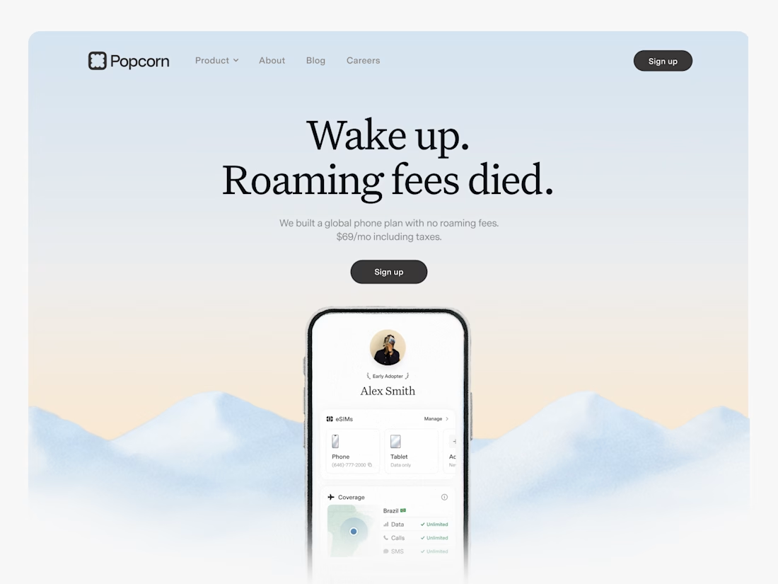

Looks great! What about readability though?
Text seems low contrast to me. Although I have a poor vision and most things seem too small and low contrast to me.

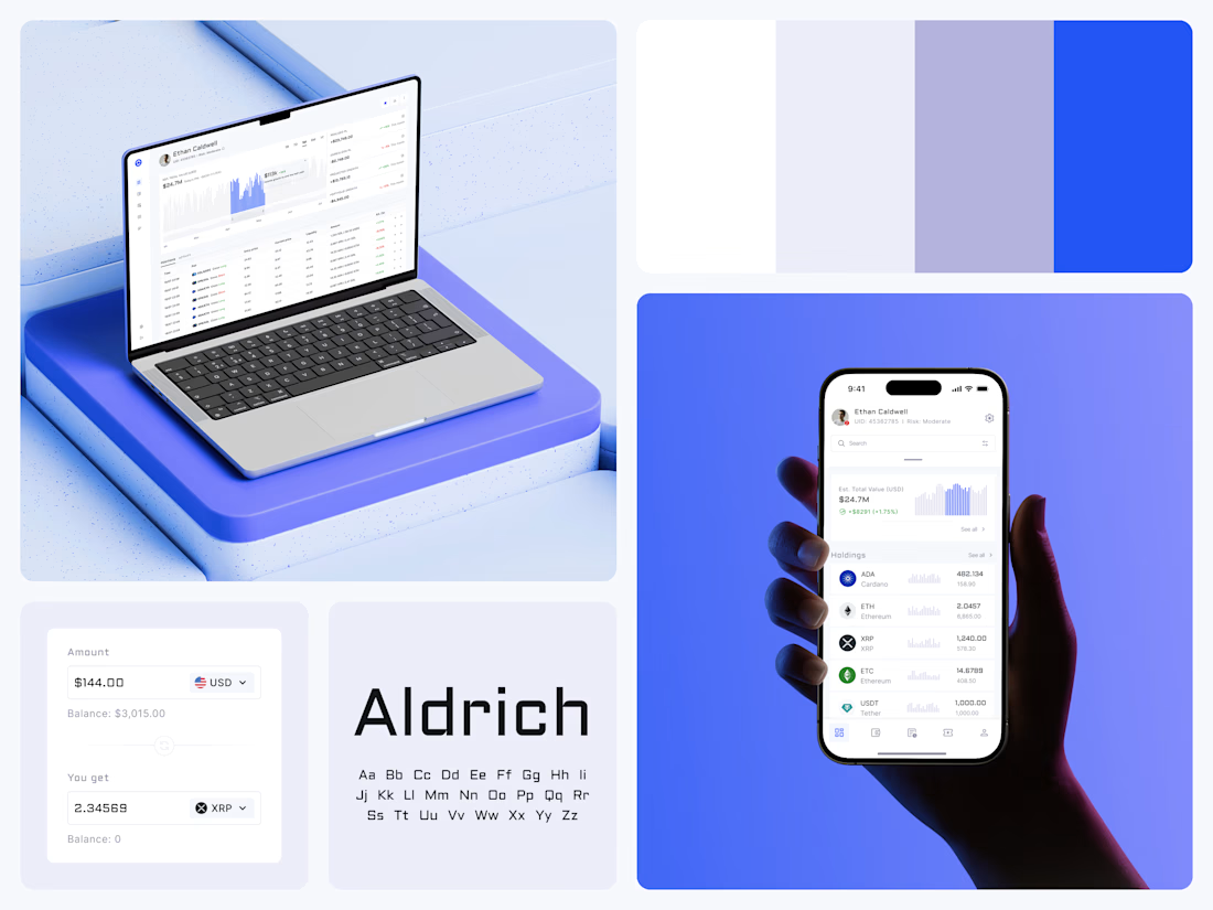
Crypto Portfolio Dashboard
Blue means one thing here: the range you are looking at.
The value chart is a row of thin gray bars, and only the selected date range fills in blue. You read the period that matters and keep the months around it as context.
The phone carries the same chart above the holdings list. Each coin gets its own small bar chart between the name and the amount, so you can scan the whole portfolio for movement without opening a single coin.
Trading screens get busy fast. This one stays light and calm, so the numbers lead: total value, realized and unrealized P&L and open positions, all on one screen.
Designed by the Hue & Machine team.
#Crypto #Fintech #DashboardDesign #TradingPlatform #DataVisualization #UIDesign #ProductDesign #WebApp #MobileDesign #FigmaDesign



Nice Ui Dmytro

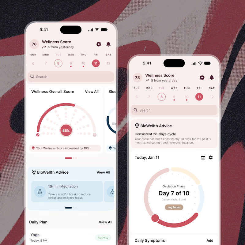
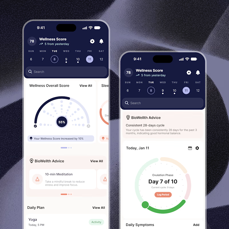
Exploring two color palette directions for a women’s health app. Which one feels right to you? 👀
32 voted
56%
25 voted
44%
57 votes
Closed

Both are amazing! The purple definitely has better contrast, but I’d still go with the berry one, purely a personal preference