The network for creativity
Join 1.25M professional creatives like you
Connect with clients, get discovered, and run your business 100% commission-free
Creatives on Contra have earned over $150M and we are just getting started
Back to feedPost

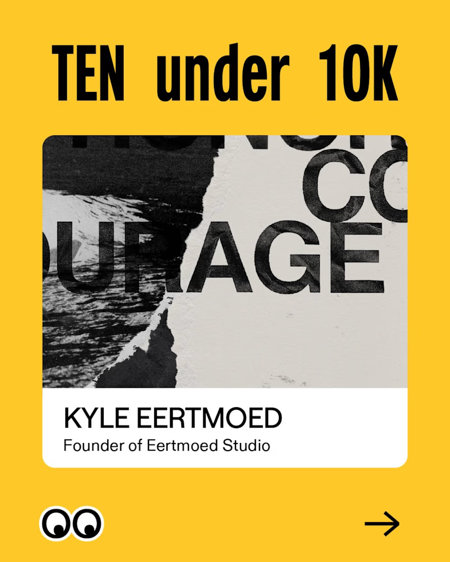
Creative Boom chose 10 designers or design studios with under 10k followers (or thereabouts) that they think you should follow 👀
Check them out:
@bydavydenduyver
@estersaba.design
@workbypage
@halistenstudio
@davejonesdesign
@not.about.us
@studiobarath
@studiosorethumb
@eertmoed.studio
@zora.designstudio
The network for creativity
Join 1.25M professional creatives like you
Connect with clients, get discovered, and run your business 100% commission-free
Creatives on Contra have earned over $150M and we are just getting started

Challenges
View all


Related posts

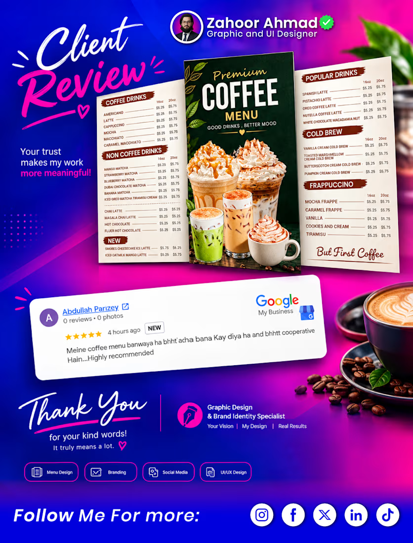
☕ Another Happy Client, Another Creative Milestone! ✨
Recently designed this premium Coffee Menu for a client, focusing on clean layout, attractive visuals, easy readability, and a professional brand presentation.
The best part? My client shared this wonderful review on my Google Business Profile! ⭐⭐⭐⭐⭐
“Meine coffee menu banwaya ha bht acha ban Kaya diya ha and bht cooperative hain... Highly recommended”
Client satisfaction is what makes every project more meaningful. 🙌
Looking for a Coffee Menu, Restaurant Menu, Branding, Graphic Design, or UI/UX Design for your business? Let’s turn your vision into something professional and impactful. 🎨
📍 View my Google Business Profile & explore my work:
https://share.google/3nBj5ldnrF5o27K2b
💬 Have a design project in mind? Feel free to connect or message me!
#CoffeeMenuDesign #MenuDesign #GraphicDesigner #ClientReview #GoogleReview #BrandIdentity #RestaurantBranding #GraphicDesign #UIUXDesign #PortfolioShowcase #ClientSatisfaction #ZahoorAhmad #FreelanceDesigner #BusinessBranding #DesignThatWorks

Congrats

Design Concept — Packaging Proposals
Three Visual Directions
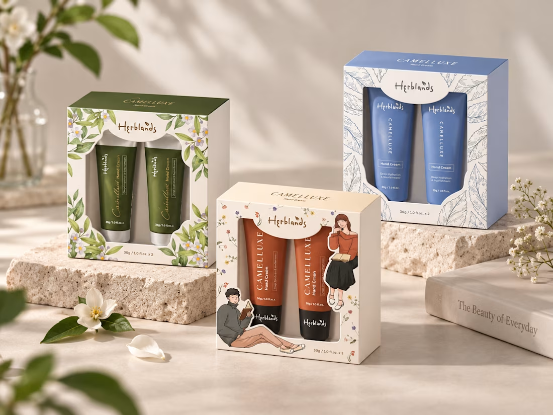
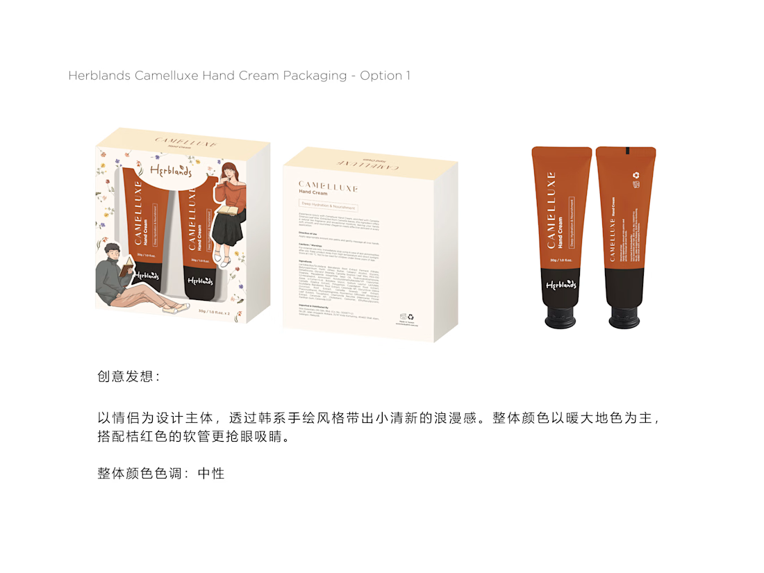
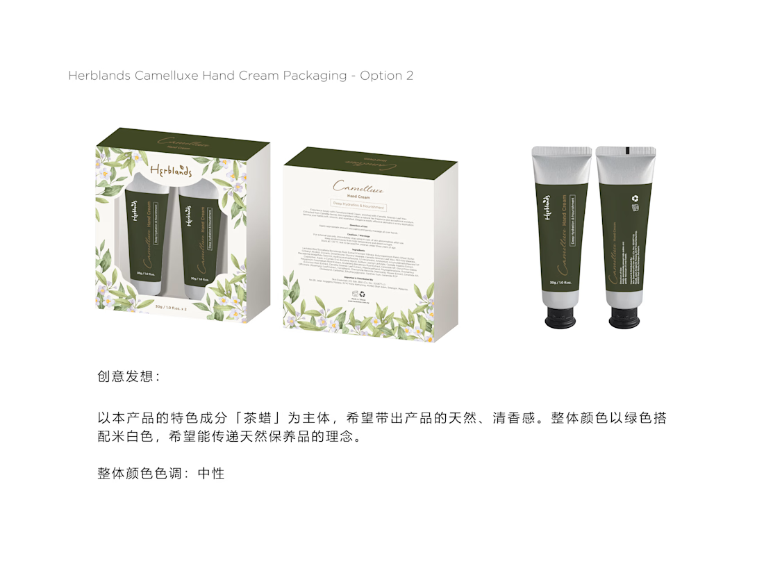
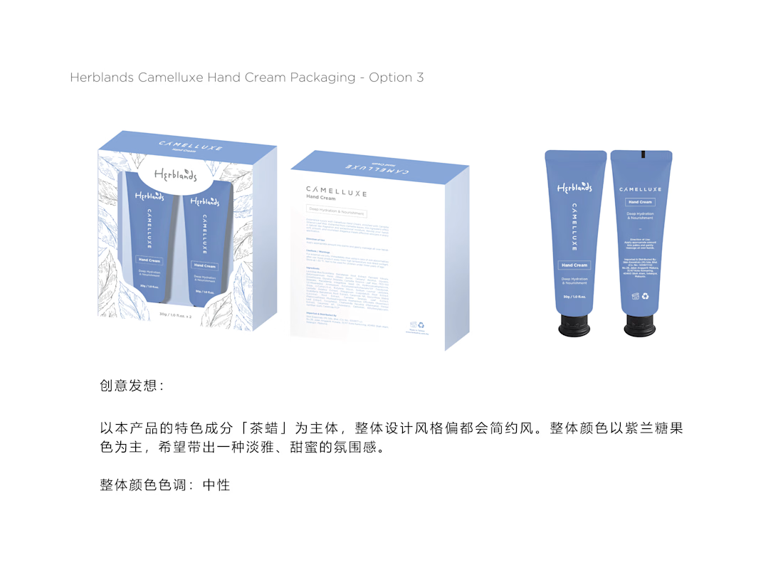
Three packaging concepts explore different styles and colour palettes for the Camelluxe hand cream range.
Proposal 01 — Botanical Elegance
Natural & Refined
Deep green tones with delicate floral illustrations create a natural, elegant, and premium botanical identity.
Proposal 02 — Clean & Modern
Fresh & Minimal
Soft blue tones with line-art botanical elements create a clean, calming, and contemporary skincare aesthetic.
Proposal 03 — Warm & Youthful
Playful & Lifestyle-Led
Warm orange tones, character illustrations, and small floral details create a friendlier, more youthful lifestyle direction.
Credit: HWG



the orange one with the little characters is my pick. did they choose one yet?
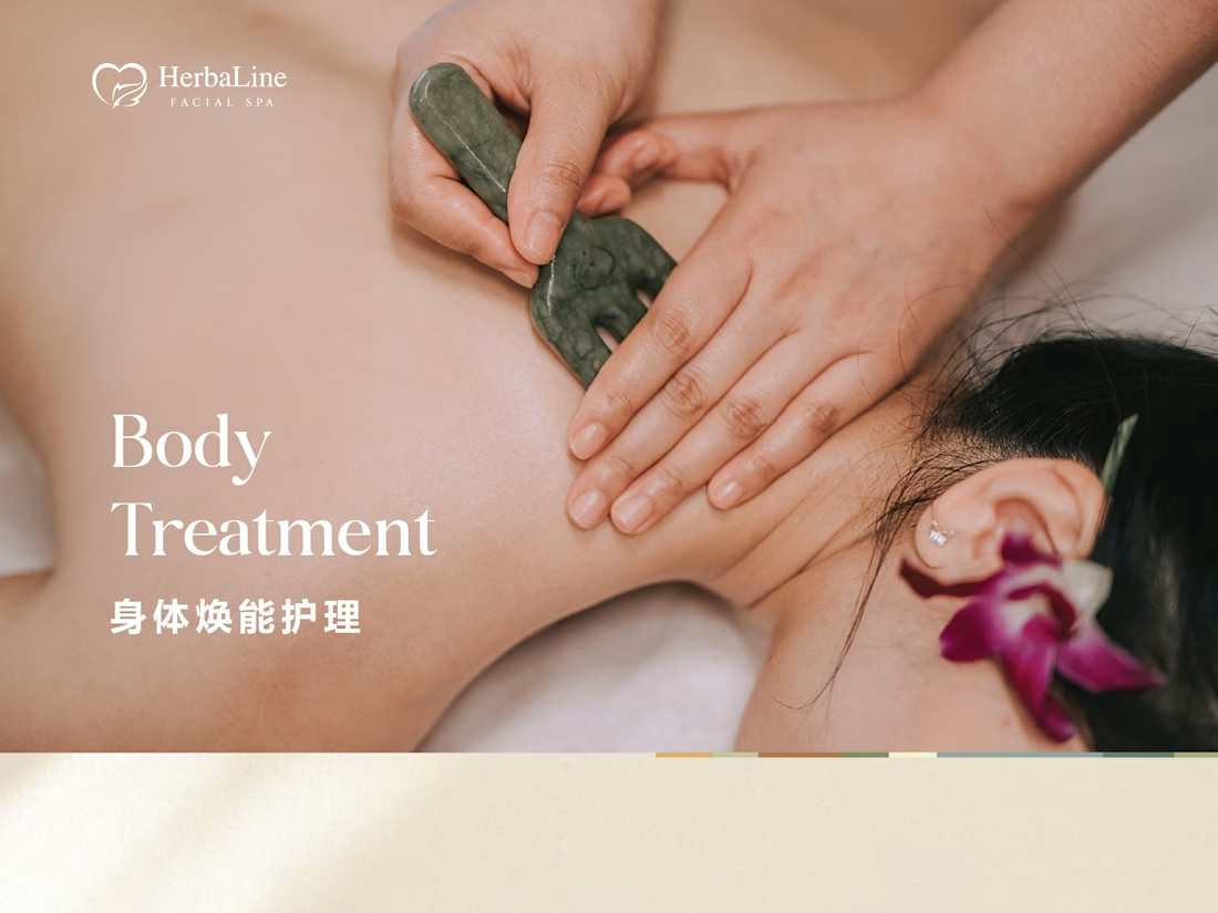
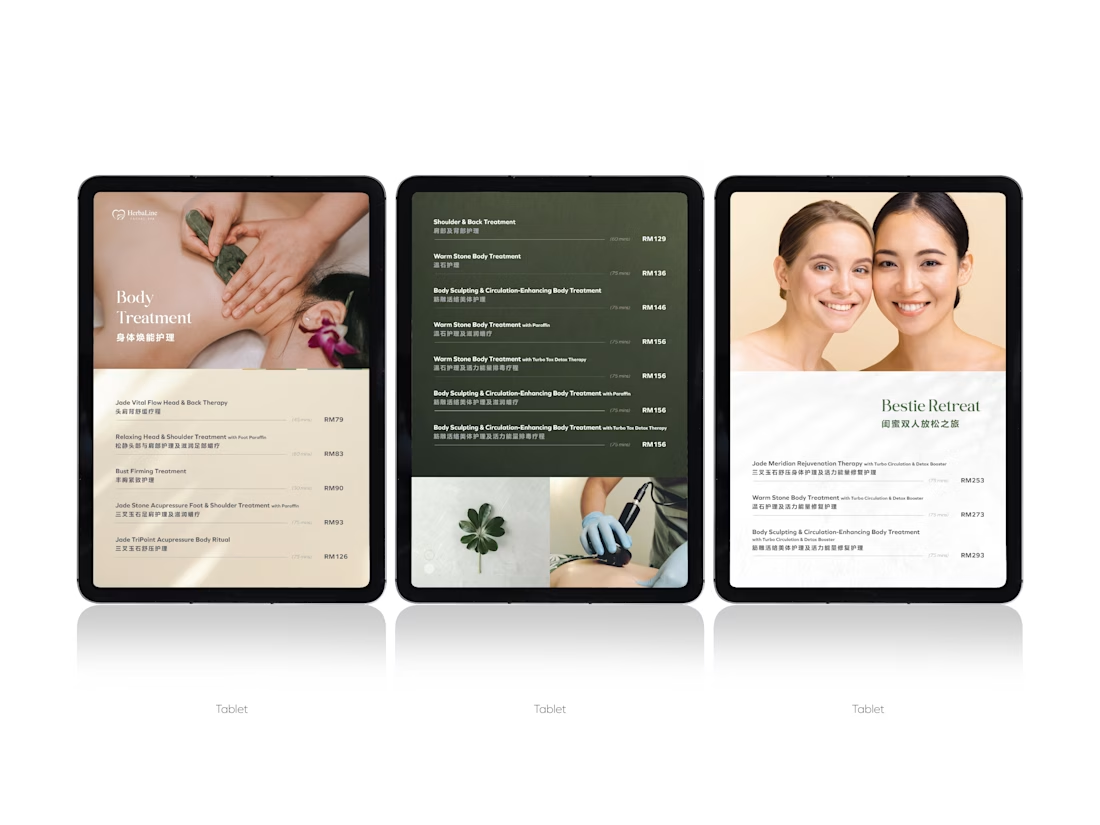
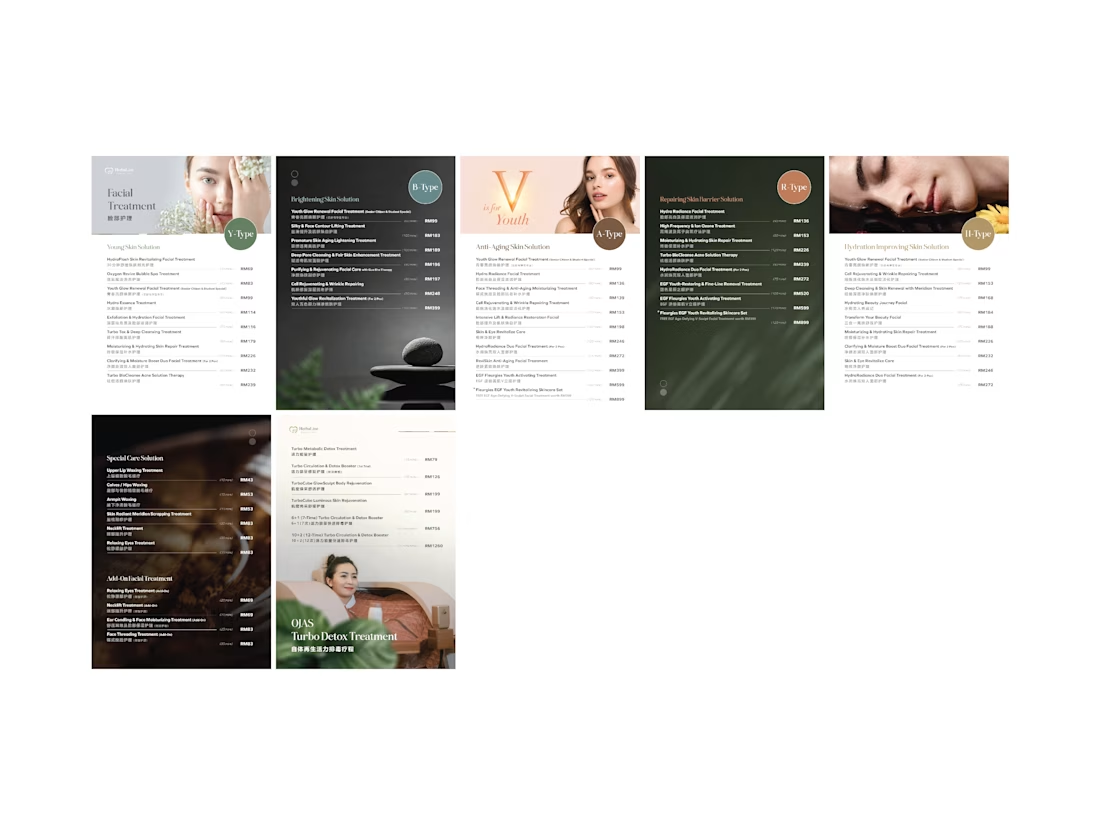
Design Concept
Clean & Premium
A minimalist layout creates a refined and professional spa experience.
Natural Colour Palette
Soft ivory and deep botanical green reflect wellness, relaxation, and a natural spa atmosphere.
Clear Information Hierarchy
Treatment names, durations, and prices are structured for quick and easy browsing.
Visual Consistency
Consistent typography, spacing, and imagery create a cohesive treatment menu across different categories.
Credit: HWG

Treatment menus are a nastier hierarchy problem than they look — name, duration and price all want the same eye at the same moment. Curious how you settled it: lighter weight on the durations, or pulling them into their own column?