The network for creativity
Join 1.25M professional creatives like you
Connect with clients, get discovered, and run your business 100% commission-free
Creatives on Contra have earned over $150M and we are just getting started
Back to feedPost


The network for creativity
Join 1.25M professional creatives like you
Connect with clients, get discovered, and run your business 100% commission-free
Creatives on Contra have earned over $150M and we are just getting started

Challenges
View all


Related posts

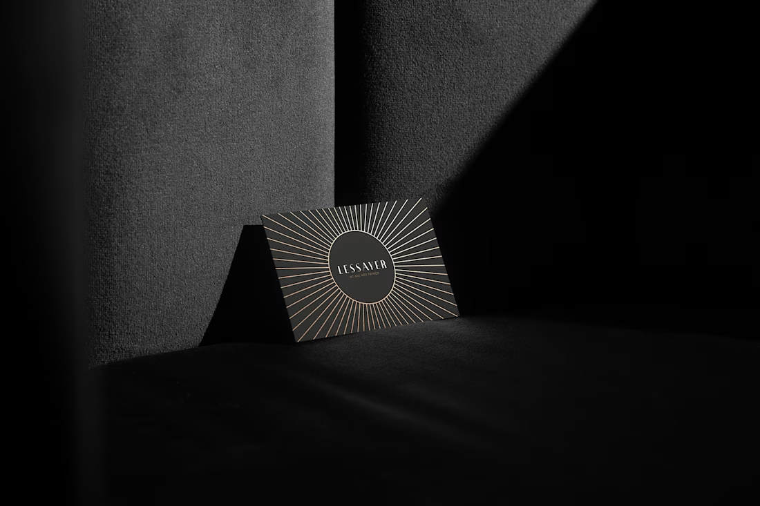
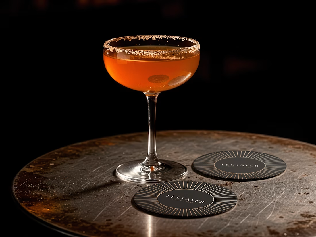
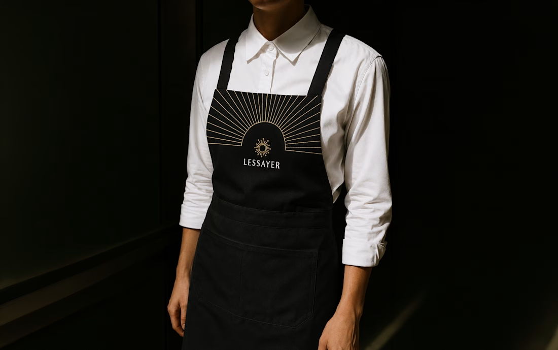
Lessayer
Where Belle Époque elegance meets contemporary minimalism.
The identity started with a simple challenge: how can a luxury pastry brand feel refined and timeless without relying on predictable visual codes?
The answer became a single geometric symbol combining three ideas a crown, a sliced cake, and a subtle reference to the New Zealand sun.
One mark. Three meanings. One distinctive identity.
Here’s a first look at the logo construction and stationery system.
Full case study coming tomorrow.


You are the best

Brand Expressions for Munch


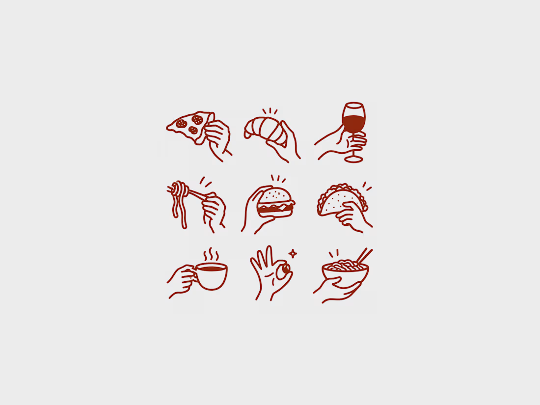
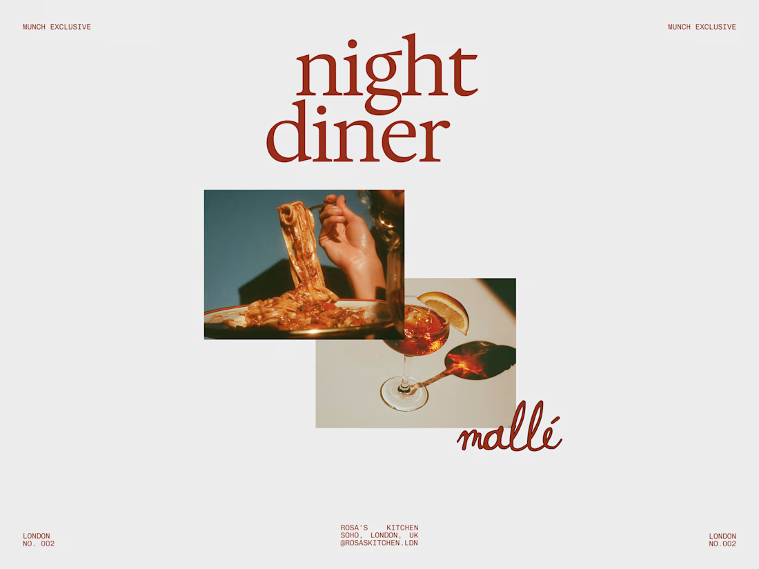
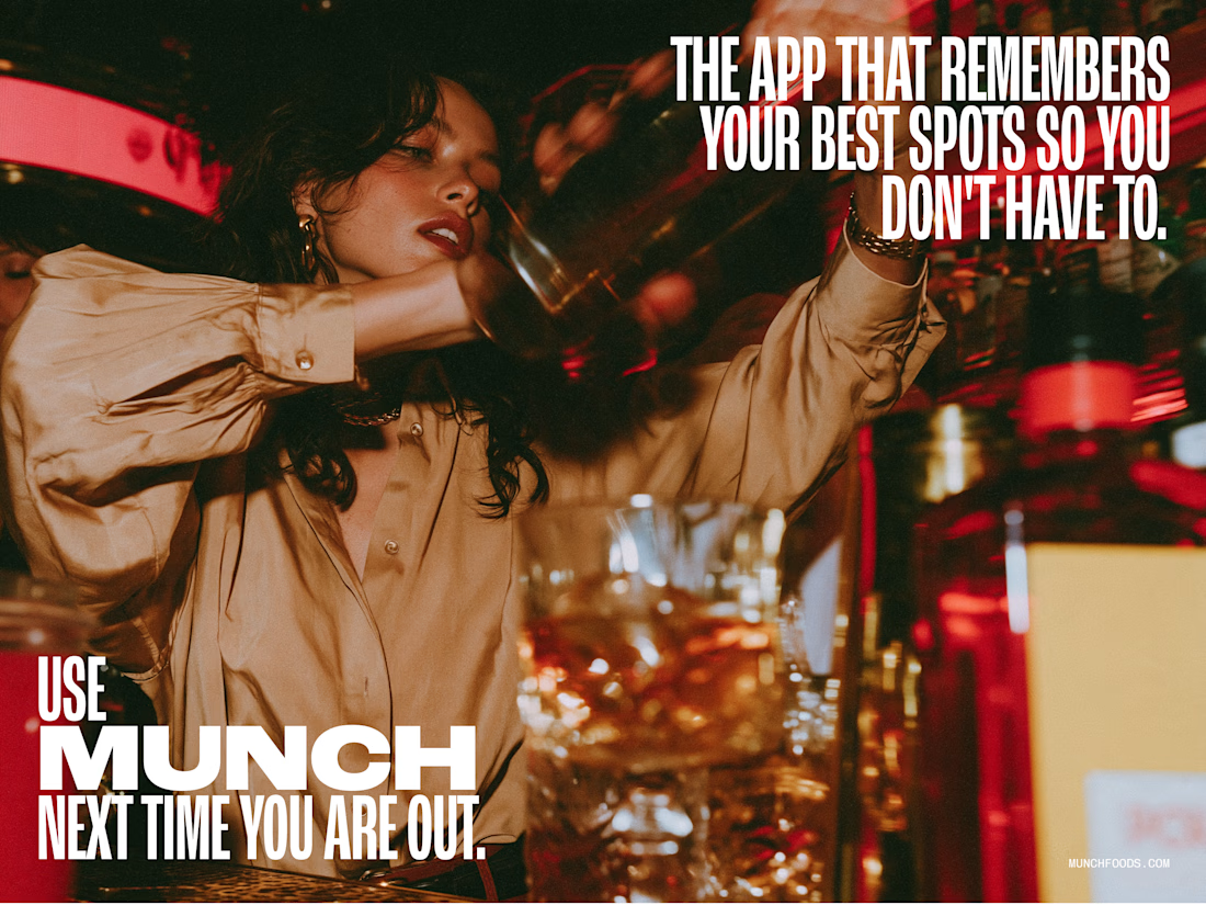
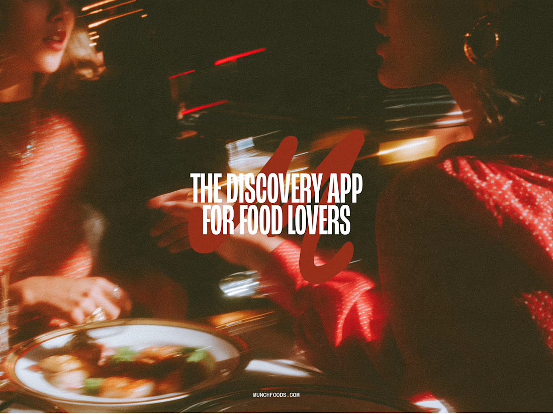

The hand-drawn gesture icons paired with that retro diner script give it real personality, feels less like a generic food app and more like something with a point of view.