The network for creativity
Join 1.25M professional creatives like you
Connect with clients, get discovered, and run your business 100% commission-free
Creatives on Contra have earned over $150M and we are just getting started
Back to feedPost

A little preview of pawpaw — my upcoming pet care template.
It's nearly there. Now comes the part I love most: the final polish. Refining the details that make a template feel premium.
Launch coming soon 🐾


The scrolling paw print particle trail in the hero section is such a playful touch. However, the white text inside the bright orange cards is a little hard to read. What do you think about making that text a darker shade or tweaking the orange a bit so it stands out better?
The network for creativity
Join 1.25M professional creatives like you
Connect with clients, get discovered, and run your business 100% commission-free
Creatives on Contra have earned over $150M and we are just getting started





Related posts

My 3rd Framer template, SKI8, is live on @Framer
I kept landing on ski school websites with jaw-dropping mountains up top, then buried prices, tiny buttons, and no way to book.
Your site is your first lesson. If it feels clunky, people assume the instruction will be too.
So lead with one bold hero, show your courses clearly, and make booking a single tap.
That's exactly what SKI8 does: bold, snow-inspired, fully responsive, no code needed. Built for ski schools, clubs, camps, and instructors.
Grab it free on Framer 👇


Congrats buddy

Same prompt. Two builders.
One site made with Lovable, one with Google AI Studio. A Flemish still-life snack brand, gilt frames, GSAP scroll, the works.
Which one is better?
33 voted
67%

16 voted
33%

49 votes
Closed


Building a pet SaaS hero
Soft visuals, bold typography, and a clear conversion path, designed to make the product feel as friendly as the pets it helps
Built in Framer
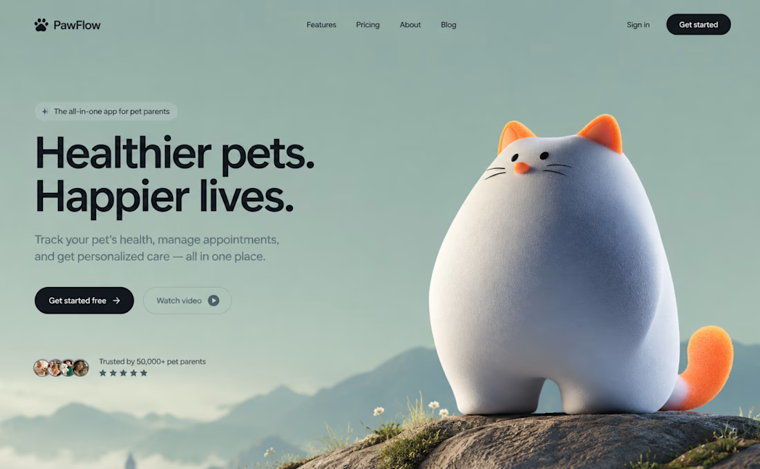

The dark CTA stands out against the soft sage background, even with the cat taking center stage. How are you handling the cat and headline on mobile: stacked or a tighter crop?