The network for creativity
Join 1.25M professional creatives like you
Connect with clients, get discovered, and run your business 100% commission-free
Creatives on Contra have earned over $150M and we are just getting started
Back to feedPost

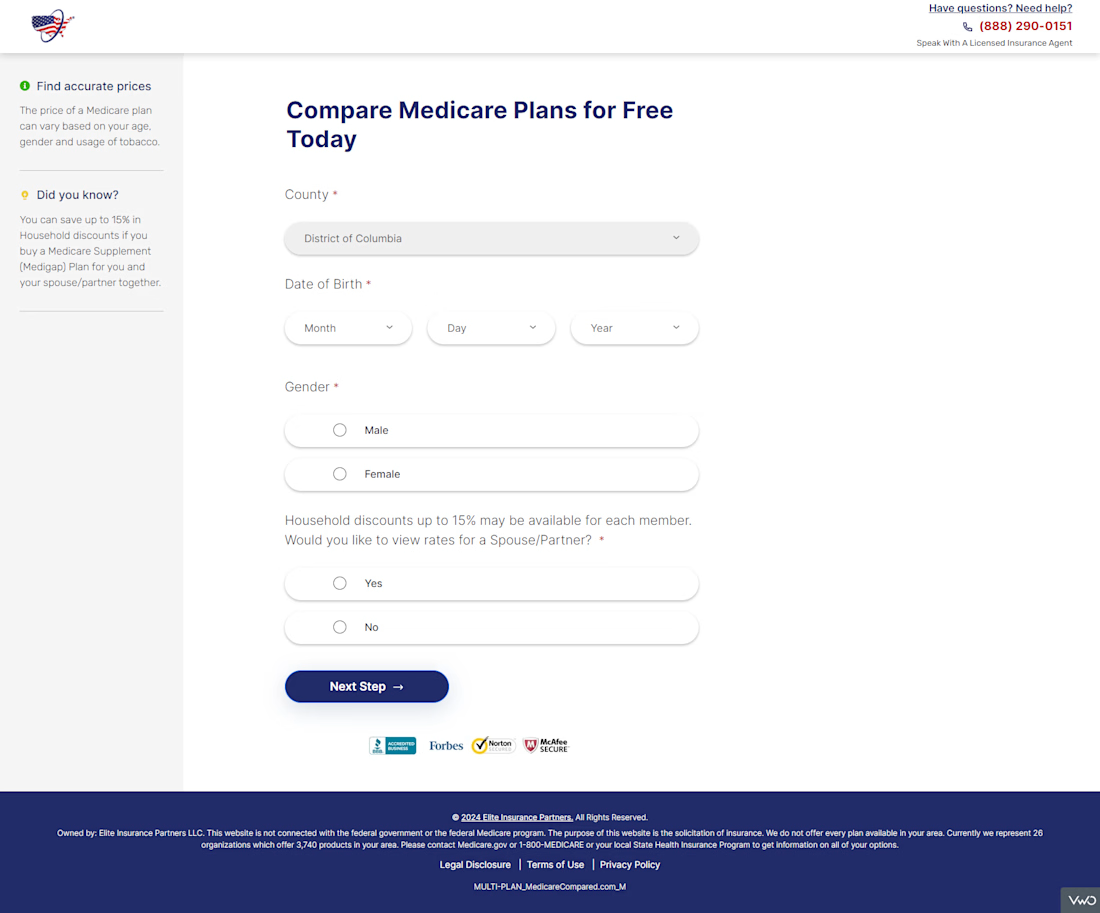
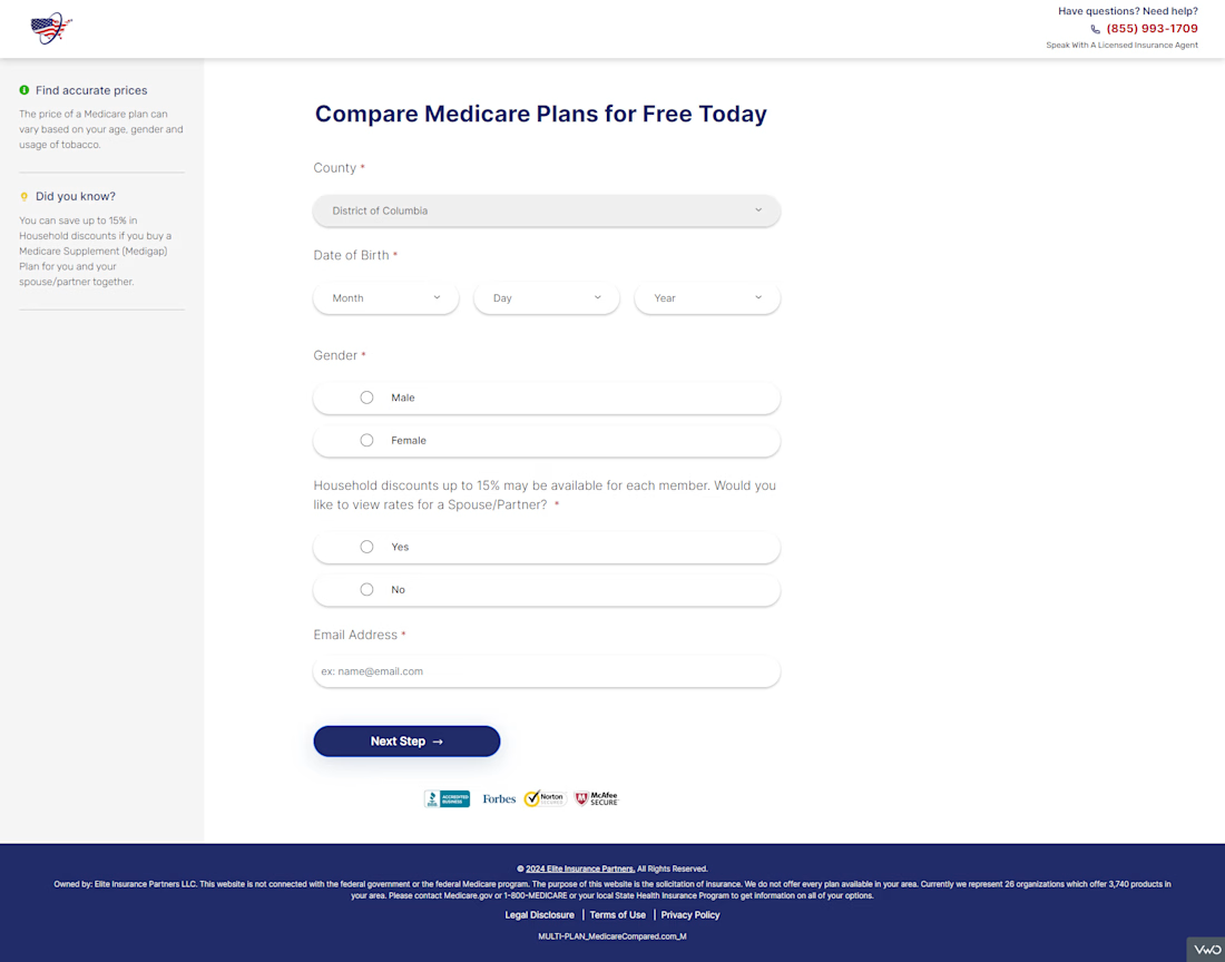
Form Field Rearrangement A/B Experiment
Problem: Analytics showed a heavy drop-off on the final step where users were asked for name, phone, and email all at once, it felt like handing over everything in a single ask.
Action: Restructured the form by moving the email field to an earlier step, separating it from the phone field so the contact ask felt more progressive and less invasive.
Result: The repositioned email field reduced friction at the final step and lifted overall conversions by 3.48%.


The network for creativity
Join 1.25M professional creatives like you
Connect with clients, get discovered, and run your business 100% commission-free
Creatives on Contra have earned over $150M and we are just getting started




Related posts



Going with A-Studio, clear direction and easy to navigate 😊

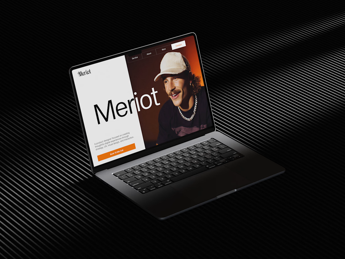
Meriot Netherlands-based product designer portfolio
I explored a portfolio website for Meriot, a product designer based in the Netherlands who wanted a digital presence that felt more personal, editorial, and design-focused.
The challenge was to avoid the typical portfolio formula and create something that communicates personality within the first few seconds.
The direction
→ Bold editorial typography
→ Strong personal photography
→ Minimal black-and-white foundation
→ Warm orange accent for CTAs
→ Simple, structured navigation
→ Clear positioning as a product designer
→ A portfolio experience that feels like a personal brand
The idea was to make the website feel confident without being complicated.
Rather than leading with a long introduction, the hero immediately communicates who Meriot is, what he does, and where the visitor should go next.



Nice design broooo

Dark mode or Light mode?
Testing out this interactive coordinate effect for the AEVUM wordmark.

19 voted
73%
7 voted
27%
26 votes
Closed

Dark mode