pro
Tonya Golden
Website Developer & Conversion Optimization Strategist


The Wren's Hollow Website Redesign Project
1
14
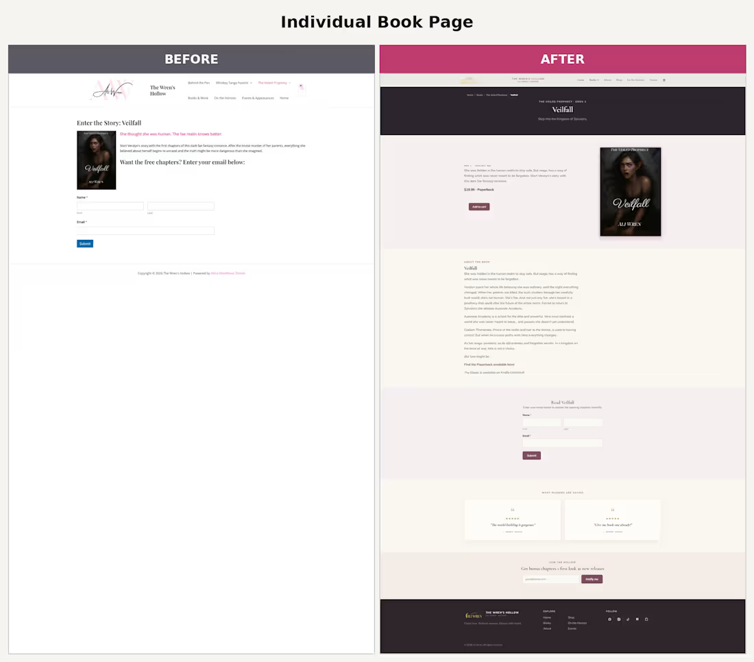
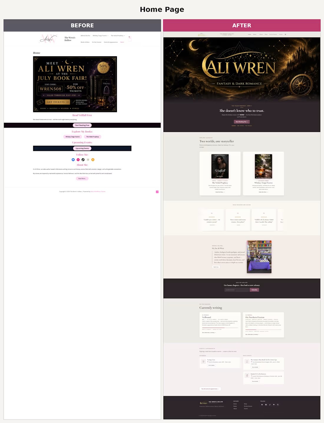
The Wren's Hollow (aliwrenauthor.com (http://aliwrenauthor.com)) Redesign Project
Site type: Author/personal brand site for Ali Wren, an indie romance/fantasy writer, built on WordPress with WooCommerce for direct book sales.
Pages:
Home: Hero banner promoting a free read (Veilfall), book highlights for her two series (Whiskey Tango Foxtrot, The Veiled Prophecy), an events teaser, social links, and a short "About Me" blurb.
Behind the Pen (About): Longer bio (she's also a biological anthropologist and mom), a "My Journey" timeline of her writing milestones from 2024–2026, social links, and a contact/newsletter form.
Whiskey Tango Foxtrot: Series page for her military romance series: character bios for a 7-man Green Beret team, plus book blurbs and purchase/Goodreads links for Whiskey & Secrets and Whiskey & Lies.
The Veiled Prophecy: Series page for her fae fantasy series: world intro (Kingdom of Sylvaeris) and blurbs for Veilfall (out now) and Veilbound (coming Fall 2026).
Books & More (Shop): WooCommerce store listing 4 paperbacks with prices and add-to-cart buttons.
On the Horizon: "Coming soon" page detailing four in-progress projects/books with status tags.
Events & Appearances: Upcoming and past in-person events (book fairs, signings) with dates, locations, and Facebook event links.
Overall impression: Content-rich, personal, and functional, but visually it reads as a fairly standard WordPress/WooCommerce theme, heavy text blocks, minimal visual hierarchy between series, and the shop/events pages feel a bit generic compared to the strong personality of her writing brand. Good bones for a redesign to give it a more distinctive, genre-appropriate aesthetic (romance/fantasy branding, better book showcases, etc.).
1
190
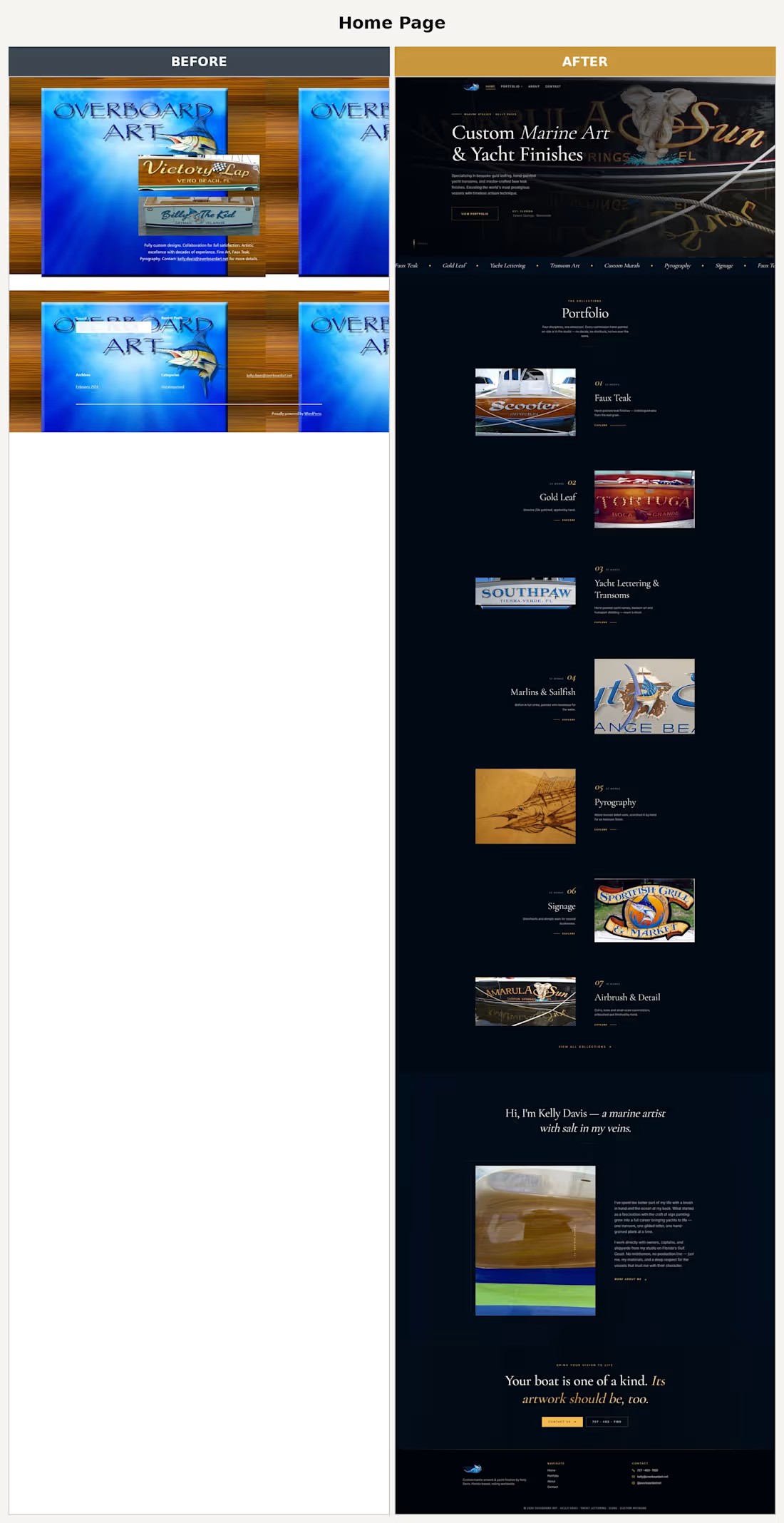
Overboard Art - Website Rework
Who it's for: Kelly Davis, a marine artist in Tarpon Springs, FL, specializing in hand painted yacht lettering, faux teak, gold leaf, and marine murals.
Original site (overboardart.net (http://overboardart.net))
A bare bones WordPress blog, essentially unstyled from the default theme. It had:
A one line header ("Overboard Art, Custom, Specialty Fine Art") and two stacked images with no layout or context
A short paragraph of body copy and an email contact
A sidebar with "Recent Posts," "Archives," and "Categories," standard WordPress blog widgets
Individual "posts" (e.g., Tortuga, Sharky, Cheeky) that were really just single work photos with a caption, formatted like blog entries rather than a portfolio
No navigation, no organized galleries, no way to browse work by category, and no clear path to contact or commission
Functionally, it was closer to a photo dump blog than a business site. It didn't showcase the craftsmanship or make it easy for a prospective yacht owner to browse work or get in touch.
New site
A purpose built portfolio and marketing site with real information architecture:
Home: a full hero section with brand positioning ("Custom Marine Art & Yacht Finishes"), a scrolling ticker of specialties (faux teak, gold leaf, yacht lettering, pyrography, etc.), and a portfolio preview
Portfolio: work organized into 7 real collections (Faux Teak with 32 works, Marlins & Sailfish with 37, Yacht Lettering & Transoms with 20, Airbrush & Detail with 18, Gold Leaf, Pyrography, Signage), each with its own count and description, turning scattered photos into a browsable, categorized body of work
About: a proper bio for Kelly Davis, establishing credibility and personal story ("salt in my veins," working directly with owners, captains, and shipyards)
Contact: a dedicated page with phone number, replacing the old "just email this address" approach
Clear navigation (Home, Portfolio, About, Contact) present on every page
How the rework improved it
Positioning: reframed from a generic craft blog to a premium "marine atelier" brand, which matches the high end yacht clientele.
Discoverability: visitors can now browse by craft type instead of scrolling a chronological blog feed.
Credibility: an About page and clear specialty breakdown builds trust before someone reaches out.
Conversion path: a real Contact page with phone number gives a clear next step, versus a buried email address.
Visual presentation: hero imagery and structured sections replace the default WordPress theme's flat, unstyled layout.
5
252
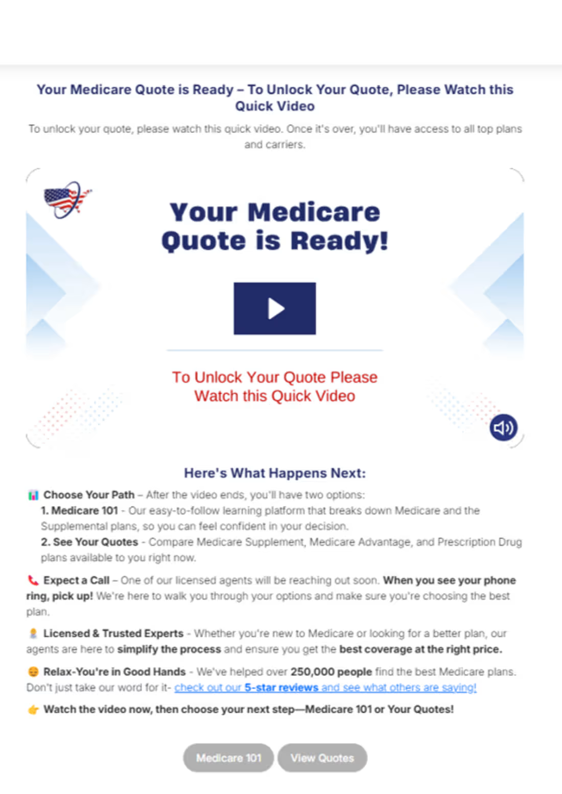
Video Thumbnail Design A/B/C Experiment
Problem: After launching the Medicare Thank You Video, watch rates were lower than expected, the default thumbnail wasn't compelling enough to pull users into the video.
Action: Designed and tested 3 new high-contrast thumbnail variations against the original, optimizing for visual interrupt and click-to-play intent.
Result: All 3 variations beat the control on lead-to-policy, with the winning thumbnail lifting LtP from 4.3% to 5.9%.
1
94