The network for creativity
Join 1.25M professional creatives like you
Connect with clients, get discovered, and run your business 100% commission-free
Creatives on Contra have earned over $150M and we are just getting started
Back to feedPost

Stargrade came to me with the challenge to build a brand that communicates the calibre of their firm; visible enough to command attention, understated enough to reflect the intelligence and discretion that private security demands.
They already served high profile clients; from corporate executives to government officials but their identity at the time was fragmented and in a market where a company's visual presence signals its credibility before a single conversation takes place, the gap was costing them.
We built a brand and visual identity system that is cohesive and carefully reflects their expertise. The foundation of the work was a single positioning statement built to carry the brand across every context, client, and location: Do business anywhere without safety concerns.
The brand now holds its own in the rooms where Stargrade operates; in front of executives and government officials who make decisions based on trust, track record, and the signals a firm sends before it speaks.
Their new brand identity reflects precisely what Stargrade is: intelligent, prepared, and operating at the highest level.



The network for creativity
Join 1.25M professional creatives like you
Connect with clients, get discovered, and run your business 100% commission-free
Creatives on Contra have earned over $150M and we are just getting started








Related posts

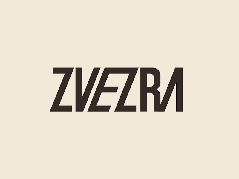
Which ZVEZRA logo direction do you prefer? 👀
I’ve been exploring two variations of the wordmark. Both follow the same visual direction, but each has its own character.
Vote below!
I’d love to hear your thoughts! 👇
39 voted
53%
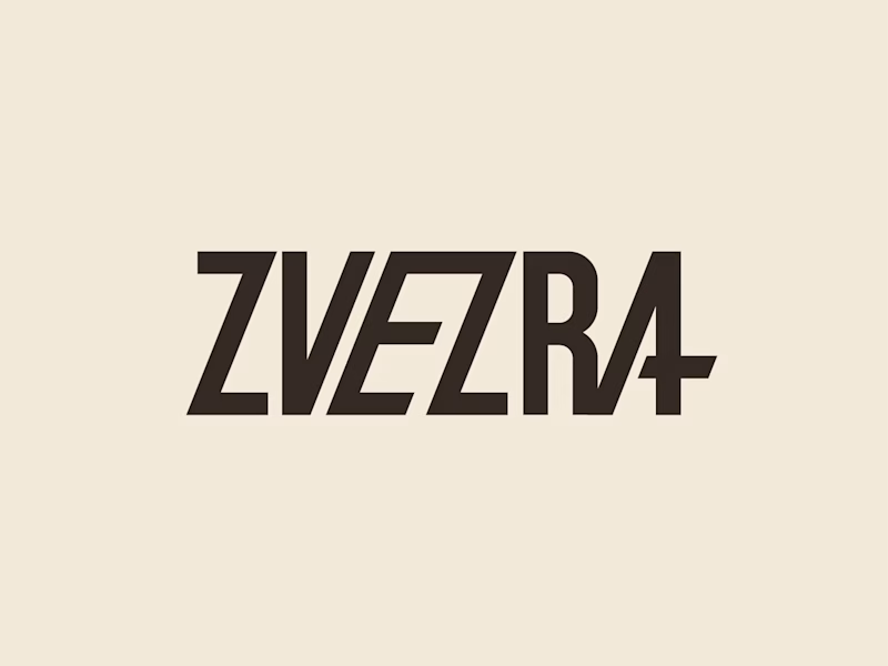
34 voted
47%
73 votes
Closed

Option 1 for me, it has a bit more personality. Both are strong though, tough call

Interactive AI Analytics Dashboard | SaaS Product Design
A modern, animated AI-powered eCommerce analytics dashboard designed to help businesses track sales performance, monitor revenue, understand customer behavior, and make data-driven decisions.
The design combines a clean SaaS interface, intuitive data visualization, interactive dashboard elements, and smooth animations to create a more engaging user experience. Every section is designed to make complex analytics easier to understand while maintaining a professional, scalable, and user-friendly layout.


Super clean work!

Designed this concept poster for the Koenigsegg CCGT1.
Art direction, layout, grade: all mine.




good one