The network for creativity
Join 1.25M professional creatives like you
Connect with clients, get discovered, and run your business 100% commission-free
Creatives on Contra have earned over $150M and we are just getting started
Back to feedPost

Take a look at this amazing dashboard by Fatih Alkan

Power BI Sales Analytics Dashboard (4 pages)
🔗 Live Preview: View the interactive dashboard before purchase
The network for creativity
Join 1.25M professional creatives like you
Connect with clients, get discovered, and run your business 100% commission-free
Creatives on Contra have earned over $150M and we are just getting started


Related posts

One Fleet dashboard, two moods. Which one is you? 🖤
A sits in a misty gray desert with soft rocks. B goes darker, with a black stage, a dead tree, and a tiny pop of yellow. 🌵
Which one would stop your scroll? Vote A or B below! 👇👀
#UIDesign #DashboardDesign #ProductDesign #MockupDesign #DesignPoll #FleetManagement
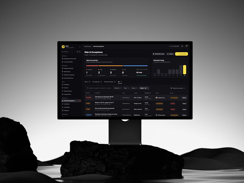
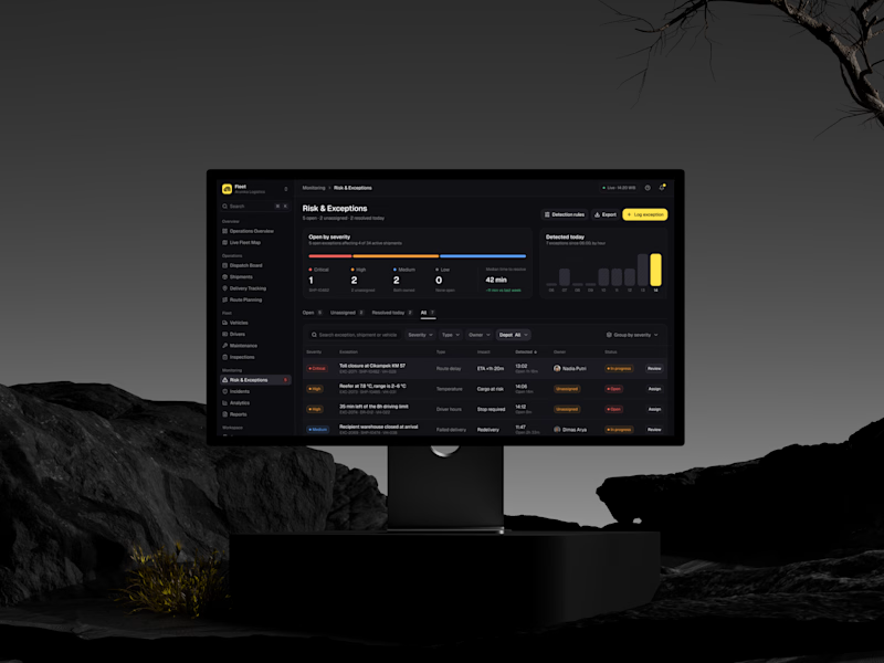
2 votes
Ends in 8h

B — the black stage and yellow pop win.



The purple gradients keep learning lively and fun.

Energy dashboards don't have to feel like spreadsheets.
This is a concept redesign of an energy-data platform's overview screen. The aim was to keep it dense enough for traders and asset managers, but calm enough to read at a glance.

Nice UI