
Ashutosh Mishra
Data Analyst | Power BI, Python & Excel Dashboard Expert
New to Contra
Ashutosh is building their profile!

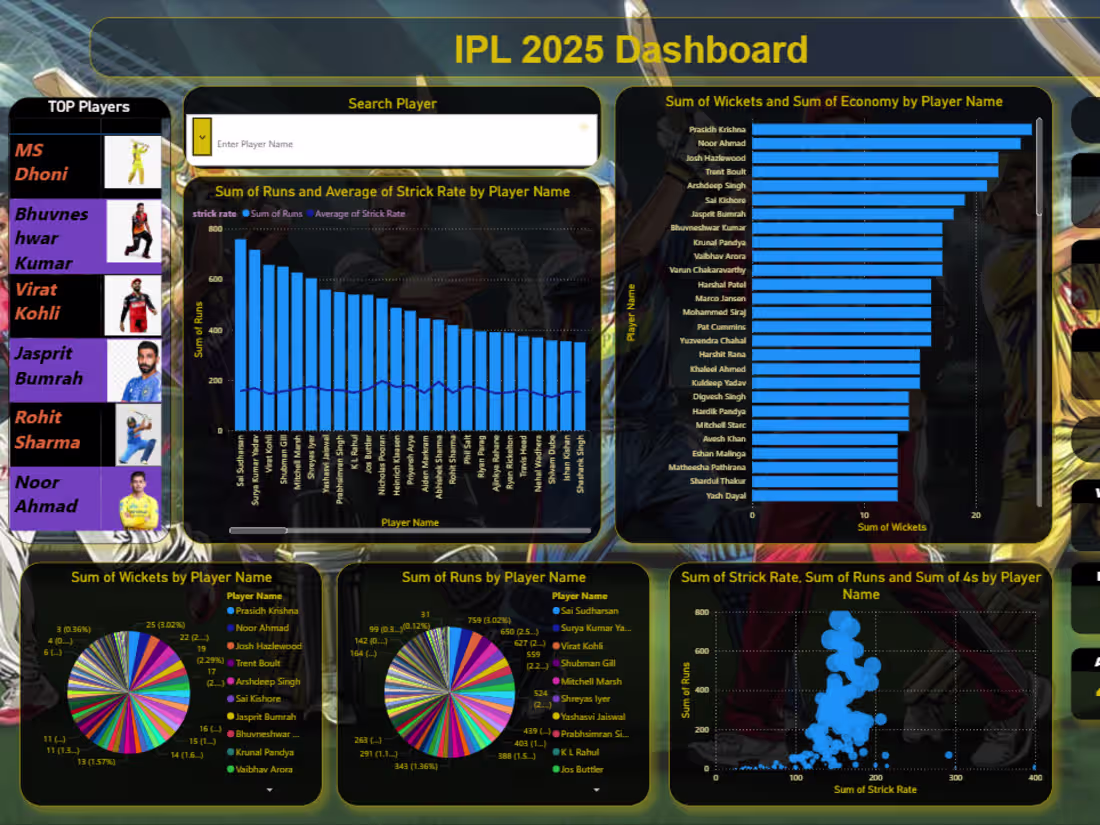
I recently developed an interactive dashboard using Power BI to analyze IPL 2025 player performance. This project focuses on transforming raw cricket data into meaningful insights through visualization and analytics.
🔍 Key Highlights of the Dashboard:
• Player-wise analysis of Runs, Wickets, Strike Rate & Economy
• Identification of Top Batsmen and Bowlers
• Interactive filters (Search Player feature 🔍)
• Visualizations including Bar Charts, Pie Charts & Scatter Plots
• KPI Cards for quick insights
💡 This project helped me strengthen my skills in:
• Data Cleaning & Preparation using Excel
• Data Modeling & Visualization using Power BI
• Creating DAX Measures for analysis
• Designing interactive and user-friendly dashboards
0
28
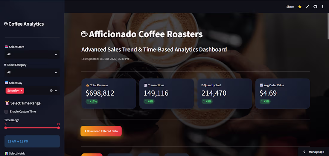
☕ Afficionado Coffee Roasters – Sales Trend & Time-Based Performance Analytics Dashboard
I developed an interactive Business Intelligence dashboard to analyze sales trends, customer purchasing behavior, store performance, and peak business hours using transaction-level sales data.
🔹 Key Features:
✅ Interactive filters (Store, Category, Day, Time Range)
✅ KPI Dashboard
✅ Sales Trend Analysis
✅ Store Performance Comparison
✅ Product Performance Analysis
✅ Revenue Heatmaps
✅ Smart Business Insights & Recommendations
🛠 Tech Stack:
Python | Pandas | Plotly | Streamlit | Data Visualization
Through this project, I gained hands-on experience in:
📊 Data Cleaning
📈 Exploratory Data Analysis (EDA)
⚙️ Feature Engineering
📉 Data Visualization
💡 Business Intelligence Dashboard Development
A special thanks to Unified Mentor for providing this opportunity and helping me apply data analytics concepts to a real-world business scenario.
🔗 Live Dashboard:
https://lnkd.in/dw9BUNfU
0
36
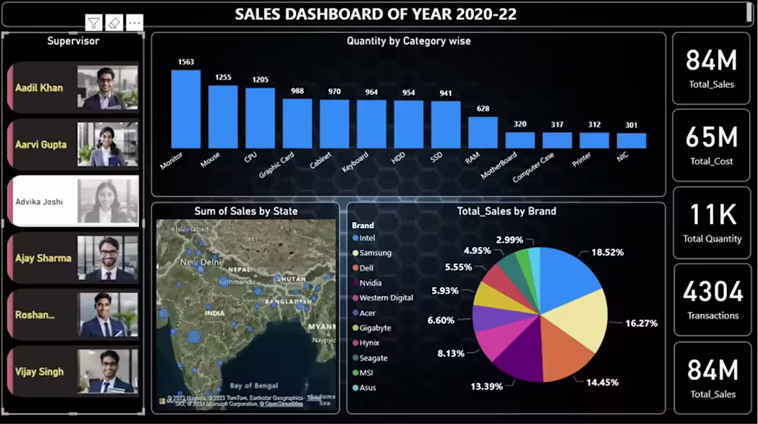
I created a Sales Dashboard (2020–2022) to analyze sales performance and product distribution.
🔹 Key Insights from the Dashboard:
• Total Sales: 16M
• Total Cost: 12M
• Total Profit: 4M
• Total Quantity Sold: 2032
📈 The dashboard includes:
• Category-wise quantity analysis
• Brand-wise sales distribution
• State-wise sales visualization using maps
• KPI cards for quick business insights
0
22
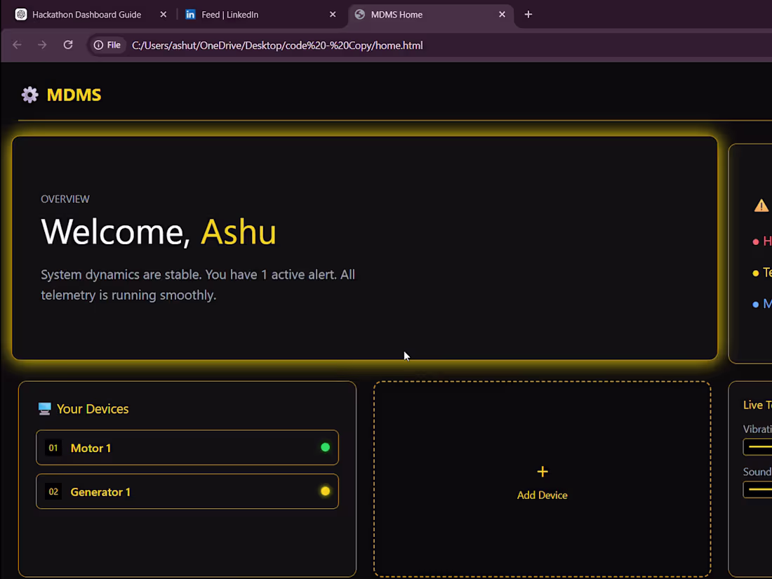
🚀 Here’s a quick look at the UI/UX and working dashboard I designed for our hackathon project MDMS (Machine Dynamics Monitoring System).
🏆 This project helped us win the 🥇 Gold Medal at CODEVISTA v1.0.
💡 What I built:
I designed and developed a multi-page interactive dashboard to monitor machine health (Motor & Generator) in real-time.
⚙️ Key Features:
✔️ Clean and modern UI with smooth animations & hover effects
✔️ Device-based navigation (Motor & Generator dashboards)
✔️ Real-time data visualization using dynamic charts
✔️ Live telemetry simulation (Temperature, Vibration, Current, Power)
✔️ Smart status detection (OK / WARNING / CRITICAL)
✔️ Audio alert system for warning conditions
✔️ Integrity Score & prediction system for machine health
✔️ “Add Device” feature with file input interaction
📊 The dashboard continuously updates data and visually reflects machine behavior, making it easy to detect early signs of failure.
🎯 My focus was to make complex machine data:
➡️ Simple
➡️ Visual
➡️ Easy to understand
This project gave me hands-on experience in UI/UX + Frontend Development + Data Visualization.
0
15