The network for creativity
Join 1.25M professional creatives like you
Connect with clients, get discovered, and run your business 100% commission-free
Creatives on Contra have earned over $150M and we are just getting started
Back to feedPost
Built a skincare identity around one brief: intimate, confident, luxe, without looking like every other minimal beauty brand.
NERA got a custom wordmark, a deep maroon palette instead of the usual beige, packaging, and web + retail touchpoints so it holds together everywhere.
Full case study on my profile. Which touchpoint would you change first?
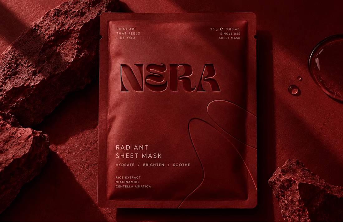
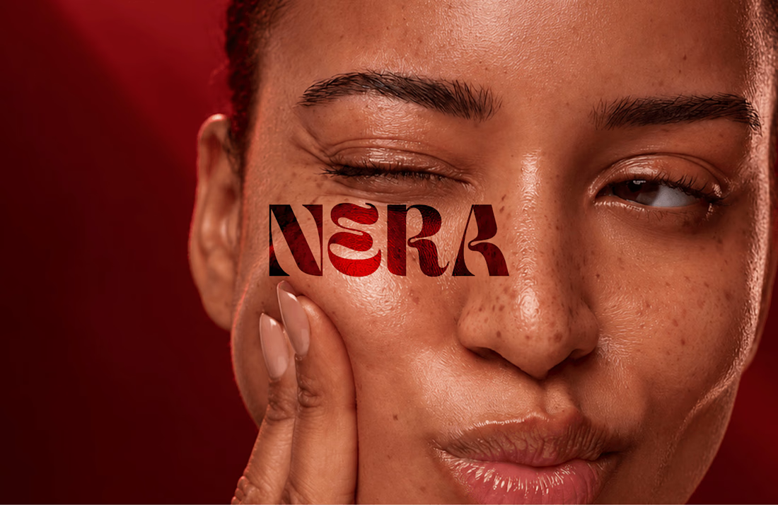
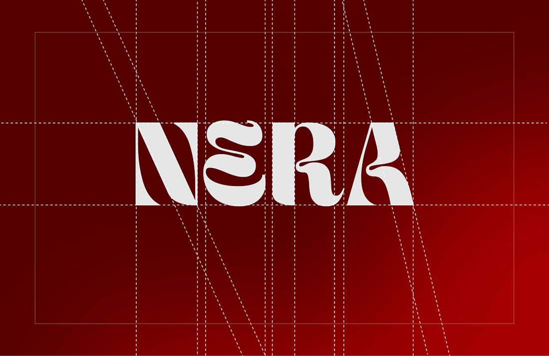
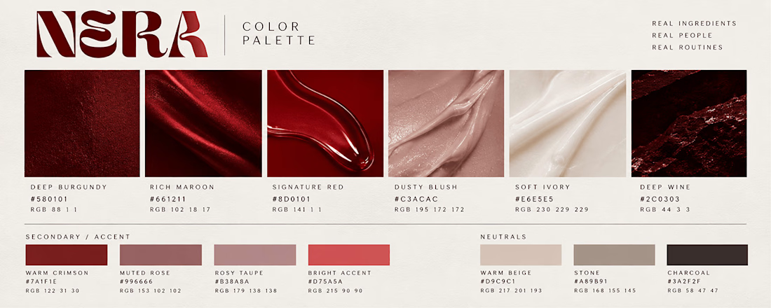


going with deep maroon instead of generic beige was the right move. custom wordmark sits super clean on the packaging.

Thanks Man 🙌

Amazing work! Love your design style, very creative and clean 👌
Thank You🙌

T O P!!
🙌 Thank you
The network for creativity
Join 1.25M professional creatives like you
Connect with clients, get discovered, and run your business 100% commission-free
Creatives on Contra have earned over $150M and we are just getting started










Related posts


A little excerpt from the brand guidelines for a recent project


The APS mark built from the four small symbols reads like a map legend, which suits a psychology service. Nice that the guidelines page shows it on the dark teal, most would have played it safe on white.


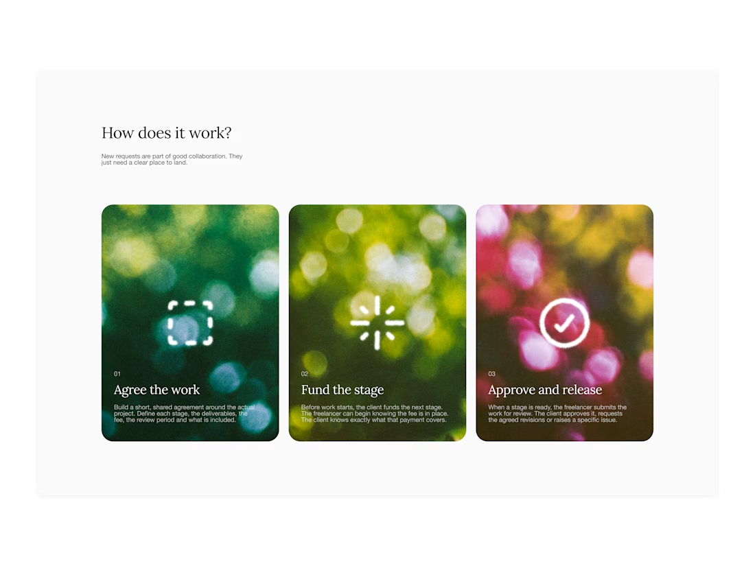

Your web sections always have such strong art direction. Great to see the brand carried right into the layout.

How can branding make people feel part of a community?
When working on Strawberry Health, we explored how visual identity could make women’s health feel more approachable and collective.
One of the ways was through supporting brand elements: stickers, badges and phrases that could live beyond the logo and become expressions of belonging.
These elements turned the identity into something people could interact with, share and make their own.
It’s a small detail, but I think it’s an important part of building brands around communities: the identity shouldn’t only identify the brand. It should give people something to identify with.
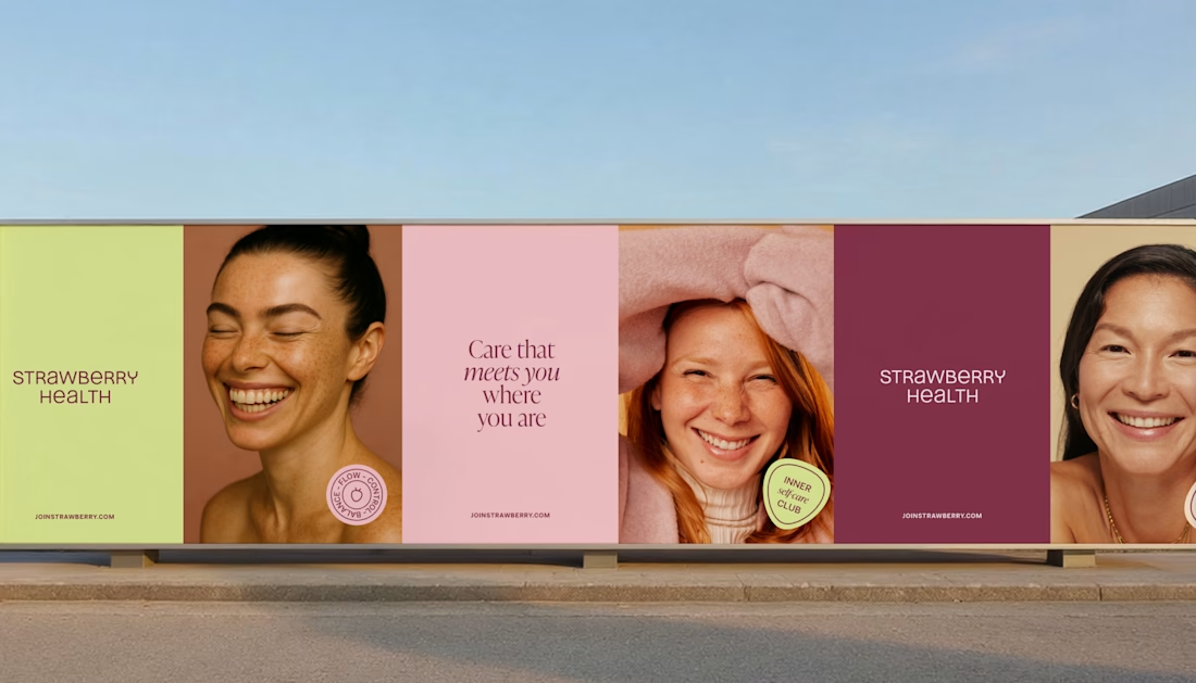
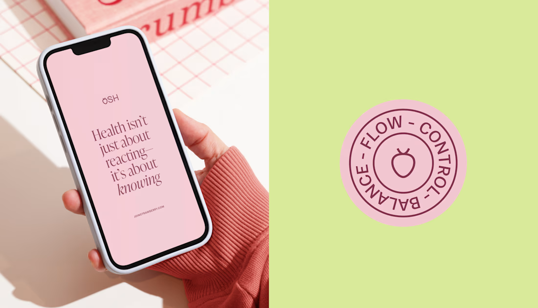
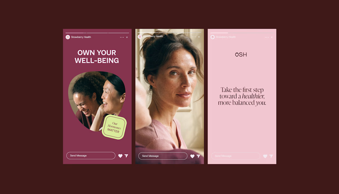
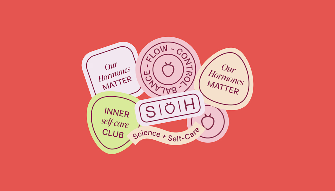

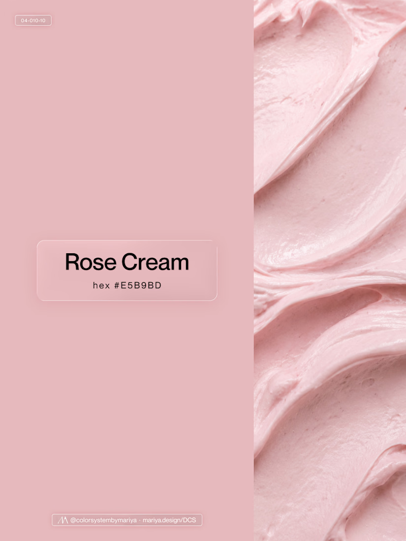
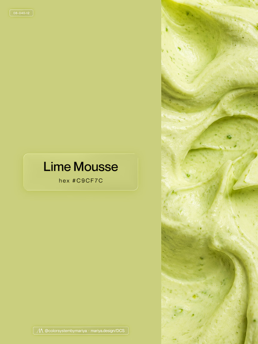
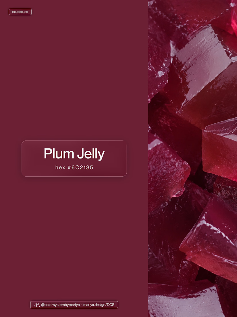
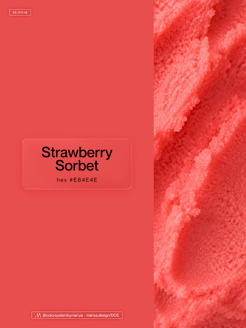
Love, love, love the colors. My mind goes: Rose Cream, Lime Mousse and Plum, hmmmm, which Plum... Plum Jelly. And of course, Strawberry Sorbet.
Let me match the vibe using my delicious swatches 😊